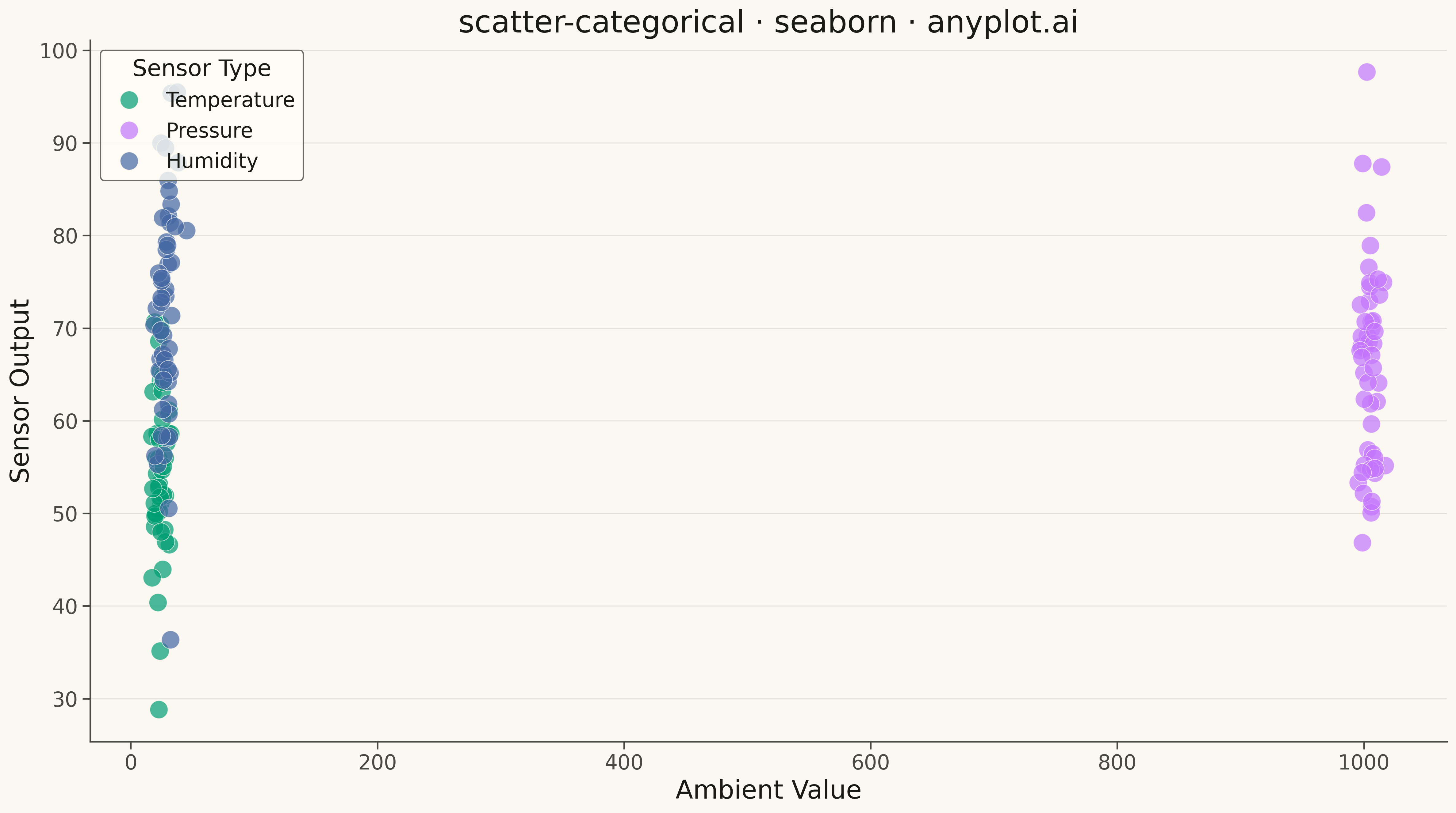
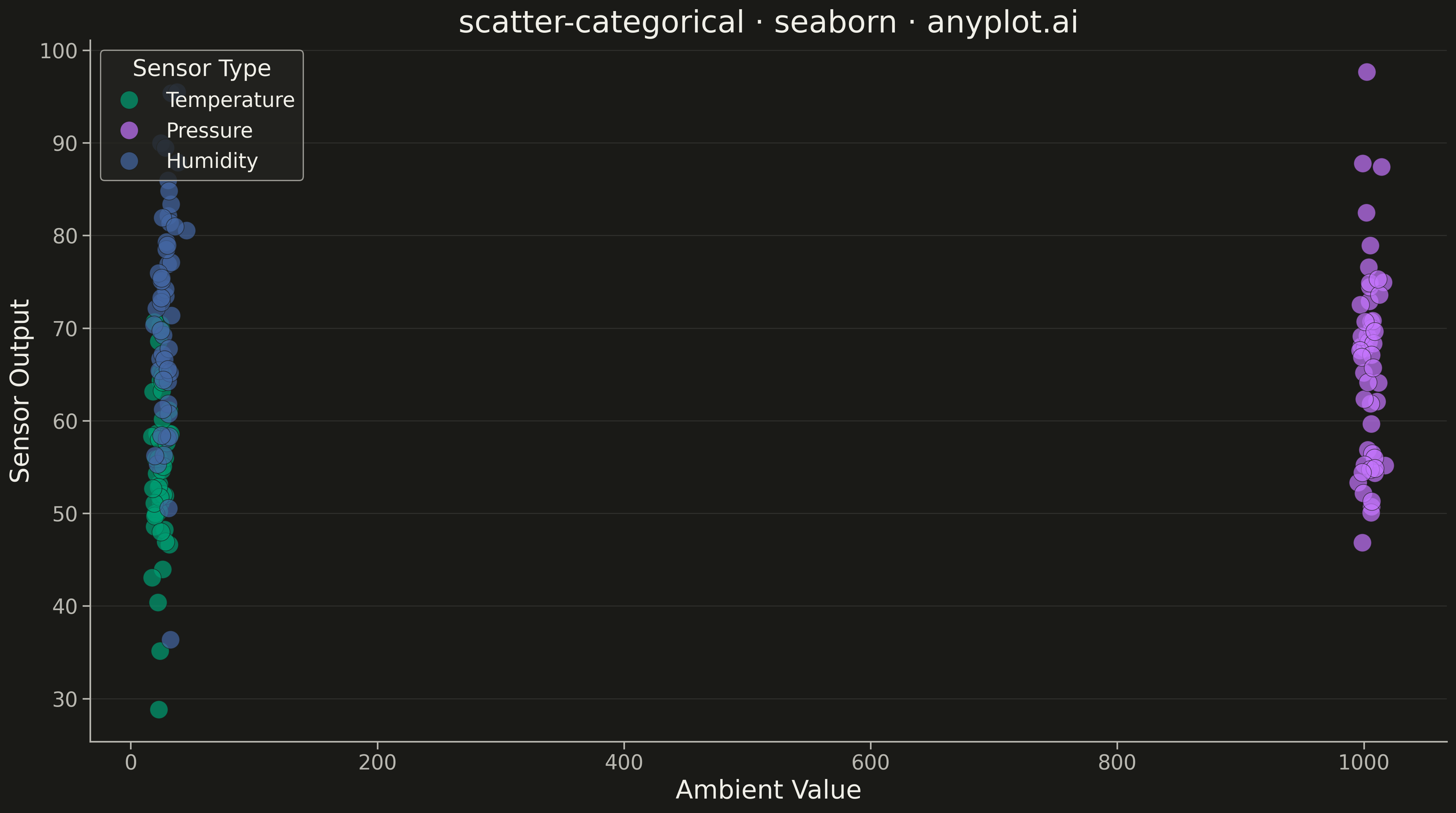
A scatter plot where points are colored according to a categorical variable. Each category has a distinct color, allowing visual comparison of patterns across groups. A legend maps colors to category names.
""" anyplot.ai
scatter-categorical: Categorical Scatter Plot
Library: seaborn 0.13.2 | Python 3.13.13
Quality: 88/100 | Updated: 2026-05-12
"""

import os

import matplotlib.pyplot as plt
import numpy as np
import pandas as pd
import seaborn as sns


# Theme tokens
THEME = os.getenv("ANYPLOT_THEME", "light")
PAGE_BG = "#FAF8F1" if THEME == "light" else "#1A1A17"
ELEVATED_BG = "#FFFDF6" if THEME == "light" else "#242420"
INK = "#1A1A17" if THEME == "light" else "#F0EFE8"
INK_SOFT = "#4A4A44" if THEME == "light" else "#B8B7B0"

# Okabe-Ito palette - canonical order, first series always #009E73
IMPRINT = ["#009E73", "#C475FD", "#4467A3"]

# Configure seaborn theme
sns.set_theme(
    style="ticks",
    rc={
        "figure.facecolor": PAGE_BG,
        "axes.facecolor": PAGE_BG,
        "axes.edgecolor": INK_SOFT,
        "axes.labelcolor": INK,
        "text.color": INK,
        "xtick.color": INK_SOFT,
        "ytick.color": INK_SOFT,
        "grid.color": INK,
        "grid.alpha": 0.10,
        "legend.facecolor": ELEVATED_BG,
        "legend.edgecolor": INK_SOFT,
    },
)

# Data - IoT sensor readings across three sensor types
np.random.seed(42)

n_per_group = 50

# Temperature sensors: readings range 15-35°C, with humidity correlation
temp_x = np.random.normal(25, 4, n_per_group)
temp_y = np.random.normal(55, 10, n_per_group)

# Pressure sensors: readings range 995-1015 hPa, with higher variance
pressure_x = np.random.normal(1005, 5, n_per_group)
pressure_y = np.random.normal(65, 12, n_per_group)

# Humidity sensors: readings range 30-90%, with temperature correlation
humidity_x = np.random.normal(28, 4.5, n_per_group)
humidity_y = np.random.normal(72, 11, n_per_group)

df = pd.DataFrame(
    {
        "Ambient Value": np.concatenate([temp_x, pressure_x, humidity_x]),
        "Sensor Output": np.concatenate([temp_y, pressure_y, humidity_y]),
        "Sensor Type": ["Temperature"] * n_per_group + ["Pressure"] * n_per_group + ["Humidity"] * n_per_group,
    }
)

# Plot
fig, ax = plt.subplots(figsize=(16, 9), facecolor=PAGE_BG)

sns.scatterplot(
    data=df,
    x="Ambient Value",
    y="Sensor Output",
    hue="Sensor Type",
    palette=IMPRINT,
    s=200,
    alpha=0.7,
    edgecolor=PAGE_BG,
    linewidth=0.5,
    ax=ax,
)

# Styling
ax.set_title("scatter-categorical · seaborn · anyplot.ai", fontsize=24, fontweight="medium", color=INK)
ax.set_xlabel("Ambient Value", fontsize=20, color=INK)
ax.set_ylabel("Sensor Output", fontsize=20, color=INK)
ax.tick_params(axis="both", labelsize=16, colors=INK_SOFT)

# Grid
ax.yaxis.grid(True, alpha=0.10, linewidth=0.8, color=INK)

# Legend
ax.legend(title="Sensor Type", fontsize=16, title_fontsize=18, loc="upper left")

# Remove top and right spines
ax.spines["top"].set_visible(False)
ax.spines["right"].set_visible(False)

plt.tight_layout()
plt.savefig(f"plot-{THEME}.png", dpi=300, bbox_inches="tight", facecolor=PAGE_BG)
Runnable source as JSON, for any HTTP client: https://api.anyplot.ai/specs/scatter-categorical/seaborn/code. Any spec id and library id listed in llms-full.txt fit the same URL shape; every URL below is complete and callable.
{
  "spec_id": "scatter-categorical",
  "language": "python",
  "library": "seaborn",
  "page": "https://anyplot.ai/scatter-categorical/python/seaborn",
  "hub": "https://anyplot.ai/scatter-categorical",
  "code_json": "https://api.anyplot.ai/specs/scatter-categorical/seaborn/code",
  "spec_json": "https://api.anyplot.ai/specs/scatter-categorical",
  "render_light_png": "https://storage.googleapis.com/anyplot-images/plots/scatter-categorical/python/seaborn/plot-light.png",
  "render_dark_png": "https://storage.googleapis.com/anyplot-images/plots/scatter-categorical/python/seaborn/plot-dark.png",
  "quality_score": 88.0,
  "license": "MIT",
  "guide": "https://anyplot.ai/llms.txt"
}
Part of Categorical Scatter Plot on anyplot.ai.