The same plot in 14 other libraries — Python: Altair, Bokeh, Matplotlib, Plotly, plotnine, Pygal, Seaborn; R: ggplot2; Julia: Makie.jl; JavaScript: Chart.js, D3.js, Apache ECharts, Highcharts, MUI X Charts. Compare all 15 side by side: Regression Diagnostic Panel (Four-Plot Display) in Python, R, Julia and JavaScript.
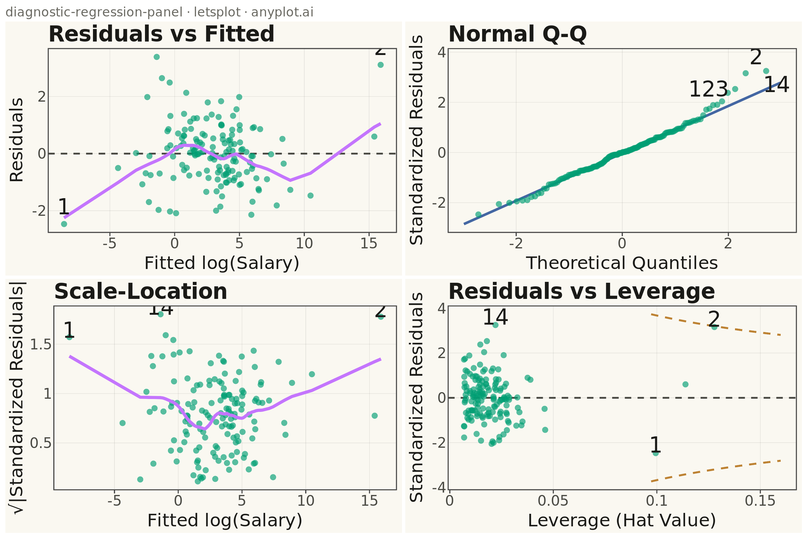
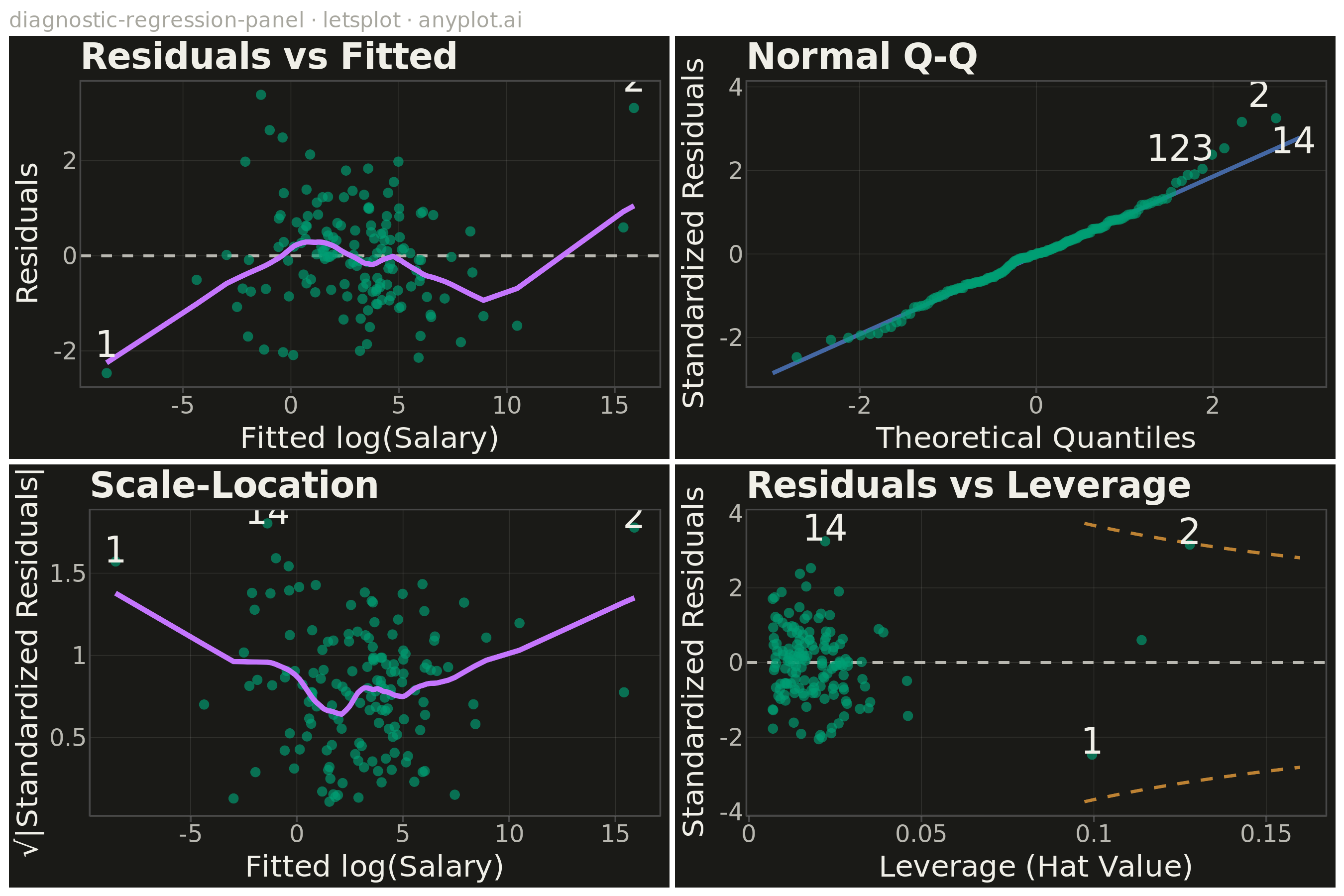
A 2x2 panel of diagnostic plots for evaluating linear regression model assumptions, replicating the classic output of R's `plot(lm)`. The four subplots are: (1) Residuals vs Fitted values to detect non-linearity and heteroscedasticity, (2) Normal Q-Q plot of standardized residuals to assess normality, (3) Scale-Location plot (square root of standardized residuals vs fitted values) to check homoscedasticity, and (4) Residuals vs Leverage with Cook's distance contours to identify influential observations. This composite display is the standard first step in regression model validation across statistics, academia, and regulated industries.
""" anyplot.ai
diagnostic-regression-panel: Regression Diagnostic Panel (Four-Plot Display)
Library: letsplot 4.9.0 | Python 3.13.13
Quality: 86/100 | Created: 2026-05-13
"""

import os

import numpy as np
import pandas as pd
from lets_plot import *
from scipy import stats
from statsmodels.nonparametric.smoothers_lowess import lowess


LetsPlot.setup_html()

THEME = os.getenv("ANYPLOT_THEME", "light")
PAGE_BG = "#FAF8F1" if THEME == "light" else "#1A1A17"
ELEVATED_BG = "#FFFDF6" if THEME == "light" else "#242420"
INK = "#1A1A17" if THEME == "light" else "#F0EFE8"
INK_SOFT = "#4A4A44" if THEME == "light" else "#B8B7B0"
INK_MUTED = "#6B6A63" if THEME == "light" else "#A8A79F"
GRID_COLOR = "rgba(26,26,23,0.10)" if THEME == "light" else "rgba(240,239,232,0.10)"

BRAND = "#009E73"  # Okabe-Ito position 1
SMOOTHER = "#C475FD"  # Okabe-Ito position 2
REFERENCE = "#4467A3"  # Okabe-Ito position 3
CONTOUR = "#BD8233"  # Okabe-Ito position 4

CREDIT = "diagnostic-regression-panel · letsplot · anyplot.ai"

# Data: salary prediction regression with heteroscedasticity and influential points
np.random.seed(42)
n = 150
# x1: years of experience (standardised), x2: education index
x1 = np.random.normal(0, 1, n)
x2 = np.random.uniform(-2, 2, n)
noise = np.random.normal(0, 0.8 + 0.4 * np.abs(x1), n)
y = 3.0 + 2.0 * x1 - 1.2 * x2 + noise  # log(Salary / median)

# Inject influential outliers (extreme experience / education combinations)
x1[[0, 1, 2]] = [4.0, -3.8, 4.5]
x2[[0, 1, 2]] = [-3.0, 2.8, -2.5]
y[[0, 1, 2]] = [16.0, -11.0, 19.0]

X = np.column_stack([np.ones(n), x1, x2])
p_params = 3

XtX_inv = np.linalg.inv(X.T @ X)
beta = XtX_inv @ X.T @ y
fitted = X @ beta
residuals = y - fitted
mse = np.sum(residuals**2) / (n - p_params)

H = X @ XtX_inv @ X.T
leverage = np.diag(H)
std_residuals = residuals / np.sqrt(mse * (1 - leverage))
cooks_d = (std_residuals**2 * leverage) / (p_params * (1 - leverage))

top3 = np.argsort(cooks_d)[-3:][::-1]

# Shared theme — font sizes at required minimums, panel borders removed
anyplot_theme = theme(
    plot_background=element_rect(fill=PAGE_BG, color=PAGE_BG),
    panel_background=element_rect(fill=PAGE_BG),
    panel_border=element_blank(),
    panel_grid_major=element_line(color=GRID_COLOR, size=0.5),
    panel_grid_minor=element_blank(),
    axis_title=element_text(color=INK, size=20),
    axis_text=element_text(color=INK_SOFT, size=16),
    axis_line=element_line(color=INK_SOFT),
    plot_title=element_text(color=INK, size=24, face="bold"),
    plot_subtitle=element_text(color=INK_MUTED, size=14),
    legend_background=element_rect(fill=ELEVATED_BG, color=INK_SOFT),
    legend_text=element_text(color=INK_SOFT, size=16),
    legend_title=element_text(color=INK, size=18),
)

# ── Plot 1: Residuals vs Fitted ──────────────────────────────────────────────
lw1 = lowess(residuals, fitted, frac=0.4, return_sorted=True)
df1 = pd.DataFrame({"fitted": fitted, "residuals": residuals})
df1_smooth = pd.DataFrame({"x": lw1[:, 0], "y": lw1[:, 1]})
df1_labels = pd.DataFrame({"fitted": fitted[top3], "residuals": residuals[top3], "label": [str(i) for i in top3]})

p1 = (
    ggplot(df1, aes("fitted", "residuals"))
    + geom_hline(yintercept=0, color=INK_SOFT, size=0.8, linetype="dashed")
    + geom_point(color=BRAND, size=3, alpha=0.65)
    + geom_line(data=df1_smooth, mapping=aes("x", "y"), color=SMOOTHER, size=1.5)
    + geom_text(data=df1_labels, mapping=aes("fitted", "residuals", label="label"), color=INK, size=12, nudge_y=0.6)
    + labs(x="Fitted log(Salary)", y="Residuals", title="Residuals vs Fitted")
    + anyplot_theme
    + ggsize(800, 450)
)

# ── Plot 2: Normal Q-Q ───────────────────────────────────────────────────────
sorted_idx = np.argsort(std_residuals)
sorted_std = std_residuals[sorted_idx]
theoretical_q = stats.norm.ppf(np.linspace(0.5 / n, 1 - 0.5 / n, n))

q25, q75 = np.percentile(sorted_std, [25, 75])
t25, t75 = stats.norm.ppf([0.25, 0.75])
slope_qq = (q75 - q25) / (t75 - t25)
intercept_qq = q25 - slope_qq * t25
t_range = np.linspace(theoretical_q.min() * 1.1, theoretical_q.max() * 1.1, 80)
df2_ref = pd.DataFrame({"x": t_range, "y": intercept_qq + slope_qq * t_range})

abs_rank = np.argsort(np.abs(sorted_std))[-3:]
df2 = pd.DataFrame({"theoretical": theoretical_q, "std_res": sorted_std})

# Compute staggered label positions to avoid overlap in the top-right cluster
lab_theo = theoretical_q[abs_rank]
lab_std = sorted_std[abs_rank]
lab_labels = [str(sorted_idx[k]) for k in abs_rank]
sort_order = np.argsort(lab_theo)
lab_theo = lab_theo[sort_order]
lab_std = lab_std[sort_order]
lab_labels = [lab_labels[i] for i in sort_order]
# Three extreme points: leftmost nudged left, next two separated up/down
nudge_x = np.array([-0.50, 0.20, 0.20])
nudge_y = np.array([0.0, 0.65, -0.55])
df2_labels = pd.DataFrame({"lx": lab_theo + nudge_x, "ly": lab_std + nudge_y, "label": lab_labels})

p2 = (
    ggplot(df2, aes("theoretical", "std_res"))
    + geom_line(data=df2_ref, mapping=aes("x", "y"), color=REFERENCE, size=1.2)
    + geom_point(color=BRAND, size=3, alpha=0.65)
    + geom_text(data=df2_labels, mapping=aes("lx", "ly", label="label"), color=INK, size=12)
    + labs(x="Theoretical Quantiles", y="Standardized Residuals", title="Normal Q-Q")
    + anyplot_theme
    + ggsize(800, 450)
)

# ── Plot 3: Scale-Location ───────────────────────────────────────────────────
sqrt_abs = np.sqrt(np.abs(std_residuals))
lw3 = lowess(sqrt_abs, fitted, frac=0.4, return_sorted=True)
df3 = pd.DataFrame({"fitted": fitted, "sqrt_abs": sqrt_abs})
df3_smooth = pd.DataFrame({"x": lw3[:, 0], "y": lw3[:, 1]})
df3_labels = pd.DataFrame({"fitted": fitted[top3], "sqrt_abs": sqrt_abs[top3], "label": [str(i) for i in top3]})

p3 = (
    ggplot(df3, aes("fitted", "sqrt_abs"))
    + geom_point(color=BRAND, size=3, alpha=0.65)
    + geom_line(data=df3_smooth, mapping=aes("x", "y"), color=SMOOTHER, size=1.5)
    + geom_text(data=df3_labels, mapping=aes("fitted", "sqrt_abs", label="label"), color=INK, size=12, nudge_y=0.07)
    + labs(x="Fitted log(Salary)", y="√|Standardized Residuals|", title="Scale-Location")
    + anyplot_theme
    + ggsize(800, 450)
)

# ── Plot 4: Residuals vs Leverage ────────────────────────────────────────────
h_seq = np.linspace(0.001, leverage.max() * 1.25, 400)
std_lim = max(abs(std_residuals)) * 1.15
contour_rows = []
for D in [0.5, 1.0]:
    r_vals = np.sqrt(D * p_params * (1 - h_seq) / h_seq)
    for sign, tag in [(1, "pos"), (-1, "neg")]:
        mask = r_vals <= std_lim
        contour_rows.append(pd.DataFrame({"h": h_seq[mask], "r": sign * r_vals[mask], "grp": f"D={D}_{tag}"}))
df_contours = pd.concat(contour_rows, ignore_index=True)

df4 = pd.DataFrame({"leverage": leverage, "std_res": std_residuals})
df4_labels = pd.DataFrame({"leverage": leverage[top3], "std_res": std_residuals[top3], "label": [str(i) for i in top3]})

p4 = (
    ggplot(df4, aes("leverage", "std_res"))
    + geom_hline(yintercept=0, color=INK_SOFT, size=0.8, linetype="dashed")
    + geom_line(data=df_contours, mapping=aes("h", "r", group="grp"), color=CONTOUR, size=0.9, linetype="dashed")
    + geom_point(color=BRAND, size=3, alpha=0.65)
    + geom_text(data=df4_labels, mapping=aes("leverage", "std_res", label="label"), color=INK, size=12, nudge_y=0.35)
    + labs(x="Leverage (Hat Value)", y="Standardized Residuals", title="Residuals vs Leverage")
    + anyplot_theme
    + ggsize(800, 450)
)

# ── Assemble 2×2 panel with figure-level credit ──────────────────────────────
panel = (
    gggrid([p1, p2, p3, p4], ncol=2)
    + labs(subtitle=CREDIT)
    + theme(plot_subtitle=element_text(color=INK_MUTED, size=14))
)

ggsave(panel, f"plot-{THEME}.png", path=".", scale=3)
ggsave(panel, f"plot-{THEME}.html", path=".")
Runnable source as JSON, for any HTTP client: https://api.anyplot.ai/specs/diagnostic-regression-panel/letsplot/code. Any spec id and library id listed in llms-full.txt fit the same URL shape; every URL below is complete and callable.
{
  "spec_id": "diagnostic-regression-panel",
  "language": "python",
  "library": "letsplot",
  "page": "https://anyplot.ai/diagnostic-regression-panel/python/letsplot",
  "hub": "https://anyplot.ai/diagnostic-regression-panel",
  "code_json": "https://api.anyplot.ai/specs/diagnostic-regression-panel/letsplot/code",
  "spec_json": "https://api.anyplot.ai/specs/diagnostic-regression-panel",
  "render_light_png": "https://storage.googleapis.com/anyplot-images/plots/diagnostic-regression-panel/python/letsplot/plot-light.png",
  "render_dark_png": "https://storage.googleapis.com/anyplot-images/plots/diagnostic-regression-panel/python/letsplot/plot-dark.png",
  "interactive_light_html": "https://storage.googleapis.com/anyplot-images/plots/diagnostic-regression-panel/python/letsplot/plot-light.html",
  "interactive_dark_html": "https://storage.googleapis.com/anyplot-images/plots/diagnostic-regression-panel/python/letsplot/plot-dark.html",
  "quality_score": 86.0,
  "license": "MIT",
  "guide": "https://anyplot.ai/llms.txt"
}
Part of Regression Diagnostic Panel (Four-Plot Display) on anyplot.ai.