The same plot in 14 other libraries — Python: Altair, Bokeh, lets-plot, Matplotlib, plotnine, Pygal, Seaborn; R: ggplot2; Julia: Makie.jl; JavaScript: Chart.js, D3.js, Apache ECharts, Highcharts, MUI X Charts. Compare all 15 side by side: Regression Diagnostic Panel (Four-Plot Display) in Python, R, Julia and JavaScript.
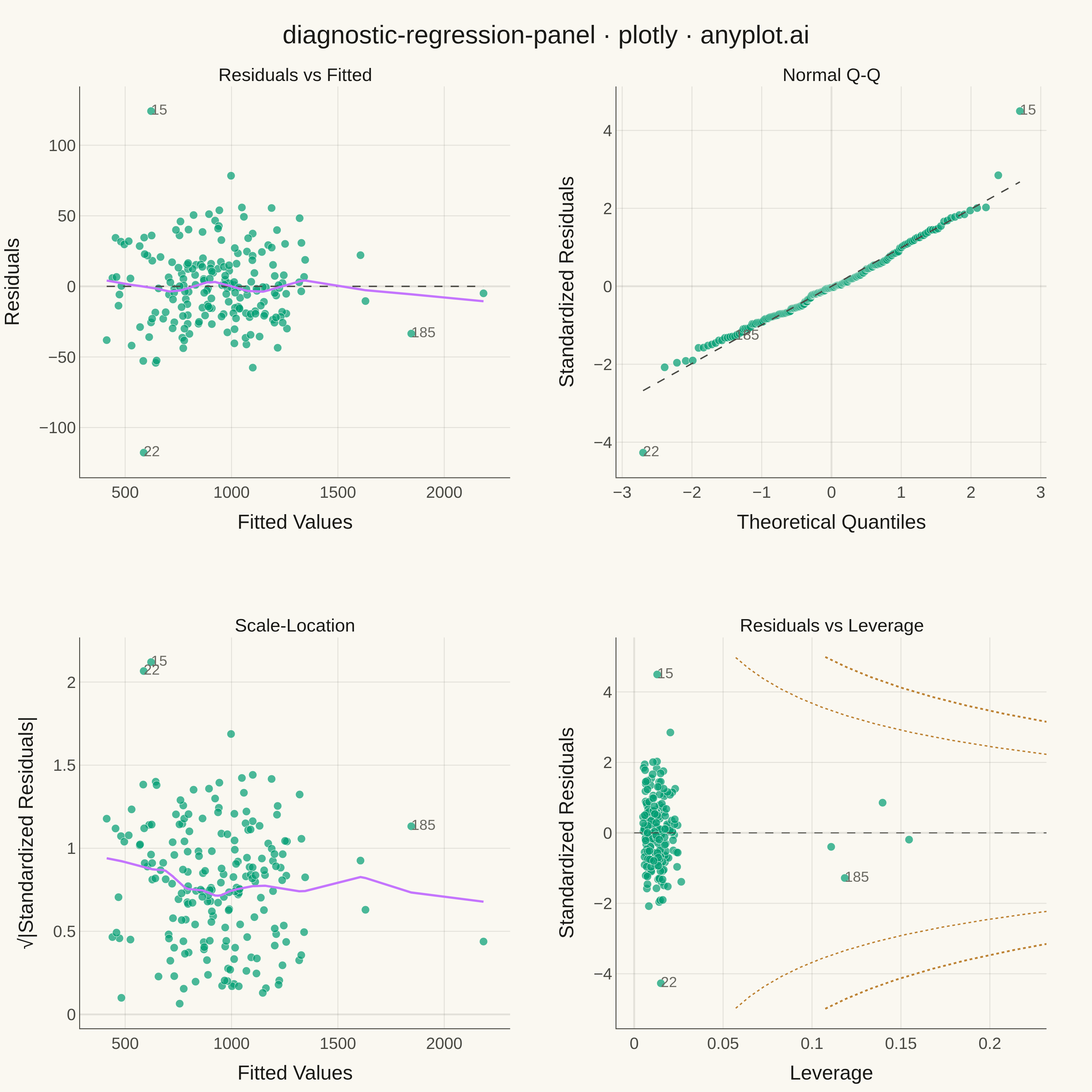
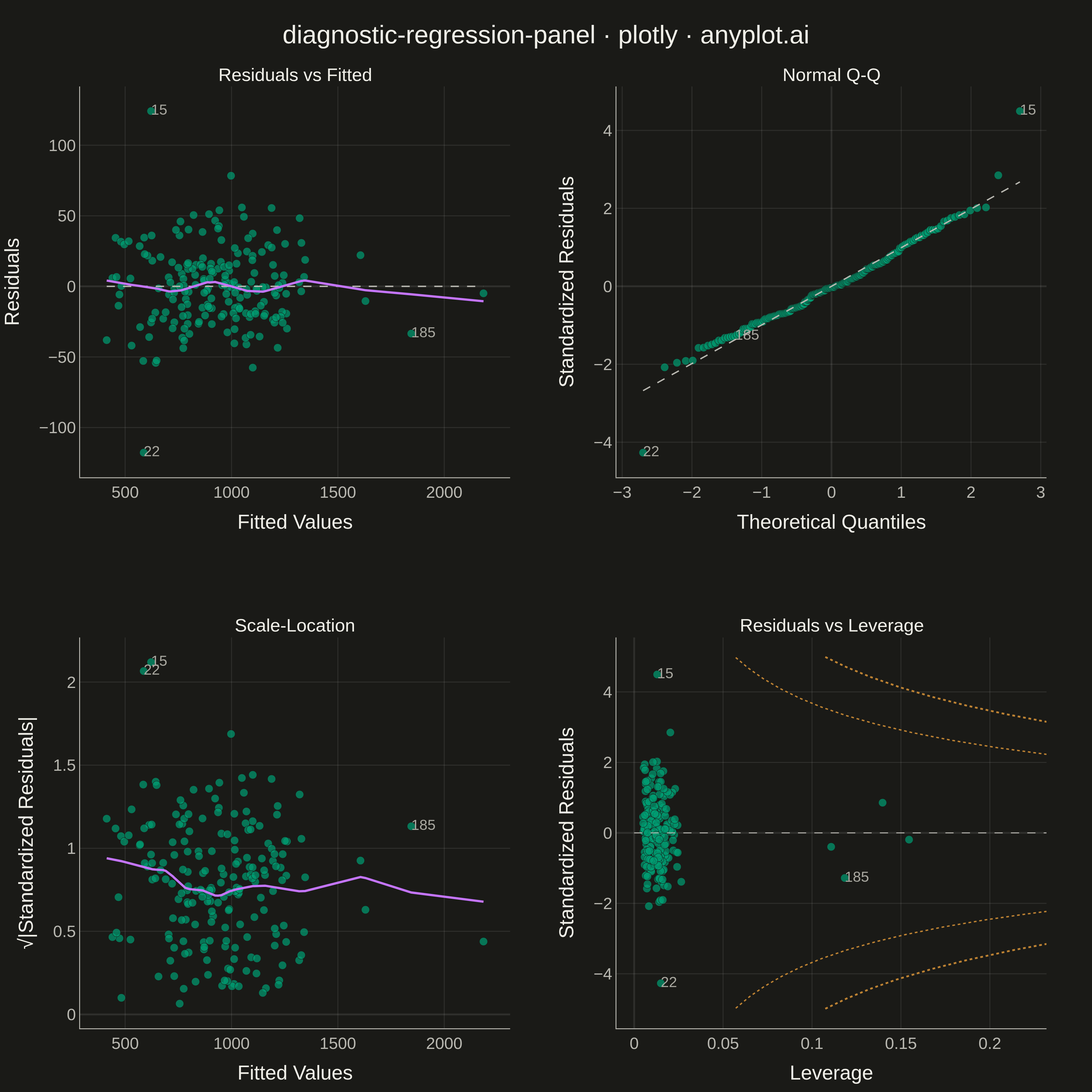
A 2x2 panel of diagnostic plots for evaluating linear regression model assumptions, replicating the classic output of R's `plot(lm)`. The four subplots are: (1) Residuals vs Fitted values to detect non-linearity and heteroscedasticity, (2) Normal Q-Q plot of standardized residuals to assess normality, (3) Scale-Location plot (square root of standardized residuals vs fitted values) to check homoscedasticity, and (4) Residuals vs Leverage with Cook's distance contours to identify influential observations. This composite display is the standard first step in regression model validation across statistics, academia, and regulated industries.
""" anyplot.ai
diagnostic-regression-panel: Regression Diagnostic Panel (Four-Plot Display)
Library: plotly 6.7.0 | Python 3.13.13
Quality: 89/100 | Created: 2026-05-13
"""

import os

import numpy as np
import plotly.graph_objects as go
from plotly.subplots import make_subplots
from scipy import stats
from statsmodels.nonparametric.smoothers_lowess import lowess


# Theme tokens
THEME = os.getenv("ANYPLOT_THEME", "light")
PAGE_BG = "#FAF8F1" if THEME == "light" else "#1A1A17"
INK = "#1A1A17" if THEME == "light" else "#F0EFE8"
INK_SOFT = "#4A4A44" if THEME == "light" else "#B8B7B0"
INK_MUTED = "#6B6A63" if THEME == "light" else "#A8A79F"
GRID = "rgba(26,26,23,0.10)" if THEME == "light" else "rgba(240,239,232,0.10)"
BRAND = "#009E73"  # Okabe-Ito position 1 — scatter points
C2 = "#C475FD"  # Okabe-Ito position 2 — LOWESS smoother lines
C4 = "#BD8233"  # Okabe-Ito position 4 — Cook's distance contours

# Data — apartment rental price regression with synthetic data
np.random.seed(42)
n = 200
p = 3  # intercept + sqft + bedrooms

sqft = np.random.uniform(400, 3000, n)
beds = np.random.uniform(1.0, 6.0, n)
# Inject a few high-leverage observations (extreme predictor values)
sqft[185], sqft[186] = 5800.0, 6200.0
beds[190], beds[191] = 11.0, 12.5

X = np.column_stack([np.ones(n), sqft, beds])
noise = np.random.normal(0, 25, n)
# Inject high-residual outliers that will inflate Cook's distance
noise[15] += 110
noise[22] -= 95
noise[67] += 70

rent = X @ [200.0, 0.18, 120.0] + noise

# OLS fit
XtX_inv = np.linalg.inv(X.T @ X)
beta = XtX_inv @ X.T @ rent
fitted = X @ beta
resid = rent - fitted

# Hat matrix diagonal (leverage) via einsum — avoids storing full n×n matrix
h = np.einsum("ij,jk,ik->i", X, XtX_inv, X)
h = np.clip(h, 0.0, 1.0 - 1e-10)

# Internally studentized residuals and Cook's distance
mse = resid @ resid / (n - p)
sr = resid / (np.sqrt(mse) * np.sqrt(1.0 - h))
cooks = sr**2 * h / (p * (1.0 - h))
top3 = np.argsort(cooks)[-3:][::-1]

# LOWESS smoothers for subplots 1 and 3
ord_ = np.argsort(fitted)
lo_r = lowess(resid[ord_], fitted[ord_], frac=0.5, return_sorted=True)
lo_sl = lowess(np.sqrt(np.abs(sr[ord_])), fitted[ord_], frac=0.5, return_sorted=True)

# Normal Q-Q data
qq = stats.probplot(sr, dist="norm")
th_q, sa_q = qq[0][0], qq[0][1]
slope, intercept = qq[1][0], qq[1][1]
ql_x = np.array([th_q[0], th_q[-1]])
ql_y = slope * ql_x + intercept
# Rank of each observation for labeling in QQ space
qq_ord = np.argsort(sr)
qq_rank = np.empty(n, dtype=int)
qq_rank[qq_ord] = np.arange(n)

# Cook's distance contour lines for subplot 4
h_c = np.linspace(0.001, h.max() * 1.5, 400)


def cook_contour(D_level):
    r = np.sqrt(D_level * p * (1.0 - h_c) / h_c)
    mask = r < 5.0
    return h_c[mask], r[mask]


hc05, rc05 = cook_contour(0.5)
hc10, rc10 = cook_contour(1.0)

# Build 2×2 subplot figure
fig = make_subplots(
    rows=2,
    cols=2,
    subplot_titles=["Residuals vs Fitted", "Normal Q-Q", "Scale-Location", "Residuals vs Leverage"],
    horizontal_spacing=0.11,
    vertical_spacing=0.17,
)

mk = dict(color=BRAND, size=9, opacity=0.70, line=dict(color=PAGE_BG, width=0.5))

# ── Subplot 1: Residuals vs Fitted ────────────────────────────────────────
fig.add_trace(go.Scatter(x=fitted, y=resid, mode="markers", marker=mk, showlegend=False), row=1, col=1)
fig.add_trace(
    go.Scatter(
        x=[fitted.min(), fitted.max()],
        y=[0, 0],
        mode="lines",
        line=dict(color=INK_SOFT, width=1.5, dash="dash"),
        showlegend=False,
    ),
    row=1,
    col=1,
)
fig.add_trace(
    go.Scatter(x=lo_r[:, 0], y=lo_r[:, 1], mode="lines", line=dict(color=C2, width=2.5), showlegend=False), row=1, col=1
)
fig.add_trace(
    go.Scatter(
        x=fitted[top3],
        y=resid[top3],
        mode="text",
        text=[str(i) for i in top3],
        textposition="middle right",
        textfont=dict(size=16, color=INK_MUTED),
        showlegend=False,
    ),
    row=1,
    col=1,
)

# ── Subplot 2: Normal Q-Q ─────────────────────────────────────────────────
fig.add_trace(go.Scatter(x=th_q, y=sa_q, mode="markers", marker=mk, showlegend=False), row=1, col=2)
fig.add_trace(
    go.Scatter(x=ql_x, y=ql_y, mode="lines", line=dict(color=INK_SOFT, width=1.5, dash="dash"), showlegend=False),
    row=1,
    col=2,
)
fig.add_trace(
    go.Scatter(
        x=th_q[qq_rank[top3]],
        y=sa_q[qq_rank[top3]],
        mode="text",
        text=[str(i) for i in top3],
        textposition="middle right",
        textfont=dict(size=16, color=INK_MUTED),
        showlegend=False,
    ),
    row=1,
    col=2,
)

# ── Subplot 3: Scale-Location ─────────────────────────────────────────────
fig.add_trace(go.Scatter(x=fitted, y=np.sqrt(np.abs(sr)), mode="markers", marker=mk, showlegend=False), row=2, col=1)
fig.add_trace(
    go.Scatter(x=lo_sl[:, 0], y=lo_sl[:, 1], mode="lines", line=dict(color=C2, width=2.5), showlegend=False),
    row=2,
    col=1,
)
fig.add_trace(
    go.Scatter(
        x=fitted[top3],
        y=np.sqrt(np.abs(sr[top3])),
        mode="text",
        text=[str(i) for i in top3],
        textposition="middle right",
        textfont=dict(size=16, color=INK_MUTED),
        showlegend=False,
    ),
    row=2,
    col=1,
)

# ── Subplot 4: Residuals vs Leverage ─────────────────────────────────────
fig.add_trace(go.Scatter(x=h, y=sr, mode="markers", marker=mk, showlegend=False), row=2, col=2)
fig.add_trace(
    go.Scatter(
        x=[0.0, h.max() * 1.5],
        y=[0, 0],
        mode="lines",
        line=dict(color=INK_SOFT, width=1.0, dash="dash"),
        showlegend=False,
    ),
    row=2,
    col=2,
)
if len(hc05):
    fig.add_trace(
        go.Scatter(x=hc05, y=rc05, mode="lines", line=dict(color=C4, width=1.5, dash="dot"), showlegend=False),
        row=2,
        col=2,
    )
    fig.add_trace(
        go.Scatter(x=hc05, y=-rc05, mode="lines", line=dict(color=C4, width=1.5, dash="dot"), showlegend=False),
        row=2,
        col=2,
    )
if len(hc10):
    fig.add_trace(
        go.Scatter(x=hc10, y=rc10, mode="lines", line=dict(color=C4, width=2.0, dash="dot"), showlegend=False),
        row=2,
        col=2,
    )
    fig.add_trace(
        go.Scatter(x=hc10, y=-rc10, mode="lines", line=dict(color=C4, width=2.0, dash="dot"), showlegend=False),
        row=2,
        col=2,
    )
fig.add_trace(
    go.Scatter(
        x=h[top3],
        y=sr[top3],
        mode="text",
        text=[str(i) for i in top3],
        textposition="middle right",
        textfont=dict(size=16, color=INK_MUTED),
        showlegend=False,
    ),
    row=2,
    col=2,
)

# Global layout
fig.update_layout(
    title=dict(
        text="diagnostic-regression-panel · plotly · anyplot.ai", font=dict(size=28, color=INK), x=0.5, xanchor="center"
    ),
    paper_bgcolor=PAGE_BG,
    plot_bgcolor=PAGE_BG,
    font=dict(color=INK, size=18),
    showlegend=False,
    margin=dict(t=95, l=70, r=50, b=70),
)

# Subplot title fonts (make_subplots stores them as layout annotations)
fig.update_annotations(font=dict(size=20, color=INK))

# Axis styles
ax_kw = dict(
    title_font=dict(size=22, color=INK),
    tickfont=dict(size=18, color=INK_SOFT),
    gridcolor=GRID,
    linecolor=INK_SOFT,
    zerolinecolor=GRID,
    showgrid=True,
    showline=True,
    mirror=False,
)
fig.update_xaxes(title_text="Fitted Values", row=1, col=1, **ax_kw)
fig.update_xaxes(title_text="Theoretical Quantiles", row=1, col=2, **ax_kw)
fig.update_xaxes(title_text="Fitted Values", row=2, col=1, **ax_kw)
fig.update_xaxes(title_text="Leverage", row=2, col=2, **ax_kw)
fig.update_yaxes(title_text="Residuals", row=1, col=1, **ax_kw)
fig.update_yaxes(title_text="Standardized Residuals", row=1, col=2, **ax_kw)
fig.update_yaxes(title_text="√|Standardized Residuals|", row=2, col=1, **ax_kw)
fig.update_yaxes(title_text="Standardized Residuals", row=2, col=2, **ax_kw)

# Save
fig.write_image(f"plot-{THEME}.png", width=1200, height=1200, scale=3)
fig.write_html(f"plot-{THEME}.html", include_plotlyjs="cdn")
Runnable source as JSON, for any HTTP client: https://api.anyplot.ai/specs/diagnostic-regression-panel/plotly/code. Any spec id and library id listed in llms-full.txt fit the same URL shape; every URL below is complete and callable.
{
  "spec_id": "diagnostic-regression-panel",
  "language": "python",
  "library": "plotly",
  "page": "https://anyplot.ai/diagnostic-regression-panel/python/plotly",
  "hub": "https://anyplot.ai/diagnostic-regression-panel",
  "code_json": "https://api.anyplot.ai/specs/diagnostic-regression-panel/plotly/code",
  "spec_json": "https://api.anyplot.ai/specs/diagnostic-regression-panel",
  "render_light_png": "https://storage.googleapis.com/anyplot-images/plots/diagnostic-regression-panel/python/plotly/plot-light.png",
  "render_dark_png": "https://storage.googleapis.com/anyplot-images/plots/diagnostic-regression-panel/python/plotly/plot-dark.png",
  "interactive_light_html": "https://storage.googleapis.com/anyplot-images/plots/diagnostic-regression-panel/python/plotly/plot-light.html",
  "interactive_dark_html": "https://storage.googleapis.com/anyplot-images/plots/diagnostic-regression-panel/python/plotly/plot-dark.html",
  "quality_score": 89.0,
  "license": "MIT",
  "guide": "https://anyplot.ai/llms.txt"
}
Part of Regression Diagnostic Panel (Four-Plot Display) on anyplot.ai.