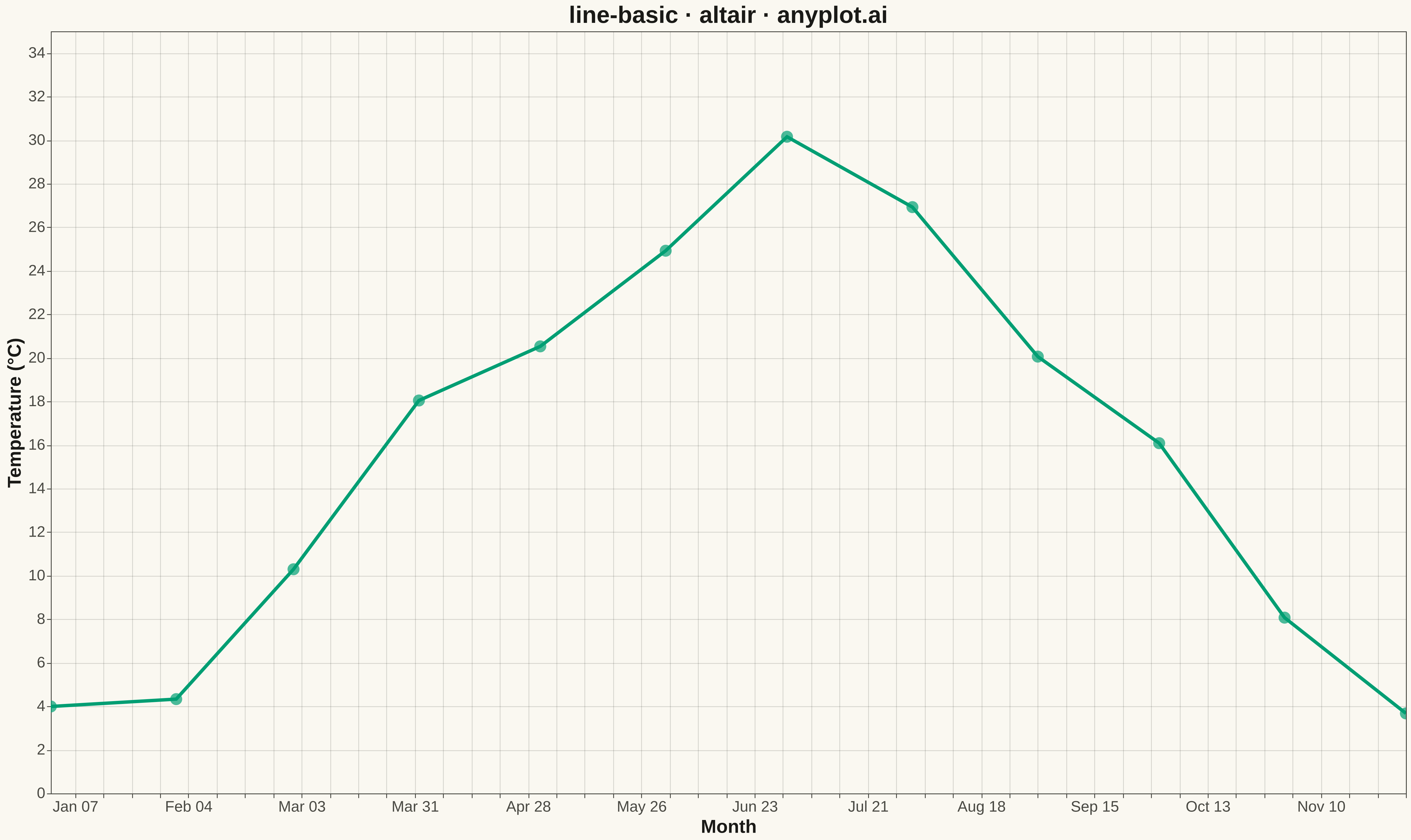
A basic line plot connects data points with straight lines to show how a continuous variable changes over a sequence or time. It's ideal for revealing trends, patterns, and changes in data over ordered intervals. The simplicity of a single-line design makes it easy to interpret at a glance.
""" anyplot.ai
line-basic: Basic Line Plot
Library: altair 6.1.0 | Python 3.13.13
Quality: 86/100 | Updated: 2026-04-29
"""

import os

import altair as alt
import numpy as np
import pandas as pd


# Theme tokens
THEME = os.getenv("ANYPLOT_THEME", "light")
PAGE_BG = "#FAF8F1" if THEME == "light" else "#1A1A17"
ELEVATED_BG = "#FFFDF6" if THEME == "light" else "#242420"
INK = "#1A1A17" if THEME == "light" else "#F0EFE8"
INK_SOFT = "#4A4A44" if THEME == "light" else "#B8B7B0"
BRAND = "#009E73"

# Data - Monthly temperature readings over a year
np.random.seed(42)
months = pd.date_range(start="2024-01-01", periods=12, freq="MS")
base_temp = 15 + 12 * np.sin((np.arange(12) - 3) * np.pi / 6)
temperature = base_temp + np.random.randn(12) * 2
df = pd.DataFrame({"Month": months, "Temperature": temperature})

# Plot
tooltip_enc = [
    alt.Tooltip("Month:T", title="Month", format="%B %Y"),
    alt.Tooltip("Temperature:Q", title="Temperature (°C)", format=".1f"),
]

line = (
    alt.Chart(df)
    .mark_line(strokeWidth=4, color=BRAND)
    .encode(x=alt.X("Month:T", title="Month"), y=alt.Y("Temperature:Q", title="Temperature (°C)"))
)

points = (
    alt.Chart(df)
    .mark_point(size=200, color=BRAND, filled=True)
    .encode(x="Month:T", y="Temperature:Q", tooltip=tooltip_enc)
)

chart = (
    (line + points)
    .interactive()
    .properties(
        width=1600, height=900, title=alt.Title("line-basic · altair · anyplot.ai", fontSize=28), background=PAGE_BG
    )
    .configure_view(fill=PAGE_BG, stroke=INK_SOFT)
    .configure_axis(
        domainColor=INK_SOFT,
        tickColor=INK_SOFT,
        gridColor=INK,
        gridOpacity=0.15,
        labelColor=INK_SOFT,
        titleColor=INK,
        labelFontSize=18,
        titleFontSize=22,
    )
    .configure_title(color=INK, fontSize=28)
    .configure_legend(fillColor=ELEVATED_BG, strokeColor=INK_SOFT, labelColor=INK_SOFT, titleColor=INK)
)

# Save
chart.save(f"plot-{THEME}.png", scale_factor=3.0)
chart.save(f"plot-{THEME}.html")
Runnable source as JSON, for any HTTP client: https://api.anyplot.ai/specs/line-basic/altair/code. Any spec id and library id listed in llms-full.txt fit the same URL shape; every URL below is complete and callable.
{
  "spec_id": "line-basic",
  "language": "python",
  "library": "altair",
  "page": "https://anyplot.ai/line-basic/python/altair",
  "hub": "https://anyplot.ai/line-basic",
  "code_json": "https://api.anyplot.ai/specs/line-basic/altair/code",
  "spec_json": "https://api.anyplot.ai/specs/line-basic",
  "render_light_png": "https://storage.googleapis.com/anyplot-images/plots/line-basic/python/altair/plot-light.png",
  "render_dark_png": "https://storage.googleapis.com/anyplot-images/plots/line-basic/python/altair/plot-dark.png",
  "interactive_light_html": "https://storage.googleapis.com/anyplot-images/plots/line-basic/python/altair/plot-light.html",
  "interactive_dark_html": "https://storage.googleapis.com/anyplot-images/plots/line-basic/python/altair/plot-dark.html",
  "quality_score": 86.0,
  "license": "MIT",
  "guide": "https://anyplot.ai/llms.txt"
}
Part of Basic Line Plot on anyplot.ai.