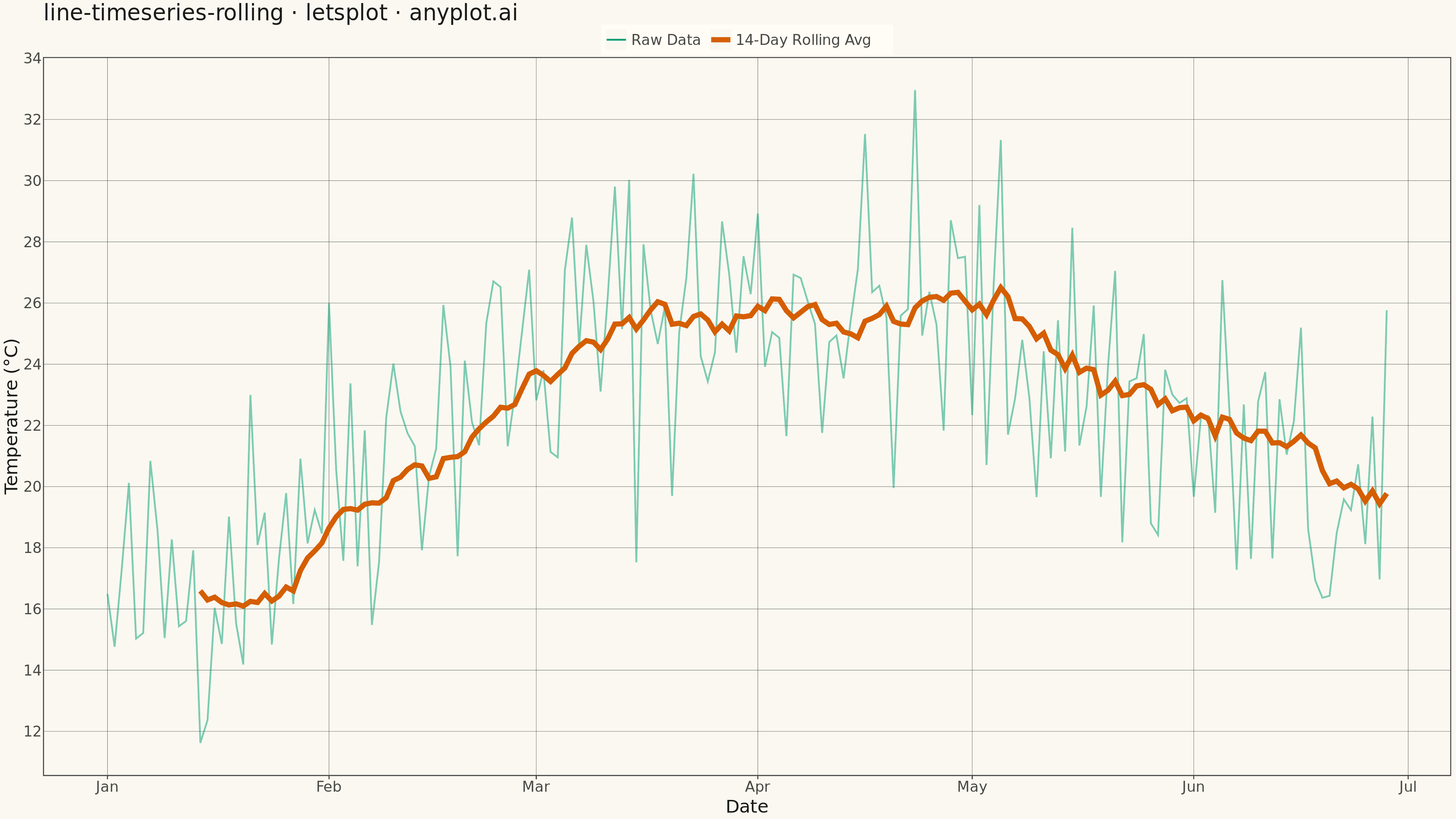
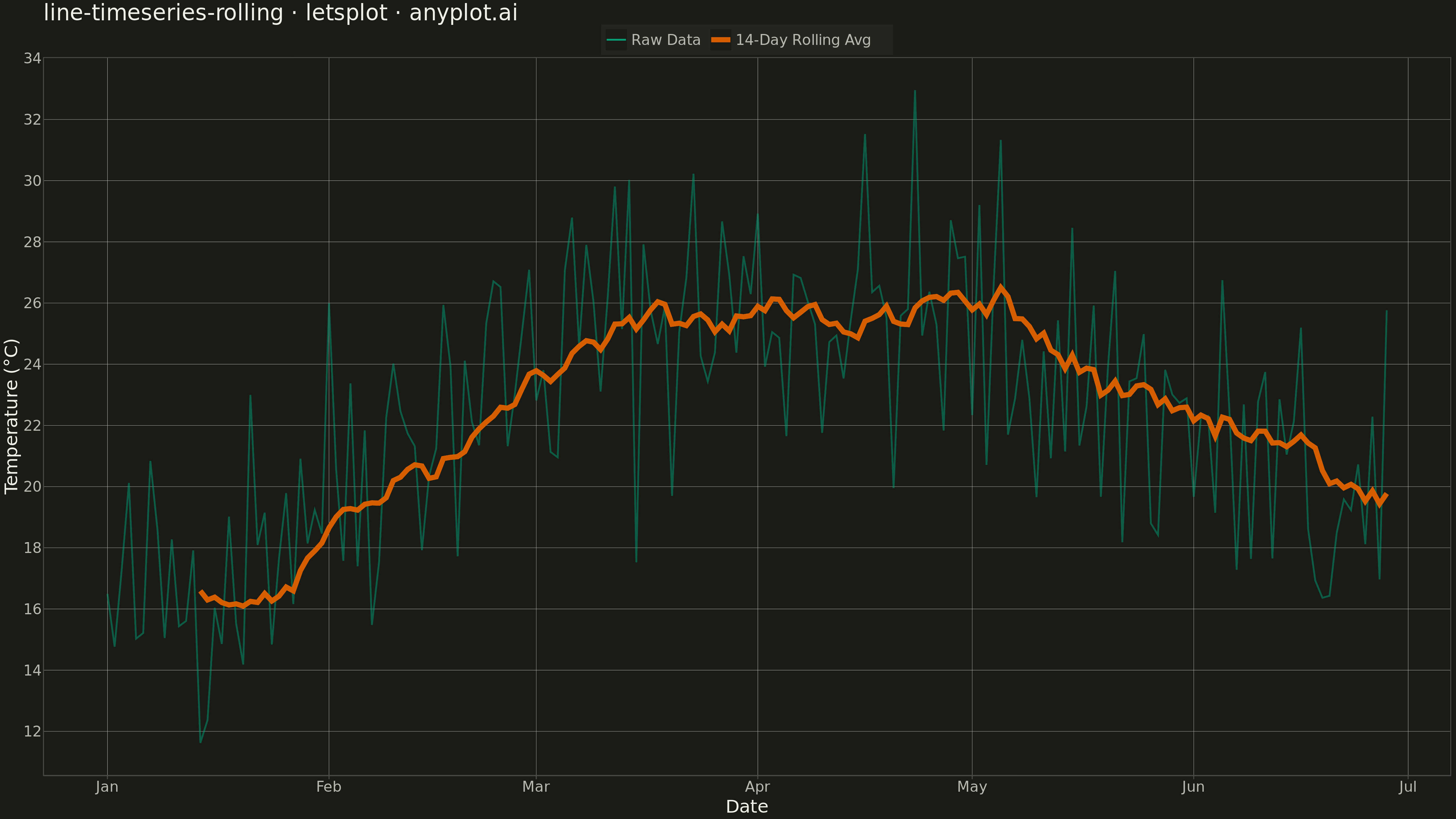
A time series plot that displays raw data points alongside a smoothed rolling average (moving average) line. The raw data shows actual observations while the rolling average reveals underlying trends by reducing noise and short-term fluctuations. This dual-layer visualization is essential for trend identification, making patterns visible that might be obscured by day-to-day volatility.
""" anyplot.ai
line-timeseries-rolling: Time Series with Rolling Average Overlay
Library: letsplot 4.9.0 | Python 3.13.13
Quality: 84/100 | Updated: 2026-05-13
"""

import numpy as np
import pandas as pd
from lets_plot import *


LetsPlot.setup_html()

# Data: Simulated daily sensor temperature readings
np.random.seed(42)
n_days = 180
dates = pd.date_range("2024-01-01", periods=n_days, freq="D")

# Generate realistic temperature data with seasonal trend and noise
base_temp = 15  # Base temperature in Celsius
seasonal = 10 * np.sin(2 * np.pi * np.arange(n_days) / 365)  # Seasonal variation
noise = np.random.normal(0, 3, n_days)  # Daily fluctuations
trend = np.linspace(0, 2, n_days)  # Slight warming trend
values = base_temp + seasonal + noise + trend

# Calculate 14-day rolling average
rolling_window = 14
rolling_avg = pd.Series(values).rolling(window=rolling_window, center=False).mean()

# Create DataFrame for plotting
df = pd.DataFrame({"date": dates, "value": values, "rolling_avg": rolling_avg})

# Reshape data for lets-plot (long format for legend)
df_raw = df[["date", "value"]].copy()
df_raw["series"] = "Raw Data"
df_raw = df_raw.rename(columns={"value": "temp"})

df_rolling = df[["date", "rolling_avg"]].dropna().copy()
df_rolling["series"] = f"{rolling_window}-Day Rolling Avg"
df_rolling = df_rolling.rename(columns={"rolling_avg": "temp"})

df_long = pd.concat([df_raw, df_rolling], ignore_index=True)

# Plot
plot = (
    ggplot(df_long, aes(x="date", y="temp", color="series"))
    + geom_line(aes(alpha="series", size="series"))
    + labs(x="Date", y="Temperature (°C)", title="line-timeseries-rolling · letsplot · pyplots.ai")
    + scale_color_manual(name="", values=["#306998", "#FFD43B"])
    + scale_alpha_manual(name="", values=[0.5, 1.0])
    + scale_size_manual(name="", values=[0.8, 2.5])
    + theme_minimal()
    + theme(
        plot_title=element_text(size=24),
        axis_title=element_text(size=20),
        axis_text=element_text(size=16),
        legend_text=element_text(size=16),
        legend_position="top",
        panel_grid_major=element_line(color="#CCCCCC", size=0.5),
    )
    + ggsize(1600, 900)
)

# Save PNG (scale 3x for 4800 × 2700 px)
ggsave(plot, "plot.png", path=".", scale=3)

# Save HTML for interactive version
ggsave(plot, "plot.html", path=".")
Runnable source as JSON, for any HTTP client: https://api.anyplot.ai/specs/line-timeseries-rolling/letsplot/code. Any spec id and library id listed in llms-full.txt fit the same URL shape; every URL below is complete and callable.
{
  "spec_id": "line-timeseries-rolling",
  "language": "python",
  "library": "letsplot",
  "page": "https://anyplot.ai/line-timeseries-rolling/python/letsplot",
  "hub": "https://anyplot.ai/line-timeseries-rolling",
  "code_json": "https://api.anyplot.ai/specs/line-timeseries-rolling/letsplot/code",
  "spec_json": "https://api.anyplot.ai/specs/line-timeseries-rolling",
  "render_light_png": "https://storage.googleapis.com/anyplot-images/plots/line-timeseries-rolling/python/letsplot/plot-light.png",
  "render_dark_png": "https://storage.googleapis.com/anyplot-images/plots/line-timeseries-rolling/python/letsplot/plot-dark.png",
  "interactive_light_html": "https://storage.googleapis.com/anyplot-images/plots/line-timeseries-rolling/python/letsplot/plot-light.html",
  "interactive_dark_html": "https://storage.googleapis.com/anyplot-images/plots/line-timeseries-rolling/python/letsplot/plot-dark.html",
  "quality_score": 84.0,
  "license": "MIT",
  "guide": "https://anyplot.ai/llms.txt"
}
Part of Time Series with Rolling Average Overlay on anyplot.ai.