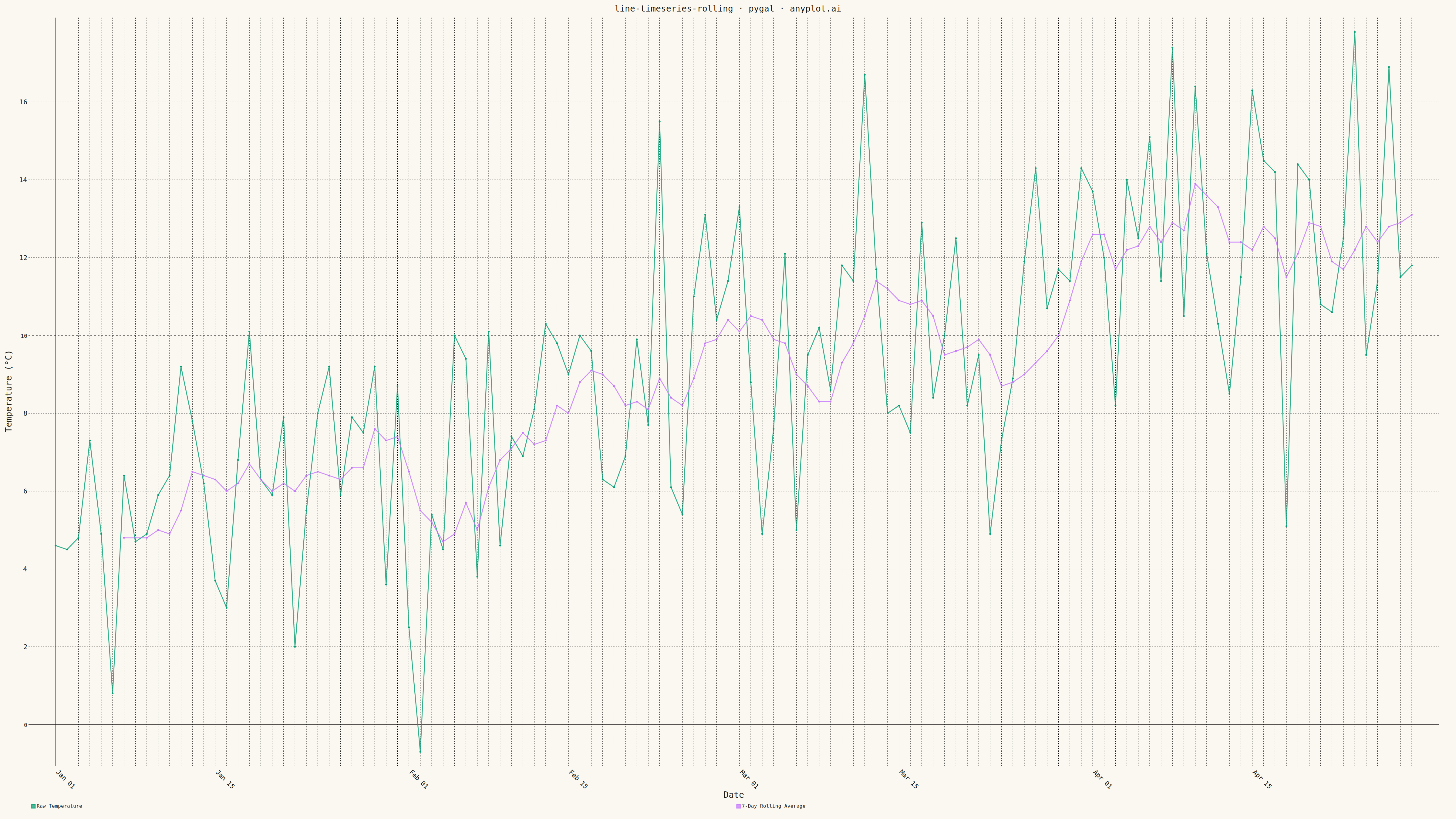
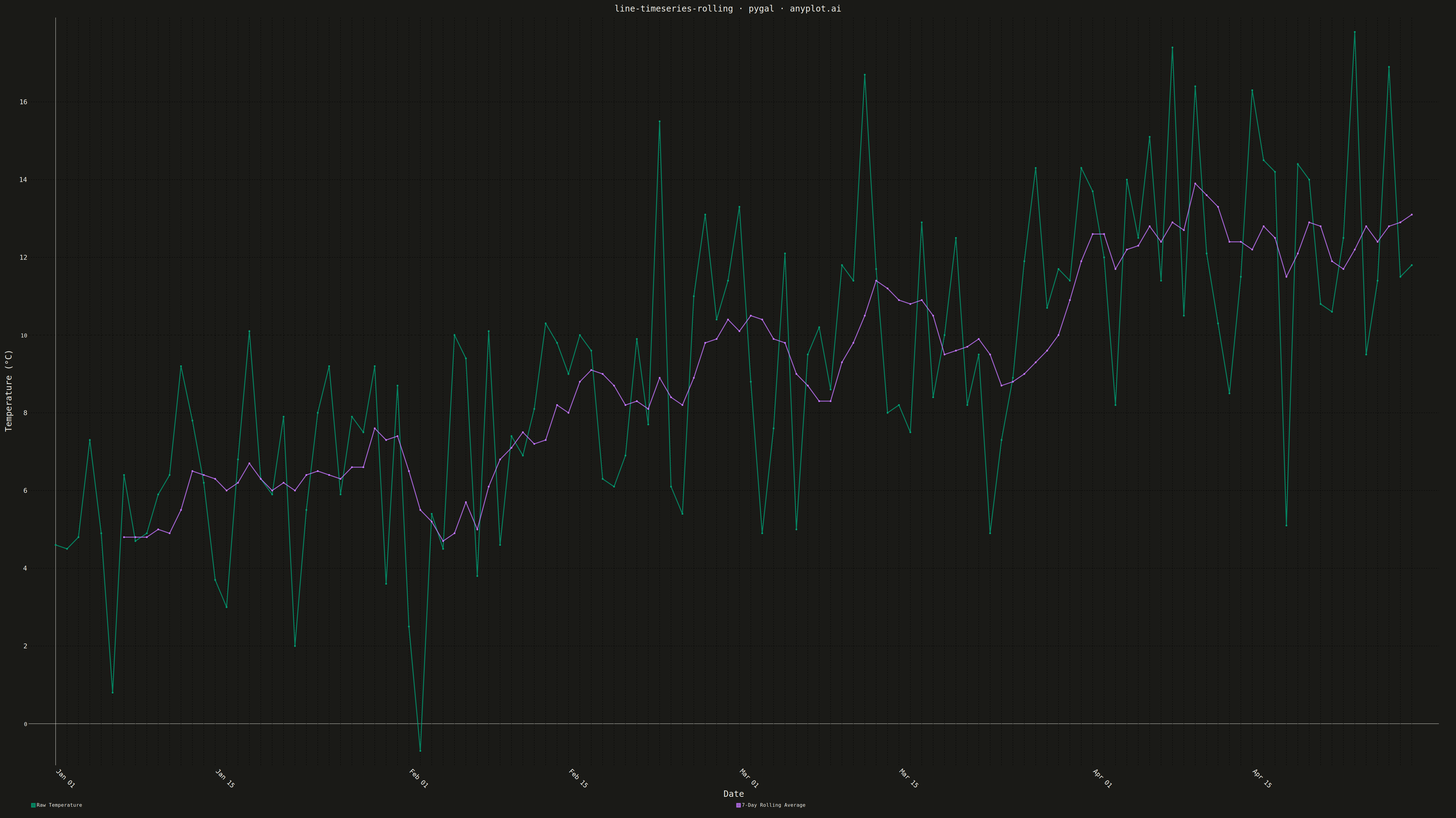
A time series plot that displays raw data points alongside a smoothed rolling average (moving average) line. The raw data shows actual observations while the rolling average reveals underlying trends by reducing noise and short-term fluctuations. This dual-layer visualization is essential for trend identification, making patterns visible that might be obscured by day-to-day volatility.
""" anyplot.ai
line-timeseries-rolling: Time Series with Rolling Average Overlay
Library: pygal 3.1.0 | Python 3.13.13
Quality: 90/100 | Updated: 2026-05-13
"""

import os
import random
from datetime import datetime, timedelta

import pygal
from pygal.style import Style


# Theme tokens
THEME = os.getenv("ANYPLOT_THEME", "light")
PAGE_BG = "#FAF8F1" if THEME == "light" else "#1A1A17"
INK = "#1A1A17" if THEME == "light" else "#F0EFE8"
INK_MUTED = "#6B6A63" if THEME == "light" else "#A8A79F"

# Okabe-Ito palette: first series is brand green
IMPRINT = ("#009E73", "#C475FD", "#4467A3", "#BD8233", "#AE3030", "#2ABCCD", "#954477")

# Seed for reproducibility
random.seed(42)

# Generate daily temperature readings for 4 months
start_date = datetime(2024, 1, 1)
dates = [start_date + timedelta(days=i) for i in range(120)]

# Generate temperature data with seasonal trend and noise
temperatures = []
for i in range(120):
    seasonal = 5 + 8 * (i / 120)
    noise = random.gauss(0, 3)
    temp = seasonal + noise
    temperatures.append(round(temp, 1))

# Calculate 7-day rolling average
window_size = 7
rolling_avg = []
for i in range(len(temperatures)):
    if i < window_size - 1:
        rolling_avg.append(None)
    else:
        window = temperatures[i - window_size + 1 : i + 1]
        avg = sum(window) / window_size
        rolling_avg.append(round(avg, 1))

# Custom style with theme-adaptive tokens
custom_style = Style(
    background=PAGE_BG,
    plot_background=PAGE_BG,
    foreground=INK,
    foreground_strong=INK,
    foreground_subtle=INK_MUTED,
    colors=IMPRINT,
    title_font_size=28,
    label_font_size=22,
    major_label_font_size=18,
    legend_font_size=16,
    value_font_size=14,
    stroke_width=3,
)

# Create line chart with grid on both axes
chart = pygal.Line(
    width=4800,
    height=2700,
    style=custom_style,
    title="line-timeseries-rolling · pygal · anyplot.ai",
    x_title="Date",
    y_title="Temperature (°C)",
    show_x_guides=True,
    show_y_guides=True,
    x_label_rotation=45,
    show_legend=True,
    legend_at_bottom=True,
)

# Add raw temperature data (thinner line)
chart.add("Raw Temperature", temperatures, stroke_style={"width": 2})

# Add rolling average (prominent line)
chart.add("7-Day Rolling Average", rolling_avg, stroke_style={"width": 6})

# Set x-axis labels - show every 2 weeks
x_labels = []
for d in dates:
    if d.day in [1, 15]:
        x_labels.append(d.strftime("%b %d"))
    else:
        x_labels.append("")

chart.x_labels = x_labels

# Save as theme-suffixed PNG and HTML
chart.render_to_png(f"plot-{THEME}.png")
chart.render_to_file(f"plot-{THEME}.html")
Runnable source as JSON, for any HTTP client: https://api.anyplot.ai/specs/line-timeseries-rolling/pygal/code. Any spec id and library id listed in llms-full.txt fit the same URL shape; every URL below is complete and callable.
{
  "spec_id": "line-timeseries-rolling",
  "language": "python",
  "library": "pygal",
  "page": "https://anyplot.ai/line-timeseries-rolling/python/pygal",
  "hub": "https://anyplot.ai/line-timeseries-rolling",
  "code_json": "https://api.anyplot.ai/specs/line-timeseries-rolling/pygal/code",
  "spec_json": "https://api.anyplot.ai/specs/line-timeseries-rolling",
  "render_light_png": "https://storage.googleapis.com/anyplot-images/plots/line-timeseries-rolling/python/pygal/plot-light.png",
  "render_dark_png": "https://storage.googleapis.com/anyplot-images/plots/line-timeseries-rolling/python/pygal/plot-dark.png",
  "interactive_light_html": "https://storage.googleapis.com/anyplot-images/plots/line-timeseries-rolling/python/pygal/plot-light.html",
  "interactive_dark_html": "https://storage.googleapis.com/anyplot-images/plots/line-timeseries-rolling/python/pygal/plot-dark.html",
  "quality_score": 90.0,
  "license": "MIT",
  "guide": "https://anyplot.ai/llms.txt"
}
Part of Time Series with Rolling Average Overlay on anyplot.ai.