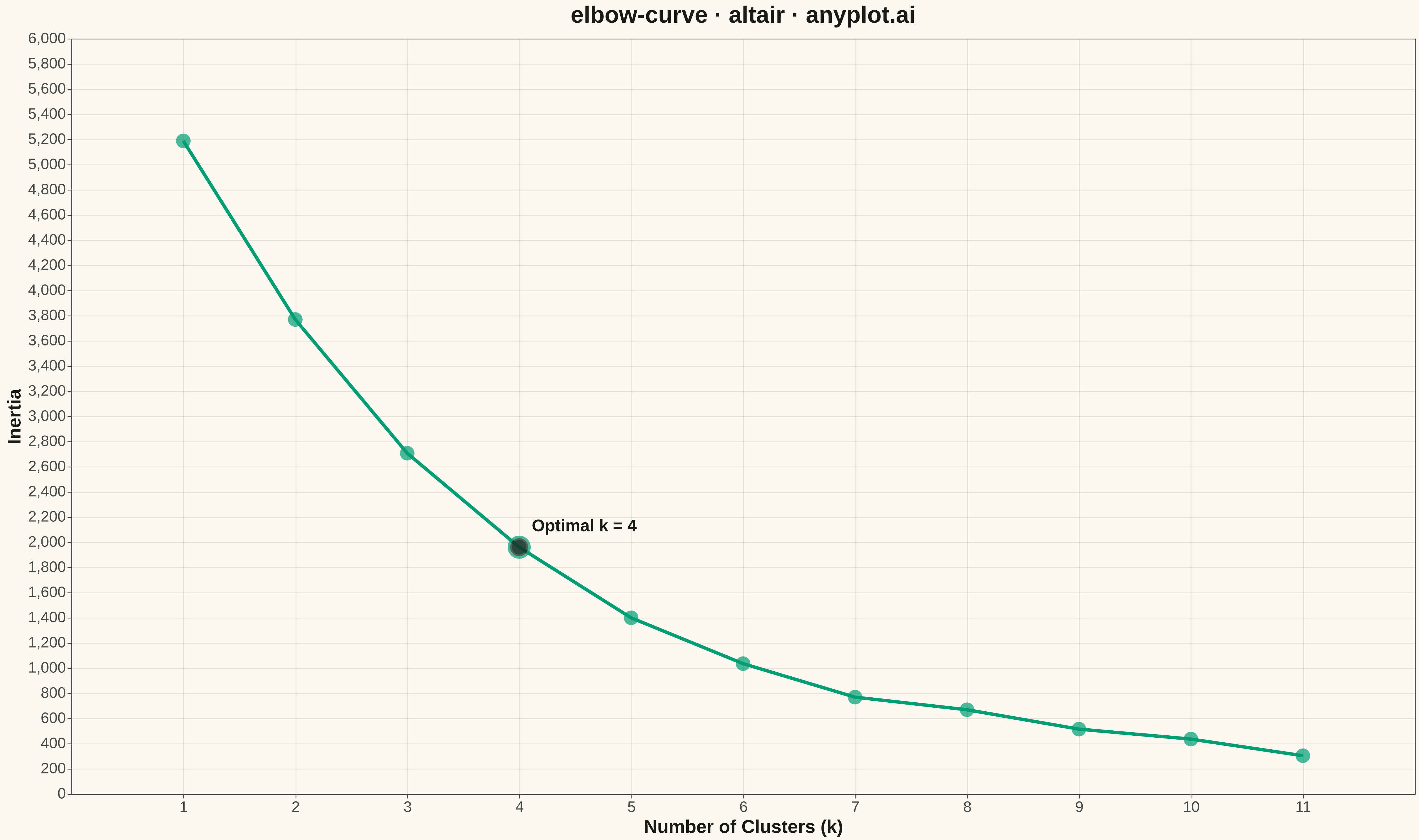
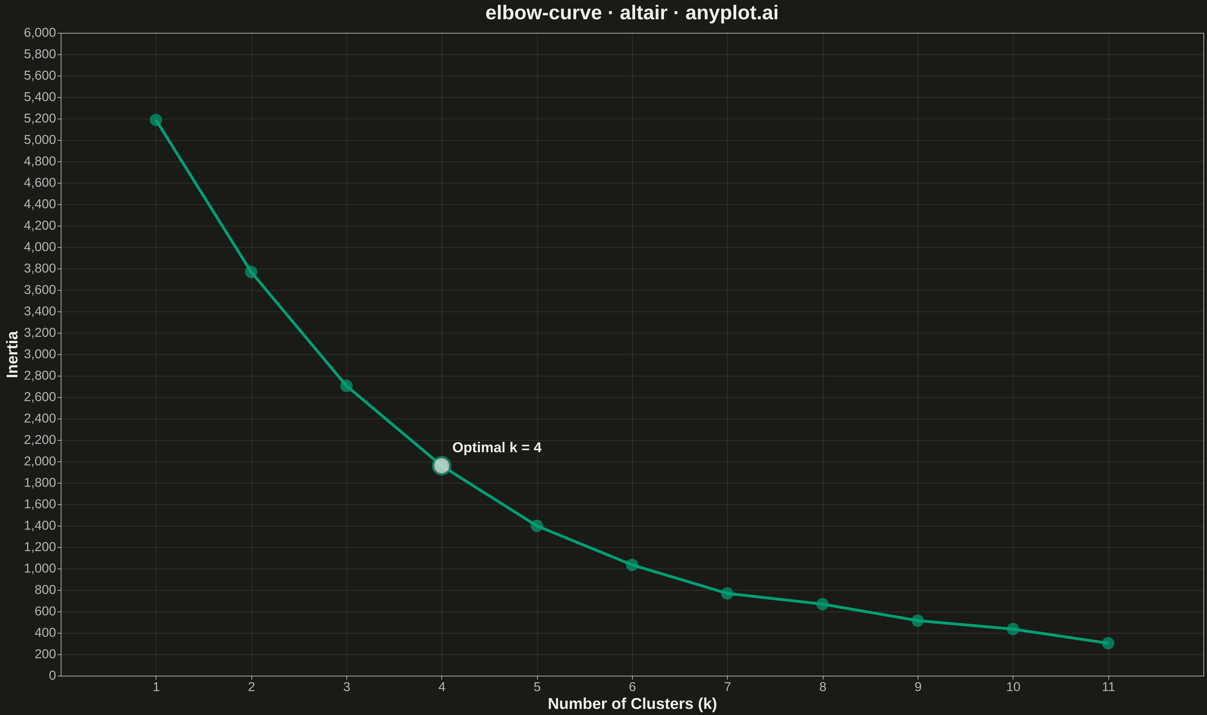
An elbow curve visualizes the relationship between the number of clusters (k) and within-cluster sum of squares (inertia/distortion) in K-means clustering. The plot helps identify the optimal number of clusters by finding the "elbow point" where adding more clusters yields diminishing returns in reducing inertia. This is a fundamental diagnostic tool for unsupervised learning parameter selection.
""" anyplot.ai
elbow-curve: Elbow Curve for K-Means Clustering
Library: altair 6.1.0 | Python 3.13.13
Quality: 90/100 | Updated: 2026-05-10
"""

import os

import altair as alt
import numpy as np
import pandas as pd


# Theme tokens
THEME = os.getenv("ANYPLOT_THEME", "light")
PAGE_BG = "#FAF8F1" if THEME == "light" else "#1A1A17"
ELEVATED_BG = "#FFFDF6" if THEME == "light" else "#242420"
INK = "#1A1A17" if THEME == "light" else "#F0EFE8"
INK_SOFT = "#4A4A44" if THEME == "light" else "#B8B7B0"
BRAND = "#009E73"  # Okabe-Ito position 1

# Data - Simulate K-means inertia values with realistic decay
np.random.seed(42)
k_values = list(range(1, 12))

# Realistic inertia: sharp drop initially, then diminishing returns
base_inertia = 5000
inertia = []
for k in k_values:
    decay = base_inertia * np.exp(-0.35 * (k - 1)) + 200
    noise = np.random.uniform(-50, 50)
    inertia.append(max(decay + noise, 150))

# Mark optimal k (elbow point at k=4)
optimal_k = 4

df = pd.DataFrame({"Number of Clusters (k)": k_values, "Inertia": inertia})

# Create base line chart
line = (
    alt.Chart(df)
    .mark_line(color=BRAND, strokeWidth=4)
    .encode(
        x=alt.X(
            "Number of Clusters (k):Q",
            scale=alt.Scale(domain=[0.5, 11.5]),
            axis=alt.Axis(tickCount=11, values=k_values),
        ),
        y=alt.Y("Inertia:Q", scale=alt.Scale(domain=[0, max(inertia) * 1.1])),
    )
)

# Add points at each k value
points = (
    alt.Chart(df)
    .mark_point(size=300, color=BRAND, filled=True)
    .encode(x="Number of Clusters (k):Q", y="Inertia:Q", tooltip=["Number of Clusters (k)", "Inertia"])
)

# Highlight the elbow point (optimal k)
elbow_df = df[df["Number of Clusters (k)"] == optimal_k]
elbow_point = (
    alt.Chart(elbow_df)
    .mark_point(size=600, color=INK, filled=True, stroke=BRAND, strokeWidth=3)
    .encode(x="Number of Clusters (k):Q", y="Inertia:Q")
)

# Add annotation for elbow point
elbow_text = (
    alt.Chart(elbow_df)
    .mark_text(align="left", baseline="bottom", dx=15, dy=-15, fontSize=20, fontWeight="bold", color=INK)
    .encode(x="Number of Clusters (k):Q", y="Inertia:Q", text=alt.value(f"Optimal k = {optimal_k}"))
)

# Combine layers
chart = (
    (line + points + elbow_point + elbow_text)
    .properties(
        width=1600,
        height=900,
        background=PAGE_BG,
        title=alt.Title("elbow-curve · altair · anyplot.ai", fontSize=28, anchor="middle", color=INK),
    )
    .configure_axis(
        labelFontSize=18,
        titleFontSize=22,
        gridColor=INK,
        gridOpacity=0.1,
        labelColor=INK_SOFT,
        titleColor=INK,
        domainColor=INK_SOFT,
        tickColor=INK_SOFT,
    )
    .configure_view(fill=PAGE_BG, stroke=INK_SOFT)
    .configure_title(color=INK)
)

# Save outputs
chart.save(f"plot-{THEME}.png", scale_factor=3.0)
chart.save(f"plot-{THEME}.html")
Runnable source as JSON, for any HTTP client: https://api.anyplot.ai/specs/elbow-curve/altair/code. Any spec id and library id listed in llms-full.txt fit the same URL shape; every URL below is complete and callable.
{
  "spec_id": "elbow-curve",
  "language": "python",
  "library": "altair",
  "page": "https://anyplot.ai/elbow-curve/python/altair",
  "hub": "https://anyplot.ai/elbow-curve",
  "code_json": "https://api.anyplot.ai/specs/elbow-curve/altair/code",
  "spec_json": "https://api.anyplot.ai/specs/elbow-curve",
  "render_light_png": "https://storage.googleapis.com/anyplot-images/plots/elbow-curve/python/altair/plot-light.png",
  "render_dark_png": "https://storage.googleapis.com/anyplot-images/plots/elbow-curve/python/altair/plot-dark.png",
  "interactive_light_html": "https://storage.googleapis.com/anyplot-images/plots/elbow-curve/python/altair/plot-light.html",
  "interactive_dark_html": "https://storage.googleapis.com/anyplot-images/plots/elbow-curve/python/altair/plot-dark.html",
  "quality_score": 90.0,
  "license": "MIT",
  "guide": "https://anyplot.ai/llms.txt"
}
Part of Elbow Curve for K-Means Clustering on anyplot.ai.