The same plot in 14 other libraries — JavaScript: D3.js, Apache ECharts, Highcharts, MUI X Charts; Python: Altair, Bokeh, lets-plot, Matplotlib, Plotly, plotnine, Pygal, Seaborn; R: ggplot2; Julia: Makie.jl. Compare all 15 side by side: Styled Line Plot in Python, R, Julia and JavaScript.
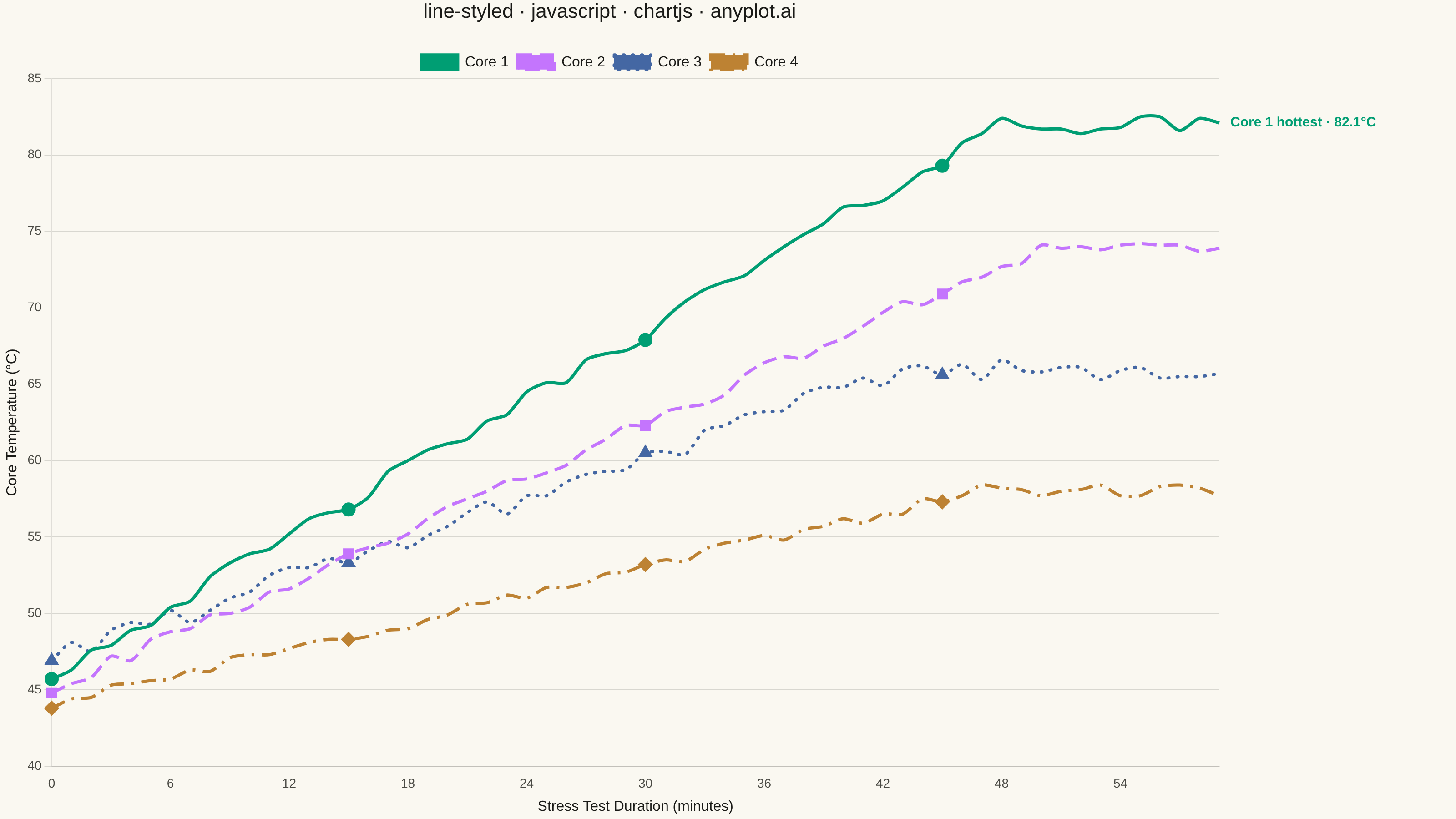
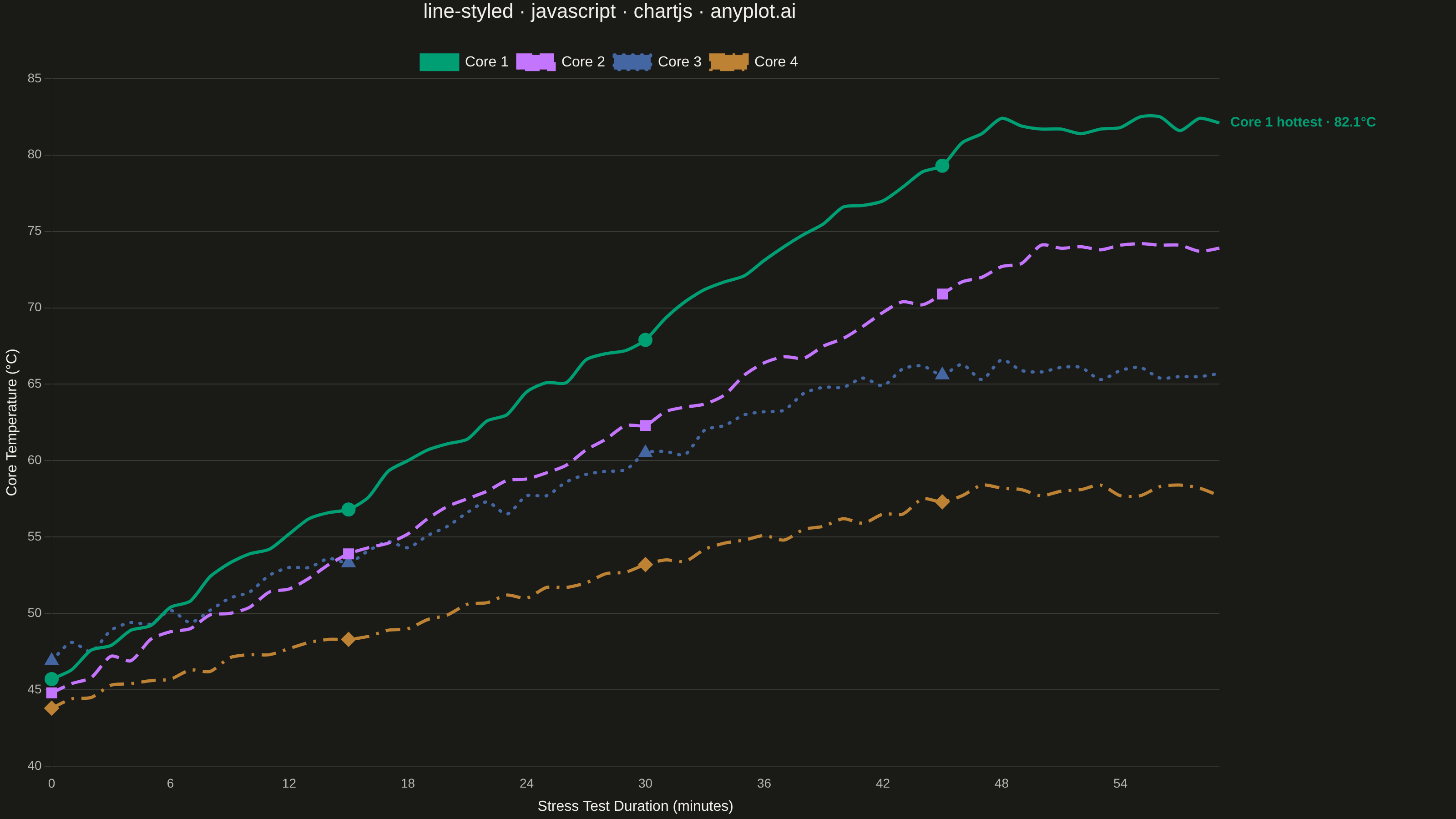
A line plot using different line styles (solid, dashed, dotted, dash-dot) to distinguish multiple data series. This is especially useful for black-and-white printing or when color distinction is insufficient.
// anyplot.ai
// line-styled: Styled Line Plot
// Library: chartjs 4.4.7 | JavaScript 22.23.2
// Quality: 94/100 | Created: 2026-09-05

//# anyplot-orientation: landscape
const t = window.ANYPLOT_TOKENS;

// --- Data (in-memory, deterministic) ---------------------------------------
function lcg(seed) {
  let state = seed;
  return () => {
    state = (state * 1664525 + 1013904223) % 4294967296;
    return state / 4294967296;
  };
}
const rand = lcg(42);

const minutes = Array.from({ length: 60 }, (_, i) => i);

function coreTemperature(baseline, rampRate, plateau, noiseScale) {
  return minutes.map((minute) => {
    const ramp = Math.min(minute * rampRate, plateau - baseline);
    const noise = (rand() - 0.5) * noiseScale;
    return Math.round((baseline + ramp + noise) * 10) / 10;
  });
}

// Dash patterns tuned so each style stays distinguishable even when the
// chart is scaled down to a mobile thumbnail: the dotted style uses a round
// cap with a wide gap (reads as separated dots, not a near-solid line) and
// the dash-dot gaps are enlarged so the dot doesn't merge into the dashes.
const series = [
  { label: "Core 1", data: coreTemperature(46, 0.75, 82, 1.2), borderDash: [], cap: "butt", pointStyle: "circle" },
  { label: "Core 2", data: coreTemperature(45, 0.58, 74, 1.0), borderDash: [16, 8], cap: "butt", pointStyle: "rect" },
  { label: "Core 3", data: coreTemperature(47, 0.44, 66, 1.4), borderDash: [1, 9], cap: "round", pointStyle: "triangle" },
  { label: "Core 4", data: coreTemperature(44, 0.3, 58, 0.9), borderDash: [16, 8, 3, 8], cap: "butt", pointStyle: "rectRot" },
];

// --- Mount -----------------------------------------------------------------
const canvas = document.createElement("canvas");
document.getElementById("container").appendChild(canvas);

// Custom Chart.js plugin (afterDatasetsDraw) that annotates the hottest
// core's final reading — a deliberate focal point/data-storytelling touch
// rather than treating all four series with equal visual weight.
const peakAnnotationPlugin = {
  id: "peakAnnotation",
  afterDatasetsDraw(chart) {
    const hottest = series.reduce((best, s, i) => (s.data[s.data.length - 1] > series[best].data[series[best].data.length - 1] ? i : best), 0);
    const meta = chart.getDatasetMeta(hottest);
    const point = meta.data[meta.data.length - 1];
    if (!point) return;
    const value = series[hottest].data[series[hottest].data.length - 1];
    const { ctx } = chart;
    ctx.save();
    ctx.font = "600 15px sans-serif";
    ctx.fillStyle = t.palette[hottest];
    ctx.textAlign = "left";
    ctx.textBaseline = "middle";
    ctx.fillText(`${series[hottest].label} hottest · ${value.toFixed(1)}°C`, point.x + 12, point.y);
    ctx.restore();
  },
};

// --- Chart -----------------------------------------------------------------
new Chart(canvas, {
  type: "line",
  data: {
    labels: minutes,
    datasets: series.map((s, i) => ({
      label: s.label,
      data: s.data,
      borderColor: t.palette[i],
      backgroundColor: t.palette[i],
      borderDash: s.borderDash,
      borderCapStyle: s.cap,
      borderWidth: 3.5,
      // Sparse markers every 15 minutes reinforce the dash pattern with a
      // distinct point shape per series, so style stays legible even when
      // the dash pattern itself compresses at small thumbnail scales.
      pointStyle: s.pointStyle,
      pointRadius: (ctx) => (ctx.dataIndex % 15 === 0 ? 6 : 0),
      pointBackgroundColor: t.palette[i],
      pointBorderColor: t.palette[i],
      pointHoverRadius: 6,
      tension: 0.25,
    })),
  },
  plugins: [peakAnnotationPlugin],
  options: {
    responsive: true,
    maintainAspectRatio: false,
    animation: false,
    layout: {
      padding: { right: 260 },
    },
    plugins: {
      title: {
        display: true,
        text: "line-styled · javascript · chartjs · anyplot.ai",
        color: t.ink,
        font: { size: 22, weight: "500" },
        padding: { bottom: 24 },
      },
      legend: {
        position: "top",
        labels: { color: t.ink, font: { size: 16 }, boxWidth: 40 },
      },
    },
    scales: {
      x: {
        title: { display: true, text: "Stress Test Duration (minutes)", color: t.ink, font: { size: 16 } },
        ticks: { color: t.inkSoft, font: { size: 14 }, maxTicksLimit: 10 },
        grid: { display: false },
      },
      y: {
        title: { display: true, text: "Core Temperature (°C)", color: t.ink, font: { size: 16 } },
        ticks: { color: t.inkSoft, font: { size: 14 } },
        grid: { color: t.grid },
      },
    },
  },
});
Runnable source as JSON, for any HTTP client: https://api.anyplot.ai/specs/line-styled/chartjs/code. Any spec id and library id listed in llms-full.txt fit the same URL shape; every URL below is complete and callable.
{
  "spec_id": "line-styled",
  "language": "javascript",
  "library": "chartjs",
  "page": "https://anyplot.ai/line-styled/javascript/chartjs",
  "hub": "https://anyplot.ai/line-styled",
  "code_json": "https://api.anyplot.ai/specs/line-styled/chartjs/code",
  "spec_json": "https://api.anyplot.ai/specs/line-styled",
  "render_light_png": "https://storage.googleapis.com/anyplot-images/plots/line-styled/javascript/chartjs/plot-light.png",
  "render_dark_png": "https://storage.googleapis.com/anyplot-images/plots/line-styled/javascript/chartjs/plot-dark.png",
  "interactive_light_html": "https://storage.googleapis.com/anyplot-images/plots/line-styled/javascript/chartjs/plot-light.html",
  "interactive_dark_html": "https://storage.googleapis.com/anyplot-images/plots/line-styled/javascript/chartjs/plot-dark.html",
  "quality_score": 94.0,
  "license": "MIT",
  "guide": "https://anyplot.ai/llms.txt"
}
Part of Styled Line Plot on anyplot.ai.