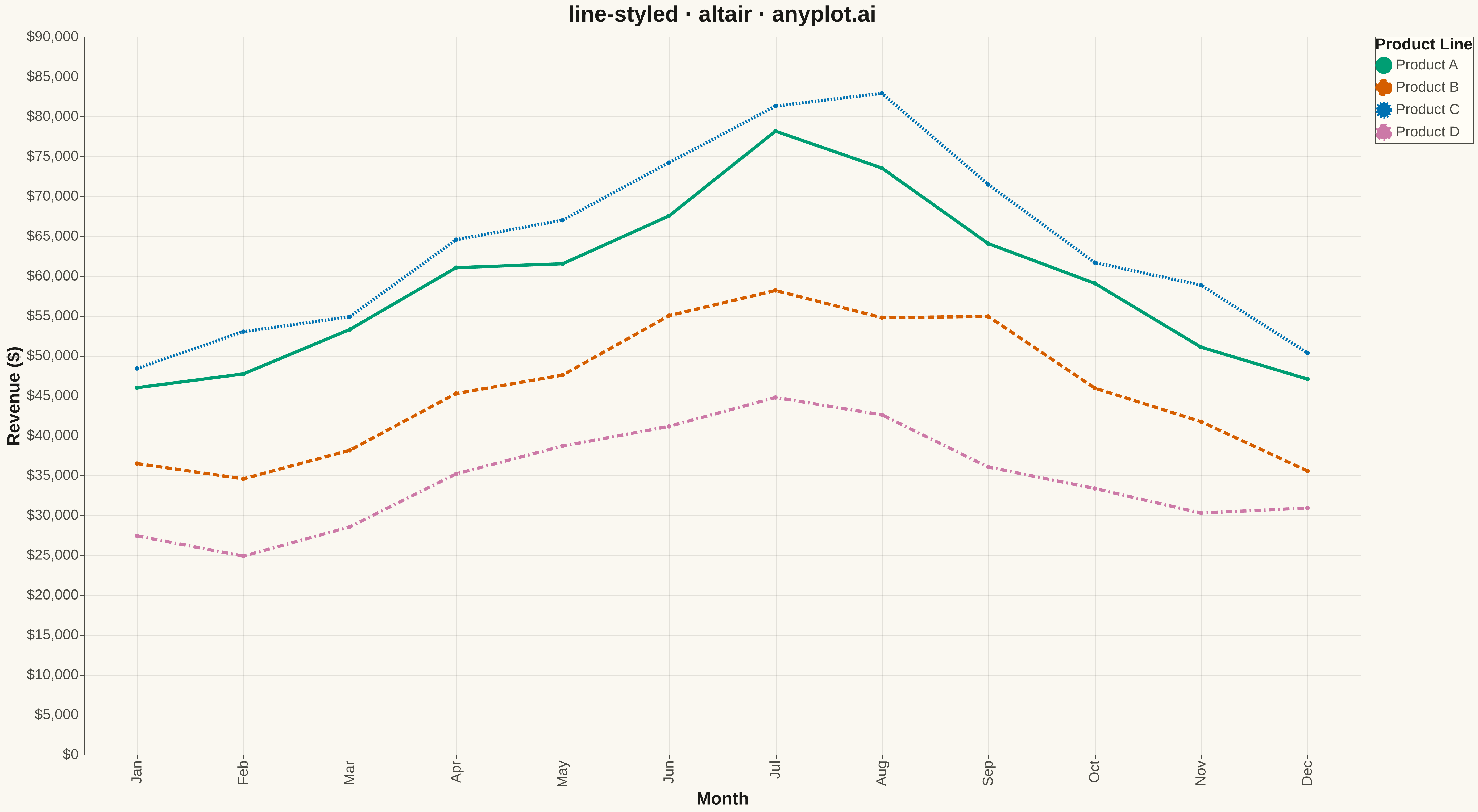
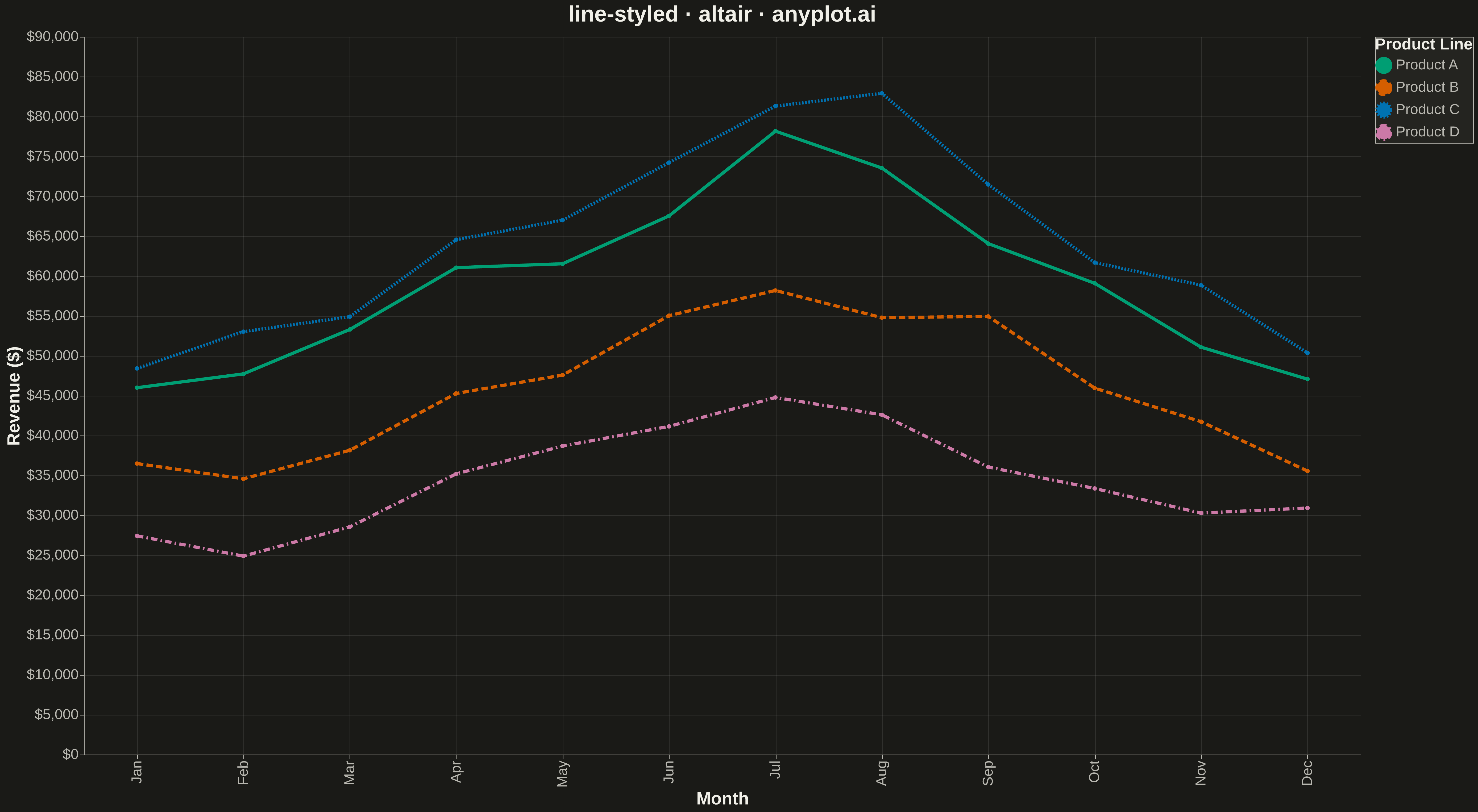
A line plot using different line styles (solid, dashed, dotted, dash-dot) to distinguish multiple data series. This is especially useful for black-and-white printing or when color distinction is insufficient.
""" anyplot.ai
line-styled: Styled Line Plot
Library: altair 6.1.0 | Python 3.13.13
Quality: 82/100 | Updated: 2026-05-12
"""

import altair as alt
import numpy as np
import pandas as pd


# Data - Monthly temperature readings from different weather stations
np.random.seed(42)
months = np.arange(1, 13)
month_names = ["Jan", "Feb", "Mar", "Apr", "May", "Jun", "Jul", "Aug", "Sep", "Oct", "Nov", "Dec"]

# Temperature data for 4 weather stations with seasonal patterns
base_temp = np.array([5, 7, 12, 16, 21, 25, 28, 27, 23, 17, 11, 6])
station_a = base_temp + np.random.randn(12) * 1.5
station_b = base_temp - 3 + np.random.randn(12) * 1.5
station_c = base_temp + 5 + np.random.randn(12) * 1.5
station_d = base_temp - 6 + np.random.randn(12) * 1.5

# Create long-form DataFrame for Altair
df = pd.DataFrame(
    {
        "Month": month_names * 4,
        "MonthNum": list(months) * 4,
        "Temperature": np.concatenate([station_a, station_b, station_c, station_d]),
        "Station": (["Coastal"] * 12 + ["Mountain"] * 12 + ["Valley"] * 12 + ["Highland"] * 12),
    }
)

# Define line styles (strokeDash) for each station
line_styles = {
    "Coastal": [0],  # solid
    "Mountain": [8, 4],  # dashed
    "Valley": [2, 2],  # dotted
    "Highland": [8, 4, 2, 4],  # dash-dot
}

# Colors - using Python palette and accessible colors
station_colors = {
    "Coastal": "#306998",  # Python Blue
    "Mountain": "#FFD43B",  # Python Yellow
    "Valley": "#48A9A6",  # Teal
    "Highland": "#E76F51",  # Coral
}

# Create the chart
chart = (
    alt.Chart(df)
    .mark_line(
        strokeWidth=4  # Thicker lines for visibility
    )
    .encode(
        x=alt.X(
            "MonthNum:O",
            title="Month",
            axis=alt.Axis(
                labelFontSize=18,
                titleFontSize=22,
                values=list(months),
                labelExpr="['Jan', 'Feb', 'Mar', 'Apr', 'May', 'Jun', 'Jul', 'Aug', 'Sep', 'Oct', 'Nov', 'Dec'][datum.value - 1]",
            ),
        ),
        y=alt.Y(
            "Temperature:Q",
            title="Temperature (\u00b0C)",
            scale=alt.Scale(domain=[-5, 40]),
            axis=alt.Axis(labelFontSize=18, titleFontSize=22),
        ),
        color=alt.Color(
            "Station:N",
            scale=alt.Scale(domain=list(station_colors.keys()), range=list(station_colors.values())),
            legend=alt.Legend(
                title="Weather Station", titleFontSize=20, labelFontSize=18, symbolStrokeWidth=4, symbolSize=300
            ),
        ),
        strokeDash=alt.StrokeDash(
            "Station:N", scale=alt.Scale(domain=list(line_styles.keys()), range=list(line_styles.values())), legend=None
        ),  # Combine with color legend
    )
    .properties(
        width=1600,
        height=900,
        title=alt.Title(text="line-styled \u00b7 altair \u00b7 pyplots.ai", fontSize=28, anchor="middle"),
    )
    .configure_axis(grid=True, gridOpacity=0.3, gridDash=[2, 2])
    .configure_view(strokeWidth=0)
)

# Save as PNG (scale_factor=3 gives 4800x2700)
chart.save("plot.png", scale_factor=3.0)

# Save as HTML for interactivity
chart.save("plot.html")
Runnable source as JSON, for any HTTP client: https://api.anyplot.ai/specs/line-styled/altair/code. Any spec id and library id listed in llms-full.txt fit the same URL shape; every URL below is complete and callable.
{
  "spec_id": "line-styled",
  "language": "python",
  "library": "altair",
  "page": "https://anyplot.ai/line-styled/python/altair",
  "hub": "https://anyplot.ai/line-styled",
  "code_json": "https://api.anyplot.ai/specs/line-styled/altair/code",
  "spec_json": "https://api.anyplot.ai/specs/line-styled",
  "render_light_png": "https://storage.googleapis.com/anyplot-images/plots/line-styled/python/altair/plot-light.png",
  "render_dark_png": "https://storage.googleapis.com/anyplot-images/plots/line-styled/python/altair/plot-dark.png",
  "interactive_light_html": "https://storage.googleapis.com/anyplot-images/plots/line-styled/python/altair/plot-light.html",
  "interactive_dark_html": "https://storage.googleapis.com/anyplot-images/plots/line-styled/python/altair/plot-dark.html",
  "quality_score": 82.0,
  "license": "MIT",
  "guide": "https://anyplot.ai/llms.txt"
}
Part of Styled Line Plot on anyplot.ai.