The same plot in 14 other libraries — Python: Altair, Bokeh, lets-plot, Matplotlib, Plotly, plotnine, Pygal, Seaborn; R: ggplot2; JavaScript: Chart.js, D3.js, Apache ECharts, Highcharts, MUI X Charts. Compare all 15 side by side: Range Interval Chart in Python, R, Julia and JavaScript.
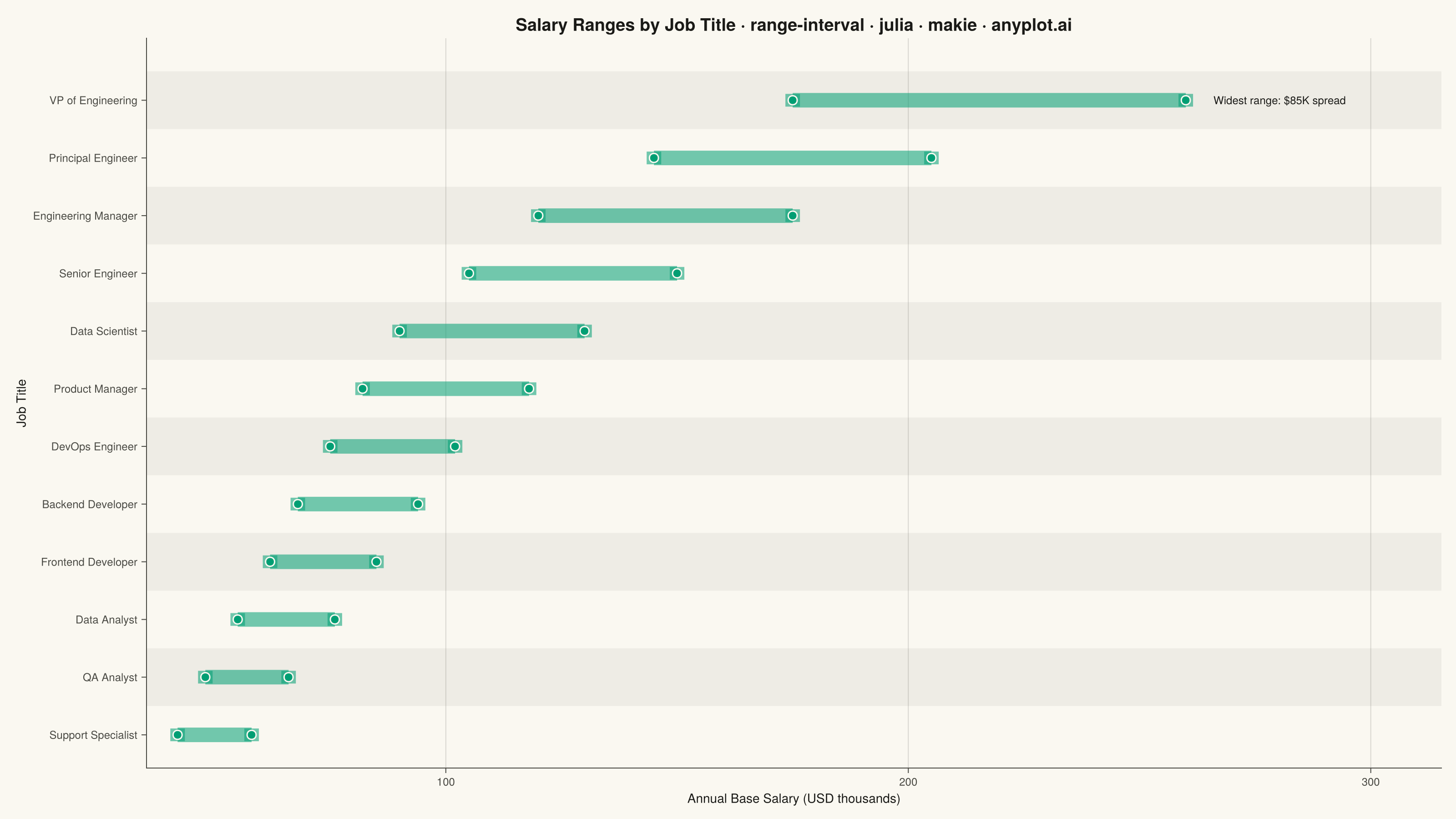
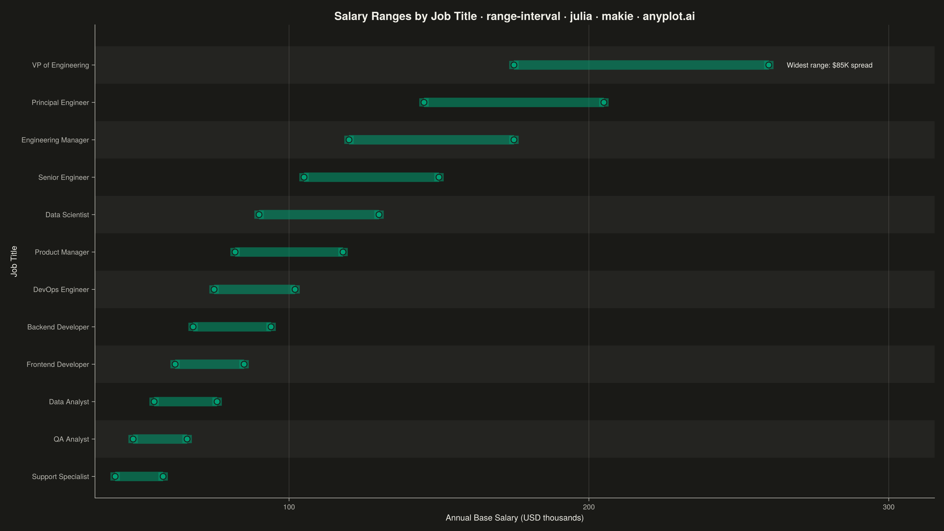
A range interval chart displays min-max ranges or intervals as vertical or horizontal bars/segments for each category, making it ideal for visualizing uncertainty bounds, confidence intervals, or value spreads. Unlike error bars which extend from a central data point, range intervals show the full span between two values as a filled bar or line segment, emphasizing the range itself rather than deviation from a center. This visualization excels at comparing ranges across multiple categories simultaneously.
# anyplot.ai
# range-interval: Range Interval Chart
# Library: makie 0.21.9 | Julia 1.11.9
# Quality: 94/100 | Created: 2026-09-02

using CairoMakie
using Colors
using Random

Random.seed!(42)

# --- Theme tokens -----------------------------------------------------------
const THEME    = get(ENV, "ANYPLOT_THEME", "light")
const PAGE_BG  = THEME == "light" ? colorant"#FAF8F1" : colorant"#1A1A17"
const INK      = THEME == "light" ? colorant"#1A1A17" : colorant"#F0EFE8"
const INK_SOFT = THEME == "light" ? colorant"#4A4A44" : colorant"#B8B7B0"
const IMPRINT_PALETTE = [
    colorant"#009E73", colorant"#C475FD", colorant"#4467A3", colorant"#BD8233",
    colorant"#AE3030", colorant"#2ABCCD", colorant"#954477", colorant"#99B314",
]
const BRAND = IMPRINT_PALETTE[1]

# --- Data ---------------------------------------------------------------
# Annual base salary ranges by job title at a mid-size tech company (USD thousands),
# sorted by midpoint so the chart reads as a low-to-high career ladder.
job_titles = [
    "Support Specialist", "QA Analyst", "Data Analyst", "Frontend Developer",
    "Backend Developer", "DevOps Engineer", "Product Manager", "Data Scientist",
    "Senior Engineer", "Engineering Manager", "Principal Engineer", "VP of Engineering",
]
min_salary = [42, 48, 55, 62, 68, 75, 82, 90, 105, 120, 145, 175]
max_salary = [58, 66, 76, 85, 94, 102, 118, 130, 150, 175, 205, 260]

order = sortperm(min_salary .+ max_salary)
job_titles = job_titles[order]
min_salary = Float64.(min_salary[order])
max_salary = Float64.(max_salary[order])
positions = 1:length(job_titles)

spread = max_salary .- min_salary
widest_idx = argmax(spread)

# --- Title (scales fontsize to length; 67 chars is the style-guide baseline) --
title_text = "Salary Ranges by Job Title · range-interval · julia · makie · anyplot.ai"
ratio = length(title_text) > 67 ? 67 / length(title_text) : 1.0
titlesize = max(round(Int, 20 * ratio), 13)

# --- Plot ---------------------------------------------------------------
fig = Figure(
    resolution      = (1600, 900),
    fontsize        = 14,
    backgroundcolor = PAGE_BG,
)

ax = Axis(
    fig[1, 1];
    title              = title_text,
    titlesize          = titlesize,
    titlecolor         = INK,
    xlabel             = "Annual Base Salary (USD thousands)",
    ylabel             = "Job Title",
    xlabelsize         = 14,
    ylabelsize         = 14,
    xlabelcolor        = INK,
    ylabelcolor        = INK,
    xticklabelsize     = 12,
    yticklabelsize     = 12,
    xticklabelcolor    = INK_SOFT,
    yticklabelcolor    = INK_SOFT,
    xtickcolor         = INK_SOFT,
    ytickcolor         = INK_SOFT,
    yticks             = (positions, job_titles),
    backgroundcolor    = PAGE_BG,
    topspinevisible    = false,
    rightspinevisible  = false,
    leftspinecolor     = INK_SOFT,
    bottomspinecolor   = INK_SOFT,
    xgridcolor         = RGBAf(INK.r, INK.g, INK.b, 0.15),
    ygridvisible       = false,
    xautolimitmargin   = (0.03, 0.22),
)

# Alternating row bands (every other category) for scan-ability across 12 rows.
band_rows = collect(positions)[2:2:end]
hspan!(ax, band_rows .- 0.5, band_rows .+ 0.5; color = (INK_SOFT, 0.07))

rangebars!(
    ax, positions, min_salary, max_salary;
    direction = :x,
    color = (BRAND, 0.55),
    whiskerwidth = 14,
    linewidth = 16,
)

scatter!(ax, min_salary, positions; color = BRAND, markersize = 14, strokewidth = 1.5, strokecolor = PAGE_BG)
scatter!(ax, max_salary, positions; color = BRAND, markersize = 14, strokewidth = 1.5, strokecolor = PAGE_BG)

# Callout on the widest-range category to give readers an immediate takeaway
# beyond the sort order alone.
text!(
    ax, max_salary[widest_idx] + 6, positions[widest_idx];
    text = "Widest range: \$$(round(Int, spread[widest_idx]))K spread",
    color = INK, fontsize = 12, align = (:left, :center),
)

# --- Save -----------------------------------------------------------------
save("plot-$(THEME).png", fig; px_per_unit = 2)
Runnable source as JSON, for any HTTP client: https://api.anyplot.ai/specs/range-interval/makie/code. Any spec id and library id listed in llms-full.txt fit the same URL shape; every URL below is complete and callable.
{
  "spec_id": "range-interval",
  "language": "julia",
  "library": "makie",
  "page": "https://anyplot.ai/range-interval/julia/makie",
  "hub": "https://anyplot.ai/range-interval",
  "code_json": "https://api.anyplot.ai/specs/range-interval/makie/code",
  "spec_json": "https://api.anyplot.ai/specs/range-interval",
  "render_light_png": "https://storage.googleapis.com/anyplot-images/plots/range-interval/julia/makie/plot-light.png",
  "render_dark_png": "https://storage.googleapis.com/anyplot-images/plots/range-interval/julia/makie/plot-dark.png",
  "quality_score": 94.0,
  "license": "MIT",
  "guide": "https://anyplot.ai/llms.txt"
}
Part of Range Interval Chart on anyplot.ai.