The same plot in 14 other libraries — Python: Altair, Bokeh, lets-plot, Matplotlib, Plotly, plotnine, Seaborn; R: ggplot2; Julia: Makie.jl; JavaScript: Chart.js, D3.js, Apache ECharts, Highcharts, MUI X Charts. Compare all 15 side by side: SHAP Waterfall Plot for Feature Attribution in Python, R, Julia and JavaScript.
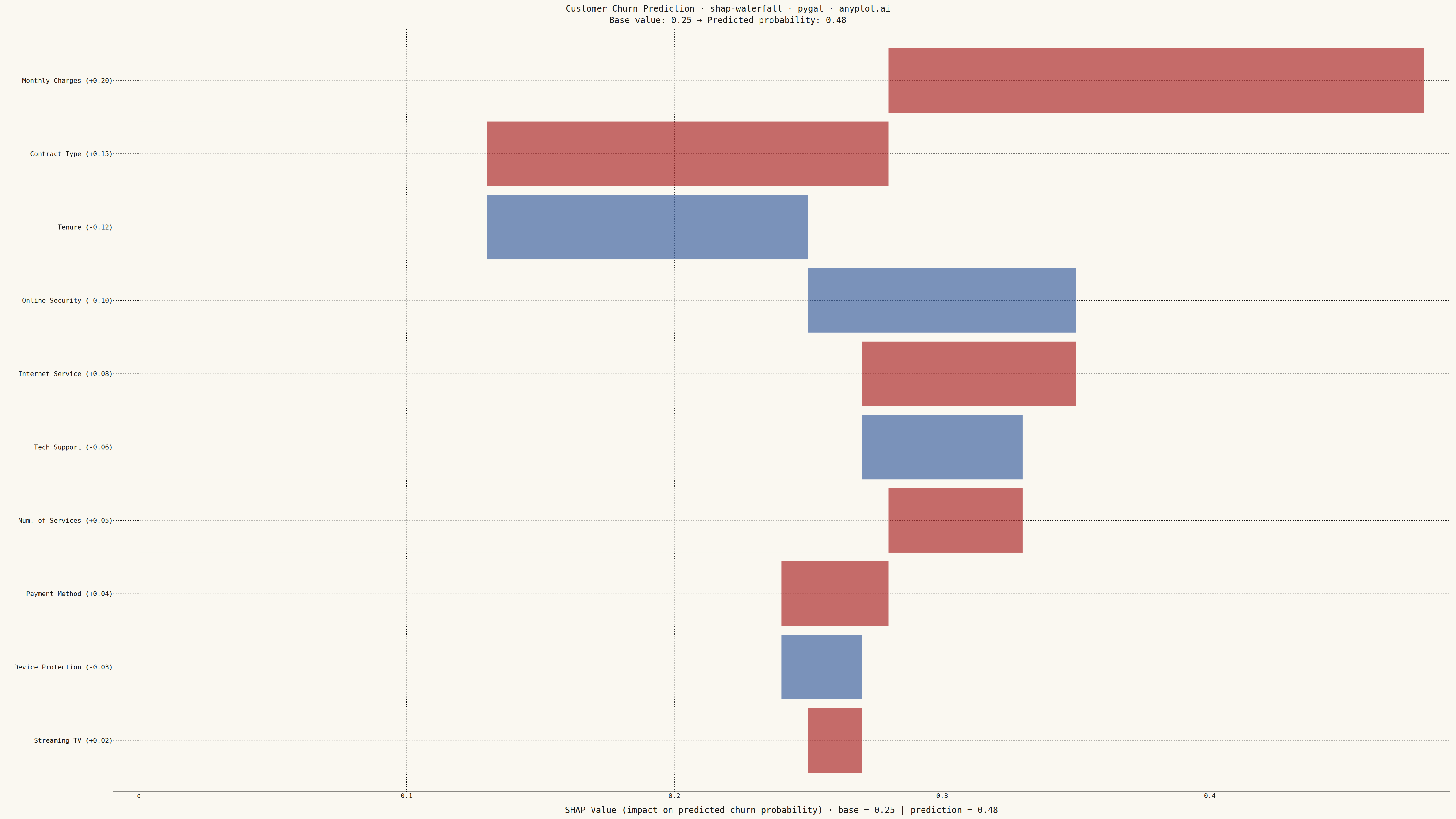
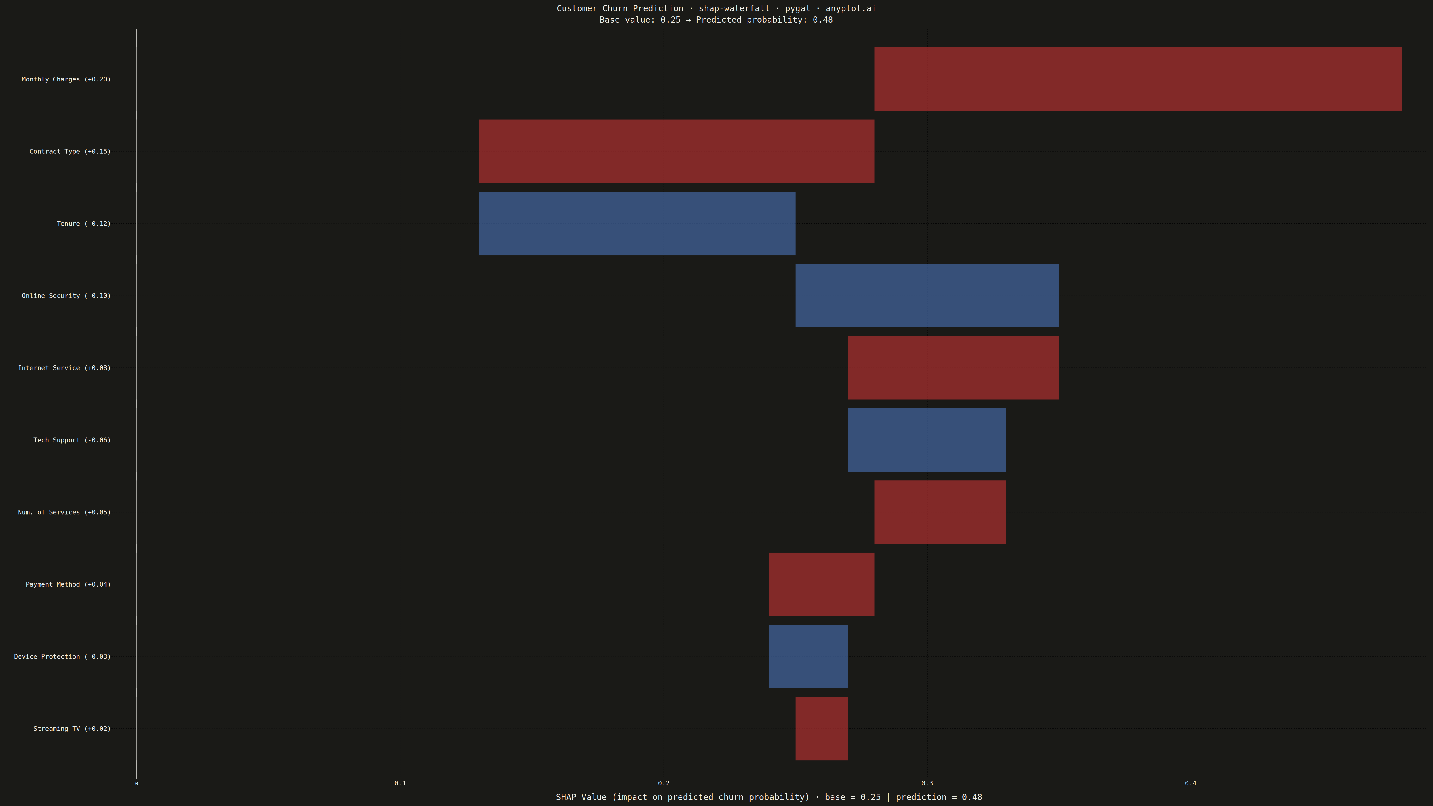
A waterfall-style chart showing how each feature contributes to pushing a model prediction from a base value (expected model output) to the final predicted value. Horizontal bar segments extend right for positive SHAP values and left for negative SHAP values, stacking cumulatively so the viewer can trace the path from baseline to prediction. This is a core ML explainability visualization for explaining individual predictions, complementing the SHAP summary plot which shows feature effects across many samples.
""" anyplot.ai
shap-waterfall: SHAP Waterfall Plot for Feature Attribution
Library: pygal 3.1.0 | Python 3.13.13
Quality: 80/100 | Created: 2026-05-07
"""

import os
import sys


# Prevent this file (pygal.py) from shadowing the installed pygal package
_here = os.path.dirname(os.path.abspath(__file__))
sys.path = [p for p in sys.path if os.path.abspath(p or os.getcwd()) != _here]

import numpy as np
import pygal
from pygal.style import Style


THEME = os.getenv("ANYPLOT_THEME", "light")
PAGE_BG = "#FAF8F1" if THEME == "light" else "#1A1A17"
INK = "#1A1A17" if THEME == "light" else "#F0EFE8"
INK_MUTED = "#6B6A63" if THEME == "light" else "#A8A79F"

# Data – customer churn prediction SHAP explanation
np.random.seed(42)

feature_names = [
    "Monthly Charges",
    "Contract Type",
    "Tenure",
    "Online Security",
    "Internet Service",
    "Tech Support",
    "Num. of Services",
    "Payment Method",
    "Device Protection",
    "Streaming TV",
]
shap_raw = [0.20, 0.15, -0.12, -0.10, 0.08, -0.06, 0.05, 0.04, -0.03, 0.02]
base_value = 0.25
final_value = round(base_value + sum(shap_raw), 4)  # 0.48

# Sort ascending by abs magnitude (pygal draws first label at bottom, last at top)
idx = sorted(range(len(shap_raw)), key=lambda i: abs(shap_raw[i]), reverse=False)
features = [feature_names[i] for i in idx]
shap_vals = [shap_raw[i] for i in idx]

# Compute cumulative starting positions from base_value
cum_starts = []
running = base_value
for v in shap_vals:
    cum_starts.append(running)
    running += v

# Waterfall stacking: invisible spacer + visible SHAP bar per feature
# Positive: spacer extends 0→cum_start, colored bar extends cum_start→cum_end
# Negative: spacer extends 0→cum_end (left edge), colored bar covers the negative delta
spacer_data = []
shap_data = []

for i, v in enumerate(shap_vals):
    if v >= 0:
        spacer = cum_starts[i]
        visible = v
        color = "#AE3030"  # imprint red — positive SHAP
    else:
        spacer = cum_starts[i] + v  # left edge = cum_end
        visible = abs(v)
        color = "#4467A3"  # Okabe-Ito blue for negative SHAP
    spacer_data.append({"value": spacer, "color": PAGE_BG})
    shap_data.append({"value": visible, "color": color, "label": f"{v:+.3f}"})

# Feature labels with embedded SHAP values
labels_with_vals = [f"{feat}  ({v:+.2f})" for feat, v in zip(features, shap_vals, strict=True)]

# Style
custom_style = Style(
    background=PAGE_BG,
    plot_background=PAGE_BG,
    foreground=INK,
    foreground_strong=INK,
    foreground_subtle=INK_MUTED,
    colors=(PAGE_BG, "#AE3030"),
    title_font_size=28,
    label_font_size=22,
    major_label_font_size=18,
    legend_font_size=16,
    value_font_size=16,
    stroke_width=0,
)

# HorizontalStackedBar enables waterfall stacking via spacer + visible series
chart = pygal.HorizontalStackedBar(
    width=4800,
    height=2700,
    style=custom_style,
    title=(
        "Customer Churn Prediction  ·  shap-waterfall  ·  pygal  ·  anyplot.ai\n"
        f"Base value: {base_value:.2f}  →  Predicted probability: {final_value:.2f}"
    ),
    x_title=(
        f"SHAP Value (impact on predicted churn probability)"
        f"  ·  base = {base_value:.2f}  |  prediction = {final_value:.2f}"
    ),
    show_legend=False,
    show_y_guides=False,
    show_x_guides=True,
)

# Reference lines at base value and final prediction
chart.x_guides = [base_value, final_value]
chart.x_labels = labels_with_vals

# Spacer series (background-colored, visually invisible)
chart.add("", spacer_data)
# Visible SHAP contribution bars (per-bar color encodes polarity)
chart.add("SHAP Contribution", shap_data)

# Save
chart.render_to_png(f"plot-{THEME}.png")
with open(f"plot-{THEME}.html", "wb") as f:
    f.write(chart.render())
Runnable source as JSON, for any HTTP client: https://api.anyplot.ai/specs/shap-waterfall/pygal/code. Any spec id and library id listed in llms-full.txt fit the same URL shape; every URL below is complete and callable.
{
  "spec_id": "shap-waterfall",
  "language": "python",
  "library": "pygal",
  "page": "https://anyplot.ai/shap-waterfall/python/pygal",
  "hub": "https://anyplot.ai/shap-waterfall",
  "code_json": "https://api.anyplot.ai/specs/shap-waterfall/pygal/code",
  "spec_json": "https://api.anyplot.ai/specs/shap-waterfall",
  "render_light_png": "https://storage.googleapis.com/anyplot-images/plots/shap-waterfall/python/pygal/plot-light.png",
  "render_dark_png": "https://storage.googleapis.com/anyplot-images/plots/shap-waterfall/python/pygal/plot-dark.png",
  "interactive_light_html": "https://storage.googleapis.com/anyplot-images/plots/shap-waterfall/python/pygal/plot-light.html",
  "interactive_dark_html": "https://storage.googleapis.com/anyplot-images/plots/shap-waterfall/python/pygal/plot-dark.html",
  "quality_score": 80.0,
  "license": "MIT",
  "guide": "https://anyplot.ai/llms.txt"
}
Part of SHAP Waterfall Plot for Feature Attribution on anyplot.ai.