The same plot in 14 other libraries — Python: Altair, Bokeh, lets-plot, Matplotlib, Plotly, Pygal, Seaborn; R: ggplot2; Julia: Makie.jl; JavaScript: Chart.js, D3.js, Apache ECharts, Highcharts, MUI X Charts. Compare all 15 side by side: SHAP Waterfall Plot for Feature Attribution in Python, R, Julia and JavaScript.
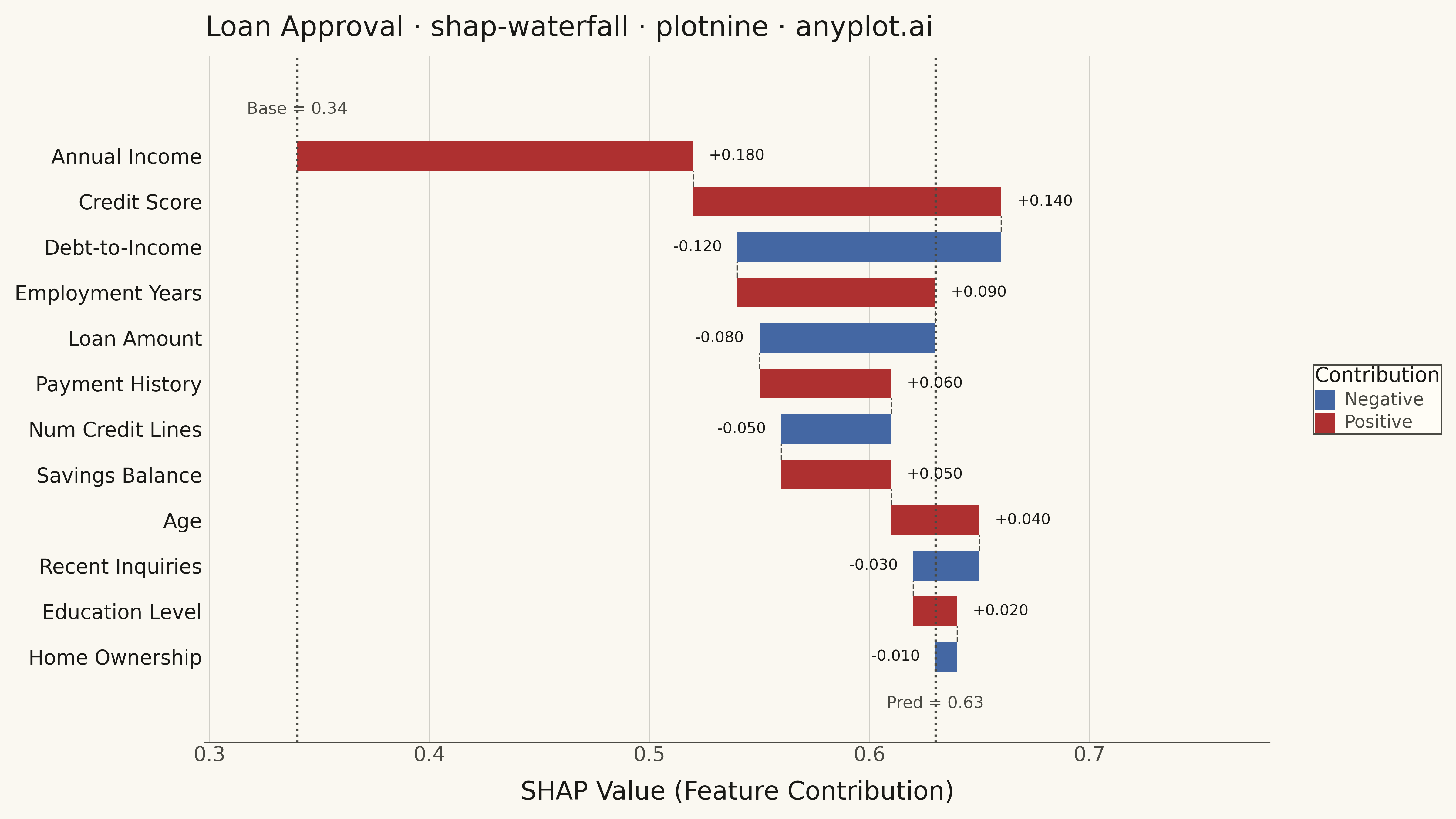
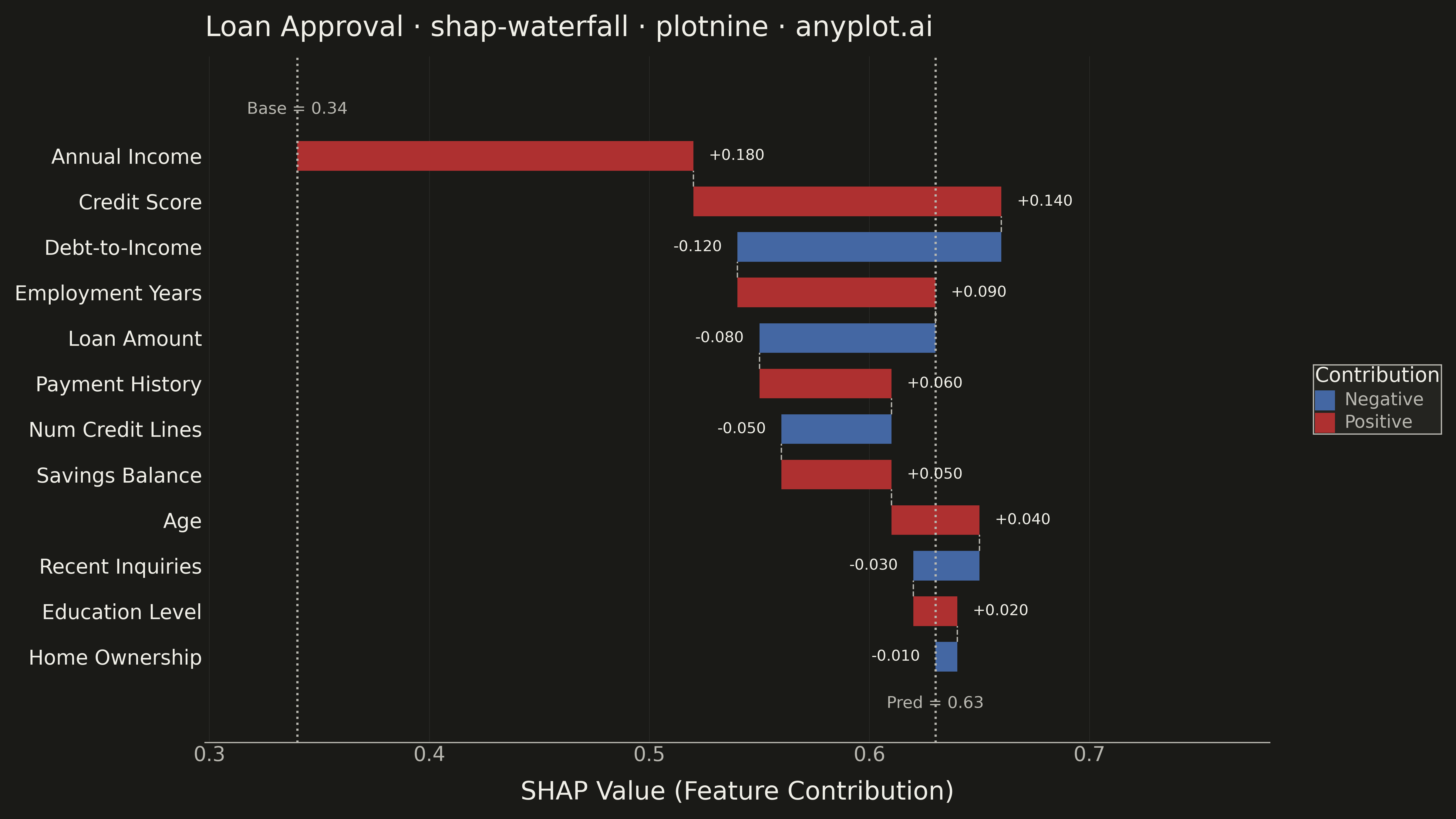
A waterfall-style chart showing how each feature contributes to pushing a model prediction from a base value (expected model output) to the final predicted value. Horizontal bar segments extend right for positive SHAP values and left for negative SHAP values, stacking cumulatively so the viewer can trace the path from baseline to prediction. This is a core ML explainability visualization for explaining individual predictions, complementing the SHAP summary plot which shows feature effects across many samples.
""" anyplot.ai
shap-waterfall: SHAP Waterfall Plot for Feature Attribution
Library: plotnine 0.15.4 | Python 3.13.13
Quality: 88/100 | Created: 2026-05-08
"""

import importlib.util
import os
import sys

import numpy as np
import pandas as pd


# Handle import conflicts: remove the implementations/python dir from sys.path
sys.path = [p for p in sys.path if not p.endswith("python")]
if "plotnine" in sys.modules:
    del sys.modules["plotnine"]

# Load plotnine explicitly from site-packages
_pn_spec = importlib.util.find_spec("plotnine")
_pn = importlib.util.module_from_spec(_pn_spec)
sys.modules["plotnine"] = _pn
_pn_spec.loader.exec_module(_pn)

aes = _pn.aes
coord_cartesian = _pn.coord_cartesian
element_blank = _pn.element_blank
element_line = _pn.element_line
element_rect = _pn.element_rect
element_text = _pn.element_text
geom_rect = _pn.geom_rect
geom_segment = _pn.geom_segment
geom_text = _pn.geom_text
geom_vline = _pn.geom_vline
ggplot = _pn.ggplot
labs = _pn.labs
scale_fill_manual = _pn.scale_fill_manual
scale_y_continuous = _pn.scale_y_continuous
theme = _pn.theme

THEME = os.getenv("ANYPLOT_THEME", "light")
PAGE_BG = "#FAF8F1" if THEME == "light" else "#1A1A17"
ELEVATED_BG = "#FFFDF6" if THEME == "light" else "#242420"
INK = "#1A1A17" if THEME == "light" else "#F0EFE8"
INK_SOFT = "#4A4A44" if THEME == "light" else "#B8B7B0"
GRID_COLOR = "#C8C7C0" if THEME == "light" else "#2E2E2B"

COLOR_POS = "#AE3030"  # imprint red — positive SHAP contributions
COLOR_NEG = "#4467A3"  # imprint blue — negative SHAP contributions

# Data: credit scoring model — explaining a single loan approval prediction
np.random.seed(42)
features = [
    "Annual Income",
    "Credit Score",
    "Debt-to-Income",
    "Employment Years",
    "Loan Amount",
    "Payment History",
    "Num Credit Lines",
    "Savings Balance",
    "Age",
    "Recent Inquiries",
    "Education Level",
    "Home Ownership",
]
shap_raw = [0.18, 0.14, -0.12, 0.09, -0.08, 0.06, -0.05, 0.05, 0.04, -0.03, 0.02, -0.01]
base_value = 0.34
final_value = round(base_value + sum(shap_raw), 4)

df = pd.DataFrame({"feature": features, "shap_value": shap_raw})
df = df.reindex(df["shap_value"].abs().sort_values(ascending=False).index).reset_index(drop=True)
n = len(df)

# Cumulative start/end x positions (index 0 = largest |SHAP| = top of chart)
df["start"] = base_value + df["shap_value"].cumsum().shift(1).fillna(0)
df["end"] = df["start"] + df["shap_value"]

# Y positions: largest |SHAP| at top (y=n), smallest at bottom (y=1)
df["y_pos"] = list(range(n, 0, -1))
df["direction"] = df["shap_value"].apply(lambda v: "Positive" if v >= 0 else "Negative")
df["bar_label"] = df["shap_value"].apply(lambda v: f"+{v:.3f}" if v >= 0 else f"{v:.3f}")

BAR_H = 0.65
df["ymin"] = df["y_pos"] - BAR_H / 2
df["ymax"] = df["y_pos"] + BAR_H / 2

# Connector dashes between adjacent bars at their shared x boundary
conn_rows = []
for i in range(n - 1):
    conn_rows.append(
        {"x": df.iloc[i]["end"], "y0": df.iloc[i + 1]["y_pos"] + BAR_H / 2, "y1": df.iloc[i]["y_pos"] - BAR_H / 2}
    )
df_conn = pd.DataFrame(conn_rows)

# Annotations for the baseline and final prediction reference lines
df_base_ann = pd.DataFrame({"x": [base_value], "y": [n + 0.85], "label": [f"Base = {base_value:.2f}"]})
df_final_ann = pd.DataFrame({"x": [final_value], "y": [0.15], "label": [f"Pred = {final_value:.2f}"]})

# Separate bar-label DataFrames (need different ha alignment per sign)
df_pos_bars = df[df["shap_value"] >= 0].copy()
df_neg_bars = df[df["shap_value"] < 0].copy()
NUDGE = 0.007

# Axis limits
x_left = min(df["start"].min(), df["end"].min(), base_value) - 0.02
x_right = max(df["start"].max(), df["end"].max(), final_value) + 0.10
y_breaks = sorted(df["y_pos"].tolist())
y_labels = df.sort_values("y_pos")["feature"].tolist()

anyplot_theme = theme(
    figure_size=(16, 9),
    plot_background=element_rect(fill=PAGE_BG, color=PAGE_BG),
    panel_background=element_rect(fill=PAGE_BG),
    panel_grid_major_x=element_line(color=GRID_COLOR, size=0.4),
    panel_grid_major_y=element_blank(),
    panel_grid_minor=element_blank(),
    panel_border=element_blank(),
    axis_title_x=element_text(color=INK, size=20),
    axis_title_y=element_blank(),
    axis_text_x=element_text(color=INK_SOFT, size=16),
    axis_text_y=element_text(color=INK, size=16),
    axis_line_x=element_line(color=INK_SOFT),
    axis_line_y=element_blank(),
    axis_ticks_major_x=element_blank(),
    axis_ticks_major_y=element_blank(),
    plot_title=element_text(color=INK, size=22, ha="left"),
    legend_background=element_rect(fill=ELEVATED_BG, color=INK_SOFT),
    legend_text=element_text(color=INK_SOFT, size=14),
    legend_title=element_text(color=INK, size=16),
    legend_position="right",
)

plot = (
    ggplot(df)
    + geom_rect(aes(xmin="start", xmax="end", ymin="ymin", ymax="ymax", fill="direction"))
    + geom_segment(
        data=df_conn, mapping=aes(x="x", xend="x", y="y0", yend="y1"), color=INK_SOFT, linetype="dashed", size=0.6
    )
    + geom_vline(xintercept=base_value, color=INK_SOFT, linetype="dotted", size=1.0)
    + geom_vline(xintercept=final_value, color=INK_SOFT, linetype="dotted", size=1.0)
    + geom_text(
        data=df_pos_bars,
        mapping=aes(x="end", y="y_pos", label="bar_label"),
        nudge_x=NUDGE,
        ha="left",
        color=INK,
        size=12,
    )
    + geom_text(
        data=df_neg_bars,
        mapping=aes(x="end", y="y_pos", label="bar_label"),
        nudge_x=-NUDGE,
        ha="right",
        color=INK,
        size=12,
    )
    + geom_text(
        data=df_base_ann, mapping=aes(x="x", y="y", label="label"), ha="center", va="bottom", color=INK_SOFT, size=13
    )
    + geom_text(
        data=df_final_ann, mapping=aes(x="x", y="y", label="label"), ha="center", va="top", color=INK_SOFT, size=13
    )
    + scale_fill_manual(values={"Positive": COLOR_POS, "Negative": COLOR_NEG}, name="Contribution")
    + scale_y_continuous(breaks=y_breaks, labels=y_labels, expand=(0.05, 0))
    + coord_cartesian(xlim=(x_left, x_right), ylim=(-0.2, n + 1.5))
    + labs(x="SHAP Value (Feature Contribution)", y="", title="Loan Approval · shap-waterfall · plotnine · anyplot.ai")
    + anyplot_theme
)

plot.save(f"plot-{THEME}.png", dpi=300, width=16, height=9)
Runnable source as JSON, for any HTTP client: https://api.anyplot.ai/specs/shap-waterfall/plotnine/code. Any spec id and library id listed in llms-full.txt fit the same URL shape; every URL below is complete and callable.
{
  "spec_id": "shap-waterfall",
  "language": "python",
  "library": "plotnine",
  "page": "https://anyplot.ai/shap-waterfall/python/plotnine",
  "hub": "https://anyplot.ai/shap-waterfall",
  "code_json": "https://api.anyplot.ai/specs/shap-waterfall/plotnine/code",
  "spec_json": "https://api.anyplot.ai/specs/shap-waterfall",
  "render_light_png": "https://storage.googleapis.com/anyplot-images/plots/shap-waterfall/python/plotnine/plot-light.png",
  "render_dark_png": "https://storage.googleapis.com/anyplot-images/plots/shap-waterfall/python/plotnine/plot-dark.png",
  "quality_score": 88.0,
  "license": "MIT",
  "guide": "https://anyplot.ai/llms.txt"
}
Part of SHAP Waterfall Plot for Feature Attribution on anyplot.ai.