The same plot in 14 other libraries — Python: Bokeh, lets-plot, Matplotlib, Plotly, plotnine, Pygal, Seaborn; R: ggplot2; Julia: Makie.jl; JavaScript: Chart.js, D3.js, Apache ECharts, Highcharts, MUI X Charts. Compare all 15 side by side: SHAP Waterfall Plot for Feature Attribution in Python, R, Julia and JavaScript.
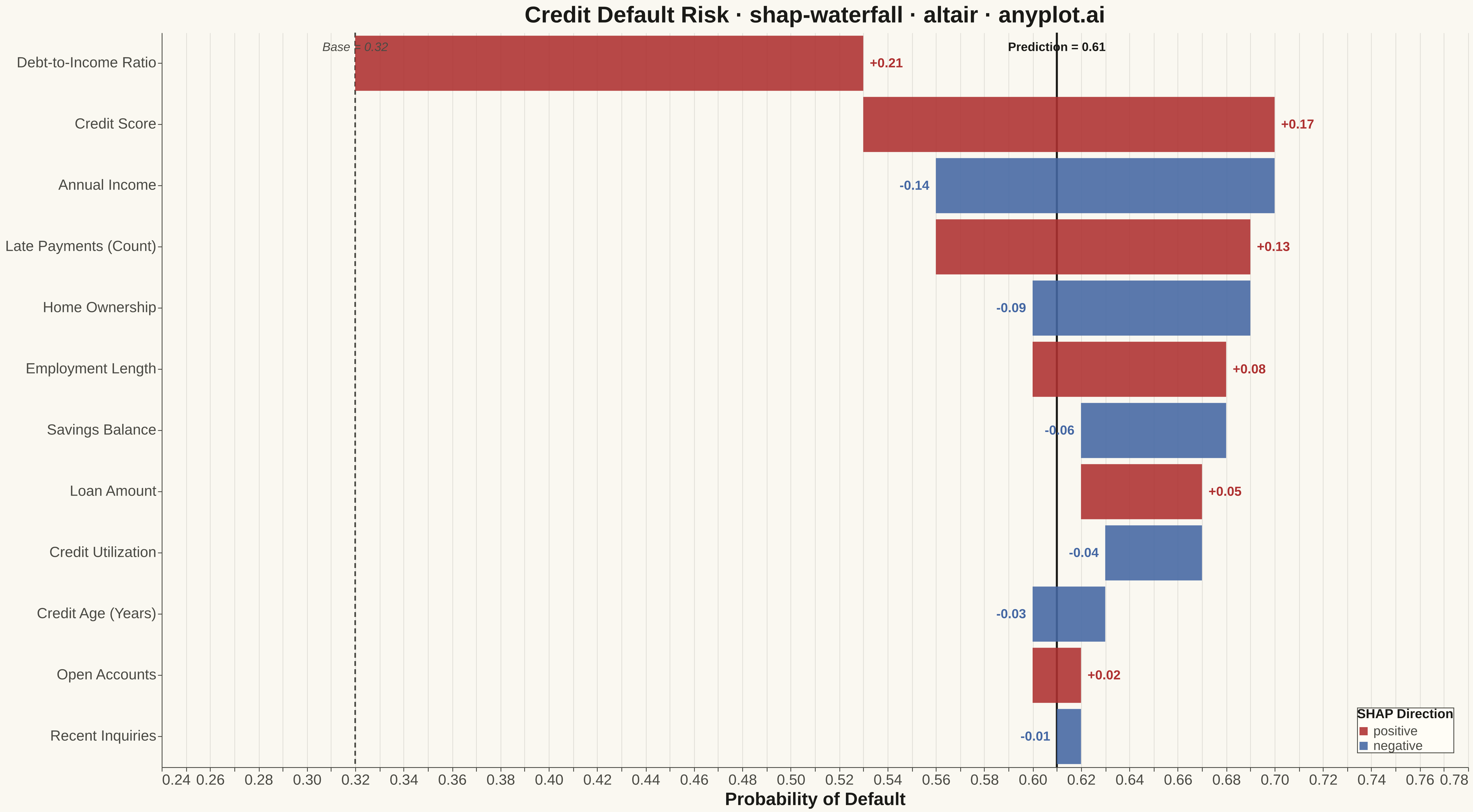
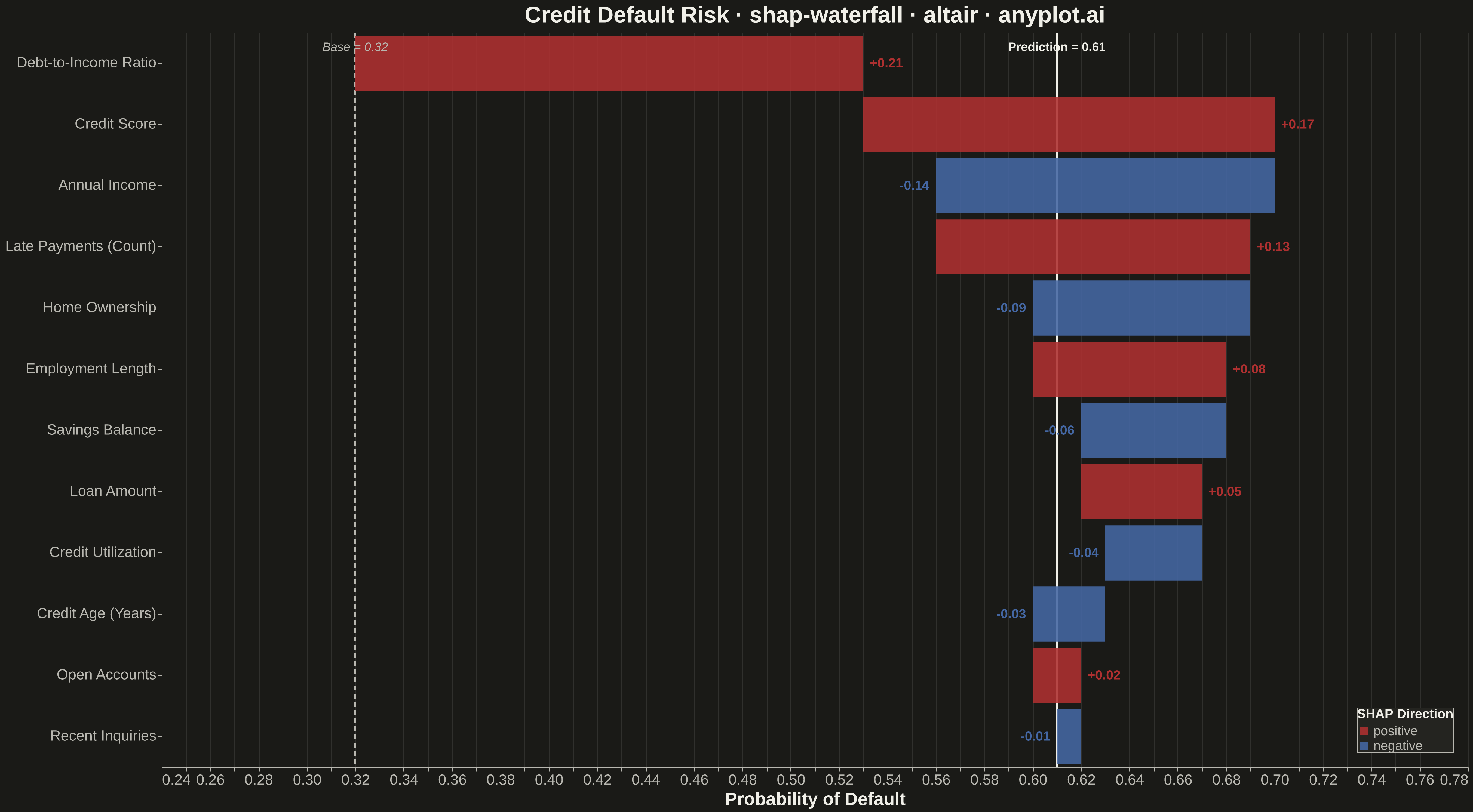
A waterfall-style chart showing how each feature contributes to pushing a model prediction from a base value (expected model output) to the final predicted value. Horizontal bar segments extend right for positive SHAP values and left for negative SHAP values, stacking cumulatively so the viewer can trace the path from baseline to prediction. This is a core ML explainability visualization for explaining individual predictions, complementing the SHAP summary plot which shows feature effects across many samples.
""" anyplot.ai
shap-waterfall: SHAP Waterfall Plot for Feature Attribution
Library: altair 6.1.0 | Python 3.13.13
Quality: 85/100 | Created: 2026-05-07
"""

import os

import altair as alt
import numpy as np
import pandas as pd


# Theme tokens
THEME = os.getenv("ANYPLOT_THEME", "light")
PAGE_BG = "#FAF8F1" if THEME == "light" else "#1A1A17"
ELEVATED_BG = "#FFFDF6" if THEME == "light" else "#242420"
INK = "#1A1A17" if THEME == "light" else "#F0EFE8"
INK_SOFT = "#4A4A44" if THEME == "light" else "#B8B7B0"

POS_COLOR = "#AE3030"  # imprint red — positive SHAP (pushes prediction up)
NEG_COLOR = "#4467A3"  # Okabe-Ito blue — negative SHAP (pushes prediction down)

# Data — loan application: individual credit default prediction
np.random.seed(42)
base_value = 0.32

feature_names = [
    "Debt-to-Income Ratio",
    "Credit Score",
    "Annual Income",
    "Late Payments (Count)",
    "Home Ownership",
    "Employment Length",
    "Savings Balance",
    "Loan Amount",
    "Credit Utilization",
    "Credit Age (Years)",
    "Open Accounts",
    "Recent Inquiries",
]
shap_values_raw = [0.21, 0.17, -0.14, 0.13, -0.09, 0.08, -0.06, 0.05, -0.04, -0.03, 0.02, -0.01]

# Sort by absolute SHAP magnitude (largest at top)
order = np.argsort(np.abs(shap_values_raw))[::-1]
features_sorted = [feature_names[i] for i in order]
shap_sorted = [shap_values_raw[i] for i in order]

# Compute cumulative bar start/end positions (waterfall stacking from base_value)
x_starts, x_ends = [], []
cumulative = base_value
for v in shap_sorted:
    x_starts.append(cumulative)
    x_ends.append(cumulative + v)
    cumulative += v

final_value = round(base_value + sum(shap_values_raw), 3)

df = pd.DataFrame(
    {
        "feature": features_sorted,
        "shap_value": shap_sorted,
        "x_start": x_starts,
        "x_end": x_ends,
        "sign": ["positive" if v > 0 else "negative" for v in shap_sorted],
        "shap_label": [f"+{v:.2f}" if v > 0 else f"{v:.2f}" for v in shap_sorted],
    }
)

df_pos = df[df["shap_value"] > 0].copy()
df_neg = df[df["shap_value"] <= 0].copy()

# X-axis domain with padding for text labels
x_pad = 0.08
x_min = min(df["x_start"].min(), df["x_end"].min()) - x_pad
x_max = max(df["x_start"].max(), df["x_end"].max()) + x_pad
x_scale = alt.Scale(domain=[x_min, x_max])

# Waterfall bars
bars = (
    alt.Chart(df)
    .mark_bar(opacity=0.88)
    .encode(
        x=alt.X("x_start:Q", scale=x_scale, axis=alt.Axis(title="Probability of Default", format=".2f")),
        x2="x_end:Q",
        y=alt.Y("feature:N", sort=features_sorted, axis=alt.Axis(title=None, labelLimit=260)),
        color=alt.Color(
            "sign:N",
            scale=alt.Scale(domain=["positive", "negative"], range=[POS_COLOR, NEG_COLOR]),
            legend=alt.Legend(title="SHAP Direction", orient="bottom-right"),
        ),
        tooltip=[
            alt.Tooltip("feature:N", title="Feature"),
            alt.Tooltip("shap_value:Q", title="SHAP Value", format="+.4f"),
            alt.Tooltip("x_start:Q", title="From", format=".3f"),
            alt.Tooltip("x_end:Q", title="To", format=".3f"),
        ],
    )
)

# SHAP value text labels — positive bars (to the right of bar end)
text_pos = (
    alt.Chart(df_pos)
    .mark_text(align="left", dx=8, fontSize=16, fontWeight="bold")
    .encode(
        x=alt.X("x_end:Q", scale=x_scale),
        y=alt.Y("feature:N", sort=features_sorted),
        text="shap_label:N",
        color=alt.value(POS_COLOR),
    )
)

# SHAP value text labels — negative bars (to the left of bar end)
text_neg = (
    alt.Chart(df_neg)
    .mark_text(align="right", dx=-8, fontSize=16, fontWeight="bold")
    .encode(
        x=alt.X("x_end:Q", scale=x_scale),
        y=alt.Y("feature:N", sort=features_sorted),
        text="shap_label:N",
        color=alt.value(NEG_COLOR),
    )
)

# Base value reference line (dashed)
base_rule = (
    alt.Chart(pd.DataFrame({"x": [base_value]}))
    .mark_rule(strokeDash=[6, 4], strokeWidth=2)
    .encode(x=alt.X("x:Q", scale=x_scale), color=alt.value(INK_SOFT))
)

# Annotation for base value positioned above the top feature
base_ann = (
    alt.Chart(pd.DataFrame({"x": [base_value], "feature": [features_sorted[0]], "label": [f"Base = {base_value:.2f}"]}))
    .mark_text(align="center", dy=-20, fontSize=15, fontStyle="italic")
    .encode(
        x=alt.X("x:Q", scale=x_scale),
        y=alt.Y("feature:N", sort=features_sorted),
        text="label:N",
        color=alt.value(INK_SOFT),
    )
)

# Final prediction reference line (solid)
final_rule = (
    alt.Chart(pd.DataFrame({"x": [final_value]}))
    .mark_rule(strokeWidth=2.5)
    .encode(x=alt.X("x:Q", scale=x_scale), color=alt.value(INK))
)

# Annotation for final prediction value
final_ann = (
    alt.Chart(
        pd.DataFrame(
            {"x": [final_value], "feature": [features_sorted[0]], "label": [f"Prediction = {final_value:.2f}"]}
        )
    )
    .mark_text(align="center", dy=-20, fontSize=15, fontWeight="bold")
    .encode(
        x=alt.X("x:Q", scale=x_scale), y=alt.Y("feature:N", sort=features_sorted), text="label:N", color=alt.value(INK)
    )
)

# Combine all layers
chart = (
    alt.layer(base_rule, final_rule, bars, text_pos, text_neg, base_ann, final_ann)
    .properties(
        width=1600, height=900, title="Credit Default Risk · shap-waterfall · altair · anyplot.ai", background=PAGE_BG
    )
    .configure_view(fill=PAGE_BG, stroke=None)
    .configure_axis(
        domainColor=INK_SOFT,
        tickColor=INK_SOFT,
        gridColor=INK,
        gridOpacity=0.10,
        labelColor=INK_SOFT,
        titleColor=INK,
        labelFontSize=18,
        titleFontSize=22,
    )
    .configure_title(color=INK, fontSize=28)
    .configure_legend(
        fillColor=ELEVATED_BG,
        strokeColor=INK_SOFT,
        labelColor=INK_SOFT,
        titleColor=INK,
        labelFontSize=16,
        titleFontSize=16,
    )
)

# Save
chart.save(f"plot-{THEME}.png", scale_factor=3.0)
chart.save(f"plot-{THEME}.html")
Runnable source as JSON, for any HTTP client: https://api.anyplot.ai/specs/shap-waterfall/altair/code. Any spec id and library id listed in llms-full.txt fit the same URL shape; every URL below is complete and callable.
{
  "spec_id": "shap-waterfall",
  "language": "python",
  "library": "altair",
  "page": "https://anyplot.ai/shap-waterfall/python/altair",
  "hub": "https://anyplot.ai/shap-waterfall",
  "code_json": "https://api.anyplot.ai/specs/shap-waterfall/altair/code",
  "spec_json": "https://api.anyplot.ai/specs/shap-waterfall",
  "render_light_png": "https://storage.googleapis.com/anyplot-images/plots/shap-waterfall/python/altair/plot-light.png",
  "render_dark_png": "https://storage.googleapis.com/anyplot-images/plots/shap-waterfall/python/altair/plot-dark.png",
  "interactive_light_html": "https://storage.googleapis.com/anyplot-images/plots/shap-waterfall/python/altair/plot-light.html",
  "interactive_dark_html": "https://storage.googleapis.com/anyplot-images/plots/shap-waterfall/python/altair/plot-dark.html",
  "quality_score": 85.0,
  "license": "MIT",
  "guide": "https://anyplot.ai/llms.txt"
}
Part of SHAP Waterfall Plot for Feature Attribution on anyplot.ai.