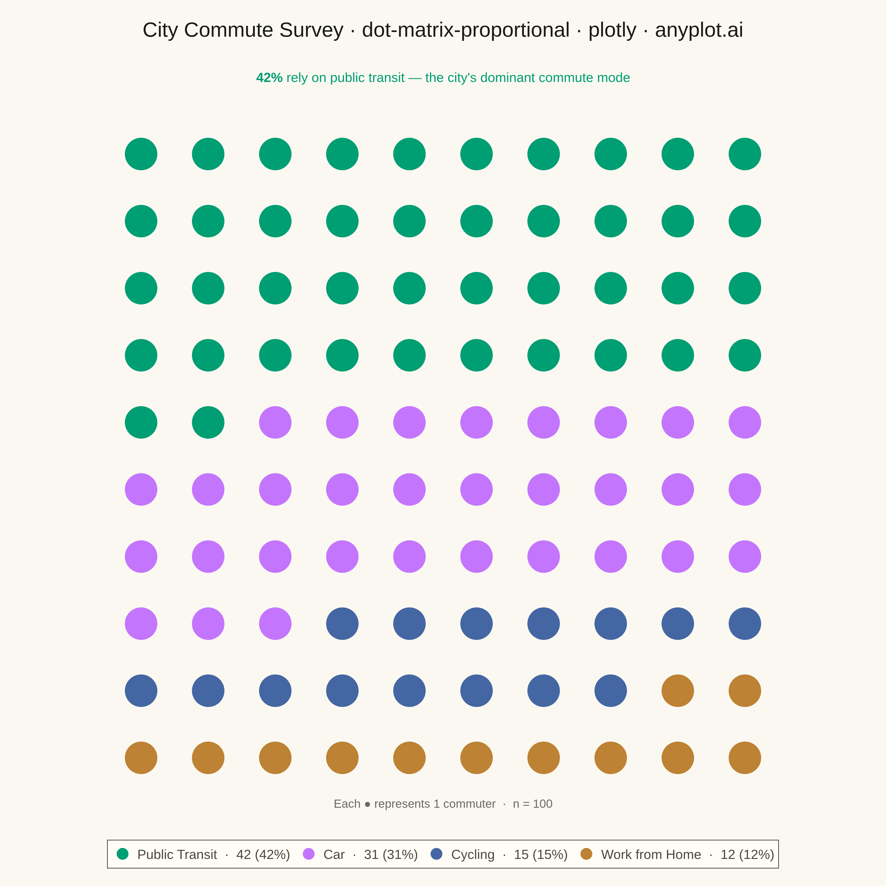
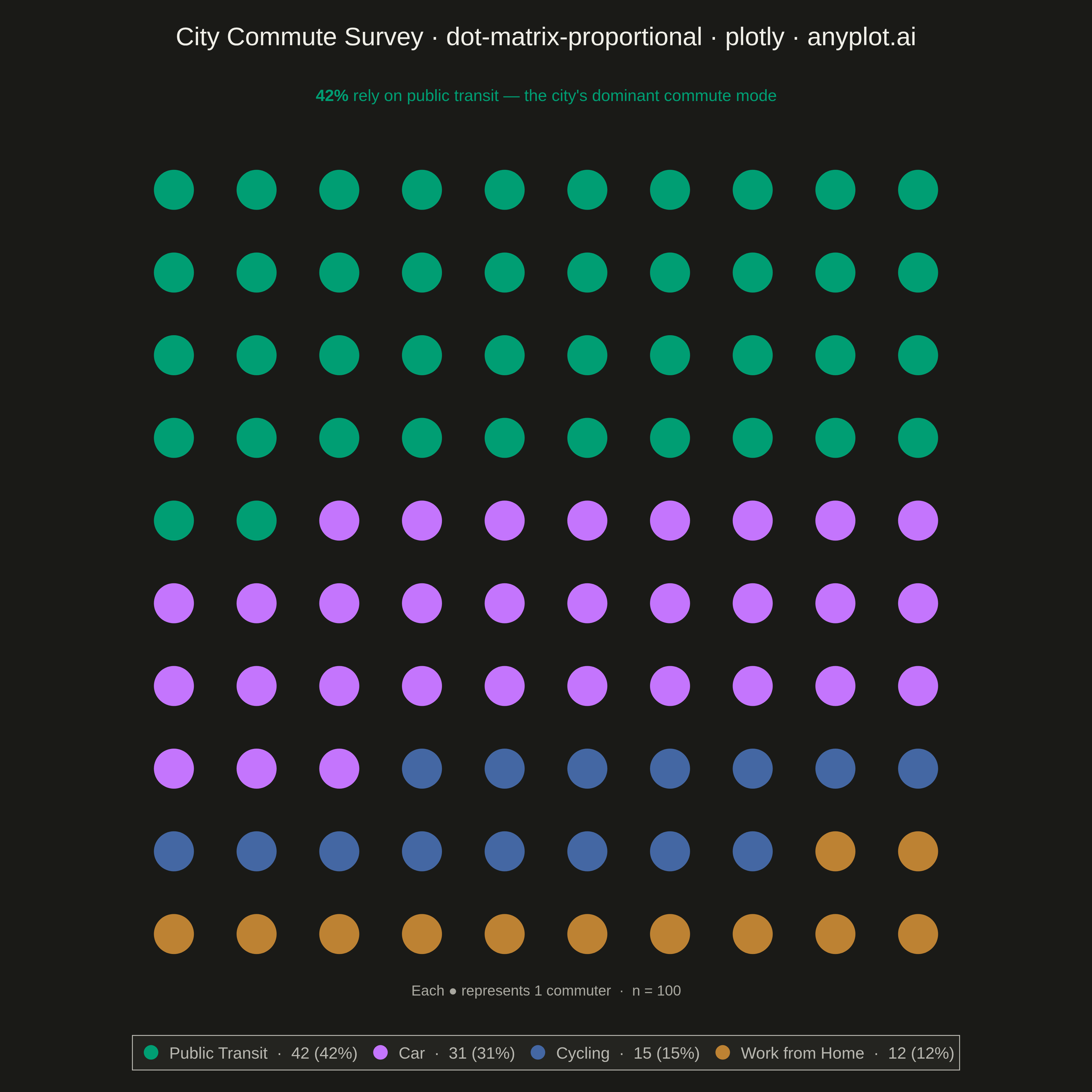
The same plot in 14 other libraries — Python: Altair, Bokeh, lets-plot, Matplotlib, plotnine, Pygal, Seaborn; R: ggplot2; Julia: Makie.jl; JavaScript: Chart.js, D3.js, Apache ECharts, Highcharts, MUI X Charts. Compare all 15 side by side: Dot Matrix Chart for Proportional Counts in Python, R, Julia and JavaScript.
A dot matrix chart displays proportions using a grid of equally-sized dots where filled or colored dots represent counts out of a total. Each dot corresponds to one unit, making it intuitive to read "X out of N" statistics at a glance. Unlike waffle charts that use percentage-based squares, dot matrix charts emphasize absolute counts with variable grid sizes, excelling at risk communication and survey result visualization.
""" anyplot.ai
dot-matrix-proportional: Dot Matrix Chart for Proportional Counts
Library: plotly 6.7.0 | Python 3.13.13
Quality: 93/100 | Created: 2026-05-08
"""

import os

import plotly.graph_objects as go


# Theme tokens
THEME = os.getenv("ANYPLOT_THEME", "light")
PAGE_BG = "#FAF8F1" if THEME == "light" else "#1A1A17"
ELEVATED_BG = "#FFFDF6" if THEME == "light" else "#242420"
INK = "#1A1A17" if THEME == "light" else "#F0EFE8"
INK_SOFT = "#4A4A44" if THEME == "light" else "#B8B7B0"
INK_MUTED = "#6B6A63" if THEME == "light" else "#A8A79F"

# Data: city commute survey, 100 respondents
categories = ["Public Transit", "Car", "Cycling", "Work from Home"]
counts = [42, 31, 15, 12]
colors = ["#009E73", "#C475FD", "#4467A3", "#BD8233"]
total = sum(counts)  # 100
grid_cols = 10
grid_rows = total // grid_cols  # 10

# Build dot grid positions: fill left-to-right, top-to-bottom
dot_positions = {}
idx = 0
for cat, count in zip(categories, counts, strict=False):
    positions = []
    for _ in range(count):
        col = idx % grid_cols
        row = idx // grid_cols
        positions.append((col, grid_rows - 1 - row))  # flip y so row 0 is at top
        idx += 1
    dot_positions[cat] = positions

# Plot
fig = go.Figure()

for cat, color, count in zip(categories, colors, counts, strict=False):
    xs = [p[0] for p in dot_positions[cat]]
    ys = [p[1] for p in dot_positions[cat]]
    pct = count / total * 100
    fig.add_trace(
        go.Scatter(
            x=xs,
            y=ys,
            mode="markers",
            name=f"{cat}  ·  {count} ({pct:.0f}%)",
            marker={"color": color, "size": 44, "symbol": "circle"},
            hovertemplate=f"<b>{cat}</b><br>Count: {count}<br>Share: {pct:.0f}%<extra></extra>",
        )
    )

# Layout
fig.update_layout(
    title={
        "text": "City Commute Survey · dot-matrix-proportional · plotly · anyplot.ai",
        "font": {"size": 28, "color": INK},
        "x": 0.5,
        "xanchor": "center",
        "y": 0.975,
        "yanchor": "top",
    },
    paper_bgcolor=PAGE_BG,
    plot_bgcolor=PAGE_BG,
    xaxis={"visible": False, "range": [-0.7, grid_cols - 0.3], "fixedrange": True},
    yaxis={"visible": False, "range": [-0.7, grid_rows - 0.3], "scaleanchor": "x", "scaleratio": 1, "fixedrange": True},
    legend={
        "orientation": "h",
        "x": 0.5,
        "y": -0.05,
        "xanchor": "center",
        "yanchor": "top",
        "bgcolor": ELEVATED_BG,
        "bordercolor": INK_SOFT,
        "borderwidth": 1,
        "font": {"color": INK_SOFT, "size": 18},
        "tracegroupgap": 0,
    },
    annotations=[
        # Insight subtitle: draw attention to the dominant transit mode
        {
            "text": "<b>42%</b> rely on public transit — the city's dominant commute mode",
            "x": 0.5,
            "y": 1.03,
            "xref": "paper",
            "yref": "paper",
            "showarrow": False,
            "font": {"size": 18, "color": "#009E73"},
            "xanchor": "center",
            "yanchor": "bottom",
        },
        # Scale context
        {
            "text": "Each ● represents 1 commuter  ·  n = 100",
            "x": 0.5,
            "y": -0.01,
            "xref": "paper",
            "yref": "paper",
            "showarrow": False,
            "font": {"size": 16, "color": INK_MUTED},
            "xanchor": "center",
            "yanchor": "bottom",
        },
    ],
    width=1200,
    height=1200,
    margin={"l": 80, "r": 80, "t": 145, "b": 110},
)

# Save
fig.write_image(f"plot-{THEME}.png", width=1200, height=1200, scale=3)
fig.write_html(f"plot-{THEME}.html", include_plotlyjs="cdn")
Runnable source as JSON, for any HTTP client: https://api.anyplot.ai/specs/dot-matrix-proportional/plotly/code. Any spec id and library id listed in llms-full.txt fit the same URL shape; every URL below is complete and callable.
{
  "spec_id": "dot-matrix-proportional",
  "language": "python",
  "library": "plotly",
  "page": "https://anyplot.ai/dot-matrix-proportional/python/plotly",
  "hub": "https://anyplot.ai/dot-matrix-proportional",
  "code_json": "https://api.anyplot.ai/specs/dot-matrix-proportional/plotly/code",
  "spec_json": "https://api.anyplot.ai/specs/dot-matrix-proportional",
  "render_light_png": "https://storage.googleapis.com/anyplot-images/plots/dot-matrix-proportional/python/plotly/plot-light.png",
  "render_dark_png": "https://storage.googleapis.com/anyplot-images/plots/dot-matrix-proportional/python/plotly/plot-dark.png",
  "interactive_light_html": "https://storage.googleapis.com/anyplot-images/plots/dot-matrix-proportional/python/plotly/plot-light.html",
  "interactive_dark_html": "https://storage.googleapis.com/anyplot-images/plots/dot-matrix-proportional/python/plotly/plot-dark.html",
  "quality_score": 93.0,
  "license": "MIT",
  "guide": "https://anyplot.ai/llms.txt"
}
Part of Dot Matrix Chart for Proportional Counts on anyplot.ai.