The same plot in 14 other libraries — Python: Altair, Bokeh, lets-plot, Matplotlib, Plotly, plotnine, Pygal, Seaborn; Julia: Makie.jl; JavaScript: Chart.js, D3.js, Apache ECharts, Highcharts, MUI X Charts. Compare all 15 side by side: Drawdown Chart in Python, R, Julia and JavaScript.
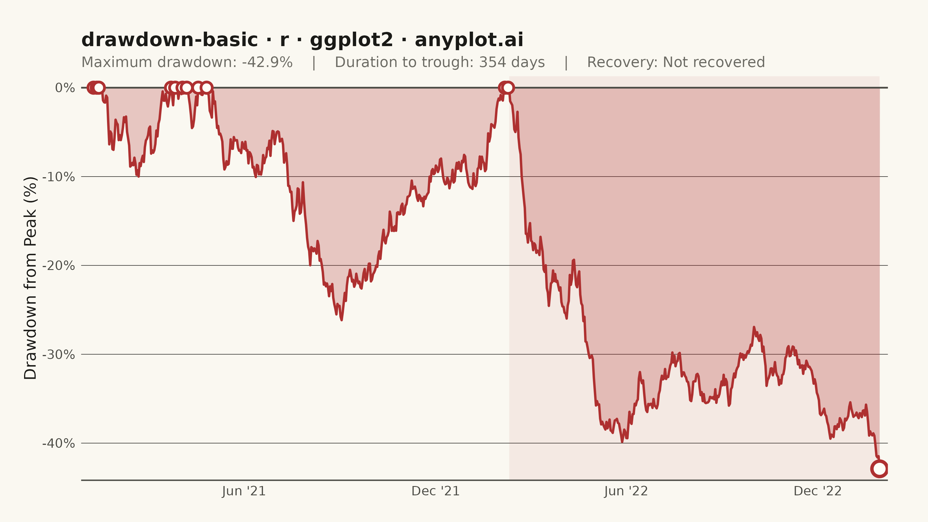
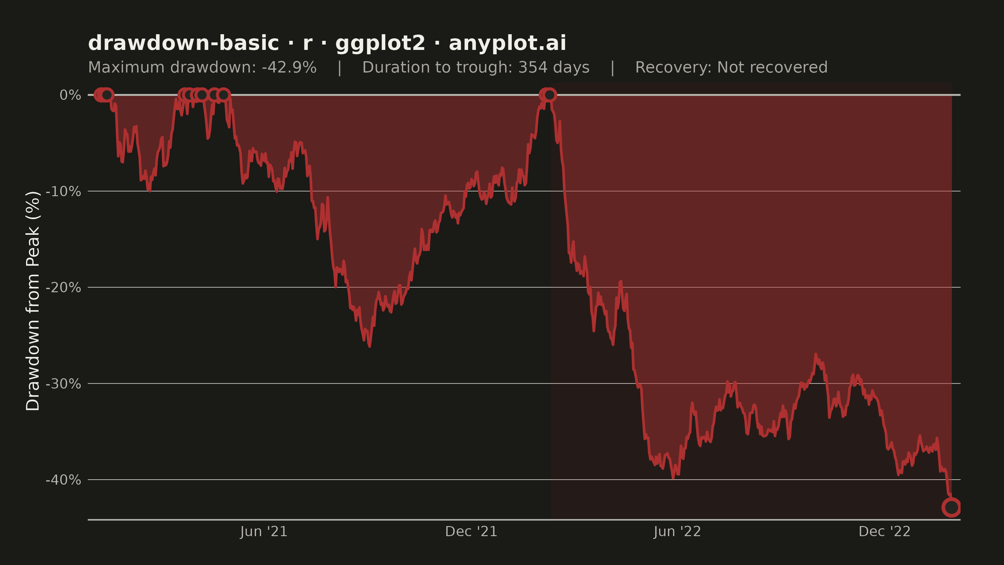
A drawdown chart visualizes the percentage decline from peak value over time, showing how far an investment or asset has fallen from its highest point. This chart is essential for risk assessment and understanding the magnitude of losses during unfavorable market periods. The filled area below the zero line emphasizes the depth and duration of drawdowns, making it easy to identify maximum drawdown periods and recovery points.
#' anyplot.ai
#' drawdown-basic: Drawdown Chart
#' Library: ggplot2 3.5.1 | R 4.4.1
#' Quality: 91/100 | Created: 2026-05-23

library(ggplot2)
library(ragg)

set.seed(42)

# Theme tokens
THEME       <- Sys.getenv("ANYPLOT_THEME", "light")
PAGE_BG     <- if (THEME == "light") "#FAF8F1" else "#1A1A17"
ELEVATED_BG <- if (THEME == "light") "#FFFDF6" else "#242420"
INK         <- if (THEME == "light") "#1A1A17" else "#F0EFE8"
INK_SOFT    <- if (THEME == "light") "#4A4A44" else "#B8B7B0"
INK_MUTED   <- if (THEME == "light") "#6B6A63" else "#A8A79F"
DD_COLOR    <- "#AE3030"  # red — semantic: loss / drawdown
DD_ALPHA    <- if (THEME == "light") 0.25 else 0.45  # more visible in dark mode

# Data: synthetic portfolio NAV, Jan 2021 – Dec 2023
# bull → correction → full recovery (new highs) → deeper bear → partial recovery
n_days  <- 756
dates   <- seq(as.Date("2021-01-04"), by = "day", length.out = n_days)
returns <- numeric(n_days)
returns[1:180]   <- rnorm(180, mean =  0.0010, sd = 0.011)  # initial bull run
returns[181:240] <- rnorm(60,  mean = -0.0030, sd = 0.014)  # first correction ~-18%
returns[241:340] <- rnorm(100, mean =  0.0020, sd = 0.010)  # strong recovery → new highs
returns[341:400] <- rnorm(60,  mean =  0.0010, sd = 0.010)  # brief continued bull
returns[401:500] <- rnorm(100, mean = -0.0030, sd = 0.014)  # rate-hike bear ~-26%
returns[501:756] <- rnorm(256, mean =  0.0007, sd = 0.011)  # gradual partial recovery

price        <- 100 * cumprod(c(1, 1 + returns))[seq_len(n_days)]
running_max  <- cummax(price)
drawdown_pct <- (price - running_max) / running_max * 100

# Key statistics
max_dd_idx  <- which.min(drawdown_pct)
max_dd_pct  <- drawdown_pct[max_dd_idx]
max_dd_date <- dates[max_dd_idx]

at_peak      <- drawdown_pct >= -0.001
pre_peaks    <- which(at_peak & seq_len(n_days) < max_dd_idx)
pre_peak_idx <- if (length(pre_peaks) > 0) tail(pre_peaks, 1) else 1L
dd_duration  <- max_dd_idx - pre_peak_idx

post_peaks     <- which(at_peak & seq_len(n_days) > max_dd_idx)
recovery_days  <- if (length(post_peaks) > 0) post_peaks[1] - max_dd_idx else NA_integer_
recovery_label <- if (!is.na(recovery_days)) sprintf("%d days", recovery_days) else "Not recovered"

# Recovery points: transitions from drawdown back to new high (zero-cross)
prev_not_peak <- c(FALSE, !at_peak[-n_days])
recovery_idx  <- which(at_peak & prev_not_peak)
recovery_df   <- data.frame(
  date     = dates[recovery_idx],
  drawdown = drawdown_pct[recovery_idx]
)

df        <- data.frame(date = dates, drawdown = drawdown_pct)
max_dd_df <- df[max_dd_idx, ]

subtitle_text <- sprintf(
  "Maximum drawdown: %.1f%%    |    Duration to trough: %d days    |    Recovery: %s",
  max_dd_pct, dd_duration, recovery_label
)

# Plot
p <- ggplot(df, aes(x = date, y = drawdown)) +
  # Highlight max drawdown period: last peak before trough → trough date
  annotate(
    "rect",
    xmin  = dates[pre_peak_idx],
    xmax  = max_dd_date,
    ymin  = -Inf,
    ymax  = Inf,
    fill  = DD_COLOR,
    alpha = 0.07
  ) +
  geom_area(fill = DD_COLOR, alpha = DD_ALPHA) +
  geom_line(color = DD_COLOR, linewidth = 0.7) +
  geom_hline(yintercept = 0, color = INK_SOFT, linewidth = 0.5) +
  # Recovery point markers: where drawdown returns to zero (new highs)
  geom_point(
    data   = recovery_df,
    aes(x = date, y = drawdown),
    shape  = 21,
    size   = 2.5,
    color  = DD_COLOR,
    fill   = ELEVATED_BG,
    stroke = 1.2
  ) +
  geom_point(
    data   = max_dd_df,
    aes(x = date, y = drawdown),
    shape  = 21,
    size   = 3.5,
    color  = DD_COLOR,
    fill   = ELEVATED_BG,
    stroke = 1.5
  ) +
  scale_x_date(
    date_breaks = "6 months",
    date_labels = "%b '%y",
    expand      = c(0.01, 0)
  ) +
  scale_y_continuous(
    labels = function(x) paste0(x, "%"),
    expand = c(0.03, 0)
  ) +
  labs(
    title    = "drawdown-basic · r · ggplot2 · anyplot.ai",
    subtitle = subtitle_text,
    x        = NULL,
    y        = "Drawdown from Peak (%)"
  ) +
  theme_minimal(base_size = 8) +
  theme(
    plot.background    = element_rect(fill = PAGE_BG, color = PAGE_BG),
    panel.background   = element_rect(fill = PAGE_BG, color = NA),
    panel.grid.major.y = element_line(color = INK, linewidth = 0.15),
    panel.grid.major.x = element_blank(),
    panel.grid.minor   = element_blank(),
    panel.border       = element_blank(),
    axis.title.y       = element_text(color = INK, size = 10),
    axis.text.x        = element_text(color = INK_SOFT, size = 8),
    axis.text.y        = element_text(color = INK_SOFT, size = 8),
    axis.line.x        = element_line(color = INK_SOFT, linewidth = 0.4),
    plot.title         = element_text(color = INK, size = 12, face = "bold"),
    plot.subtitle      = element_text(color = INK_MUTED, size = 9),
    plot.margin        = margin(20, 25, 15, 15)
  )

# Save
ggsave(
  filename = sprintf("plot-%s.png", THEME),
  plot     = p,
  device   = ragg::agg_png,
  width    = 8,
  height   = 4.5,
  units    = "in",
  dpi      = 400
)
Runnable source as JSON, for any HTTP client: https://api.anyplot.ai/specs/drawdown-basic/ggplot2/code. Any spec id and library id listed in llms-full.txt fit the same URL shape; every URL below is complete and callable.
{
  "spec_id": "drawdown-basic",
  "language": "r",
  "library": "ggplot2",
  "page": "https://anyplot.ai/drawdown-basic/r/ggplot2",
  "hub": "https://anyplot.ai/drawdown-basic",
  "code_json": "https://api.anyplot.ai/specs/drawdown-basic/ggplot2/code",
  "spec_json": "https://api.anyplot.ai/specs/drawdown-basic",
  "render_light_png": "https://storage.googleapis.com/anyplot-images/plots/drawdown-basic/r/ggplot2/plot-light.png",
  "render_dark_png": "https://storage.googleapis.com/anyplot-images/plots/drawdown-basic/r/ggplot2/plot-dark.png",
  "quality_score": 91.0,
  "license": "MIT",
  "guide": "https://anyplot.ai/llms.txt"
}
Part of Drawdown Chart on anyplot.ai.