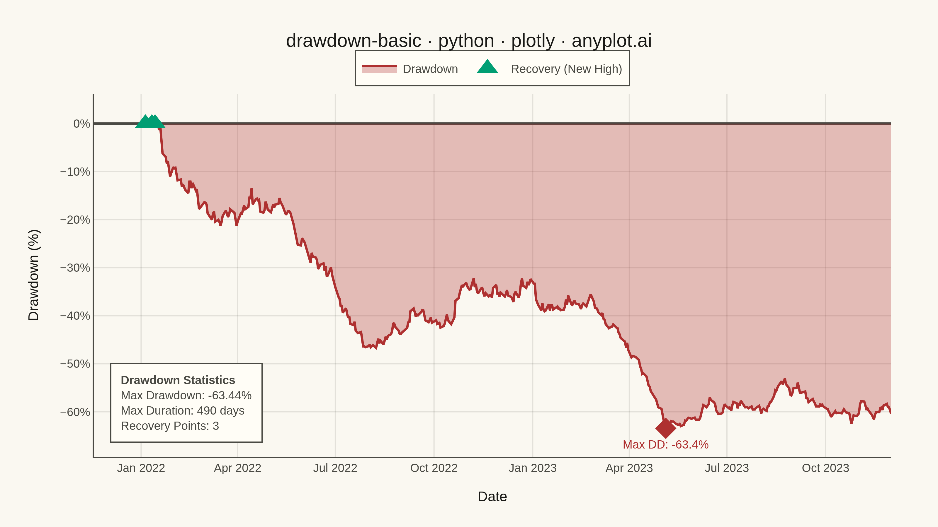
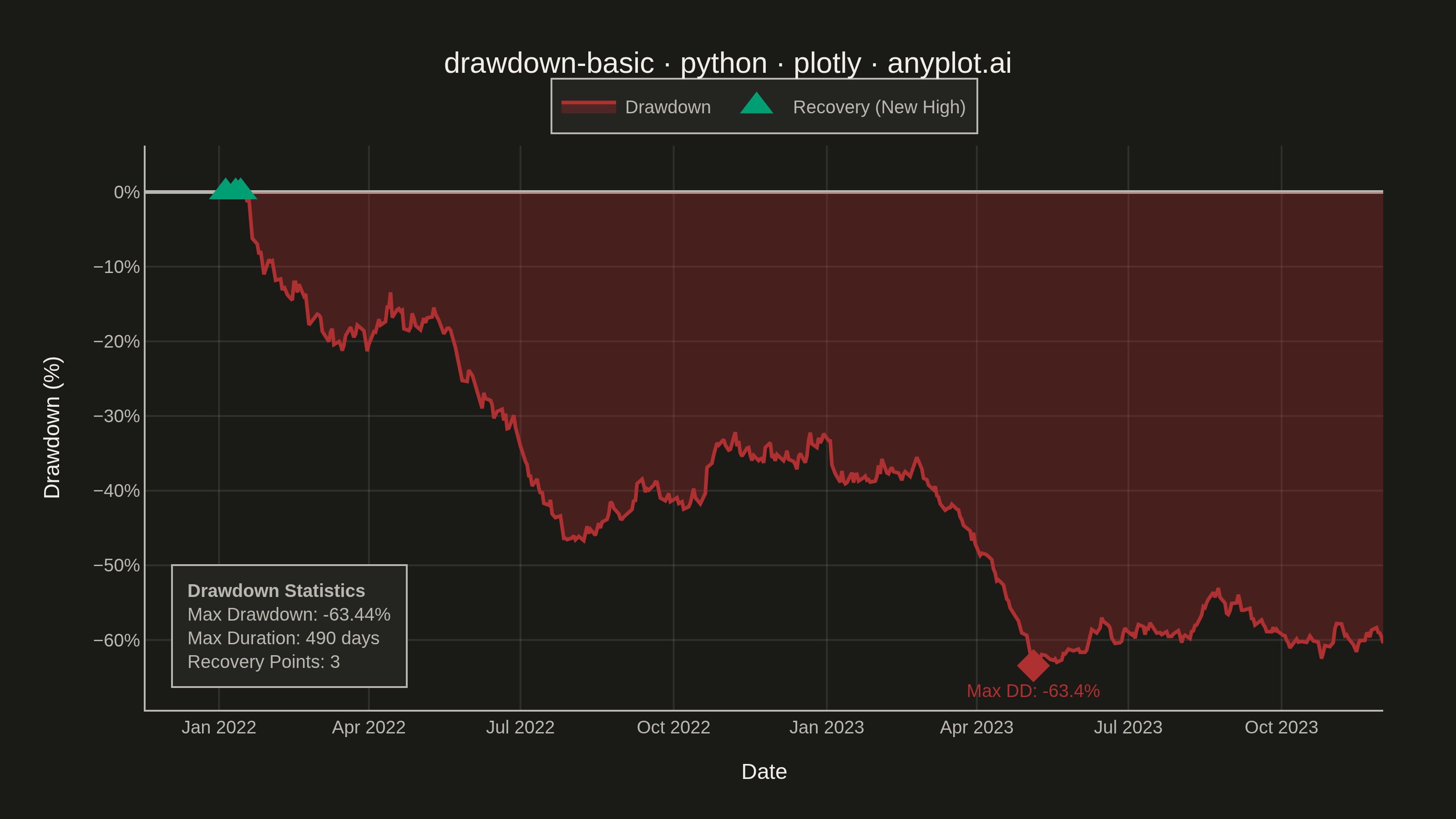
A drawdown chart visualizes the percentage decline from peak value over time, showing how far an investment or asset has fallen from its highest point. This chart is essential for risk assessment and understanding the magnitude of losses during unfavorable market periods. The filled area below the zero line emphasizes the depth and duration of drawdowns, making it easy to identify maximum drawdown periods and recovery points.
""" anyplot.ai
drawdown-basic: Drawdown Chart
Library: plotly 6.7.0 | Python 3.13.13
Quality: 90/100 | Updated: 2026-05-23
"""

import os
import sys


# Remove current directory from sys.path to avoid shadowing installed packages
sys.path = [p for p in sys.path if p not in ("", ".")]

import numpy as np
import pandas as pd
import plotly.graph_objects as go


# Theme tokens
THEME = os.getenv("ANYPLOT_THEME", "light")
PAGE_BG = "#FAF8F1" if THEME == "light" else "#1A1A17"
ELEVATED_BG = "#FFFDF6" if THEME == "light" else "#242420"
INK = "#1A1A17" if THEME == "light" else "#F0EFE8"
INK_SOFT = "#4A4A44" if THEME == "light" else "#B8B7B0"
GRID = "rgba(26, 26, 23, 0.10)" if THEME == "light" else "rgba(240, 239, 232, 0.10)"

LOSS_RED = "#AE3030"  # Imprint palette position 3 — semantic: loss/drawdown
RECOVERY_GREEN = "#009E73"  # Imprint palette position 1 — semantic: recovery/new high

# Data — simulated stock price with realistic volatility
np.random.seed(42)
n_days = 500
dates = pd.date_range("2022-01-01", periods=n_days, freq="B").strftime("%Y-%m-%d").tolist()

returns = np.random.normal(0.0003, 0.015, n_days)
returns[100:150] -= 0.008  # market correction
returns[300:350] -= 0.012  # larger drawdown period
price = 100 * np.cumprod(1 + returns)

# Calculate drawdown
running_max = np.maximum.accumulate(price)
drawdown = (price - running_max) / running_max * 100

# Find maximum drawdown
max_dd_idx = np.argmin(drawdown)
max_dd_value = drawdown[max_dd_idx]
max_dd_date = dates[max_dd_idx]

# Find recovery points (drawdown returns to zero after being negative)
recovery_mask = (drawdown == 0) & (np.roll(drawdown, 1) < 0)
recovery_mask[0] = False
recovery_dates = [d for d, m in zip(dates, recovery_mask, strict=False) if m]

# Calculate max drawdown duration
max_dd_duration = 0
current_duration = 0
for dd in drawdown:
    if dd < 0:
        current_duration += 1
        max_dd_duration = max(max_dd_duration, current_duration)
    else:
        current_duration = 0

# Plot
fig = go.Figure()

# Drawdown fill area
fig.add_trace(
    go.Scatter(
        x=dates,
        y=drawdown,
        fill="tozeroy",
        fillcolor="rgba(174, 48, 48, 0.30)",
        line=dict(color=LOSS_RED, width=2),
        name="Drawdown",
        hovertemplate="Date: %{x|%Y-%m-%d}<br>Drawdown: %{y:.2f}%<extra></extra>",
    )
)

# Maximum drawdown marker
fig.add_trace(
    go.Scatter(
        x=[max_dd_date],
        y=[max_dd_value],
        mode="markers+text",
        marker=dict(size=14, color=LOSS_RED, symbol="diamond"),
        text=[f"Max DD: {max_dd_value:.1f}%"],
        textposition="bottom center",
        textfont=dict(size=10, color=LOSS_RED),
        name="Max Drawdown",
        showlegend=False,
        hovertemplate=(f"Max Drawdown<br>Date: {max_dd_date}<br>Drawdown: {max_dd_value:.2f}%<extra></extra>"),
    )
)

# Recovery point markers (larger for better visibility)
if len(recovery_dates) > 0:
    fig.add_trace(
        go.Scatter(
            x=recovery_dates,
            y=[0] * len(recovery_dates),
            mode="markers",
            marker=dict(size=16, color=RECOVERY_GREEN, symbol="triangle-up"),
            name="Recovery (New High)",
            hovertemplate="Recovery<br>Date: %{x|%Y-%m-%d}<extra></extra>",
        )
    )

# Statistics annotation inside plot (bottom-left, avoids right-edge clipping)
stats_text = (
    f"<b>Drawdown Statistics</b><br>"
    f"Max Drawdown: {max_dd_value:.2f}%<br>"
    f"Max Duration: {max_dd_duration} days<br>"
    f"Recovery Points: {len(recovery_dates)}"
)

fig.add_annotation(
    text=stats_text,
    xref="paper",
    yref="paper",
    x=0.02,
    y=0.04,
    xanchor="left",
    yanchor="bottom",
    showarrow=False,
    font=dict(size=10, color=INK_SOFT),
    align="left",
    bordercolor=INK_SOFT,
    borderwidth=1,
    borderpad=8,
    bgcolor=ELEVATED_BG,
)

# Layout
fig.update_layout(
    autosize=False,
    paper_bgcolor=PAGE_BG,
    plot_bgcolor=PAGE_BG,
    title=dict(
        text="drawdown-basic · python · plotly · anyplot.ai", font=dict(size=16, color=INK), x=0.5, xanchor="center"
    ),
    xaxis=dict(
        title=dict(text="Date", font=dict(size=12, color=INK)),
        tickfont=dict(size=10, color=INK_SOFT),
        showgrid=True,
        gridcolor=GRID,
        linecolor=INK_SOFT,
        zerolinecolor=INK_SOFT,
    ),
    yaxis=dict(
        title=dict(text="Drawdown (%)", font=dict(size=12, color=INK)),
        tickfont=dict(size=10, color=INK_SOFT),
        ticksuffix="%",
        showgrid=True,
        gridcolor=GRID,
        linecolor=INK_SOFT,
        zeroline=True,
        zerolinewidth=2,
        zerolinecolor=INK_SOFT,
    ),
    showlegend=True,
    legend=dict(
        font=dict(size=10, color=INK_SOFT),
        bgcolor=ELEVATED_BG,
        bordercolor=INK_SOFT,
        borderwidth=1,
        orientation="h",
        yanchor="bottom",
        y=1.02,
        xanchor="center",
        x=0.5,
    ),
    margin=dict(l=80, r=40, t=80, b=60),
)

# Save
fig.write_image(f"plot-{THEME}.png", width=800, height=450, scale=4)
fig.write_html(f"plot-{THEME}.html", include_plotlyjs="cdn")
Runnable source as JSON, for any HTTP client: https://api.anyplot.ai/specs/drawdown-basic/plotly/code. Any spec id and library id listed in llms-full.txt fit the same URL shape; every URL below is complete and callable.
{
  "spec_id": "drawdown-basic",
  "language": "python",
  "library": "plotly",
  "page": "https://anyplot.ai/drawdown-basic/python/plotly",
  "hub": "https://anyplot.ai/drawdown-basic",
  "code_json": "https://api.anyplot.ai/specs/drawdown-basic/plotly/code",
  "spec_json": "https://api.anyplot.ai/specs/drawdown-basic",
  "render_light_png": "https://storage.googleapis.com/anyplot-images/plots/drawdown-basic/python/plotly/plot-light.png",
  "render_dark_png": "https://storage.googleapis.com/anyplot-images/plots/drawdown-basic/python/plotly/plot-dark.png",
  "interactive_light_html": "https://storage.googleapis.com/anyplot-images/plots/drawdown-basic/python/plotly/plot-light.html",
  "interactive_dark_html": "https://storage.googleapis.com/anyplot-images/plots/drawdown-basic/python/plotly/plot-dark.html",
  "quality_score": 90.0,
  "license": "MIT",
  "guide": "https://anyplot.ai/llms.txt"
}
Part of Drawdown Chart on anyplot.ai.