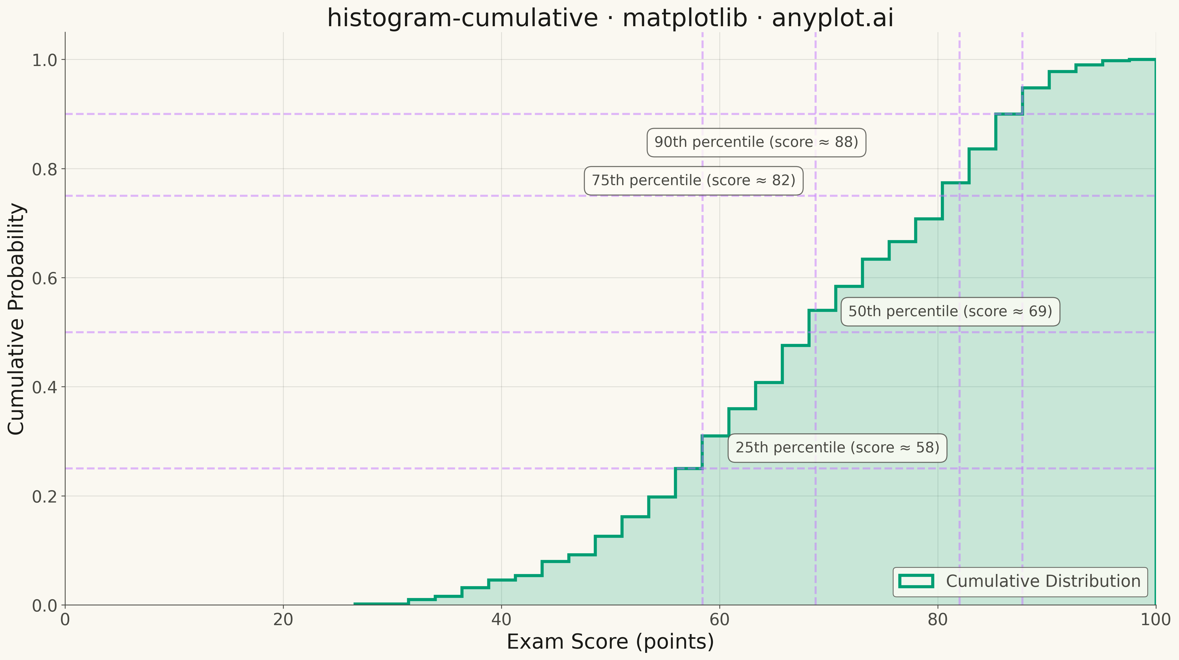
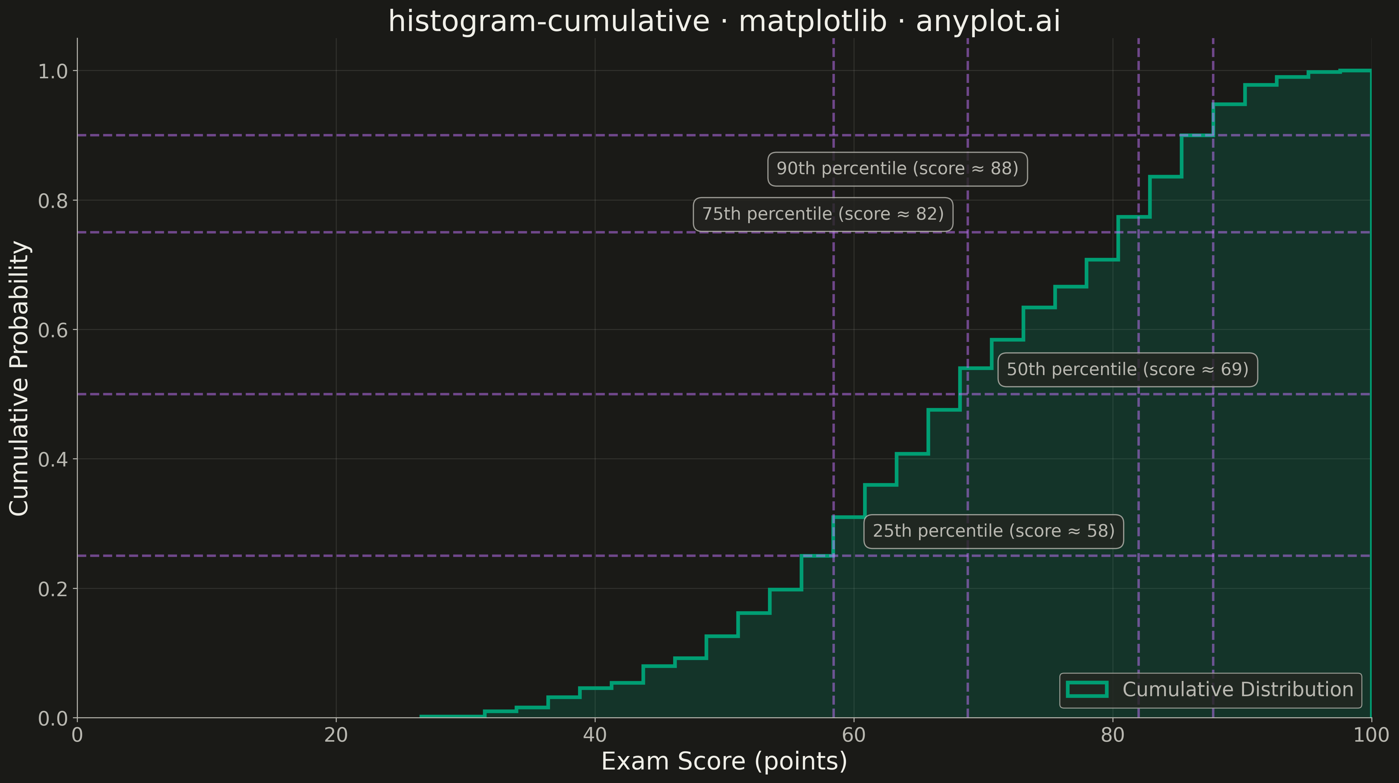
A cumulative histogram (also known as an ogive or cumulative frequency histogram) displays the running total of observations up to each bin boundary. The y-axis shows cumulative count or proportion, creating a monotonically increasing step function that reaches the total sample size (or 1.0 for normalized).
""" anyplot.ai
histogram-cumulative: Cumulative Histogram
Library: matplotlib 3.10.9 | Python 3.13.13
Quality: 97/100 | Updated: 2026-05-11
"""

import os

import matplotlib.pyplot as plt
import numpy as np


# Theme tokens (see prompts/default-style-guide.md)
THEME = os.getenv("ANYPLOT_THEME", "light")
PAGE_BG = "#FAF8F1" if THEME == "light" else "#1A1A17"
ELEVATED_BG = "#FFFDF6" if THEME == "light" else "#242420"
INK = "#1A1A17" if THEME == "light" else "#F0EFE8"
INK_SOFT = "#4A4A44" if THEME == "light" else "#B8B7B0"
INK_MUTED = "#6B6A63" if THEME == "light" else "#A8A79F"
BRAND = "#009E73"  # Okabe-Ito position 1
ACCENT = "#C475FD"  # Okabe-Ito position 2 for reference lines

# Data - exam scores with realistic distribution
np.random.seed(42)
scores = np.concatenate(
    [
        np.random.normal(65, 10, 300),  # Average performers
        np.random.normal(85, 5, 150),  # High performers
        np.random.normal(45, 8, 50),  # Lower performers
    ]
)
scores = np.clip(scores, 0, 100)

# Plot
fig, ax = plt.subplots(figsize=(16, 9), facecolor=PAGE_BG)
ax.set_facecolor(PAGE_BG)

# Cumulative histogram with step display
n, bins, patches = ax.hist(
    scores,
    bins=30,
    cumulative=True,
    density=True,
    histtype="step",
    linewidth=3,
    color=BRAND,
    label="Cumulative Distribution",
)

# Add filled area under the step function for better visibility
ax.hist(scores, bins=30, cumulative=True, density=True, histtype="stepfilled", alpha=0.2, color=BRAND)

# Add percentile bands using axhspan for distinctive matplotlib features
percentiles = [25, 50, 75, 90]
for p in percentiles:
    pct_value = np.percentile(scores, p)
    ax.axhline(y=p / 100, color=ACCENT, linestyle="--", linewidth=2, alpha=0.5)
    ax.axvline(x=pct_value, color=ACCENT, linestyle="--", linewidth=2, alpha=0.5)

    # Position annotations to avoid overlap
    if p == 90:
        xytext = (pct_value - 15, p / 100 - 0.06)
        ha = "right"
    elif p == 75:
        xytext = (pct_value - 15, p / 100 + 0.02)
        ha = "right"
    else:
        xytext = (pct_value + 3, p / 100 + 0.03)
        ha = "left"

    ax.annotate(
        f"{p}th percentile (score ≈ {pct_value:.0f})",
        xy=(pct_value, p / 100),
        xytext=xytext,
        fontsize=14,
        color=INK_SOFT,
        ha=ha,
        bbox={"boxstyle": "round,pad=0.5", "facecolor": ELEVATED_BG, "edgecolor": INK_SOFT, "alpha": 0.8},
    )

# Style
ax.set_xlabel("Exam Score (points)", fontsize=20, color=INK)
ax.set_ylabel("Cumulative Probability", fontsize=20, color=INK)
ax.set_title("histogram-cumulative · matplotlib · anyplot.ai", fontsize=24, fontweight="medium", color=INK)
ax.tick_params(axis="both", labelsize=16, colors=INK_SOFT)
ax.set_xlim(0, 100)
ax.set_ylim(0, 1.05)

# Grid styling
ax.grid(True, alpha=0.15, linestyle="-", linewidth=0.8, color=INK_SOFT)
ax.set_axisbelow(True)

# Spine styling
ax.spines["top"].set_visible(False)
ax.spines["right"].set_visible(False)
for s in ("left", "bottom"):
    ax.spines[s].set_color(INK_SOFT)
    ax.spines[s].set_linewidth(0.8)

# Legend
leg = ax.legend(fontsize=16, loc="lower right")
if leg:
    leg.get_frame().set_facecolor(ELEVATED_BG)
    leg.get_frame().set_edgecolor(INK_SOFT)
    leg.get_frame().set_linewidth(0.8)
    for text in leg.get_texts():
        text.set_color(INK_SOFT)

plt.tight_layout()
plt.savefig(f"plot-{THEME}.png", dpi=300, bbox_inches="tight", facecolor=PAGE_BG)
Runnable source as JSON, for any HTTP client: https://api.anyplot.ai/specs/histogram-cumulative/matplotlib/code. Any spec id and library id listed in llms-full.txt fit the same URL shape; every URL below is complete and callable.
{
  "spec_id": "histogram-cumulative",
  "language": "python",
  "library": "matplotlib",
  "page": "https://anyplot.ai/histogram-cumulative/python/matplotlib",
  "hub": "https://anyplot.ai/histogram-cumulative",
  "code_json": "https://api.anyplot.ai/specs/histogram-cumulative/matplotlib/code",
  "spec_json": "https://api.anyplot.ai/specs/histogram-cumulative",
  "render_light_png": "https://storage.googleapis.com/anyplot-images/plots/histogram-cumulative/python/matplotlib/plot-light.png",
  "render_dark_png": "https://storage.googleapis.com/anyplot-images/plots/histogram-cumulative/python/matplotlib/plot-dark.png",
  "quality_score": 97.0,
  "license": "MIT",
  "guide": "https://anyplot.ai/llms.txt"
}
Part of Cumulative Histogram on anyplot.ai.