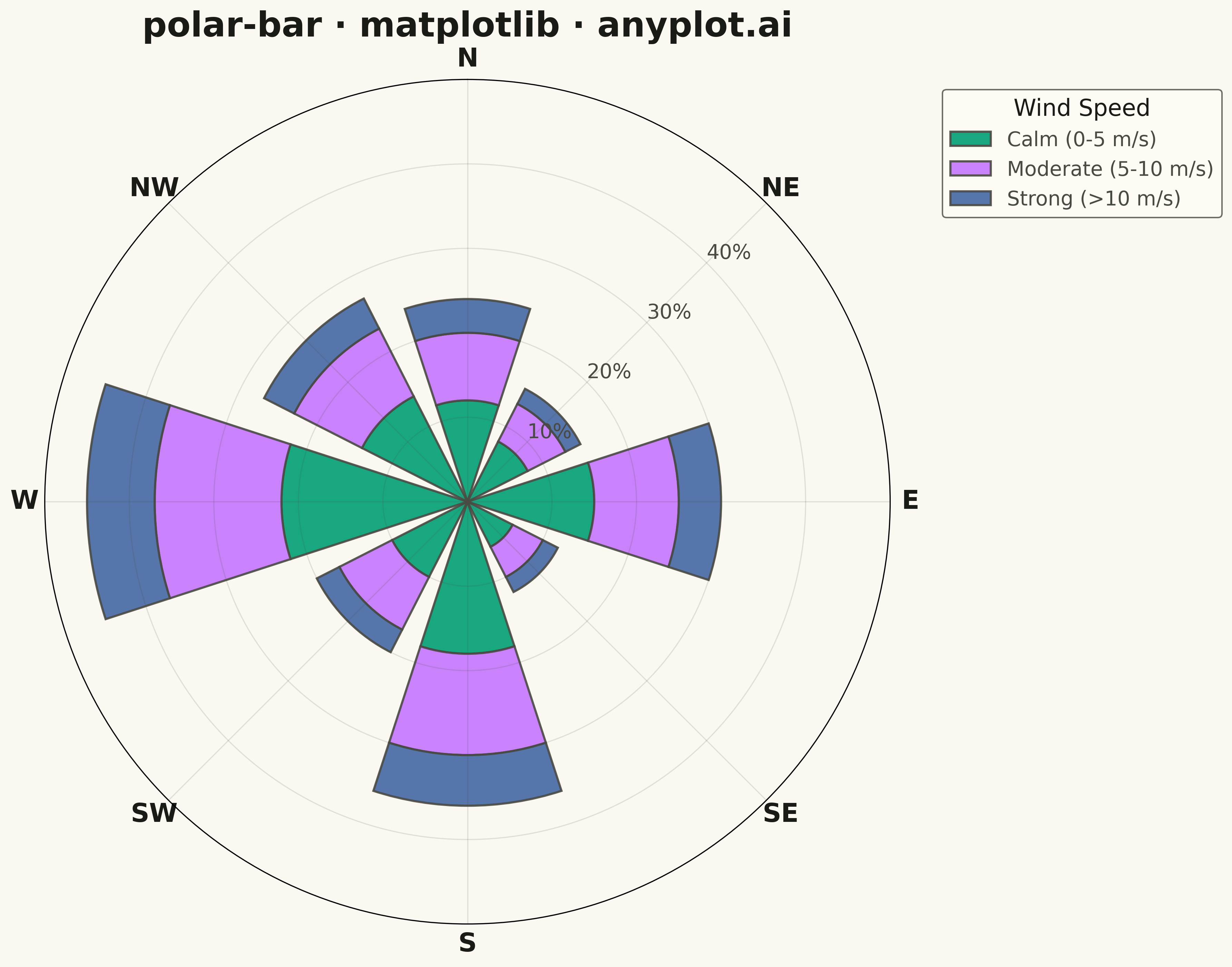
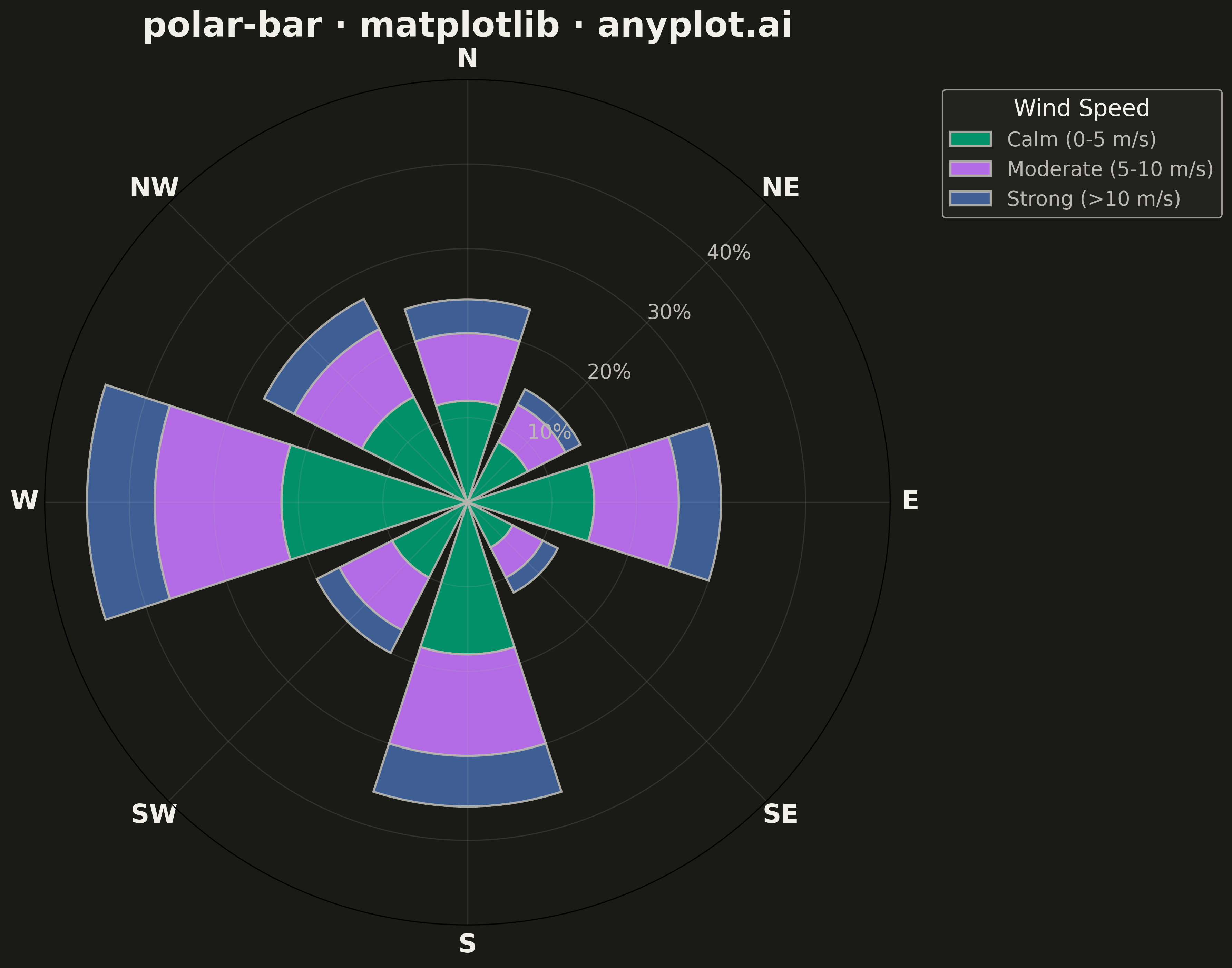
A bar chart arranged in a circle with bars radiating outward from the center. Each bar's angle represents a category (often direction) and length represents magnitude. Commonly used as a wind rose for meteorological data.
""" anyplot.ai
polar-bar: Polar Bar Chart (Wind Rose)
Library: matplotlib 3.10.9 | Python 3.13.13
Quality: 96/100 | Updated: 2026-05-13
"""

import os

import matplotlib.pyplot as plt
import numpy as np


# Theme tokens
THEME = os.getenv("ANYPLOT_THEME", "light")
PAGE_BG = "#FAF8F1" if THEME == "light" else "#1A1A17"
ELEVATED_BG = "#FFFDF6" if THEME == "light" else "#242420"
INK = "#1A1A17" if THEME == "light" else "#F0EFE8"
INK_SOFT = "#4A4A44" if THEME == "light" else "#B8B7B0"

# Okabe-Ito palette (positions 1, 2, 3 for three series)
BRAND = "#009E73"  # Position 1 (bluish green)
ACCENT1 = "#C475FD"  # Position 2 (vermillion)
ACCENT2 = "#4467A3"  # Position 3 (blue)

# Data - Wind direction frequencies (8 compass directions)
np.random.seed(42)
directions = ["N", "NE", "E", "SE", "S", "SW", "W", "NW"]
n_directions = len(directions)

# Convert directions to angles (in radians, starting from N=0, clockwise)
angles = np.linspace(0, 2 * np.pi, n_directions, endpoint=False)

# Generate wind frequency data for 3 speed categories (stacked bars)
# Calm (0-5 m/s), Moderate (5-10 m/s), Strong (>10 m/s)
calm = np.array([12, 8, 15, 6, 18, 10, 22, 14])
moderate = np.array([8, 5, 10, 4, 12, 7, 15, 9])
strong = np.array([4, 2, 5, 2, 6, 3, 8, 4])

# Bar width (slightly less than full sector for visual separation)
width = 2 * np.pi / n_directions * 0.8

# Create polar plot (square format works well for radial charts)
fig, ax = plt.subplots(figsize=(12, 12), subplot_kw={"projection": "polar"}, facecolor=PAGE_BG)
ax.set_facecolor(PAGE_BG)

# Plot stacked bars with Okabe-Ito colors
bars1 = ax.bar(
    angles,
    calm,
    width=width,
    bottom=0,
    color=BRAND,
    edgecolor=INK_SOFT,
    linewidth=1.5,
    label="Calm (0-5 m/s)",
    alpha=0.9,
)
bars2 = ax.bar(
    angles,
    moderate,
    width=width,
    bottom=calm,
    color=ACCENT1,
    edgecolor=INK_SOFT,
    linewidth=1.5,
    label="Moderate (5-10 m/s)",
    alpha=0.9,
)
bars3 = ax.bar(
    angles,
    strong,
    width=width,
    bottom=calm + moderate,
    color=ACCENT2,
    edgecolor=INK_SOFT,
    linewidth=1.5,
    label="Strong (>10 m/s)",
    alpha=0.9,
)

# Configure polar axes
ax.set_theta_zero_location("N")  # North at top
ax.set_theta_direction(-1)  # Clockwise

# Set direction labels
ax.set_xticks(angles)
ax.set_xticklabels(directions, fontsize=18, fontweight="bold", color=INK)

# Configure radial axis
ax.set_ylim(0, 50)
ax.set_yticks([10, 20, 30, 40])
ax.set_yticklabels(["10%", "20%", "30%", "40%"], fontsize=14, color=INK_SOFT)
ax.set_rlabel_position(45)  # Move radial labels to avoid overlap

# Grid styling
ax.grid(True, alpha=0.15, linestyle="-", linewidth=0.8, color=INK_SOFT)

# Title
ax.set_title("polar-bar · matplotlib · anyplot.ai", fontsize=24, pad=30, fontweight="bold", color=INK)

# Legend
leg = ax.legend(loc="upper left", bbox_to_anchor=(1.05, 1), fontsize=14, title="Wind Speed", title_fontsize=16)
if leg:
    leg.get_frame().set_facecolor(ELEVATED_BG)
    leg.get_frame().set_edgecolor(INK_SOFT)
    leg.get_frame().set_linewidth(1)
    plt.setp(leg.get_texts(), color=INK_SOFT)
    plt.setp(leg.get_title(), color=INK)

plt.tight_layout()
plt.savefig(f"plot-{THEME}.png", dpi=300, bbox_inches="tight", facecolor=PAGE_BG)
Runnable source as JSON, for any HTTP client: https://api.anyplot.ai/specs/polar-bar/matplotlib/code. Any spec id and library id listed in llms-full.txt fit the same URL shape; every URL below is complete and callable.
{
  "spec_id": "polar-bar",
  "language": "python",
  "library": "matplotlib",
  "page": "https://anyplot.ai/polar-bar/python/matplotlib",
  "hub": "https://anyplot.ai/polar-bar",
  "code_json": "https://api.anyplot.ai/specs/polar-bar/matplotlib/code",
  "spec_json": "https://api.anyplot.ai/specs/polar-bar",
  "render_light_png": "https://storage.googleapis.com/anyplot-images/plots/polar-bar/python/matplotlib/plot-light.png",
  "render_dark_png": "https://storage.googleapis.com/anyplot-images/plots/polar-bar/python/matplotlib/plot-dark.png",
  "quality_score": 96.0,
  "license": "MIT",
  "guide": "https://anyplot.ai/llms.txt"
}
Part of Polar Bar Chart (Wind Rose) on anyplot.ai.