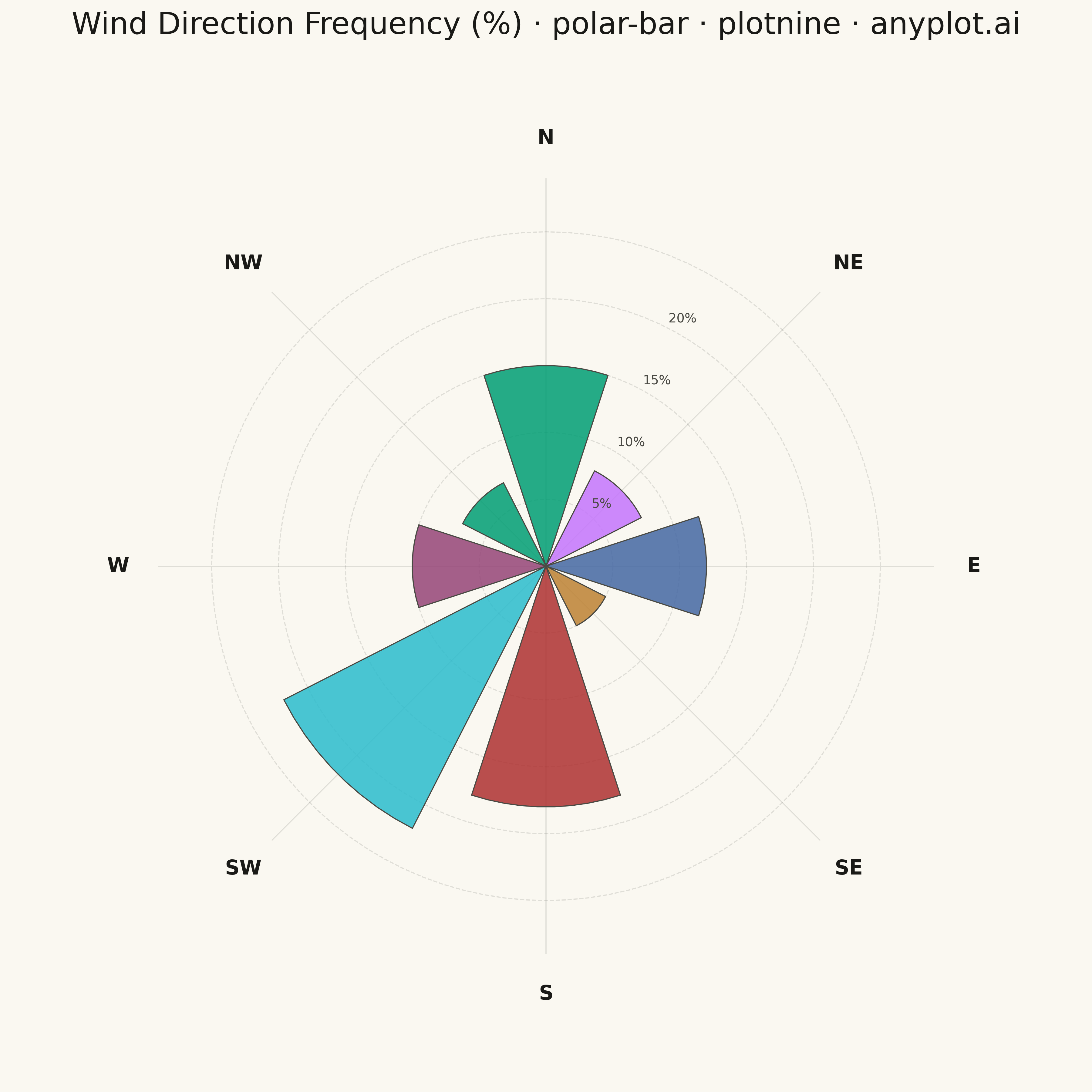
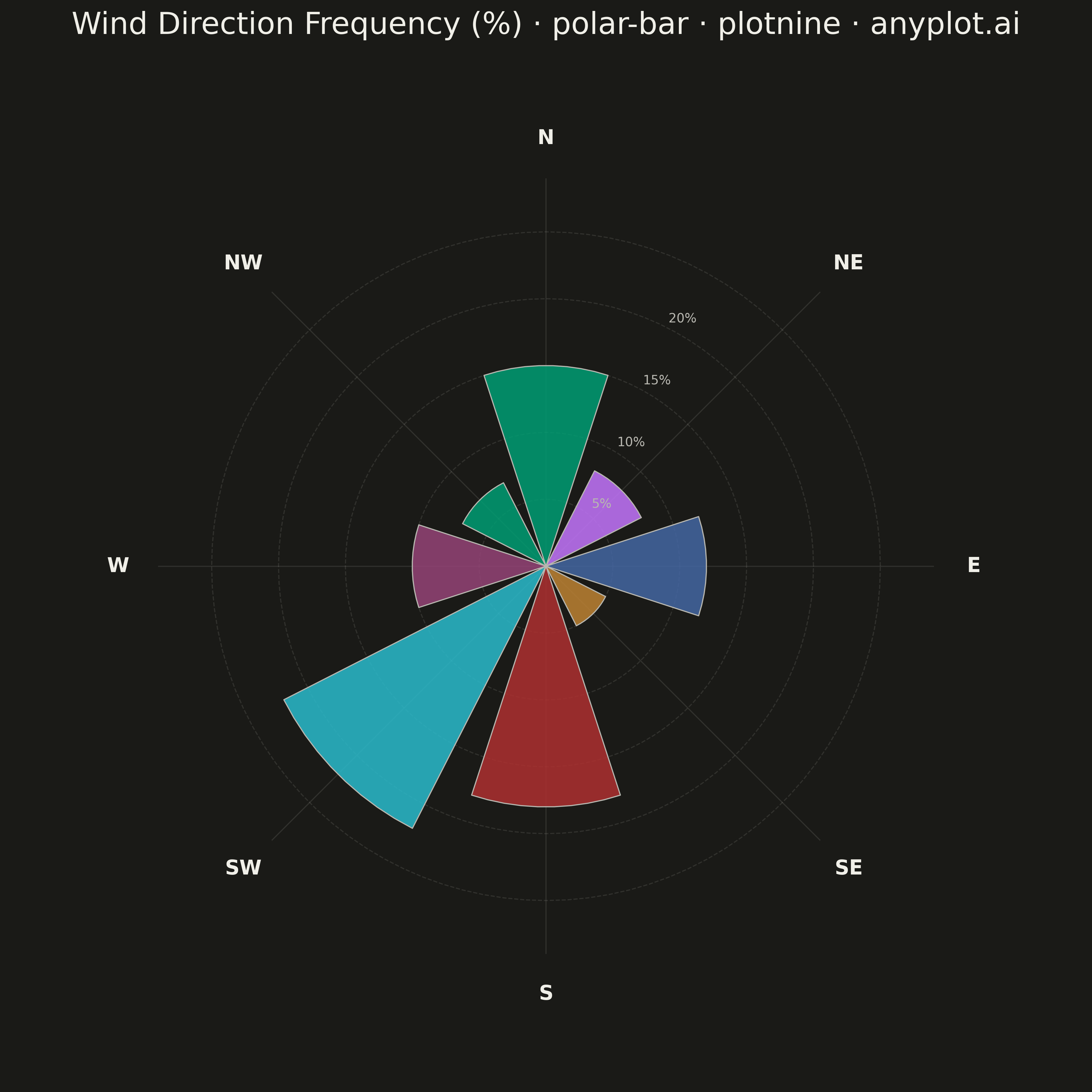
A bar chart arranged in a circle with bars radiating outward from the center. Each bar's angle represents a category (often direction) and length represents magnitude. Commonly used as a wind rose for meteorological data.
""" anyplot.ai
polar-bar: Polar Bar Chart (Wind Rose)
Library: plotnine 0.15.4 | Python 3.13.13
Quality: 90/100 | Updated: 2026-05-13
"""

import os

import numpy as np
import pandas as pd
from plotnine import (
    aes,
    coord_fixed,
    element_blank,
    element_rect,
    element_text,
    geom_path,
    geom_polygon,
    geom_segment,
    geom_text,
    ggplot,
    labs,
    scale_fill_manual,
    scale_x_continuous,
    scale_y_continuous,
    theme,
)


# Theme tokens
THEME = os.getenv("ANYPLOT_THEME", "light")
PAGE_BG = "#FAF8F1" if THEME == "light" else "#1A1A17"
INK = "#1A1A17" if THEME == "light" else "#F0EFE8"
INK_SOFT = "#4A4A44" if THEME == "light" else "#B8B7B0"

# Okabe-Ito palette
IMPRINT = ["#009E73", "#C475FD", "#4467A3", "#BD8233", "#AE3030", "#2ABCCD", "#954477"]

# Data - Wind direction frequencies (8 compass directions)
directions = ["N", "NE", "E", "SE", "S", "SW", "W", "NW"]
direction_angles = [0, 45, 90, 135, 180, 225, 270, 315]  # Degrees from North, clockwise
frequencies = [15, 8, 12, 5, 18, 22, 10, 7]

# Create polygons for each bar (wedge shape)
bar_half_width = 18  # degrees, slightly less than 22.5 for visual gap
bar_rows = []
bar_id = 0

for direction, angle, freq in zip(directions, direction_angles, frequencies, strict=True):
    start_angle = angle - bar_half_width
    end_angle = angle + bar_half_width

    # Center point
    points = [(0, 0)]

    # Arc points at the outer radius
    arc_angles = np.linspace(start_angle, end_angle, 10)
    for a in arc_angles:
        # Convert from compass (N=0, CW) to math (E=0, CCW)
        theta = np.radians(90 - a)
        x = freq * np.cos(theta)
        y = freq * np.sin(theta)
        points.append((x, y))

    # Close back to center
    points.append((0, 0))

    # Add all points to dataframe
    for i, (x, y) in enumerate(points):
        bar_rows.append({"x": x, "y": y, "direction": direction, "bar_id": bar_id, "order": i})

    bar_id += 1

bar_df = pd.DataFrame(bar_rows)

# Create circular gridlines (concentric circles at magnitude intervals)
grid_rows = []
grid_angles = np.linspace(0, 2 * np.pi, 101)
max_radius = max(frequencies) + 5
grid_radii = [5, 10, 15, 20, 25]

for radius in grid_radii:
    if radius <= max_radius:
        for angle in grid_angles:
            grid_rows.append({"x": radius * np.cos(angle), "y": radius * np.sin(angle), "radius": radius})

grid_df = pd.DataFrame(grid_rows)

# Create radial spokes (8 compass directions)
spoke_rows = []
for deg in direction_angles:
    angle = np.radians(90 - deg)
    spoke_rows.append(
        {"x1": 0, "y1": 0, "x2": (max_radius + 2) * np.cos(angle), "y2": (max_radius + 2) * np.sin(angle)}
    )

spoke_df = pd.DataFrame(spoke_rows)

# Create compass direction labels
label_rows = []
label_radius = max_radius + 5
for deg, lbl in zip(direction_angles, directions, strict=True):
    angle = np.radians(90 - deg)
    label_rows.append({"label": lbl, "x": label_radius * np.cos(angle), "y": label_radius * np.sin(angle)})

label_df = pd.DataFrame(label_rows)

# Create radius labels (frequency values) - positioned along NNE axis
radius_labels = []
label_angle = np.radians(90 - 22.5)  # NNE direction
for r in [5, 10, 15, 20]:
    if r <= max_radius:
        radius_labels.append({"label": f"{r}%", "x": r * np.cos(label_angle) + 1.5, "y": r * np.sin(label_angle)})

radius_label_df = pd.DataFrame(radius_labels)

# Color palette - first direction uses brand green, rest alternate through Okabe-Ito
colors = {
    "N": IMPRINT[0],
    "NE": IMPRINT[1],
    "E": IMPRINT[2],
    "SE": IMPRINT[3],
    "S": IMPRINT[4],
    "SW": IMPRINT[5],
    "W": IMPRINT[6],
    "NW": IMPRINT[0],
}

# Plot
plot = (
    ggplot()
    # Circular gridlines (frequency circles)
    + geom_path(
        aes(x="x", y="y", group="radius"), data=grid_df, color=INK_SOFT, size=0.5, alpha=0.15, linetype="dashed"
    )
    # Radial spokes (direction lines)
    + geom_segment(aes(x="x1", y="y1", xend="x2", yend="y2"), data=spoke_df, color=INK_SOFT, size=0.5, alpha=0.15)
    # Bar wedges (wind rose bars)
    + geom_polygon(
        aes(x="x", y="y", group="bar_id", fill="direction"),
        data=bar_df,
        color=INK_SOFT,
        size=0.5,
        alpha=0.85,
        show_legend=False,
    )
    # Compass direction labels
    + geom_text(aes(x="x", y="y", label="label"), data=label_df, size=16, color=INK, fontweight="bold")
    # Frequency labels
    + geom_text(aes(x="x", y="y", label="label"), data=radius_label_df, size=10, color=INK_SOFT, ha="left")
    # Custom colors for directions
    + scale_fill_manual(values=colors)
    # Equal coordinate system for proper circles
    + coord_fixed(ratio=1)
    # Axis scaling with padding
    + scale_x_continuous(limits=(-35, 35))
    + scale_y_continuous(limits=(-35, 35))
    # Title
    + labs(title="Wind Direction Frequency (%) · polar-bar · plotnine · anyplot.ai")
    # Theme with theme-adaptive colors
    + theme(
        figure_size=(12, 12),
        plot_title=element_text(size=24, ha="center", color=INK),
        axis_title=element_blank(),
        axis_text=element_blank(),
        axis_ticks=element_blank(),
        axis_line=element_blank(),
        panel_grid_major=element_blank(),
        panel_grid_minor=element_blank(),
        panel_background=element_rect(fill=PAGE_BG, color=PAGE_BG),
        plot_background=element_rect(fill=PAGE_BG, color=PAGE_BG),
    )
)

# Save
plot.save(f"plot-{THEME}.png", dpi=300, verbose=False)
Runnable source as JSON, for any HTTP client: https://api.anyplot.ai/specs/polar-bar/plotnine/code. Any spec id and library id listed in llms-full.txt fit the same URL shape; every URL below is complete and callable.
{
  "spec_id": "polar-bar",
  "language": "python",
  "library": "plotnine",
  "page": "https://anyplot.ai/polar-bar/python/plotnine",
  "hub": "https://anyplot.ai/polar-bar",
  "code_json": "https://api.anyplot.ai/specs/polar-bar/plotnine/code",
  "spec_json": "https://api.anyplot.ai/specs/polar-bar",
  "render_light_png": "https://storage.googleapis.com/anyplot-images/plots/polar-bar/python/plotnine/plot-light.png",
  "render_dark_png": "https://storage.googleapis.com/anyplot-images/plots/polar-bar/python/plotnine/plot-dark.png",
  "quality_score": 90.0,
  "license": "MIT",
  "guide": "https://anyplot.ai/llms.txt"
}
Part of Polar Bar Chart (Wind Rose) on anyplot.ai.