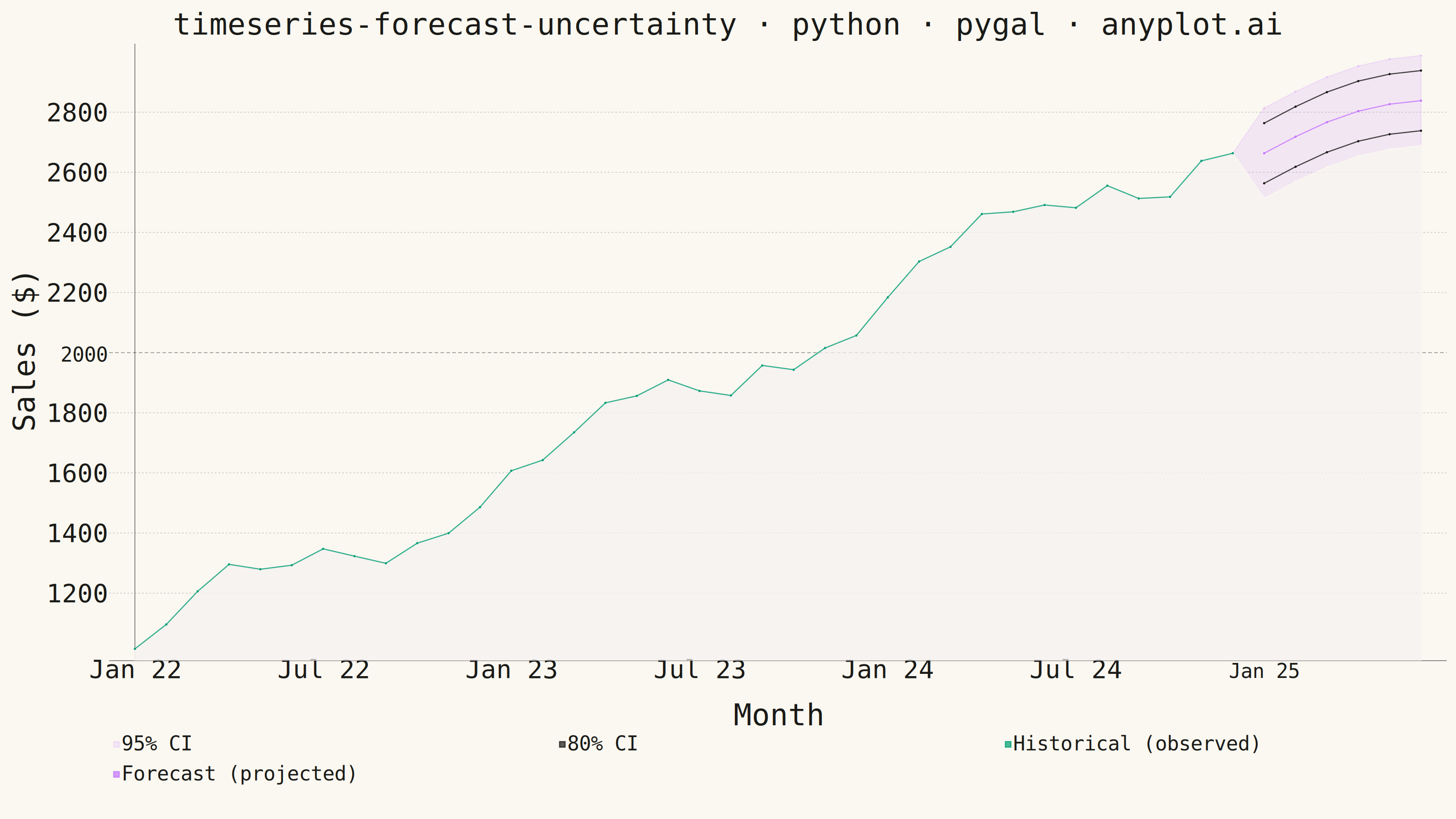
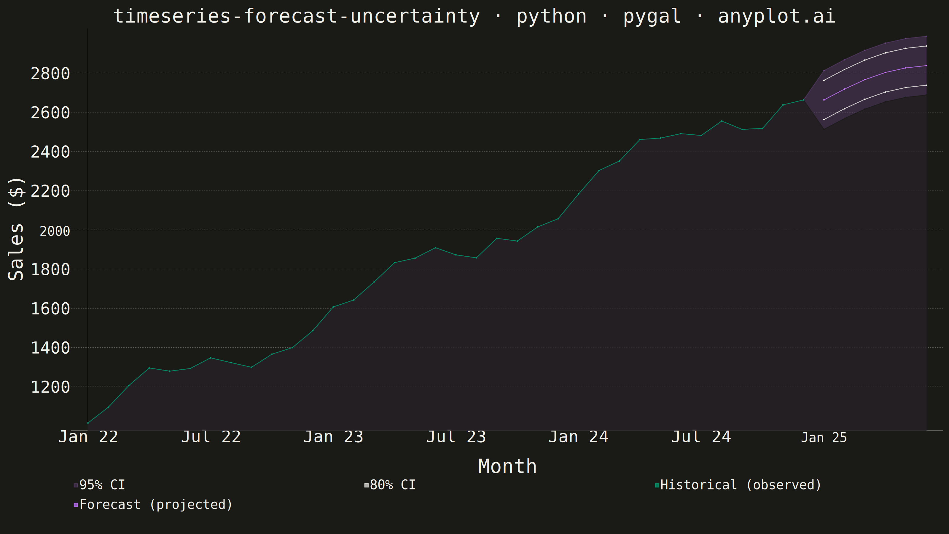
The same plot in 14 other libraries — Python: Altair, Bokeh, lets-plot, Matplotlib, Plotly, plotnine, Seaborn; R: ggplot2; Julia: Makie.jl; JavaScript: Chart.js, D3.js, Apache ECharts, Highcharts, MUI X Charts. Compare all 15 side by side: Time Series Forecast with Uncertainty Band in Python, R, Julia and JavaScript.
A time series plot that displays historical observed data followed by a forecast projection with confidence intervals or uncertainty bands. The plot clearly distinguishes between the historical period and the forecast period using a vertical line marker, with shaded bands representing different confidence levels (typically 80% and 95%). This visualization is essential for communicating prediction uncertainty in forecasting applications, helping stakeholders understand both the expected values and the range of possible outcomes.
""" anyplot.ai
timeseries-forecast-uncertainty: Time Series Forecast with Uncertainty Band
Library: pygal 3.1.0 | Python 3.13.13
Quality: 86/100 | Updated: 2026-05-19
"""

import os
import sys
sys.path[:] = [p for p in sys.path if p not in ("", ".", os.path.dirname(__file__))]

import cairosvg
import numpy as np
import pandas as pd
import pygal
from pygal.style import Style


THEME = os.getenv("ANYPLOT_THEME", "light")
PAGE_BG = "#FAF8F1" if THEME == "light" else "#1A1A17"
INK = "#1A1A17" if THEME == "light" else "#F0EFE8"
INK_MUTED = "#6B6A63" if THEME == "light" else "#A8A79F"

BRAND = "#009E73"
FORECAST_COLOR = "#C475FD"

np.random.seed(42)
months = 42
dates = pd.date_range("2022-01-01", periods=months, freq="MS")
split_idx = 36

t = np.arange(split_idx)
base = 1000 + 50 * t + 100 * np.sin(2 * np.pi * t / 12)
noise = np.random.normal(0, 30, split_idx)
actual = base + noise

t_forecast = np.arange(split_idx, months)
forecast_base = actual[-1] + 30 * (t_forecast - split_idx)
forecast_values = forecast_base + 50 * np.sin(2 * np.pi * t_forecast / 12)

upper_95 = forecast_values + 150
lower_95 = forecast_values - 150
upper_80 = forecast_values + 100
lower_80 = forecast_values - 100

x_labels = [d.strftime("%b %y") for d in dates]

CI_ALPHA = "0.25" if THEME == "dark" else "0.20"
CI_95_FILL = f"rgba(196, 117, 253, {CI_ALPHA})"

# Series order is driven by the background-erase CI technique: upper_95 fill
# (orange) then lower_95 fill (PAGE_BG) produces the CI band; BRAND historical
# line must be drawn last (on top) so the erase fill doesn't cover it.
custom_style = Style(
    background=PAGE_BG,
    plot_background=PAGE_BG,
    foreground=INK,
    foreground_strong=INK,
    foreground_subtle=INK_MUTED,
    colors=(CI_95_FILL, PAGE_BG, INK, INK, BRAND, FORECAST_COLOR),
    title_font_size=66,
    label_font_size=56,
    major_label_font_size=44,
    legend_font_size=44,
    value_font_size=36,
    stroke_width=2.5,
)

chart = pygal.Line(
    width=3200,
    height=1800,
    style=custom_style,
    show_x_guides=False,
    show_y_guides=True,
    show_legend=True,
    legend_at_bottom=True,
    dots_size=2,
    print_values=False,
    # pygal auto-calculates truncation from chart_width / len(x_labels) / font_size;
    # with 42 data points this resolves to 1 char → every label collapses to "…".
    truncate_label=-1,
)

chart.title = "timeseries-forecast-uncertainty · python · pygal · anyplot.ai"
chart.x_title = "Month"
chart.y_title = "Sales ($)"

# Sparse labels: show every 6th month; x_labels_major marks Jan 25 as the
# forecast boundary with a prominent guide line.
sparse_labels = [x_labels[i] if i % 6 == 0 else "" for i in range(len(x_labels))]
chart.x_labels = sparse_labels
chart.x_labels_major = ["Jan 25"]

# Background-erase: CI series carry actual values in the history region so the
# erase fill covers exactly the same area as the orange fill → no net band there.
upper_95_full = list(actual) + list(upper_95)
lower_95_full = list(actual) + list(lower_95)

chart.add("95% CI", upper_95_full, fill=True, show_legend=True, stroke_dasharray=(0,))
chart.add(None, lower_95_full, fill=True, show_legend=False, stroke_dasharray=(0,))
chart.add("80% CI", [None] * split_idx + list(upper_80), fill=False, show_legend=True, stroke_dasharray=(4, 4))
chart.add(None, [None] * split_idx + list(lower_80), fill=False, show_legend=False, stroke_dasharray=(4, 4))
chart.add("Historical (observed)", list(actual) + [None] * (months - split_idx), fill=False, stroke_dasharray=(0,))
chart.add("Forecast (projected)", [None] * split_idx + list(forecast_values), fill=False, stroke_dasharray=(5, 5))

# pygal hardcodes stroke:black for guide lines — invisible on dark backgrounds.
svg_bytes = chart.render()
svg_str = svg_bytes.decode("utf-8")
svg_str = svg_str.replace(
    "stroke-dasharray:4,4;stroke:black}", f"stroke-dasharray:4,4;stroke:{INK_MUTED};stroke-opacity:0.5}}"
)
svg_str = svg_str.replace("stroke-dasharray:6,6;stroke:black}", f"stroke-dasharray:8,5;stroke:{INK};stroke-width:1.5}}")

cairosvg.svg2png(bytestring=svg_str.encode(), write_to=f"plot-{THEME}.png")
with open(f"plot-{THEME}.html", "w") as f:
    f.write(svg_str)
Runnable source as JSON, for any HTTP client: https://api.anyplot.ai/specs/timeseries-forecast-uncertainty/pygal/code. Any spec id and library id listed in llms-full.txt fit the same URL shape; every URL below is complete and callable.
{
  "spec_id": "timeseries-forecast-uncertainty",
  "language": "python",
  "library": "pygal",
  "page": "https://anyplot.ai/timeseries-forecast-uncertainty/python/pygal",
  "hub": "https://anyplot.ai/timeseries-forecast-uncertainty",
  "code_json": "https://api.anyplot.ai/specs/timeseries-forecast-uncertainty/pygal/code",
  "spec_json": "https://api.anyplot.ai/specs/timeseries-forecast-uncertainty",
  "render_light_png": "https://storage.googleapis.com/anyplot-images/plots/timeseries-forecast-uncertainty/python/pygal/plot-light.png",
  "render_dark_png": "https://storage.googleapis.com/anyplot-images/plots/timeseries-forecast-uncertainty/python/pygal/plot-dark.png",
  "interactive_light_html": "https://storage.googleapis.com/anyplot-images/plots/timeseries-forecast-uncertainty/python/pygal/plot-light.html",
  "interactive_dark_html": "https://storage.googleapis.com/anyplot-images/plots/timeseries-forecast-uncertainty/python/pygal/plot-dark.html",
  "quality_score": 86.0,
  "license": "MIT",
  "guide": "https://anyplot.ai/llms.txt"
}
Part of Time Series Forecast with Uncertainty Band on anyplot.ai.