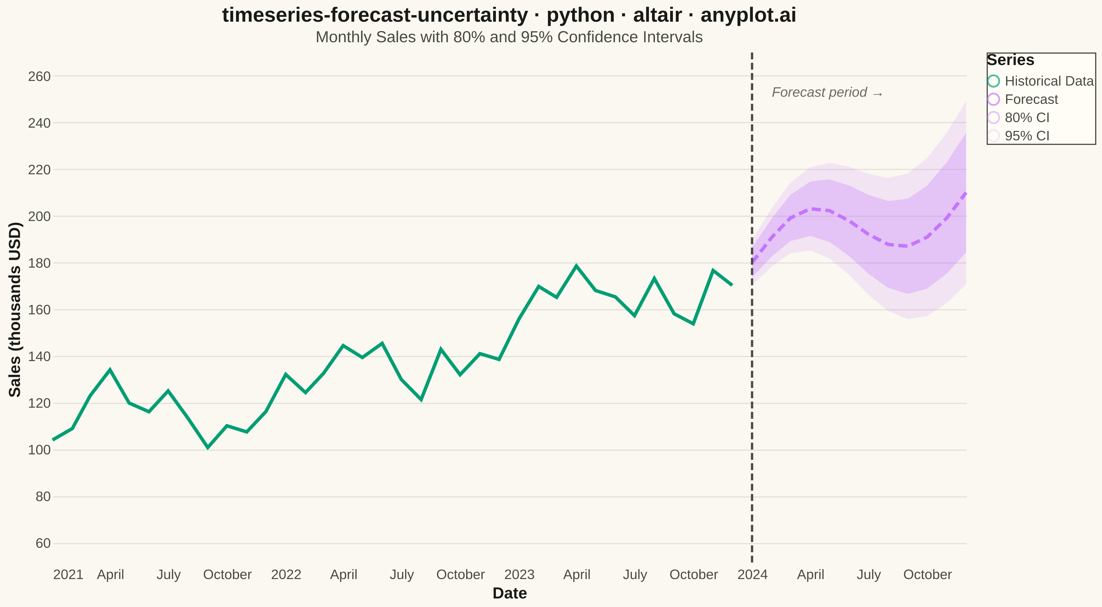
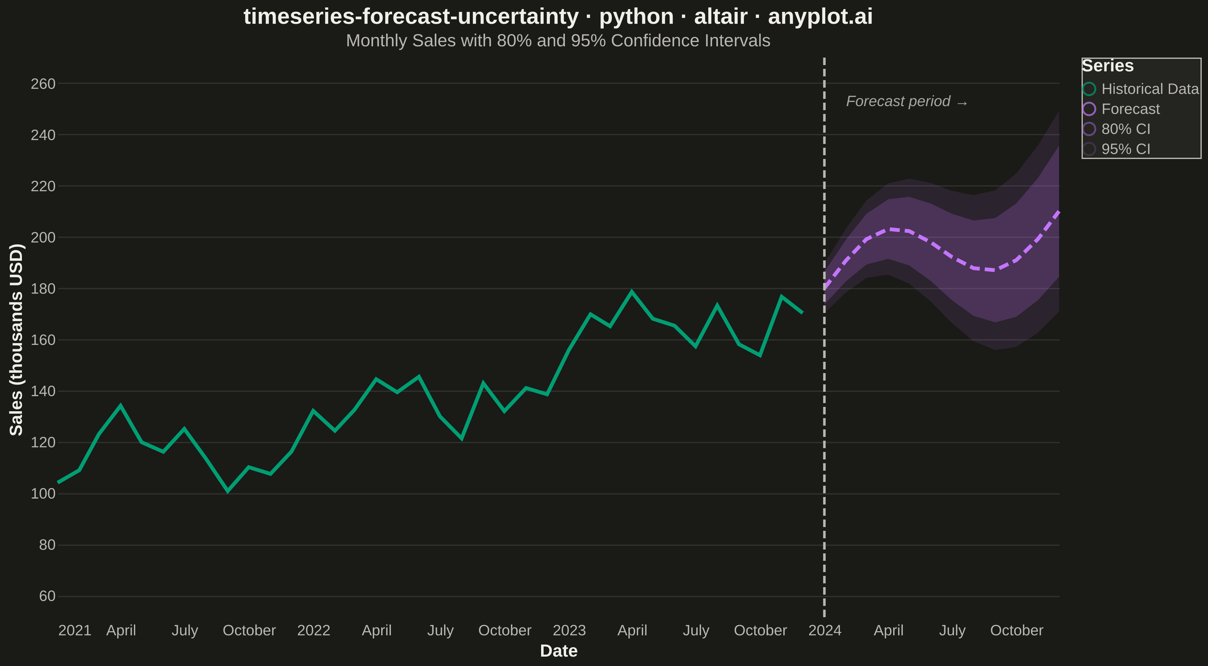
A time series plot that displays historical observed data followed by a forecast projection with confidence intervals or uncertainty bands. The plot clearly distinguishes between the historical period and the forecast period using a vertical line marker, with shaded bands representing different confidence levels (typically 80% and 95%). This visualization is essential for communicating prediction uncertainty in forecasting applications, helping stakeholders understand both the expected values and the range of possible outcomes.
""" anyplot.ai
timeseries-forecast-uncertainty: Time Series Forecast with Uncertainty Band
Library: altair 6.1.0 | Python 3.13.13
Quality: 91/100 | Updated: 2026-05-19
"""

import os

import altair as alt
import numpy as np
import pandas as pd


# Theme tokens
THEME = os.getenv("ANYPLOT_THEME", "light")
PAGE_BG = "#FAF8F1" if THEME == "light" else "#1A1A17"
ELEVATED_BG = "#FFFDF6" if THEME == "light" else "#242420"
INK = "#1A1A17" if THEME == "light" else "#F0EFE8"
INK_SOFT = "#4A4A44" if THEME == "light" else "#B8B7B0"
INK_MUTED = "#6B6A63" if THEME == "light" else "#A8A79F"

# Okabe-Ito palette
BRAND = "#009E73"  # First series - historical data
FORECAST_COLOR = "#C475FD"  # Second series - forecast

# Theme-adjusted CI band opacity — orange appears more saturated on dark backgrounds
# so we reduce opacity in dark mode to keep visual weight consistent across themes
BAND_80_OPACITY = 0.30 if THEME == "light" else 0.20
BAND_95_OPACITY = 0.15 if THEME == "light" else 0.10

# Data — Monthly sales with 36 months history + 12 months forecast
np.random.seed(42)

historical_dates = pd.date_range("2021-01-01", periods=36, freq="MS")
trend = np.linspace(100, 180, 36)
seasonal = 15 * np.sin(np.linspace(0, 6 * np.pi, 36))
noise = np.random.normal(0, 8, 36)
historical_values = trend + seasonal + noise

forecast_dates = pd.date_range("2024-01-01", periods=12, freq="MS")
forecast_trend = np.linspace(180, 210, 12)
forecast_seasonal = 15 * np.sin(np.linspace(6 * np.pi, 8 * np.pi, 12))
forecast_values = forecast_trend + forecast_seasonal

forecast_std = np.linspace(5, 20, 12)
lower_80 = forecast_values - 1.28 * forecast_std
upper_80 = forecast_values + 1.28 * forecast_std
lower_95 = forecast_values - 1.96 * forecast_std
upper_95 = forecast_values + 1.96 * forecast_std

historical_df = pd.DataFrame({"date": historical_dates, "actual": historical_values})
forecast_df = pd.DataFrame(
    {
        "date": forecast_dates,
        "forecast": forecast_values,
        "lower_80": lower_80,
        "upper_80": upper_80,
        "lower_95": lower_95,
        "upper_95": upper_95,
    }
)

y_scale = alt.Scale(domain=[50, 270])

# 95% CI band (lighter, drawn first so 80% renders on top)
band_95 = (
    alt.Chart(forecast_df)
    .mark_area(opacity=BAND_95_OPACITY)
    .encode(
        x=alt.X("date:T"),
        y=alt.Y("lower_95:Q", scale=y_scale),
        y2=alt.Y2("upper_95:Q"),
        color=alt.value(FORECAST_COLOR),
    )
)

# 80% CI band (darker, rendered on top of 95%)
band_80 = (
    alt.Chart(forecast_df)
    .mark_area(opacity=BAND_80_OPACITY)
    .encode(
        x=alt.X("date:T"),
        y=alt.Y("lower_80:Q", scale=y_scale),
        y2=alt.Y2("upper_80:Q"),
        color=alt.value(FORECAST_COLOR),
    )
)

# Historical line (solid) — invisible overlay points enable HTML tooltips
historical_line = (
    alt.Chart(historical_df)
    .mark_line(strokeWidth=3, point=alt.OverlayMarkDef(size=50, opacity=0))
    .encode(
        x=alt.X("date:T", title="Date"),
        y=alt.Y("actual:Q", title="Sales (thousands USD)", scale=y_scale),
        color=alt.value(BRAND),
        tooltip=[
            alt.Tooltip("date:T", title="Date", format="%b %Y"),
            alt.Tooltip("actual:Q", title="Sales (K USD)", format=".1f"),
        ],
    )
)

# Forecast line (dashed) — tooltip surfaces CI bounds for context
forecast_line = (
    alt.Chart(forecast_df)
    .mark_line(strokeWidth=3, strokeDash=[8, 4], point=alt.OverlayMarkDef(size=50, opacity=0))
    .encode(
        x=alt.X("date:T"),
        y=alt.Y("forecast:Q", scale=y_scale),
        color=alt.value(FORECAST_COLOR),
        tooltip=[
            alt.Tooltip("date:T", title="Date", format="%b %Y"),
            alt.Tooltip("forecast:Q", title="Forecast (K USD)", format=".1f"),
            alt.Tooltip("lower_80:Q", title="80% CI low", format=".1f"),
            alt.Tooltip("upper_80:Q", title="80% CI high", format=".1f"),
        ],
    )
)

# Vertical rule marking forecast start
forecast_start_df = pd.DataFrame({"date": [pd.Timestamp("2024-01-01")]})
vertical_rule = (
    alt.Chart(forecast_start_df).mark_rule(strokeWidth=2, strokeDash=[6, 3], color=INK_SOFT).encode(x="date:T")
)

# Annotation labelling the forecast region — placed above the CI bands
annotation_df = pd.DataFrame({"date": [pd.Timestamp("2024-02-01")], "y": [253], "label": ["Forecast period →"]})
forecast_annotation = (
    alt.Chart(annotation_df)
    .mark_text(align="left", fontSize=12, fontStyle="italic")
    .encode(x=alt.X("date:T"), y=alt.Y("y:Q", scale=y_scale), text="label:N", color=alt.value(INK_MUTED))
)

# Legend via invisible size-0 points — Altair-idiomatic approach for fixed-color layers
legend_df = pd.DataFrame(
    {
        "date": [historical_dates[0], forecast_dates[0], forecast_dates[0], forecast_dates[0]],
        "value": [0, 0, 0, 0],
        "type": ["Historical Data", "Forecast", "80% CI", "95% CI"],
    }
)
legend_chart = (
    alt.Chart(legend_df)
    .mark_point(size=0)
    .encode(
        color=alt.Color(
            "type:N",
            scale=alt.Scale(
                domain=["Historical Data", "Forecast", "80% CI", "95% CI"],
                range=[BRAND, FORECAST_COLOR, "rgba(196, 117, 253, 0.60)", "rgba(196, 117, 253, 0.25)"],
            ),
            legend=alt.Legend(title="Series", orient="right", titleFontSize=14, labelFontSize=12),
        )
    )
)

# Combine all layers
chart = (
    alt.layer(band_95, band_80, historical_line, forecast_line, vertical_rule, forecast_annotation, legend_chart)
    .properties(
        width=800,
        height=450,
        background=PAGE_BG,
        title=alt.Title(
            "timeseries-forecast-uncertainty · python · altair · anyplot.ai",
            fontSize=18,
            anchor="middle",
            color=INK,
            subtitle="Monthly Sales with 80% and 95% Confidence Intervals",
            subtitleFontSize=14,
            subtitleColor=INK_SOFT,
        ),
    )
    .configure_axis(
        labelFontSize=12,
        titleFontSize=14,
        labelColor=INK_SOFT,
        titleColor=INK,
        domain=False,
        tickSize=0,
        gridColor=INK,
        gridOpacity=0.10,
    )
    .configure_axisX(grid=False)
    .configure_view(fill=PAGE_BG, strokeWidth=0)
    .configure_legend(
        titleFontSize=14,
        labelFontSize=12,
        fillColor=ELEVATED_BG,
        strokeColor=INK_SOFT,
        labelColor=INK_SOFT,
        titleColor=INK,
    )
)

# Save outputs
chart.save(f"plot-{THEME}.png", scale_factor=4.0)
chart.save(f"plot-{THEME}.html")
Runnable source as JSON, for any HTTP client: https://api.anyplot.ai/specs/timeseries-forecast-uncertainty/altair/code. Any spec id and library id listed in llms-full.txt fit the same URL shape; every URL below is complete and callable.
{
  "spec_id": "timeseries-forecast-uncertainty",
  "language": "python",
  "library": "altair",
  "page": "https://anyplot.ai/timeseries-forecast-uncertainty/python/altair",
  "hub": "https://anyplot.ai/timeseries-forecast-uncertainty",
  "code_json": "https://api.anyplot.ai/specs/timeseries-forecast-uncertainty/altair/code",
  "spec_json": "https://api.anyplot.ai/specs/timeseries-forecast-uncertainty",
  "render_light_png": "https://storage.googleapis.com/anyplot-images/plots/timeseries-forecast-uncertainty/python/altair/plot-light.png",
  "render_dark_png": "https://storage.googleapis.com/anyplot-images/plots/timeseries-forecast-uncertainty/python/altair/plot-dark.png",
  "interactive_light_html": "https://storage.googleapis.com/anyplot-images/plots/timeseries-forecast-uncertainty/python/altair/plot-light.html",
  "interactive_dark_html": "https://storage.googleapis.com/anyplot-images/plots/timeseries-forecast-uncertainty/python/altair/plot-dark.html",
  "quality_score": 91.0,
  "license": "MIT",
  "guide": "https://anyplot.ai/llms.txt"
}
Part of Time Series Forecast with Uncertainty Band on anyplot.ai.