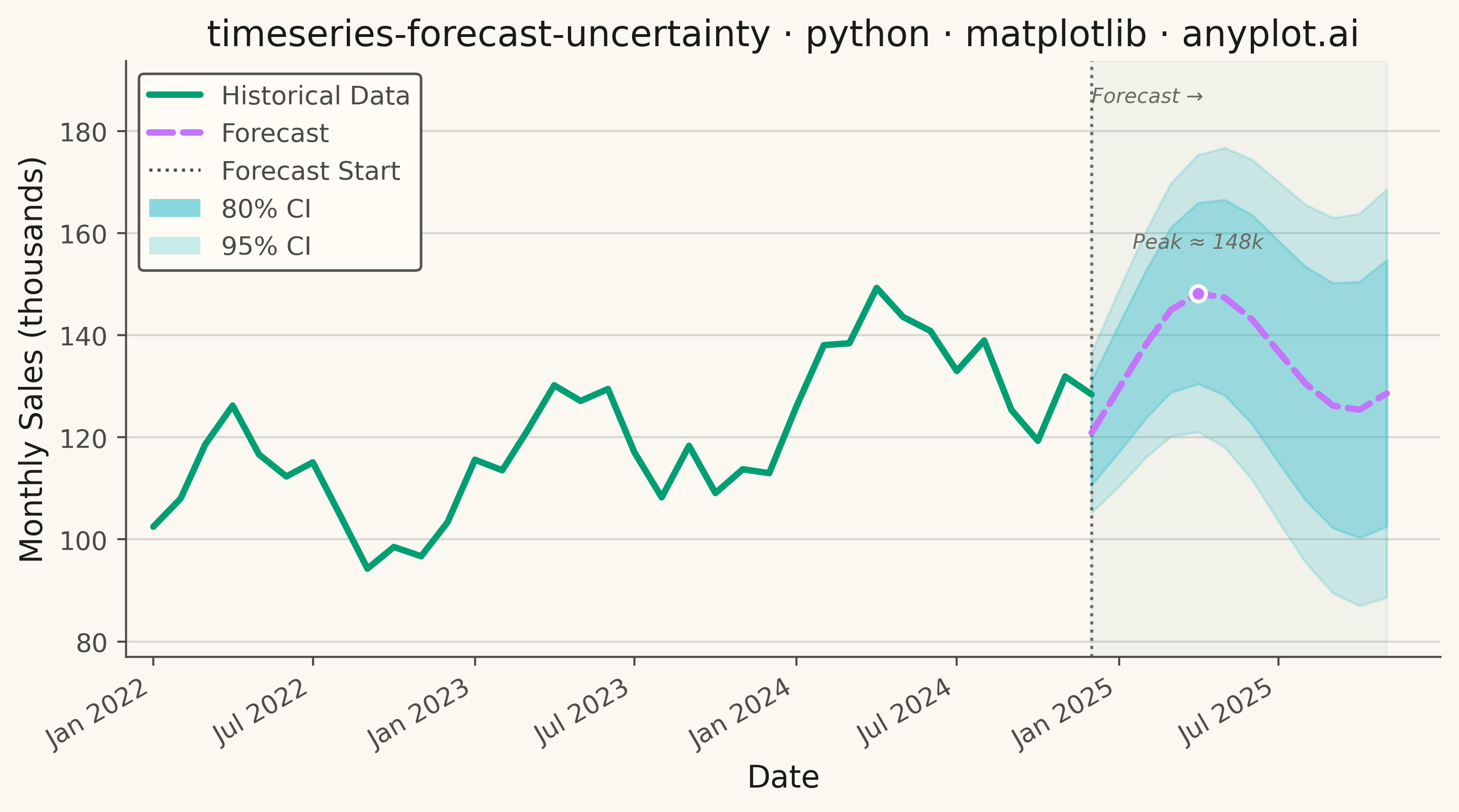
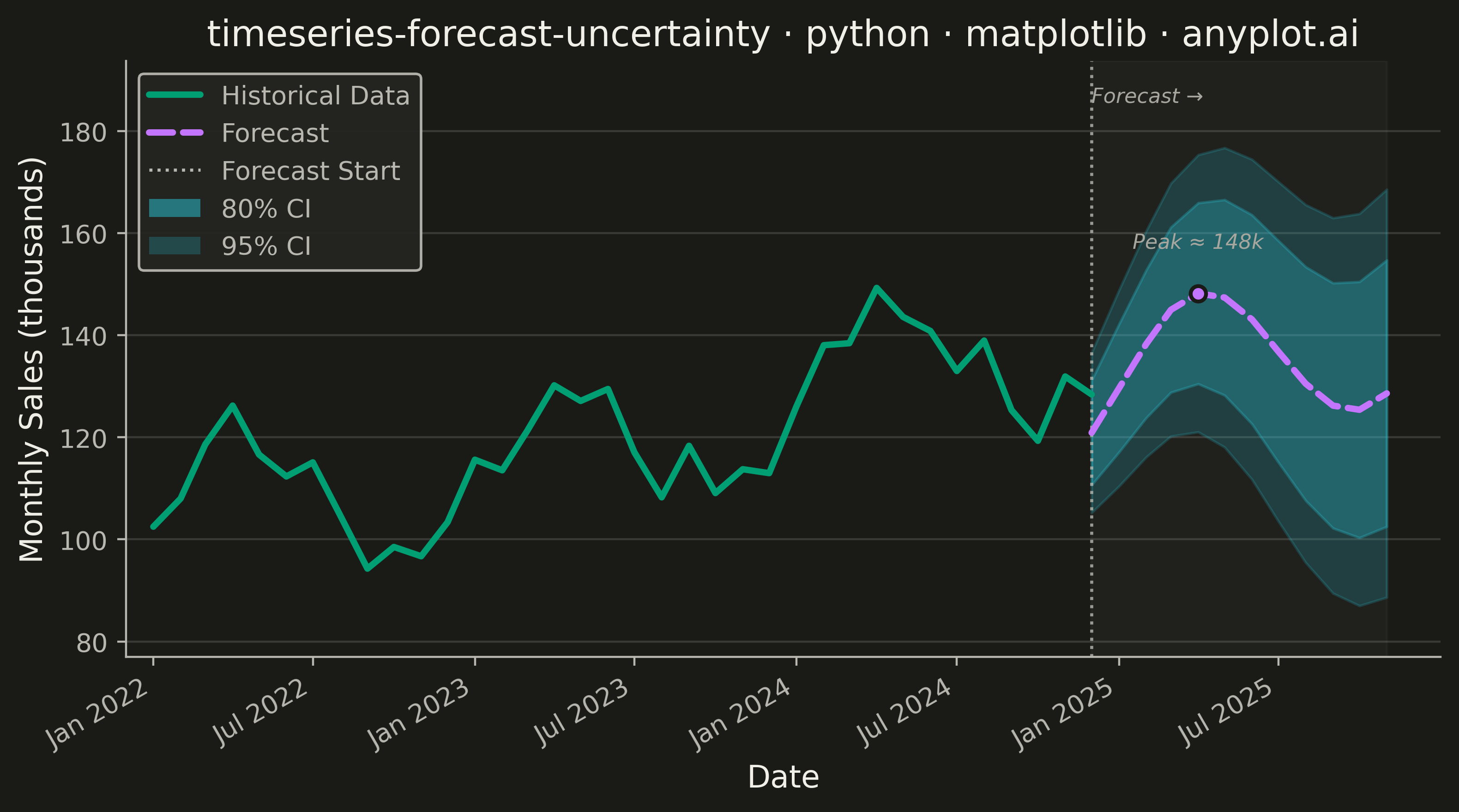
A time series plot that displays historical observed data followed by a forecast projection with confidence intervals or uncertainty bands. The plot clearly distinguishes between the historical period and the forecast period using a vertical line marker, with shaded bands representing different confidence levels (typically 80% and 95%). This visualization is essential for communicating prediction uncertainty in forecasting applications, helping stakeholders understand both the expected values and the range of possible outcomes.
""" anyplot.ai
timeseries-forecast-uncertainty: Time Series Forecast with Uncertainty Band
Library: matplotlib 3.10.9 | Python 3.13.13
Quality: 91/100 | Updated: 2026-05-19
"""

import os

import matplotlib.pyplot as plt
import numpy as np
import pandas as pd
from matplotlib.patches import Patch


# Theme tokens
THEME = os.getenv("ANYPLOT_THEME", "light")
PAGE_BG = "#FAF8F1" if THEME == "light" else "#1A1A17"
ELEVATED_BG = "#FFFDF6" if THEME == "light" else "#242420"
INK = "#1A1A17" if THEME == "light" else "#F0EFE8"
INK_SOFT = "#4A4A44" if THEME == "light" else "#B8B7B0"
INK_MUTED = "#6B6A63" if THEME == "light" else "#A8A79F"

# Okabe-Ito — pos 1 (historical), pos 2 (forecast), pos 6 (CI bands)
HISTORICAL_COLOR = "#009E73"
FORECAST_COLOR = "#C475FD"
CI_COLOR = "#2ABCCD"

# Data — monthly retail sales, 3-year history + 12-month ARIMA-style forecast
np.random.seed(42)
n_historical = 36
n_forecast = 12
overlap = 1
n_total = n_historical + n_forecast - overlap

dates = pd.date_range(start="2022-01-01", periods=n_total, freq="MS")

t = np.arange(n_historical)
trend = 100 + t * 1.2
seasonality = 15 * np.sin(2 * np.pi * t / 12)
noise = np.random.normal(0, 5, n_historical)
actual = trend + seasonality + noise

forecast_start_idx = n_historical - overlap
t_forecast = np.arange(n_forecast)
forecast_trend = actual[forecast_start_idx] + t_forecast * 1.2
forecast_seasonality = 15 * np.sin(2 * np.pi * (t[-1] - overlap + 1 + t_forecast) / 12)
forecast_values = forecast_trend + forecast_seasonality

uncertainty_growth = np.sqrt(1 + t_forecast * 0.5)
base_std = 8
lower_80 = forecast_values - 1.28 * base_std * uncertainty_growth
upper_80 = forecast_values + 1.28 * base_std * uncertainty_growth
lower_95 = forecast_values - 1.96 * base_std * uncertainty_growth
upper_95 = forecast_values + 1.96 * base_std * uncertainty_growth

historical_dates = dates[:n_historical]
forecast_dates = dates[forecast_start_idx:]

# Plot
fig, ax = plt.subplots(figsize=(8, 4.5), dpi=400, facecolor=PAGE_BG)
ax.set_facecolor(PAGE_BG)
ax.set_axisbelow(True)

# Subtle forecast region tint
ax.axvspan(forecast_dates[0], forecast_dates[-1], color=INK, alpha=0.03, zorder=0)

# CI bands — outer 95% first, then 80% sits on top (correct nesting)
ax.fill_between(forecast_dates, lower_95, upper_95, color=CI_COLOR, alpha=0.20, zorder=1)
ax.fill_between(forecast_dates, lower_80, upper_80, color=CI_COLOR, alpha=0.30, zorder=2)

# Historical solid line
(hist_line,) = ax.plot(
    historical_dates,
    actual,
    color=HISTORICAL_COLOR,
    linewidth=2.5,
    solid_capstyle="round",
    zorder=4,
    label="Historical Data",
)

# Forecast dashed line
(fc_line,) = ax.plot(
    forecast_dates,
    forecast_values,
    color=FORECAST_COLOR,
    linewidth=2.5,
    linestyle="--",
    solid_capstyle="round",
    dash_capstyle="round",
    zorder=4,
    label="Forecast",
)

# Forecast start vertical marker
ax.axvline(x=forecast_dates[0], color=INK_SOFT, linewidth=1.2, linestyle=":", alpha=0.8, zorder=3)

# Focal-point text label at the forecast boundary
y_max = max(actual.max(), upper_95.max()) + 12
ax.text(forecast_dates[0], y_max, "Forecast →", color=INK_MUTED, fontsize=8, va="top", ha="left", fontstyle="italic")

# Peak marker — highlights the expected peak of the forecast
peak_idx = np.argmax(forecast_values)
ax.plot(
    forecast_dates[peak_idx],
    forecast_values[peak_idx],
    "o",
    color=FORECAST_COLOR,
    markersize=6,
    zorder=6,
    markeredgecolor=PAGE_BG,
    markeredgewidth=1.5,
)

# Callout annotation at the forecast peak — surfaces the projected peak value
peak_val = forecast_values[peak_idx]
ax.annotate(
    f"Peak ≈ {peak_val:.0f}k",
    xy=(forecast_dates[peak_idx], peak_val),
    xytext=(0, 16),
    textcoords="offset points",
    color=INK_MUTED,
    fontsize=8,
    ha="center",
    va="bottom",
    fontstyle="italic",
)

# Style
ax.set_xlabel("Date", fontsize=12, color=INK)
ax.set_ylabel("Monthly Sales (thousands)", fontsize=12, color=INK)
ax.set_title(
    "timeseries-forecast-uncertainty · python · matplotlib · anyplot.ai", fontsize=14, fontweight="medium", color=INK
)
ax.tick_params(axis="both", labelsize=10, colors=INK_SOFT)

# Date axis — semi-annual major ticks
tick_dates = pd.date_range(start=dates[0], end=dates[-1], freq="6MS")
ax.set_xticks(tick_dates)
ax.set_xticklabels([d.strftime("%b %Y") for d in tick_dates], rotation=30, ha="right")

# Grid — y-axis only, very subtle
ax.yaxis.grid(True, alpha=0.15, linewidth=0.8, color=INK)

# Spines
for spine in ("top", "right"):
    ax.spines[spine].set_visible(False)
for spine in ("left", "bottom"):
    ax.spines[spine].set_color(INK_SOFT)

# Y-axis limits with room for the "Forecast →" label
y_min = min(actual.min(), lower_95.min()) - 10
ax.set_ylim(y_min, y_max + 5)

# X-axis padding: small right margin so the CI band doesn't clip at the edge
ax.set_xlim(dates[0] - pd.DateOffset(months=1), dates[-1] + pd.DateOffset(months=2))

# Legend — correct order: Historical, Forecast, Forecast Start, 80% CI, 95% CI
# Explicit Patch handles with visually distinct alphas so 80% vs 95% CI are clearly differentiable
fc_start_proxy = plt.Line2D([0], [0], color=INK_SOFT, linestyle=":", linewidth=1.2, label="Forecast Start")
ci_80_handle = Patch(facecolor=CI_COLOR, alpha=0.55, label="80% CI")
ci_95_handle = Patch(facecolor=CI_COLOR, alpha=0.25, label="95% CI")
leg = ax.legend(
    handles=[hist_line, fc_line, fc_start_proxy, ci_80_handle, ci_95_handle],
    fontsize=10,
    loc="upper left",
    framealpha=0.95,
)
if leg:
    leg.get_frame().set_facecolor(ELEVATED_BG)
    leg.get_frame().set_edgecolor(INK_SOFT)
    plt.setp(leg.get_texts(), color=INK_SOFT)

plt.tight_layout()
plt.savefig(f"plot-{THEME}.png", dpi=400, bbox_inches="tight", facecolor=PAGE_BG)
Runnable source as JSON, for any HTTP client: https://api.anyplot.ai/specs/timeseries-forecast-uncertainty/matplotlib/code. Any spec id and library id listed in llms-full.txt fit the same URL shape; every URL below is complete and callable.
{
  "spec_id": "timeseries-forecast-uncertainty",
  "language": "python",
  "library": "matplotlib",
  "page": "https://anyplot.ai/timeseries-forecast-uncertainty/python/matplotlib",
  "hub": "https://anyplot.ai/timeseries-forecast-uncertainty",
  "code_json": "https://api.anyplot.ai/specs/timeseries-forecast-uncertainty/matplotlib/code",
  "spec_json": "https://api.anyplot.ai/specs/timeseries-forecast-uncertainty",
  "render_light_png": "https://storage.googleapis.com/anyplot-images/plots/timeseries-forecast-uncertainty/python/matplotlib/plot-light.png",
  "render_dark_png": "https://storage.googleapis.com/anyplot-images/plots/timeseries-forecast-uncertainty/python/matplotlib/plot-dark.png",
  "quality_score": 91.0,
  "license": "MIT",
  "guide": "https://anyplot.ai/llms.txt"
}
Part of Time Series Forecast with Uncertainty Band on anyplot.ai.