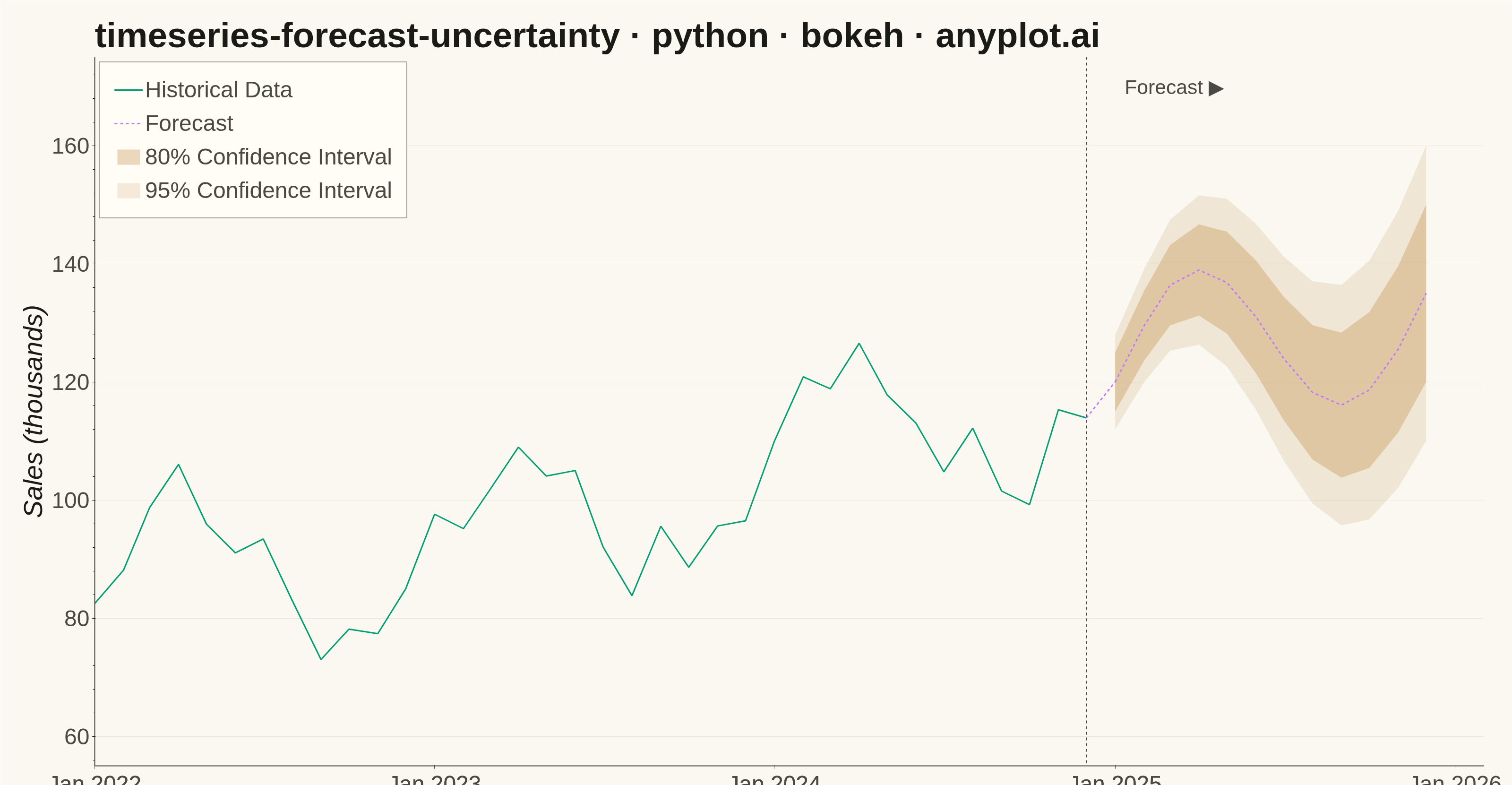
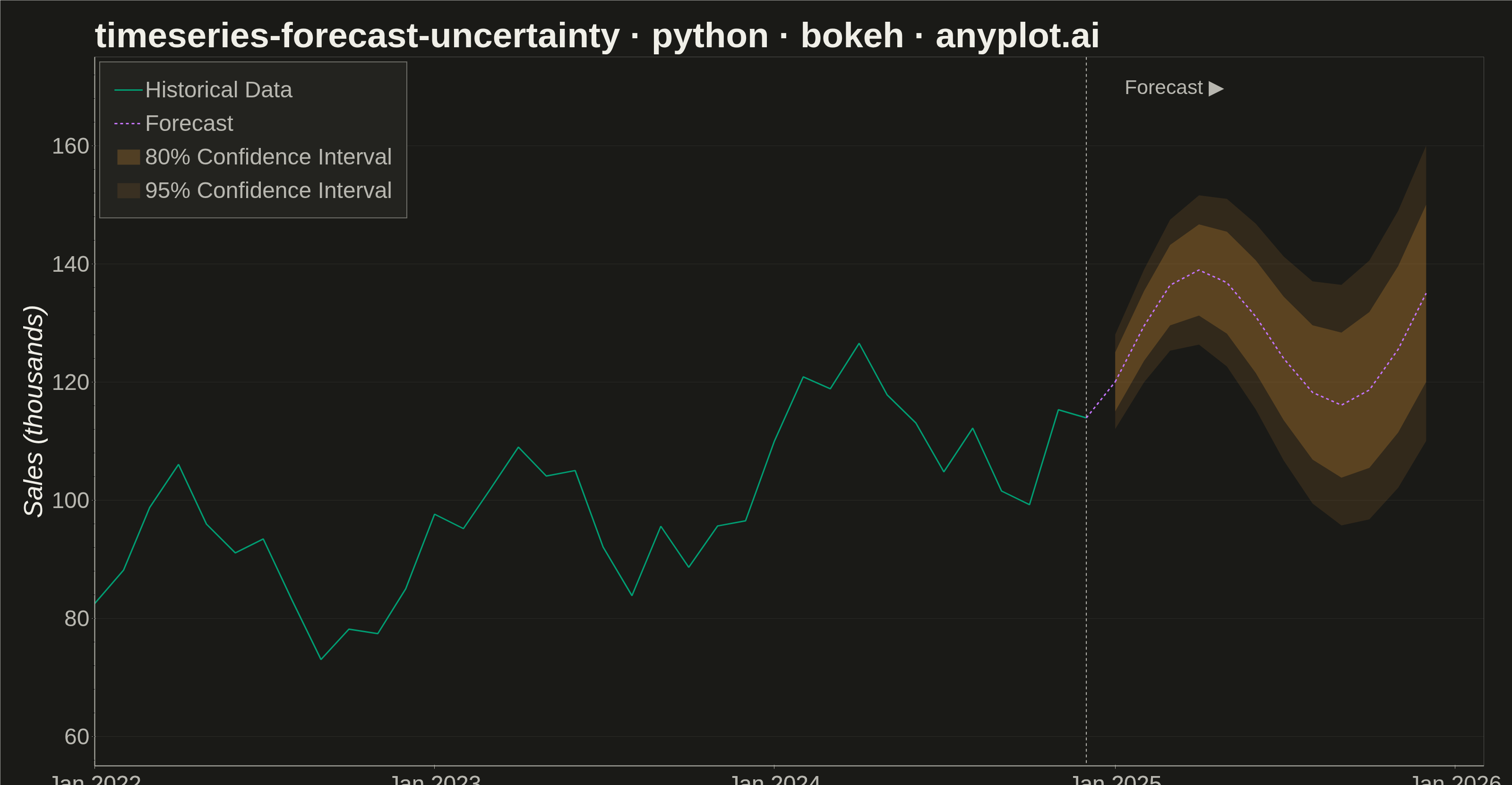
A time series plot that displays historical observed data followed by a forecast projection with confidence intervals or uncertainty bands. The plot clearly distinguishes between the historical period and the forecast period using a vertical line marker, with shaded bands representing different confidence levels (typically 80% and 95%). This visualization is essential for communicating prediction uncertainty in forecasting applications, helping stakeholders understand both the expected values and the range of possible outcomes.
""" anyplot.ai
timeseries-forecast-uncertainty: Time Series Forecast with Uncertainty Band
Library: bokeh 3.9.0 | Python 3.13.13
Quality: 90/100 | Updated: 2026-05-19
"""

import os
import time
from pathlib import Path

import numpy as np
import pandas as pd
from bokeh.io import output_file, save
from bokeh.models import ColumnDataSource, HoverTool, Label, Legend, Range1d, Span
from bokeh.plotting import figure
from selenium import webdriver
from selenium.webdriver.chrome.options import Options


# Theme tokens
THEME = os.getenv("ANYPLOT_THEME", "light")
PAGE_BG = "#FAF8F1" if THEME == "light" else "#1A1A17"
ELEVATED_BG = "#FFFDF6" if THEME == "light" else "#242420"
INK = "#1A1A17" if THEME == "light" else "#F0EFE8"
INK_SOFT = "#4A4A44" if THEME == "light" else "#B8B7B0"

OKABE_ITO_1 = "#009E73"  # Bluish green (brand)
OKABE_ITO_2 = "#C475FD"  # Vermillion
OKABE_ITO_4 = "#BD8233"  # Reddish purple

# Data - Monthly product sales with forecast
np.random.seed(42)

# Historical data: 36 months (3 years)
n_historical = 36
dates_hist = pd.date_range("2022-01-01", periods=n_historical, freq="MS")
trend = np.linspace(80, 120, n_historical)
seasonal = 15 * np.sin(np.linspace(0, 6 * np.pi, n_historical))
noise = np.random.normal(0, 5, n_historical)
actual = trend + seasonal + noise

# Forecast data: 12 months
n_forecast = 12
dates_forecast = pd.date_range(dates_hist[-1] + pd.DateOffset(months=1), periods=n_forecast, freq="MS")
trend_forecast = np.linspace(120, 135, n_forecast)
seasonal_forecast = 15 * np.sin(np.linspace(6 * np.pi, 8 * np.pi, n_forecast))
forecast = trend_forecast + seasonal_forecast

# Uncertainty grows over time
uncertainty_80 = np.linspace(5, 15, n_forecast)
uncertainty_95 = np.linspace(8, 25, n_forecast)

lower_80 = forecast - uncertainty_80
upper_80 = forecast + uncertainty_80
lower_95 = forecast - uncertainty_95
upper_95 = forecast + uncertainty_95

# X-range with right padding (2 months past last forecast date)
x_start = dates_hist[0]
x_end = dates_forecast[-1] + pd.DateOffset(months=2)
x_range = Range1d(start=x_start.timestamp() * 1000, end=x_end.timestamp() * 1000)

# Create figure
p = figure(
    width=3200,
    height=1800,
    title="timeseries-forecast-uncertainty · python · bokeh · anyplot.ai",
    x_axis_label="Date",
    y_axis_label="Sales (thousands)",
    x_axis_type="datetime",
    x_range=x_range,
    toolbar_location=None,
    min_border_bottom=180,
    min_border_left=200,
    min_border_top=120,
    min_border_right=60,
)

# Style title and axes
p.title.text_font_size = "56pt"
p.title.text_color = INK
p.xaxis.axis_label_text_font_size = "42pt"
p.yaxis.axis_label_text_font_size = "42pt"
p.xaxis.axis_label_text_color = INK
p.yaxis.axis_label_text_color = INK
p.xaxis.major_label_text_font_size = "36pt"
p.yaxis.major_label_text_font_size = "36pt"
p.xaxis.major_label_text_color = INK_SOFT
p.yaxis.major_label_text_color = INK_SOFT
p.xaxis.major_tick_line_color = INK_SOFT
p.yaxis.major_tick_line_color = INK_SOFT

# Background — outline=None removes the enclosing box (top/right spines equivalent)
p.background_fill_color = PAGE_BG
p.border_fill_color = PAGE_BG
p.outline_line_color = None

# Axis styling — keep left and bottom lines (L-shaped frame)
p.xaxis.axis_line_color = INK_SOFT
p.yaxis.axis_line_color = INK_SOFT
p.xaxis.axis_line_width = 2
p.yaxis.axis_line_width = 2

# Grid styling - subtle y-axis only
p.xgrid.grid_line_color = None
p.ygrid.grid_line_color = INK_SOFT
p.ygrid.grid_line_alpha = 0.10
p.ygrid.grid_line_width = 1

# 95% confidence band (lighter, drawn first)
source_95 = ColumnDataSource(
    data={"x": np.concatenate([dates_forecast, dates_forecast[::-1]]), "y": np.concatenate([upper_95, lower_95[::-1]])}
)
band_95 = p.patch(x="x", y="y", source=source_95, fill_color=OKABE_ITO_4, fill_alpha=0.15, line_color=None)

# 80% confidence band (darker, drawn on top)
source_80 = ColumnDataSource(
    data={"x": np.concatenate([dates_forecast, dates_forecast[::-1]]), "y": np.concatenate([upper_80, lower_80[::-1]])}
)
band_80 = p.patch(x="x", y="y", source=source_80, fill_color=OKABE_ITO_4, fill_alpha=0.30, line_color=None)

# Historical data line (solid) with hover data
source_hist = ColumnDataSource(data={"x": dates_hist, "y": actual})
hist_line = p.line(x="x", y="y", source=source_hist, line_color=OKABE_ITO_1, line_width=3)

# Forecast line (dashed) with CI data for hover tooltip
source_forecast = ColumnDataSource(
    data={
        "x": dates_forecast,
        "y": forecast,
        "lower_80": lower_80,
        "upper_80": upper_80,
        "lower_95": lower_95,
        "upper_95": upper_95,
    }
)
forecast_line = p.line(x="x", y="y", source=source_forecast, line_color=OKABE_ITO_2, line_width=3, line_dash="dashed")

# Connection line from last historical point to first forecast point
source_connect = ColumnDataSource(data={"x": [dates_hist[-1], dates_forecast[0]], "y": [actual[-1], forecast[0]]})
p.line(x="x", y="y", source=source_connect, line_color=OKABE_ITO_2, line_width=3, line_dash="dashed")

# Vertical line at forecast start
forecast_start = Span(
    location=dates_hist[-1], dimension="height", line_color=INK_SOFT, line_width=2, line_dash="dashed"
)
p.add_layout(forecast_start)

# Annotation labelling the forecast region
forecast_label = Label(
    x=dates_forecast[0].timestamp() * 1000,
    y=168,
    x_units="data",
    y_units="data",
    text="Forecast ▶",
    text_color=INK_SOFT,
    text_font_size="32pt",
    x_offset=20,
)
p.add_layout(forecast_label)

# HoverTool for historical data
hover_hist = HoverTool(
    renderers=[hist_line],
    tooltips=[("Date", "@x{%b %Y}"), ("Sales", "@y{0.0}k")],
    formatters={"@x": "datetime"},
    mode="vline",
)
p.add_tools(hover_hist)

# HoverTool for forecast with confidence intervals
hover_forecast = HoverTool(
    renderers=[forecast_line],
    tooltips=[
        ("Date", "@x{%b %Y}"),
        ("Forecast", "@y{0.0}k"),
        ("80% CI", "[@lower_80{0.0}, @upper_80{0.0}]k"),
        ("95% CI", "[@lower_95{0.0}, @upper_95{0.0}]k"),
    ],
    formatters={"@x": "datetime"},
    mode="vline",
)
p.add_tools(hover_forecast)

# Legend
legend = Legend(
    items=[
        ("Historical Data", [hist_line]),
        ("Forecast", [forecast_line]),
        ("80% Confidence Interval", [band_80]),
        ("95% Confidence Interval", [band_95]),
    ],
    location="top_left",
)

legend.label_text_font_size = "36pt"
legend.label_text_color = INK_SOFT
legend.background_fill_color = ELEVATED_BG
legend.background_fill_alpha = 0.95
legend.border_line_color = INK_SOFT
legend.border_line_width = 2
legend.padding = 30
legend.spacing = 16
legend.glyph_width = 60
legend.glyph_height = 40
p.add_layout(legend)

# Set y-axis range with room for confidence bands and annotation
p.y_range.start = 55
p.y_range.end = 175

# Save HTML
output_file(f"plot-{THEME}.html")
save(p)

# Screenshot with headless Chrome
W, H = 3200, 1800
opts = Options()
for arg in (
    "--headless=new",
    "--no-sandbox",
    "--disable-dev-shm-usage",
    "--disable-gpu",
    f"--window-size={W},{H}",
    "--hide-scrollbars",
):
    opts.add_argument(arg)
driver = webdriver.Chrome(options=opts)
driver.set_window_size(W, H)
driver.get(f"file://{Path(f'plot-{THEME}.html').resolve()}")
time.sleep(3)
driver.save_screenshot(f"plot-{THEME}.png")
driver.quit()
Runnable source as JSON, for any HTTP client: https://api.anyplot.ai/specs/timeseries-forecast-uncertainty/bokeh/code. Any spec id and library id listed in llms-full.txt fit the same URL shape; every URL below is complete and callable.
{
  "spec_id": "timeseries-forecast-uncertainty",
  "language": "python",
  "library": "bokeh",
  "page": "https://anyplot.ai/timeseries-forecast-uncertainty/python/bokeh",
  "hub": "https://anyplot.ai/timeseries-forecast-uncertainty",
  "code_json": "https://api.anyplot.ai/specs/timeseries-forecast-uncertainty/bokeh/code",
  "spec_json": "https://api.anyplot.ai/specs/timeseries-forecast-uncertainty",
  "render_light_png": "https://storage.googleapis.com/anyplot-images/plots/timeseries-forecast-uncertainty/python/bokeh/plot-light.png",
  "render_dark_png": "https://storage.googleapis.com/anyplot-images/plots/timeseries-forecast-uncertainty/python/bokeh/plot-dark.png",
  "interactive_light_html": "https://storage.googleapis.com/anyplot-images/plots/timeseries-forecast-uncertainty/python/bokeh/plot-light.html",
  "interactive_dark_html": "https://storage.googleapis.com/anyplot-images/plots/timeseries-forecast-uncertainty/python/bokeh/plot-dark.html",
  "quality_score": 90.0,
  "license": "MIT",
  "guide": "https://anyplot.ai/llms.txt"
}
Part of Time Series Forecast with Uncertainty Band on anyplot.ai.