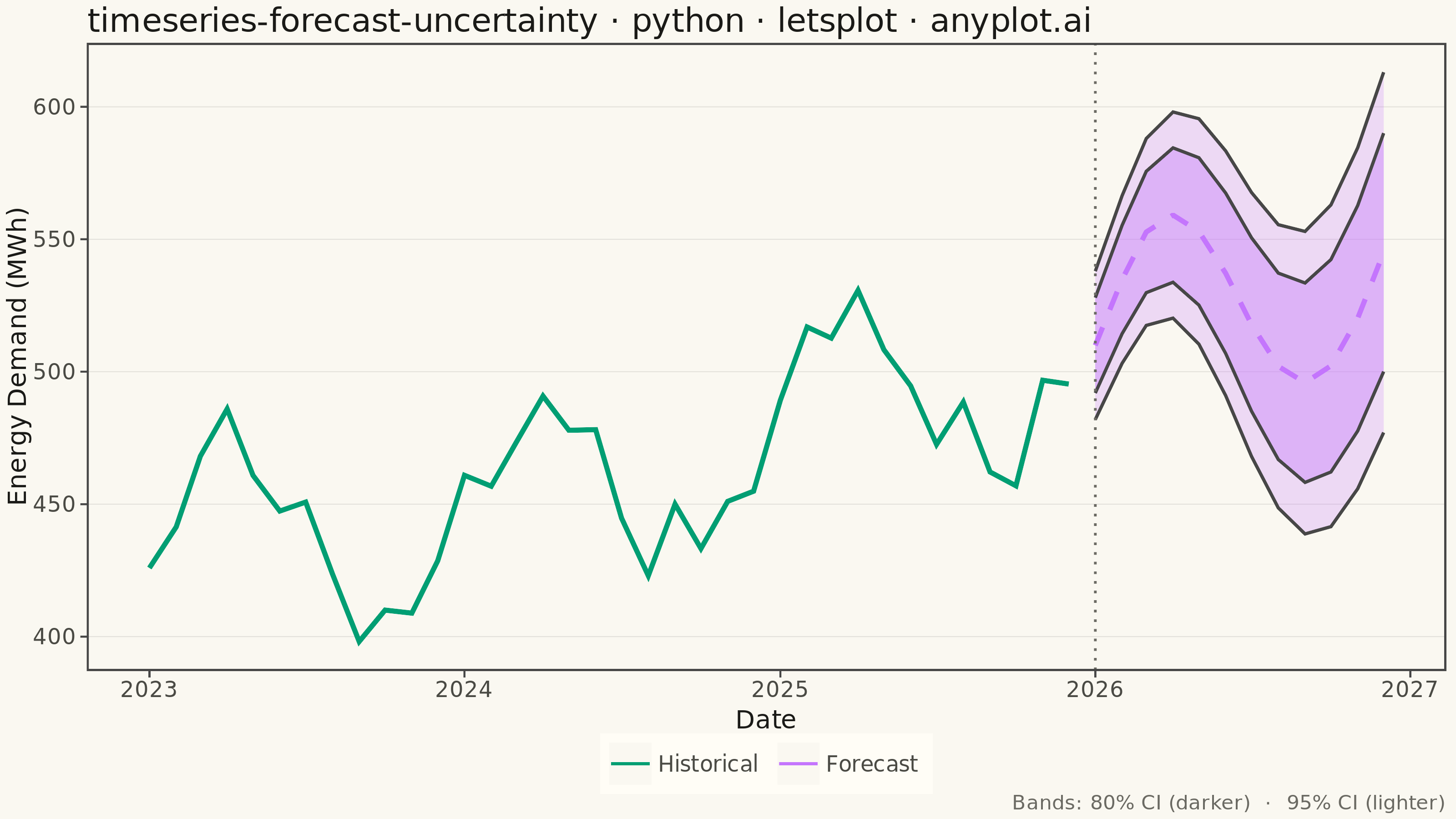
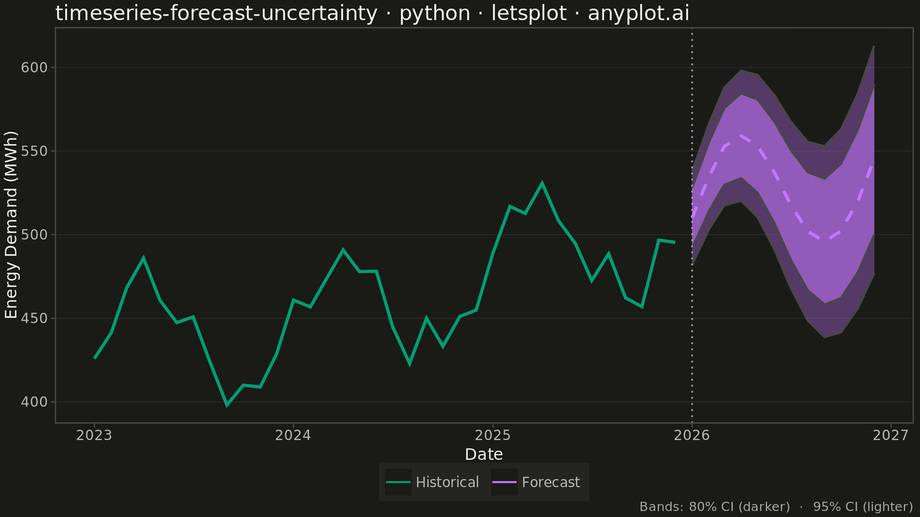
A time series plot that displays historical observed data followed by a forecast projection with confidence intervals or uncertainty bands. The plot clearly distinguishes between the historical period and the forecast period using a vertical line marker, with shaded bands representing different confidence levels (typically 80% and 95%). This visualization is essential for communicating prediction uncertainty in forecasting applications, helping stakeholders understand both the expected values and the range of possible outcomes.
""" anyplot.ai
timeseries-forecast-uncertainty: Time Series Forecast with Uncertainty Band
Library: letsplot 4.9.0 | Python 3.13.13
Quality: 89/100 | Updated: 2026-05-19
"""
# ruff: noqa: F405

import os

import numpy as np
import pandas as pd
from lets_plot import *


LetsPlot.setup_html()

# Theme tokens
THEME = os.getenv("ANYPLOT_THEME", "light")
PAGE_BG = "#FAF8F1" if THEME == "light" else "#1A1A17"
ELEVATED_BG = "#FFFDF6" if THEME == "light" else "#242420"
INK = "#1A1A17" if THEME == "light" else "#F0EFE8"
INK_SOFT = "#4A4A44" if THEME == "light" else "#B8B7B0"
INK_MUTED = "#6B6A63" if THEME == "light" else "#A8A79F"
INK_GRID = "rgba(26,26,23,0.10)" if THEME == "light" else "rgba(240,239,232,0.10)"

IMPRINT = ["#009E73", "#C475FD", "#4467A3", "#BD8233", "#AE3030", "#2ABCCD", "#954477"]

ALPHA_95 = 0.24 if THEME == "light" else 0.35
ALPHA_80 = 0.38 if THEME == "light" else 0.55

# Monthly energy demand: 36 months history + 12 month forecast
np.random.seed(42)

dates_hist = pd.date_range("2023-01-01", periods=36, freq="MS")
trend = np.linspace(420, 510, 36)
seasonal = 40 * np.sin(np.linspace(0, 6 * np.pi, 36))
noise = np.random.normal(0, 12, 36)
actual = trend + seasonal + noise

dates_forecast = pd.date_range("2026-01-01", periods=12, freq="MS")
trend_fc = np.linspace(510, 545, 12)
seasonal_fc = 40 * np.sin(np.linspace(6 * np.pi, 8 * np.pi, 12))
forecast = trend_fc + seasonal_fc
uncertainty_80 = np.linspace(18, 45, 12)
uncertainty_95 = np.linspace(28, 68, 12)

df_hist = pd.DataFrame({"date": dates_hist, "value": actual, "series": "Historical"})
df_fc = pd.DataFrame(
    {
        "date": dates_forecast,
        "value": forecast,
        "lower_80": forecast - uncertainty_80,
        "upper_80": forecast + uncertainty_80,
        "lower_95": forecast - uncertainty_95,
        "upper_95": forecast + uncertainty_95,
        "series": "Forecast",
    }
)

forecast_start = dates_forecast[0]

# Plot — theme_classic gives L-shaped spines; theme() overrides specific elements
plot = (
    ggplot()
    # 95% CI (outer, lighter)
    + geom_ribbon(
        aes(x="date", ymin="lower_95", ymax="upper_95"), data=df_fc, fill=IMPRINT[1], alpha=ALPHA_95, color=None
    )
    # 80% CI (inner, darker)
    + geom_ribbon(
        aes(x="date", ymin="lower_80", ymax="upper_80"), data=df_fc, fill=IMPRINT[1], alpha=ALPHA_80, color=None
    )
    # Historical solid line (brand green) — tooltips show value on hover in HTML
    + geom_line(
        aes(x="date", y="value", color="series"),
        data=df_hist[["date", "value", "series"]],
        size=1.2,
        linetype="solid",
        tooltips=layer_tooltips().line("@value{.0f} MWh").line("@date"),
    )
    # Forecast dashed line (orange) — tooltips show forecast and CI bounds on hover
    + geom_line(
        aes(x="date", y="value", color="series"),
        data=df_fc[["date", "value", "lower_80", "upper_80", "lower_95", "upper_95", "series"]],
        size=1.2,
        linetype="dashed",
        tooltips=layer_tooltips()
        .line("Forecast: @value{.0f} MWh")
        .line("80% CI: [@lower_80{.0f}, @upper_80{.0f}]")
        .line("95% CI: [@lower_95{.0f}, @upper_95{.0f}]")
        .line("@date"),
    )
    # Vertical marker at forecast boundary
    + geom_vline(xintercept=forecast_start.timestamp() * 1000, color=INK_MUTED, size=0.6, linetype="dotted")
    + scale_color_manual(values={"Historical": IMPRINT[0], "Forecast": IMPRINT[1]}, name="")
    + labs(
        x="Date",
        y="Energy Demand (MWh)",
        title="timeseries-forecast-uncertainty · python · letsplot · anyplot.ai",
        caption="Bands: 80% CI (darker)  ·  95% CI (lighter)",
    )
    + ggsize(800, 450)
    + theme_classic()
    + theme(
        plot_background=element_rect(fill=PAGE_BG, color=PAGE_BG),
        panel_background=element_rect(fill=PAGE_BG),
        panel_grid_major_y=element_line(color=INK_GRID, size=0.5),
        axis_title=element_text(color=INK, size=14),
        axis_text=element_text(color=INK_SOFT, size=12),
        axis_line=element_line(color=INK_SOFT, size=0.5),
        plot_title=element_text(color=INK, size=18),
        legend_background=element_rect(fill=ELEVATED_BG, color=INK_SOFT),
        legend_text=element_text(color=INK_SOFT, size=12),
        legend_title=element_blank(),
        plot_caption=element_text(color=INK_MUTED, size=11),
        legend_position="bottom",
    )
)

# Save PNG and HTML with theme suffix
ggsave(plot, f"plot-{THEME}.png", path=".", scale=4)
ggsave(plot, f"plot-{THEME}.html", path=".")
Runnable source as JSON, for any HTTP client: https://api.anyplot.ai/specs/timeseries-forecast-uncertainty/letsplot/code. Any spec id and library id listed in llms-full.txt fit the same URL shape; every URL below is complete and callable.
{
  "spec_id": "timeseries-forecast-uncertainty",
  "language": "python",
  "library": "letsplot",
  "page": "https://anyplot.ai/timeseries-forecast-uncertainty/python/letsplot",
  "hub": "https://anyplot.ai/timeseries-forecast-uncertainty",
  "code_json": "https://api.anyplot.ai/specs/timeseries-forecast-uncertainty/letsplot/code",
  "spec_json": "https://api.anyplot.ai/specs/timeseries-forecast-uncertainty",
  "render_light_png": "https://storage.googleapis.com/anyplot-images/plots/timeseries-forecast-uncertainty/python/letsplot/plot-light.png",
  "render_dark_png": "https://storage.googleapis.com/anyplot-images/plots/timeseries-forecast-uncertainty/python/letsplot/plot-dark.png",
  "interactive_light_html": "https://storage.googleapis.com/anyplot-images/plots/timeseries-forecast-uncertainty/python/letsplot/plot-light.html",
  "interactive_dark_html": "https://storage.googleapis.com/anyplot-images/plots/timeseries-forecast-uncertainty/python/letsplot/plot-dark.html",
  "quality_score": 89.0,
  "license": "MIT",
  "guide": "https://anyplot.ai/llms.txt"
}
Part of Time Series Forecast with Uncertainty Band on anyplot.ai.