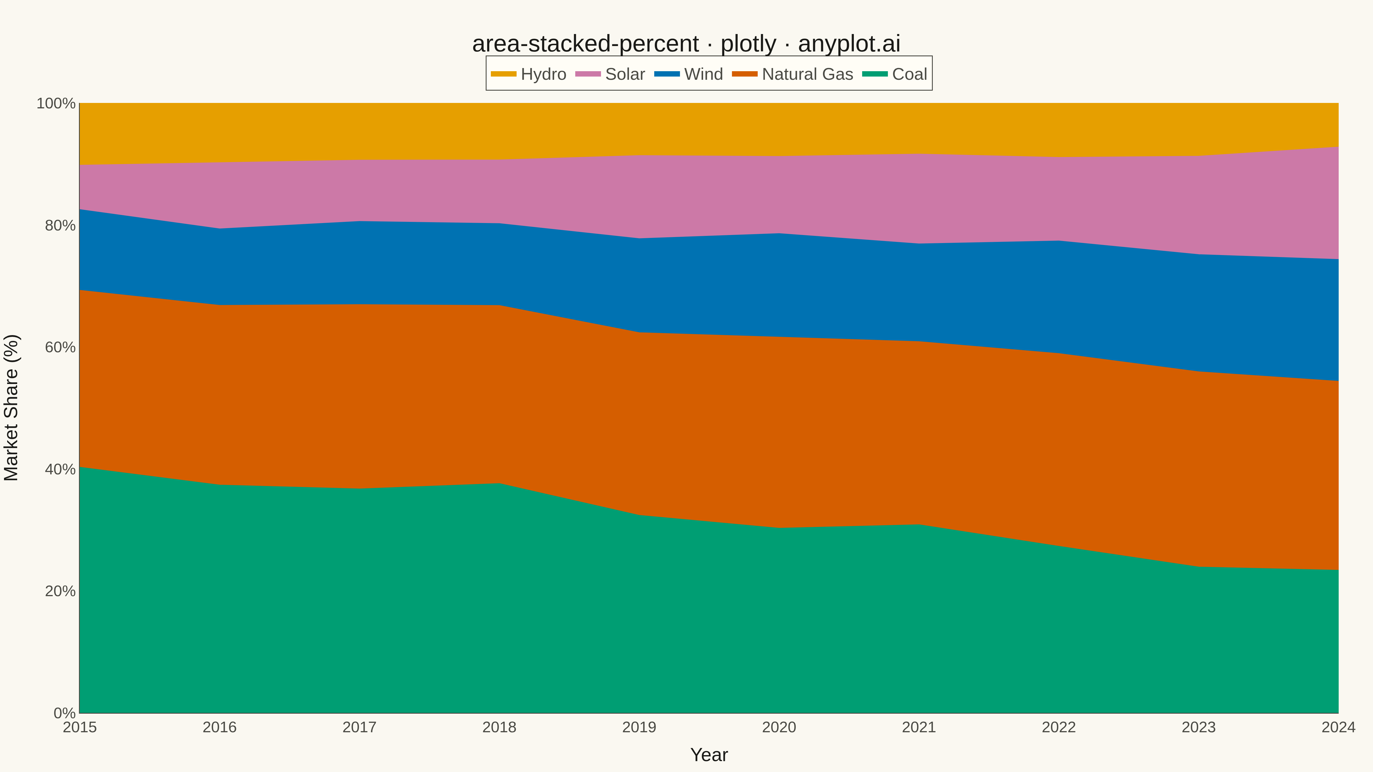
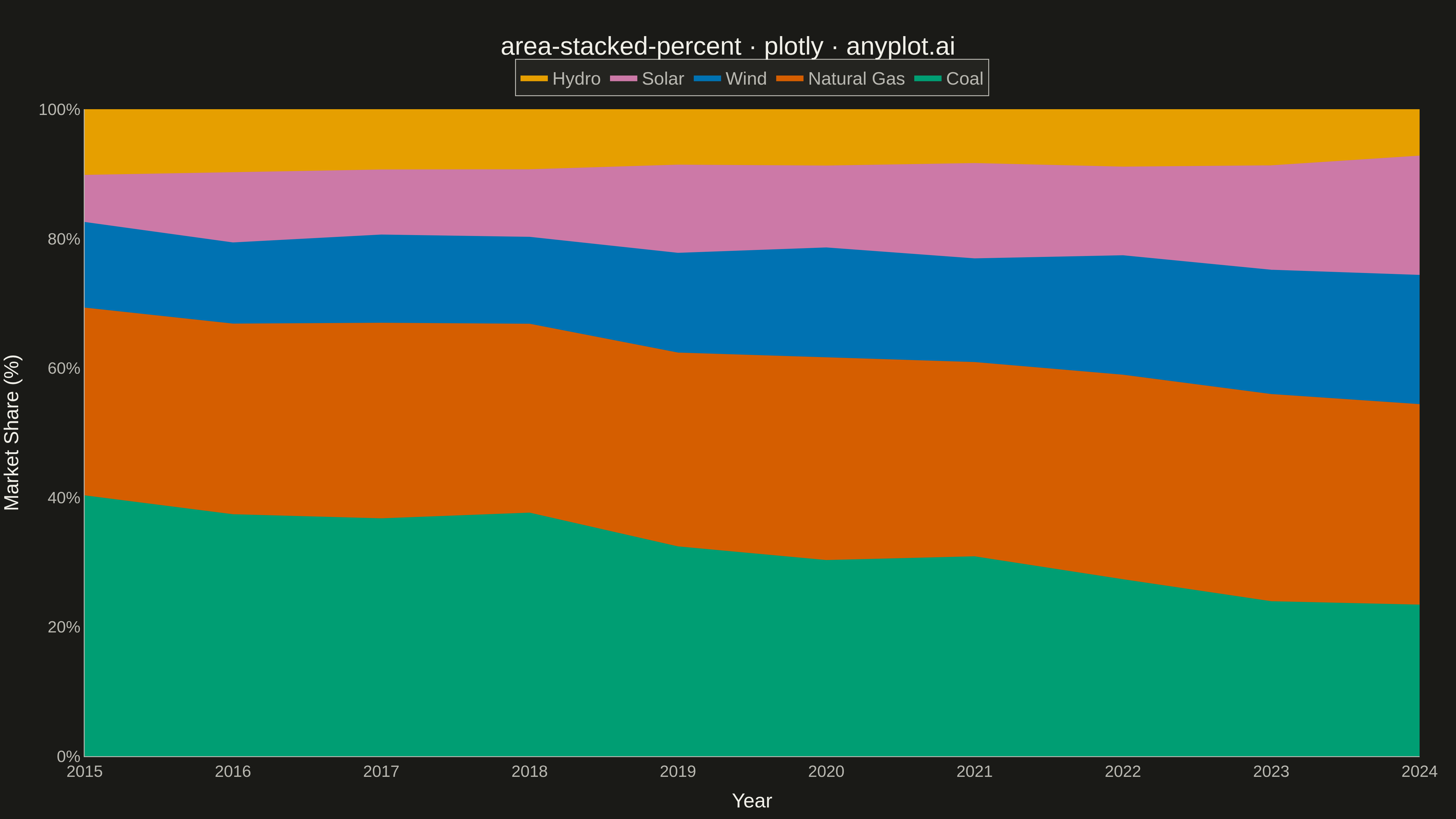
A stacked area chart normalized to 100%, where each area represents the percentage contribution of a category to the total. The combined height always equals 100%, showing proportional changes over time.
""" anyplot.ai
area-stacked-percent: 100% Stacked Area Chart
Library: plotly 6.7.0 | Python 3.13.13
Quality: 76/100 | Updated: 2026-05-12
"""

import numpy as np
import plotly.graph_objects as go


# Data - Energy source market share over time
np.random.seed(42)
years = list(range(2015, 2025))

# Simulate energy source percentages that evolve over time
# Solar grows, Coal declines, Natural Gas stable, Wind grows
coal_base = np.linspace(40, 22, len(years)) + np.random.randn(len(years)) * 2
gas_base = np.linspace(30, 32, len(years)) + np.random.randn(len(years)) * 1
wind_base = np.linspace(12, 20, len(years)) + np.random.randn(len(years)) * 1
solar_base = np.linspace(8, 18, len(years)) + np.random.randn(len(years)) * 1
hydro_base = np.linspace(10, 8, len(years)) + np.random.randn(len(years)) * 0.5

# Ensure no negative values
coal_base = np.clip(coal_base, 5, 50)
gas_base = np.clip(gas_base, 20, 40)
wind_base = np.clip(wind_base, 5, 25)
solar_base = np.clip(solar_base, 3, 25)
hydro_base = np.clip(hydro_base, 5, 15)

# Normalize to 100%
totals = coal_base + gas_base + wind_base + solar_base + hydro_base
coal = (coal_base / totals) * 100
gas = (gas_base / totals) * 100
wind = (wind_base / totals) * 100
solar = (solar_base / totals) * 100
hydro = (hydro_base / totals) * 100

# Colors - Python Blue, Yellow, and additional colorblind-safe colors
colors = ["#306998", "#FFD43B", "#4DAF4A", "#E7298A", "#66A61E"]

# Create figure
fig = go.Figure()

# Add stacked areas (using stackgroup for 100% stacking)
categories = ["Coal", "Natural Gas", "Wind", "Solar", "Hydro"]
values = [coal, gas, wind, solar, hydro]

for i, (cat, val) in enumerate(zip(categories, values)):
    fig.add_trace(
        go.Scatter(
            x=years,
            y=val,
            name=cat,
            mode="lines",
            line=dict(width=0.5, color=colors[i]),
            stackgroup="one",
            groupnorm="percent",
            fillcolor=colors[i],
            hovertemplate="%{y:.1f}%<extra>" + cat + "</extra>",
        )
    )

# Update layout
fig.update_layout(
    title=dict(text="area-stacked-percent · plotly · pyplots.ai", font=dict(size=28), x=0.5, xanchor="center"),
    xaxis=dict(
        title=dict(text="Year", font=dict(size=22)),
        tickfont=dict(size=18),
        dtick=1,
        showgrid=True,
        gridwidth=1,
        gridcolor="rgba(0,0,0,0.1)",
    ),
    yaxis=dict(
        title=dict(text="Market Share (%)", font=dict(size=22)),
        tickfont=dict(size=18),
        ticksuffix="%",
        range=[0, 100],
        showgrid=True,
        gridwidth=1,
        gridcolor="rgba(0,0,0,0.1)",
    ),
    template="plotly_white",
    legend=dict(font=dict(size=18), orientation="h", yanchor="bottom", y=1.02, xanchor="center", x=0.5),
    margin=dict(l=80, r=40, t=120, b=60),
    hovermode="x unified",
)

# Save as PNG and HTML
fig.write_image("plot.png", width=1600, height=900, scale=3)
fig.write_html("plot.html", include_plotlyjs="cdn")
Runnable source as JSON, for any HTTP client: https://api.anyplot.ai/specs/area-stacked-percent/plotly/code. Any spec id and library id listed in llms-full.txt fit the same URL shape; every URL below is complete and callable.
{
  "spec_id": "area-stacked-percent",
  "language": "python",
  "library": "plotly",
  "page": "https://anyplot.ai/area-stacked-percent/python/plotly",
  "hub": "https://anyplot.ai/area-stacked-percent",
  "code_json": "https://api.anyplot.ai/specs/area-stacked-percent/plotly/code",
  "spec_json": "https://api.anyplot.ai/specs/area-stacked-percent",
  "render_light_png": "https://storage.googleapis.com/anyplot-images/plots/area-stacked-percent/python/plotly/plot-light.png",
  "render_dark_png": "https://storage.googleapis.com/anyplot-images/plots/area-stacked-percent/python/plotly/plot-dark.png",
  "interactive_light_html": "https://storage.googleapis.com/anyplot-images/plots/area-stacked-percent/python/plotly/plot-light.html",
  "interactive_dark_html": "https://storage.googleapis.com/anyplot-images/plots/area-stacked-percent/python/plotly/plot-dark.html",
  "quality_score": 76.0,
  "license": "MIT",
  "guide": "https://anyplot.ai/llms.txt"
}
Part of 100% Stacked Area Chart on anyplot.ai.