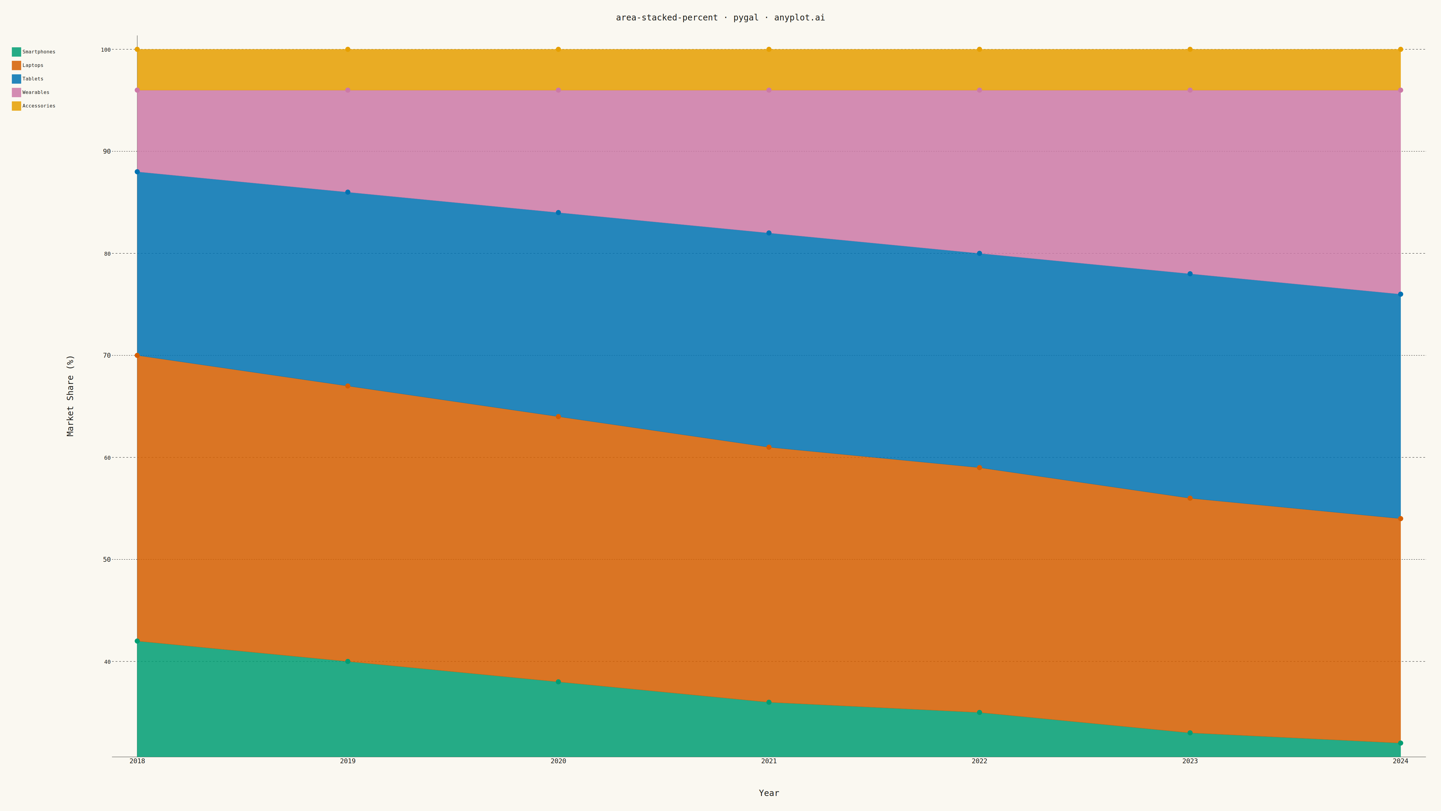
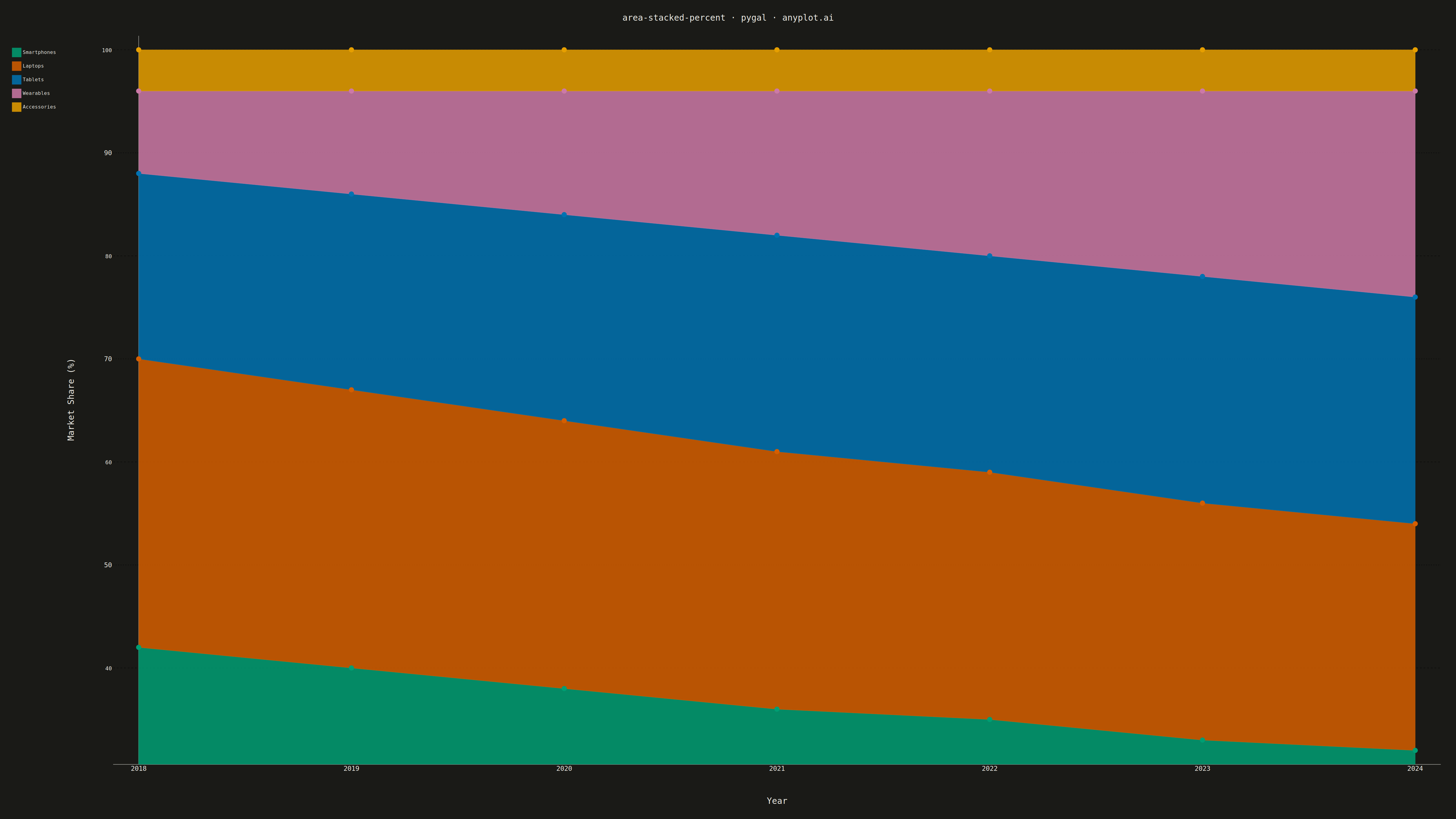
A stacked area chart normalized to 100%, where each area represents the percentage contribution of a category to the total. The combined height always equals 100%, showing proportional changes over time.
""" anyplot.ai
area-stacked-percent: 100% Stacked Area Chart
Library: pygal 3.1.0 | Python 3.13.13
Quality: 81/100 | Updated: 2026-05-12
"""

import pygal
from pygal.style import Style


# Data - Market share evolution for tech product categories
years = ["2018", "2019", "2020", "2021", "2022", "2023", "2024"]
smartphones = [42, 40, 38, 36, 35, 33, 32]
laptops = [28, 27, 26, 25, 24, 23, 22]
tablets = [18, 19, 20, 21, 21, 22, 22]
wearables = [8, 10, 12, 14, 16, 18, 20]
accessories = [4, 4, 4, 4, 4, 4, 4]

# Custom style for large canvas
custom_style = Style(
    background="white",
    plot_background="white",
    foreground="#333333",
    foreground_strong="#333333",
    foreground_subtle="#666666",
    colors=("#306998", "#FFD43B", "#3CB371", "#FF6B6B", "#9B59B6"),
    title_font_size=72,
    label_font_size=48,
    major_label_font_size=42,
    legend_font_size=42,
    value_font_size=36,
    opacity=0.85,
    opacity_hover=0.95,
    transition="250ms ease-in",
)

# Create stacked area chart with percentage mode
chart = pygal.StackedLine(
    width=4800,
    height=2700,
    style=custom_style,
    title="area-stacked-percent · pygal · pyplots.ai",
    x_title="Year",
    y_title="Market Share (%)",
    fill=True,
    stack_from_top=False,
    show_y_guides=True,
    show_x_guides=False,
    y_labels_major_every=2,
    truncate_legend=-1,
    legend_at_bottom=False,
    legend_box_size=30,
    margin=50,
    spacing=40,
    dots_size=8,
    stroke_style={"width": 3},
)

# Set x-axis labels
chart.x_labels = years

# Add data series (values already sum to 100% each year)
chart.add("Smartphones", smartphones)
chart.add("Laptops", laptops)
chart.add("Tablets", tablets)
chart.add("Wearables", wearables)
chart.add("Accessories", accessories)

# Save as PNG and HTML
chart.render_to_png("plot.png")
chart.render_to_file("plot.html")
Runnable source as JSON, for any HTTP client: https://api.anyplot.ai/specs/area-stacked-percent/pygal/code. Any spec id and library id listed in llms-full.txt fit the same URL shape; every URL below is complete and callable.
{
  "spec_id": "area-stacked-percent",
  "language": "python",
  "library": "pygal",
  "page": "https://anyplot.ai/area-stacked-percent/python/pygal",
  "hub": "https://anyplot.ai/area-stacked-percent",
  "code_json": "https://api.anyplot.ai/specs/area-stacked-percent/pygal/code",
  "spec_json": "https://api.anyplot.ai/specs/area-stacked-percent",
  "render_light_png": "https://storage.googleapis.com/anyplot-images/plots/area-stacked-percent/python/pygal/plot-light.png",
  "render_dark_png": "https://storage.googleapis.com/anyplot-images/plots/area-stacked-percent/python/pygal/plot-dark.png",
  "interactive_light_html": "https://storage.googleapis.com/anyplot-images/plots/area-stacked-percent/python/pygal/plot-light.html",
  "interactive_dark_html": "https://storage.googleapis.com/anyplot-images/plots/area-stacked-percent/python/pygal/plot-dark.html",
  "quality_score": 81.0,
  "license": "MIT",
  "guide": "https://anyplot.ai/llms.txt"
}
Part of 100% Stacked Area Chart on anyplot.ai.