The same plot in 14 other libraries — JavaScript: Chart.js, D3.js, Apache ECharts, MUI X Charts; Python: Altair, Bokeh, lets-plot, Matplotlib, Plotly, plotnine, Pygal, Seaborn; R: ggplot2; Julia: Makie.jl. Compare all 15 side by side: Basic Bar Chart in Python, R, Julia and JavaScript.
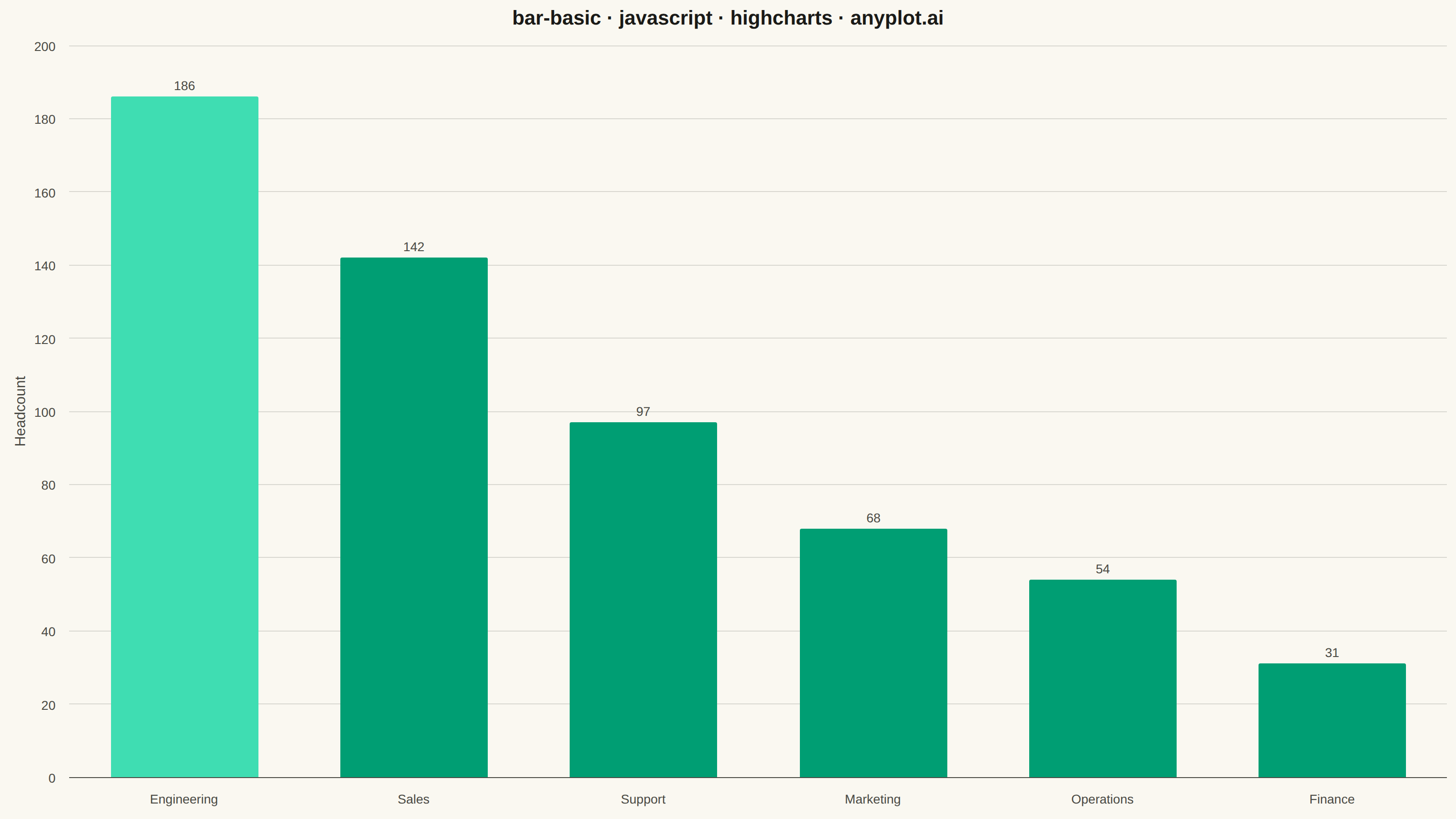
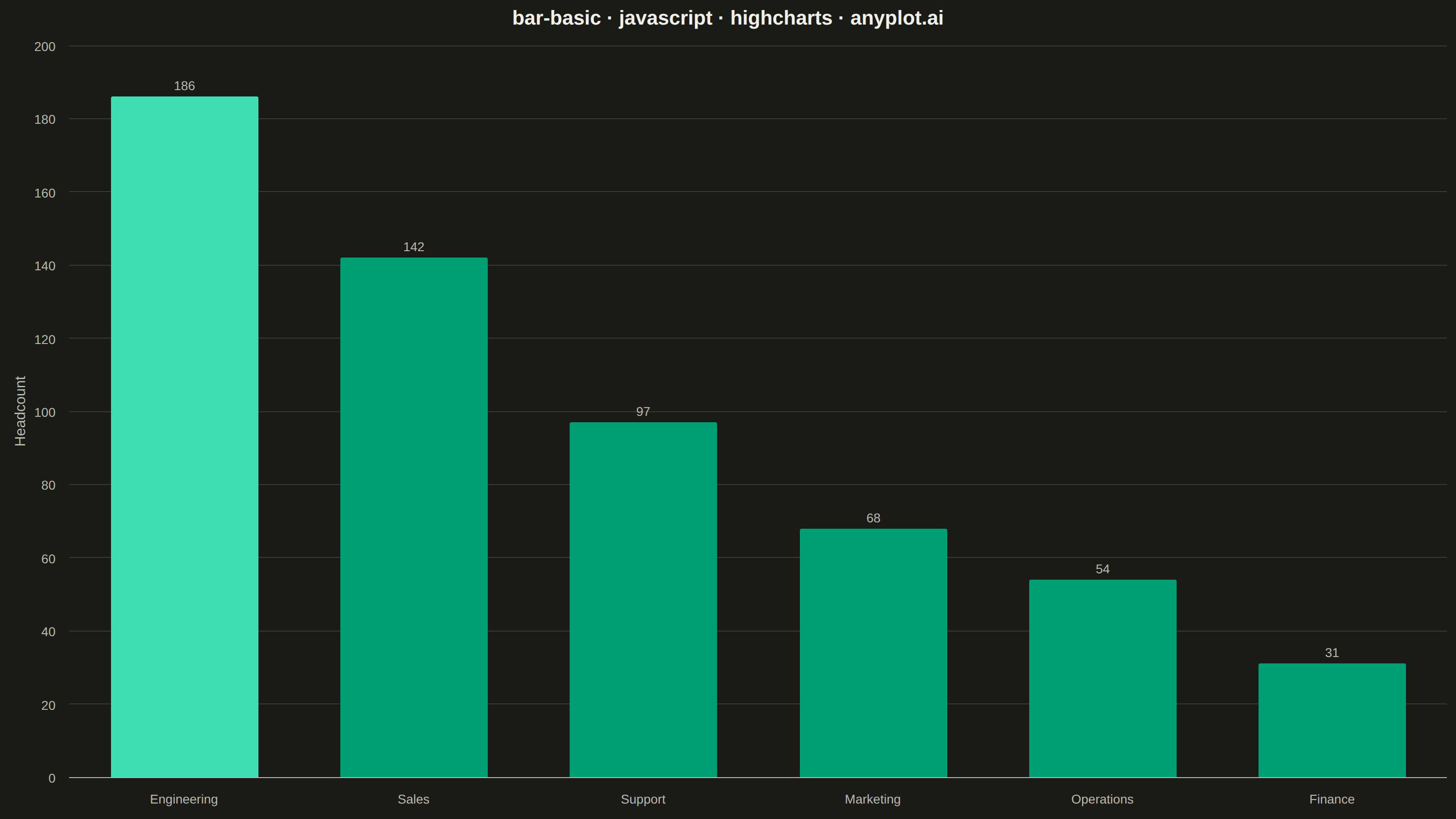
A vertical bar chart that displays categorical data with rectangular bars whose heights are proportional to the values they represent. This fundamental visualization is ideal for comparing discrete categories and identifying which categories have the highest or lowest values. Bar charts excel at showing rankings, distributions across categories, and making relative comparisons intuitive.
// anyplot.ai
// bar-basic: Basic Bar Chart
// Library: highcharts 12.6.0 | JavaScript 22.23.2
// Quality: 88/100 | Created: 2026-08-20

const t = window.ANYPLOT_TOKENS;

// --- Data (in-memory, deterministic) ----------------------------------------
const departments = [
  "Engineering",
  "Sales",
  "Support",
  "Marketing",
  "Operations",
  "Finance",
];
const headcount = [186, 142, 97, 68, 54, 31];

// Emphasize the top-ranked department with a brightened shade of the brand
// green — a deliberate hierarchy device beyond plain bar order, derived
// deterministically so it stays identical across both themes.
const leadColor = Highcharts.color(t.palette[0]).brighten(0.25).get();
const data = headcount.map((value, i) => ({
  y: value,
  color: i === 0 ? leadColor : t.palette[0],
}));

// --- Chart -------------------------------------------------------------------
Highcharts.chart("container", {
  chart: {
    type: "column",
    backgroundColor: "transparent",
    animation: false,
    style: { fontFamily: "inherit" },
  },
  credits: { enabled: false },
  colors: [t.palette[0]],
  title: {
    text: "bar-basic · javascript · highcharts · anyplot.ai",
    style: { color: t.ink, fontSize: "22px", fontWeight: "600" },
  },
  xAxis: {
    categories: departments,
    lineColor: t.inkSoft,
    tickColor: t.inkSoft,
    labels: { style: { color: t.inkSoft, fontSize: "14px" } },
    title: { text: null },
    maxPadding: 0.01,
  },
  yAxis: {
    title: {
      text: "Headcount",
      style: { color: t.inkSoft, fontSize: "16px" },
    },
    gridLineColor: t.grid,
    labels: { style: { color: t.inkSoft, fontSize: "14px" } },
    min: 0,
  },
  legend: { enabled: false },
  tooltip: {
    enabled: true,
    backgroundColor: t.elevatedBg,
    borderColor: t.grid,
    borderRadius: 6,
    shadow: false,
    style: { color: t.ink, fontSize: "14px" },
    headerFormat: "",
    pointFormat: "<b>{point.category}</b><br/>{series.name}: <b>{point.y}</b>",
  },
  plotOptions: {
    series: { animation: false },
    column: {
      borderWidth: 0,
      borderRadius: 2,
      pointPadding: 0.12,
      groupPadding: 0.08,
      dataLabels: {
        enabled: true,
        style: {
          color: t.inkSoft,
          fontSize: "14px",
          fontWeight: "500",
          textOutline: "none",
        },
      },
    },
  },
  series: [{ name: "Headcount", data }],
});
Runnable source as JSON, for any HTTP client: https://api.anyplot.ai/specs/bar-basic/highcharts/code. Any spec id and library id listed in llms-full.txt fit the same URL shape; every URL below is complete and callable.
{
  "spec_id": "bar-basic",
  "language": "javascript",
  "library": "highcharts",
  "page": "https://anyplot.ai/bar-basic/javascript/highcharts",
  "hub": "https://anyplot.ai/bar-basic",
  "code_json": "https://api.anyplot.ai/specs/bar-basic/highcharts/code",
  "spec_json": "https://api.anyplot.ai/specs/bar-basic",
  "render_light_png": "https://storage.googleapis.com/anyplot-images/plots/bar-basic/javascript/highcharts/plot-light.png",
  "render_dark_png": "https://storage.googleapis.com/anyplot-images/plots/bar-basic/javascript/highcharts/plot-dark.png",
  "interactive_light_html": "https://storage.googleapis.com/anyplot-images/plots/bar-basic/javascript/highcharts/plot-light.html",
  "interactive_dark_html": "https://storage.googleapis.com/anyplot-images/plots/bar-basic/javascript/highcharts/plot-dark.html",
  "quality_score": 88.0,
  "license": "MIT",
  "guide": "https://anyplot.ai/llms.txt"
}
Part of Basic Bar Chart on anyplot.ai.