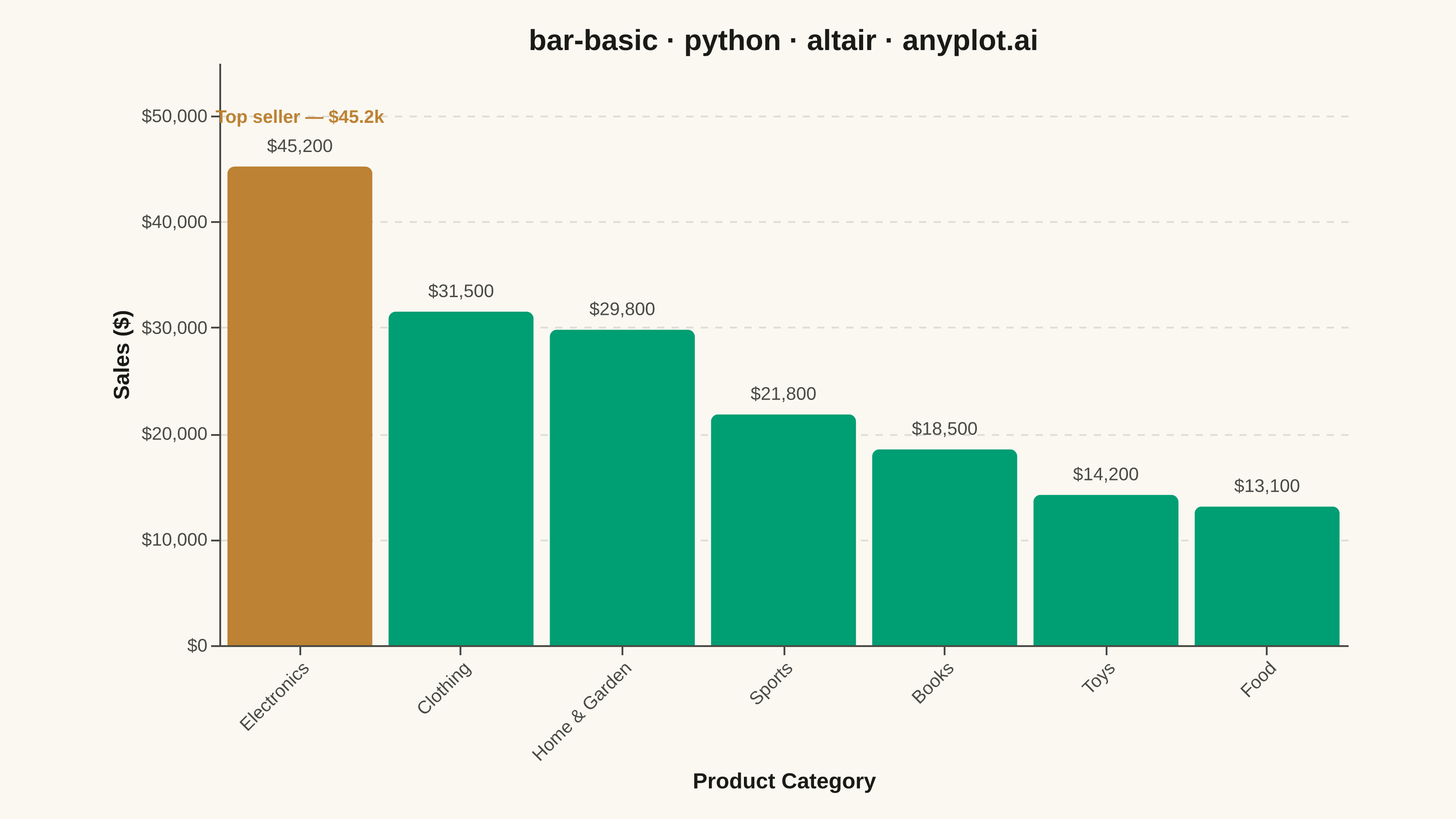
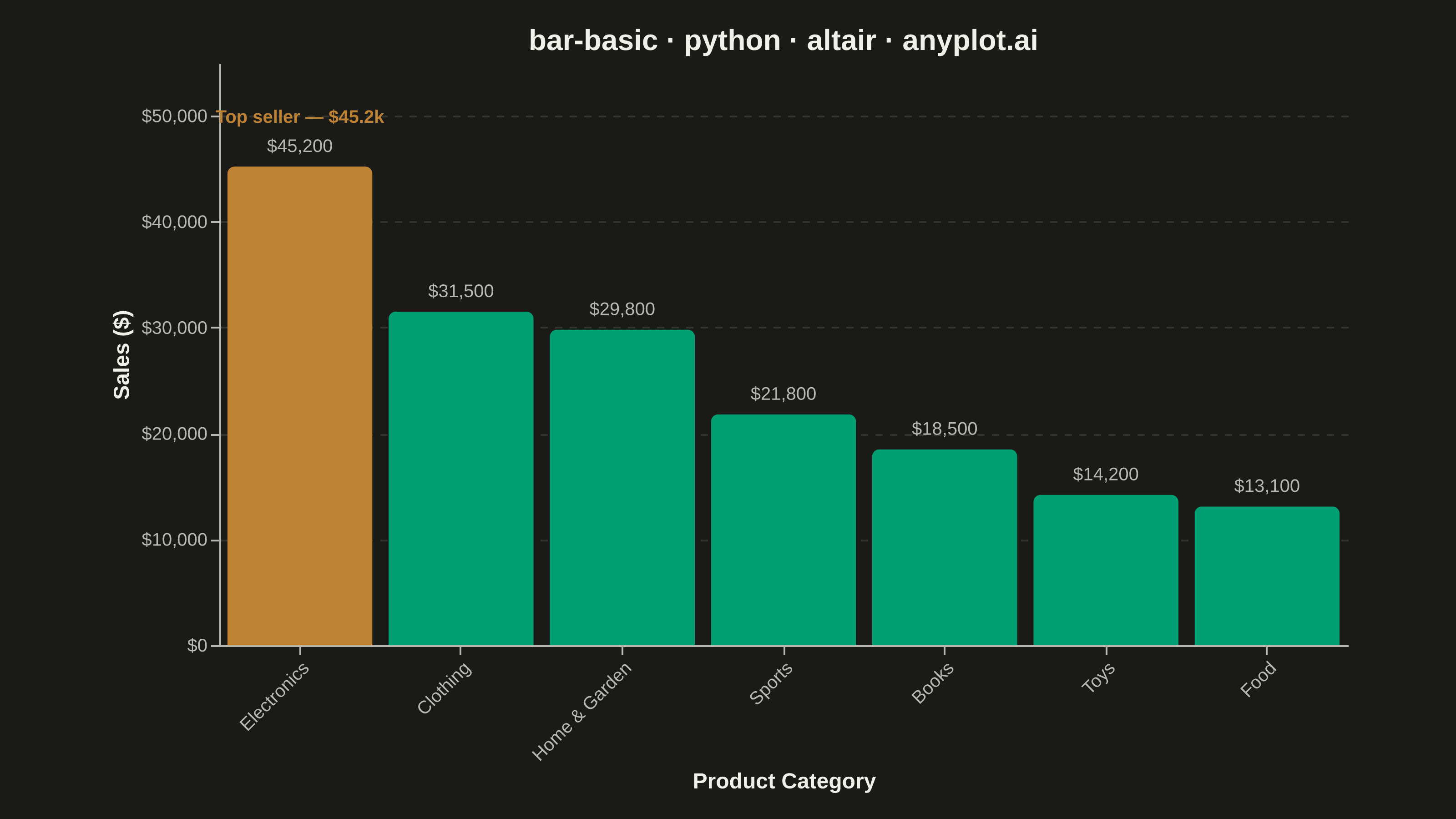
A vertical bar chart that displays categorical data with rectangular bars whose heights are proportional to the values they represent. This fundamental visualization is ideal for comparing discrete categories and identifying which categories have the highest or lowest values. Bar charts excel at showing rankings, distributions across categories, and making relative comparisons intuitive.
""" anyplot.ai
bar-basic: Basic Bar Chart
Library: altair 6.1.0 | Python 3.13.13
Quality: 91/100 | Updated: 2026-05-28
"""

import os

import altair as alt
import pandas as pd
from PIL import Image


# Theme tokens
THEME = os.getenv("ANYPLOT_THEME", "light")
PAGE_BG = "#FAF8F1" if THEME == "light" else "#1A1A17"
ELEVATED_BG = "#FFFDF6" if THEME == "light" else "#242420"
INK = "#1A1A17" if THEME == "light" else "#F0EFE8"
INK_SOFT = "#4A4A44" if THEME == "light" else "#B8B7B0"

IMPRINT_PALETTE = ["#009E73", "#C475FD", "#4467A3", "#BD8233", "#AE3030", "#2ABCCD", "#954477", "#99B314"]
BRAND = IMPRINT_PALETTE[0]  # brand green — regular bars
HIGHLIGHT = IMPRINT_PALETTE[3]  # ochre — warm top-performer accent

# Data — product sales by category, deterministic retail scenario
data = pd.DataFrame(
    {
        "category": ["Electronics", "Clothing", "Home & Garden", "Sports", "Books", "Toys", "Food"],
        "value": [45200, 31500, 29800, 21800, 18500, 14200, 13100],
    }
)
data["is_top"] = data["value"] == data["value"].max()
sort_order = data.sort_values("value", ascending=False)["category"].tolist()

# Title (40 chars < 67 baseline — no size reduction needed)
title = "bar-basic · python · altair · anyplot.ai"
title_fontsize = 16

# Bars with conditional color for top performer
bars = (
    alt.Chart(data)
    .mark_bar(cornerRadiusTopLeft=4, cornerRadiusTopRight=4)
    .encode(
        x=alt.X("category:N", title="Product Category", sort=sort_order, axis=alt.Axis(labelAngle=-45)),
        y=alt.Y(
            "value:Q",
            title="Sales ($)",
            scale=alt.Scale(domain=[0, 55000]),
            axis=alt.Axis(format="$,.0f", values=[0, 10000, 20000, 30000, 40000, 50000]),
        ),
        color=alt.condition(alt.datum.is_top, alt.value(HIGHLIGHT), alt.value(BRAND)),
        tooltip=[alt.Tooltip("category:N", title="Category"), alt.Tooltip("value:Q", title="Sales", format="$,.0f")],
    )
)

# Value labels above each bar — same size as tick labels for visual consistency
labels = bars.mark_text(align="center", baseline="bottom", dy=-6, fontSize=10).encode(
    text=alt.Text("value:Q", format="$,.0f"), color=alt.value(INK_SOFT)
)

# Top-performer callout annotation
annotation = (
    alt.Chart(pd.DataFrame({"category": ["Electronics"], "value": [45200], "label": ["Top seller — $45.2k"]}))
    .mark_text(align="center", baseline="bottom", dy=-22, fontSize=10, fontWeight="bold")
    .encode(
        x=alt.X("category:N", sort=sort_order), y=alt.Y("value:Q"), text=alt.Text("label:N"), color=alt.value(HIGHLIGHT)
    )
)

chart = (
    (bars + labels + annotation)
    .properties(width=620, height=320, background=PAGE_BG, title=alt.Title(title, fontSize=title_fontsize, color=INK))
    .configure_view(fill=PAGE_BG, strokeWidth=0)
    .configure_axis(
        labelFontSize=10,
        titleFontSize=12,
        labelColor=INK_SOFT,
        titleColor=INK,
        domainColor=INK_SOFT,
        tickColor=INK_SOFT,
        grid=False,
    )
    .configure_axisY(grid=True, gridOpacity=0.15, gridDash=[4, 4], gridColor=INK_SOFT)
)

# Save PNG then pad to exact 3200×1800 target
chart.save(f"plot-{THEME}.png", scale_factor=4.0)

TW, TH = 3200, 1800
_img = Image.open(f"plot-{THEME}.png").convert("RGB")
_w, _h = _img.size
if _w > TW or _h > TH:
    raise SystemExit(
        f"altair vl-convert produced {_w}×{_h}, exceeds target {TW}×{TH}. "
        f"Shrink chart .properties(width=, height=) values and re-render."
    )
if _w < TW or _h < TH:
    _canvas = Image.new("RGB", (TW, TH), PAGE_BG)
    _canvas.paste(_img, ((TW - _w) // 2, (TH - _h) // 2))
    _canvas.save(f"plot-{THEME}.png")

# Save interactive HTML
chart.save(f"plot-{THEME}.html")
Runnable source as JSON, for any HTTP client: https://api.anyplot.ai/specs/bar-basic/altair/code. Any spec id and library id listed in llms-full.txt fit the same URL shape; every URL below is complete and callable.
{
  "spec_id": "bar-basic",
  "language": "python",
  "library": "altair",
  "page": "https://anyplot.ai/bar-basic/python/altair",
  "hub": "https://anyplot.ai/bar-basic",
  "code_json": "https://api.anyplot.ai/specs/bar-basic/altair/code",
  "spec_json": "https://api.anyplot.ai/specs/bar-basic",
  "render_light_png": "https://storage.googleapis.com/anyplot-images/plots/bar-basic/python/altair/plot-light.png",
  "render_dark_png": "https://storage.googleapis.com/anyplot-images/plots/bar-basic/python/altair/plot-dark.png",
  "interactive_light_html": "https://storage.googleapis.com/anyplot-images/plots/bar-basic/python/altair/plot-light.html",
  "interactive_dark_html": "https://storage.googleapis.com/anyplot-images/plots/bar-basic/python/altair/plot-dark.html",
  "quality_score": 91.0,
  "license": "MIT",
  "guide": "https://anyplot.ai/llms.txt"
}
Part of Basic Bar Chart on anyplot.ai.