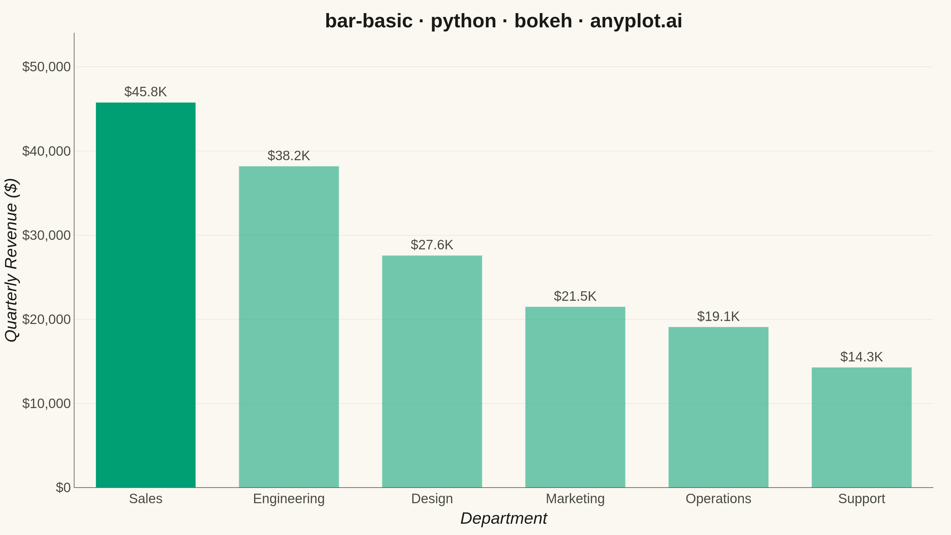
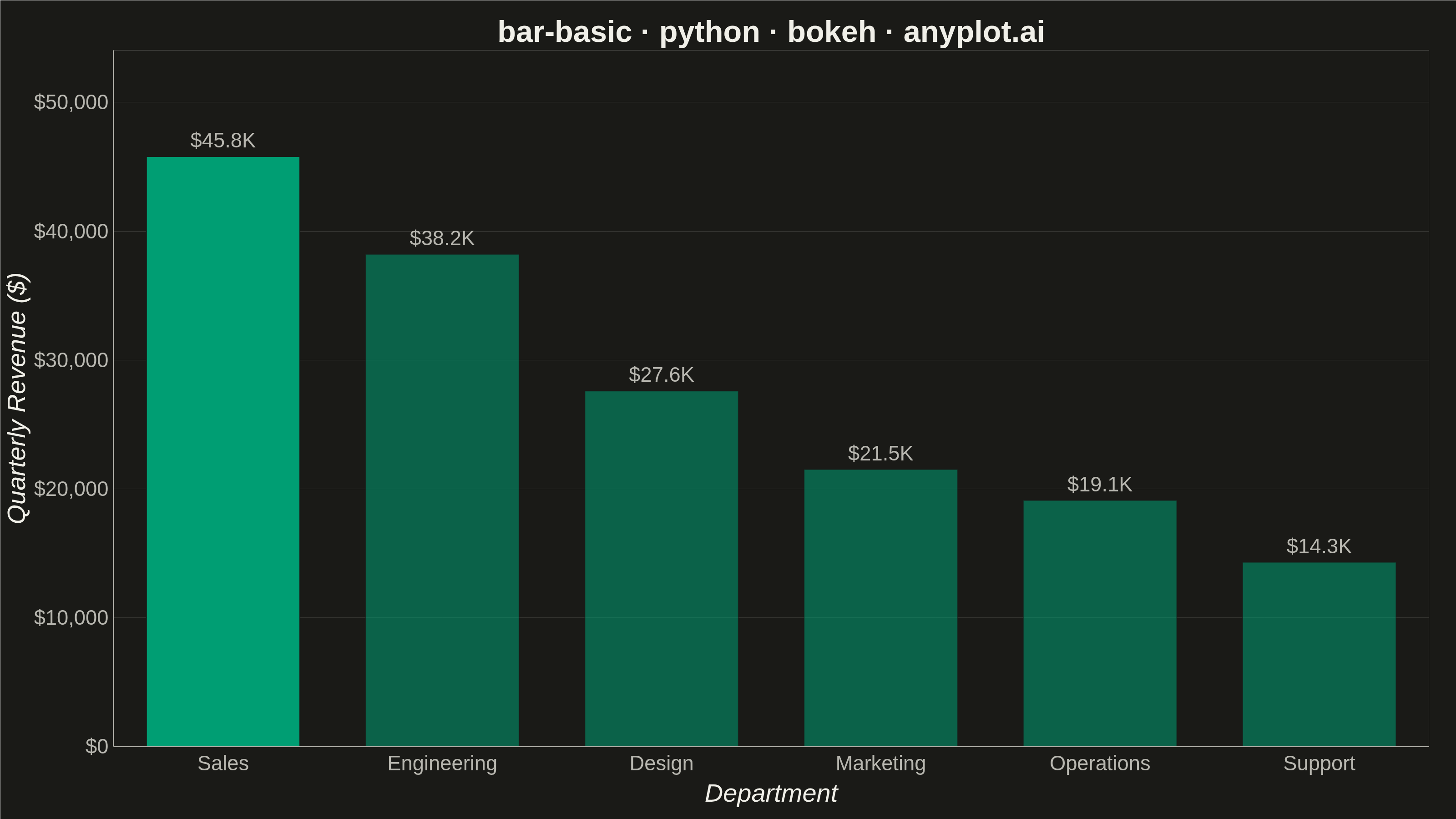
A vertical bar chart that displays categorical data with rectangular bars whose heights are proportional to the values they represent. This fundamental visualization is ideal for comparing discrete categories and identifying which categories have the highest or lowest values. Bar charts excel at showing rankings, distributions across categories, and making relative comparisons intuitive.
""" anyplot.ai
bar-basic: Basic Bar Chart
Library: bokeh 3.9.0 | Python 3.13.13
Quality: 90/100 | Updated: 2026-05-28
"""

import io
import os
import sys


# Prevent bokeh.py from shadowing the installed bokeh package
_this_dir = os.path.dirname(os.path.abspath(__file__))
sys.path = [p for p in sys.path if os.path.realpath(p) != os.path.realpath(_this_dir)]

import time
from pathlib import Path

from bokeh.io import output_file, save
from bokeh.models import ColumnDataSource, HoverTool, LabelSet, NumeralTickFormatter
from bokeh.plotting import figure
from PIL import Image
from selenium import webdriver
from selenium.webdriver.chrome.options import Options


# Theme tokens
THEME = os.getenv("ANYPLOT_THEME", "light")
PAGE_BG = "#FAF8F1" if THEME == "light" else "#1A1A17"
ELEVATED_BG = "#FFFDF6" if THEME == "light" else "#242420"
INK = "#1A1A17" if THEME == "light" else "#F0EFE8"
INK_SOFT = "#4A4A44" if THEME == "light" else "#B8B7B0"
BRAND = "#009E73"

# Data - Quarterly revenue by department, sorted descending for ranking clarity
_raw = {
    "Engineering": 38200,
    "Marketing": 21500,
    "Sales": 45800,
    "Support": 14300,
    "Design": 27600,
    "Operations": 19100,
}
categories = [k for k, _ in sorted(_raw.items(), key=lambda x: -x[1])]
values = [_raw[k] for k in categories]
value_labels = [f"${v / 1000:.1f}K" for v in values]
# Emphasize the top-ranked bar; others at reduced alpha to create a focal point
bar_alphas = [1.0 if i == 0 else 0.55 for i in range(len(categories))]

source = ColumnDataSource(
    data={"categories": categories, "values": values, "value_labels": value_labels, "alpha": bar_alphas}
)

title = "bar-basic · python · bokeh · anyplot.ai"

# HoverTool for bokeh-native interactivity (works even with toolbar_location=None)
hover = HoverTool(tooltips=[("Department", "@categories"), ("Revenue", "@values{$0,0}")])

# Create figure — toolbar_location=None prevents extra height being added above canvas
p = figure(
    x_range=categories,
    width=3200,
    height=1800,
    title=title,
    x_axis_label="Department",
    y_axis_label="Quarterly Revenue ($)",
    toolbar_location=None,
    tools=[hover],
    min_border_bottom=160,
    min_border_left=180,
    min_border_top=110,
    min_border_right=60,
)

# Bars — top bar fully saturated (focal point), others muted; page-bg edge for separation
p.vbar(
    x="categories", top="values", source=source, width=0.7, color=BRAND, alpha="alpha", line_color=PAGE_BG, line_width=2
)

# Value labels positioned above bars
labels_glyph = LabelSet(
    x="categories",
    y="values",
    text="value_labels",
    level="glyph",
    x_offset=0,
    y_offset=10,
    source=source,
    text_font_size="34pt",
    text_color=INK_SOFT,
    text_align="center",
)
p.add_layout(labels_glyph)

# Title and axis font sizes (canonical 3200×1800 values)
p.title.text_font_size = "50pt"
p.title.align = "center"
p.title.text_color = INK
p.xaxis.axis_label_text_font_size = "42pt"
p.yaxis.axis_label_text_font_size = "42pt"
p.xaxis.major_label_text_font_size = "34pt"
p.yaxis.major_label_text_font_size = "34pt"
p.xaxis.axis_label_text_color = INK
p.yaxis.axis_label_text_color = INK
p.xaxis.major_label_text_color = INK_SOFT
p.yaxis.major_label_text_color = INK_SOFT

# L-shaped frame: remove outline box, keep left + bottom axes
p.outline_line_color = None
p.xaxis.axis_line_color = INK_SOFT
p.yaxis.axis_line_color = INK_SOFT
p.xaxis.axis_line_width = 2
p.yaxis.axis_line_width = 2

# Remove tick marks, keep labels
p.xaxis.major_tick_line_color = None
p.yaxis.major_tick_line_color = None
p.xaxis.minor_tick_line_color = None
p.yaxis.minor_tick_line_color = None

# Grid — y-axis only, subtle
p.xgrid.grid_line_color = None
p.ygrid.grid_line_color = INK
p.ygrid.grid_line_alpha = 0.15

# Y-axis: dollar formatter, start at 0, headroom for labels
p.yaxis.formatter = NumeralTickFormatter(format="$0,0")
p.y_range.start = 0
p.y_range.end = max(values) * 1.18

# Theme-adaptive backgrounds
p.background_fill_color = PAGE_BG
p.border_fill_color = PAGE_BG

# Save interactive HTML
output_file(f"plot-{THEME}.html")
save(p)

# Screenshot with headless Chrome — window is H+200 tall so bokeh canvas fills
# exactly W×H; PIL crops to the target rect before saving.
W, H = 3200, 1800
opts = Options()
for arg in (
    "--headless=new",
    "--no-sandbox",
    "--disable-dev-shm-usage",
    "--disable-gpu",
    f"--window-size={W},{H + 200}",
    "--hide-scrollbars",
    "--force-device-scale-factor=1",
):
    opts.add_argument(arg)
driver = webdriver.Chrome(options=opts)
driver.set_window_size(W, H + 200)
driver.get(f"file://{Path(f'plot-{THEME}.html').resolve()}")
time.sleep(3)
raw = driver.get_screenshot_as_png()
driver.quit()
Image.open(io.BytesIO(raw)).crop((0, 0, W, H)).save(f"plot-{THEME}.png")
Runnable source as JSON, for any HTTP client: https://api.anyplot.ai/specs/bar-basic/bokeh/code. Any spec id and library id listed in llms-full.txt fit the same URL shape; every URL below is complete and callable.
{
  "spec_id": "bar-basic",
  "language": "python",
  "library": "bokeh",
  "page": "https://anyplot.ai/bar-basic/python/bokeh",
  "hub": "https://anyplot.ai/bar-basic",
  "code_json": "https://api.anyplot.ai/specs/bar-basic/bokeh/code",
  "spec_json": "https://api.anyplot.ai/specs/bar-basic",
  "render_light_png": "https://storage.googleapis.com/anyplot-images/plots/bar-basic/python/bokeh/plot-light.png",
  "render_dark_png": "https://storage.googleapis.com/anyplot-images/plots/bar-basic/python/bokeh/plot-dark.png",
  "interactive_light_html": "https://storage.googleapis.com/anyplot-images/plots/bar-basic/python/bokeh/plot-light.html",
  "interactive_dark_html": "https://storage.googleapis.com/anyplot-images/plots/bar-basic/python/bokeh/plot-dark.html",
  "quality_score": 90.0,
  "license": "MIT",
  "guide": "https://anyplot.ai/llms.txt"
}
Part of Basic Bar Chart on anyplot.ai.