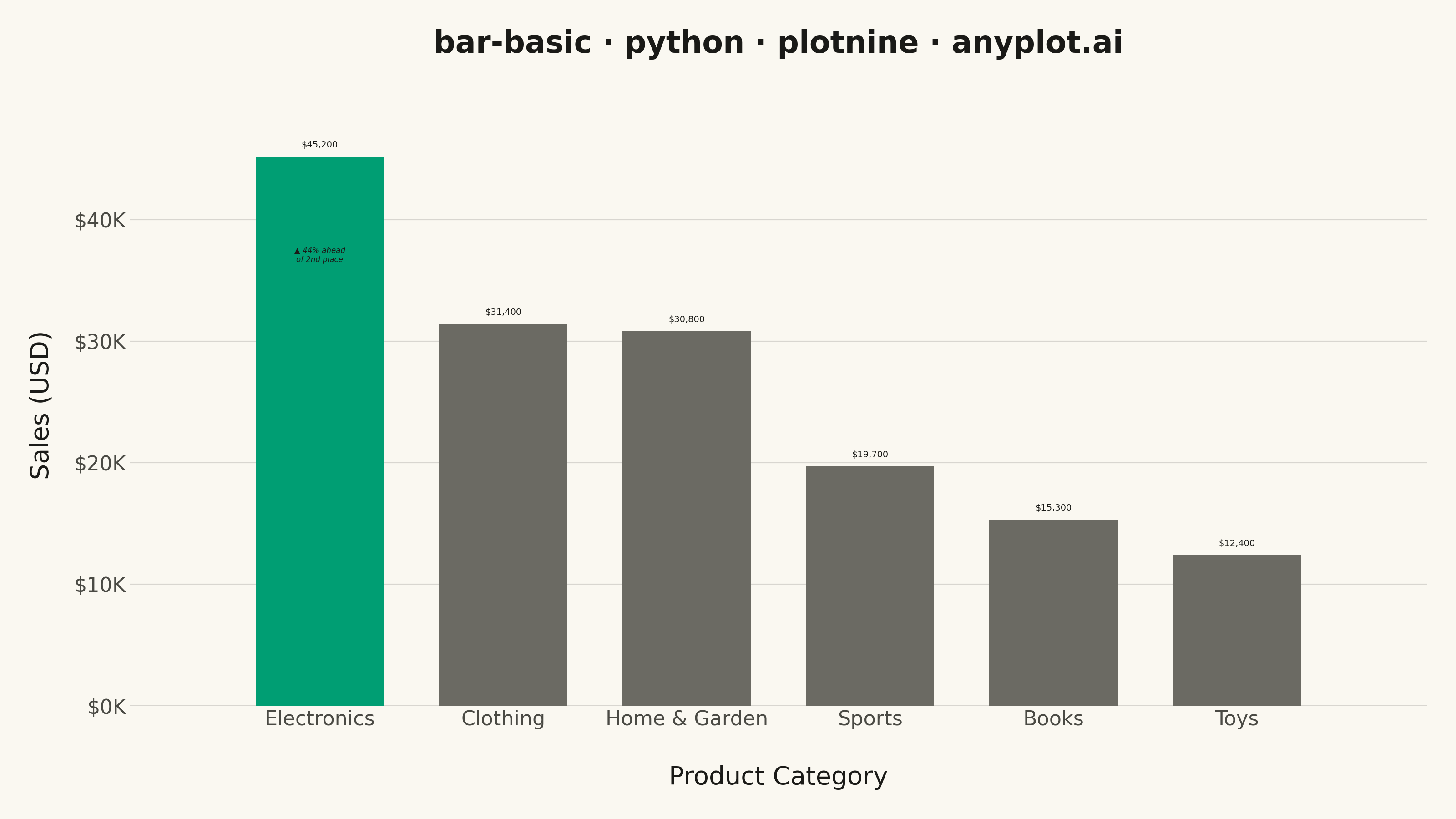
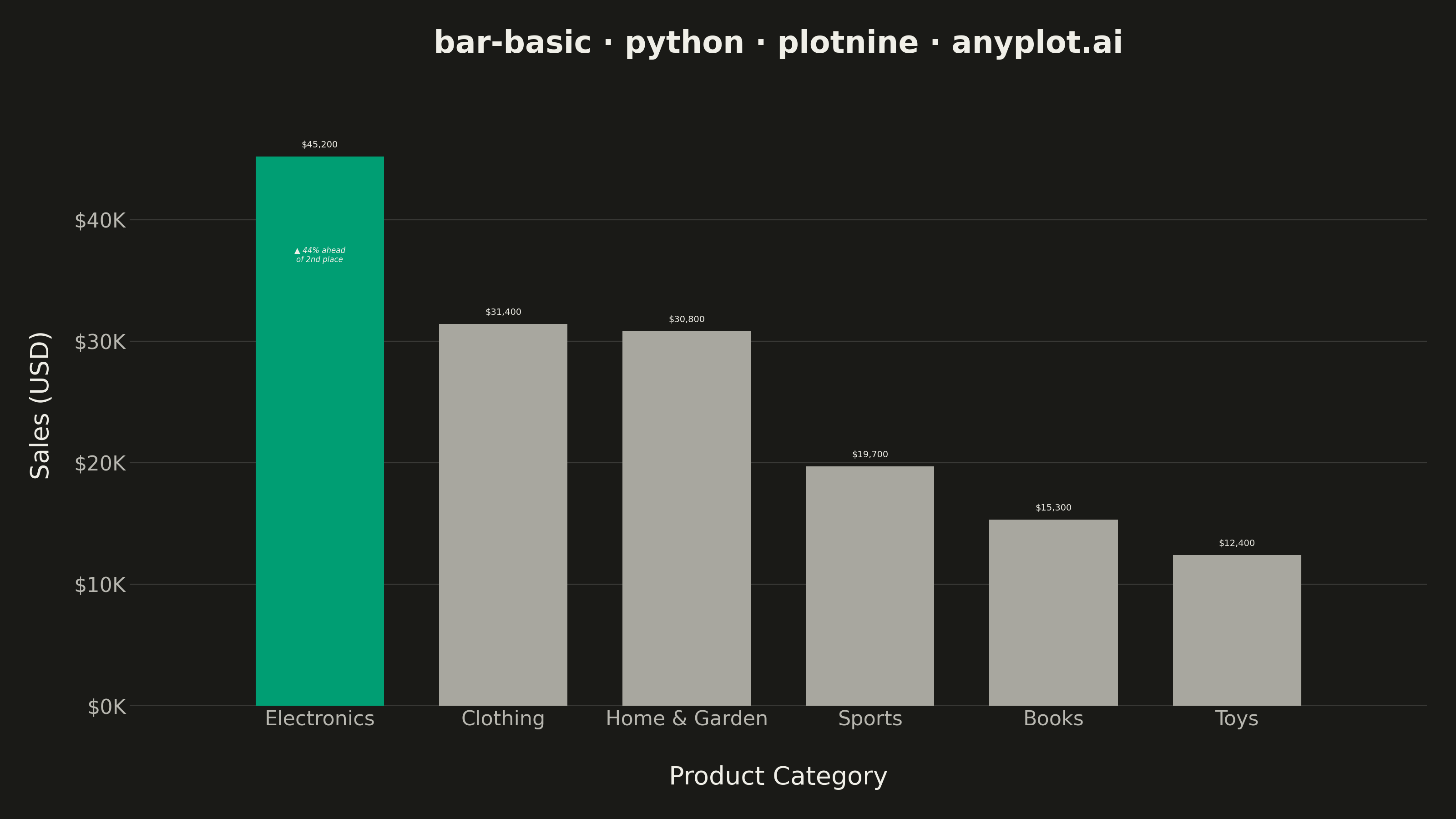
A vertical bar chart that displays categorical data with rectangular bars whose heights are proportional to the values they represent. This fundamental visualization is ideal for comparing discrete categories and identifying which categories have the highest or lowest values. Bar charts excel at showing rankings, distributions across categories, and making relative comparisons intuitive.
""" anyplot.ai
bar-basic: Basic Bar Chart
Library: plotnine 0.15.4 | Python 3.13.13
Quality: 91/100 | Updated: 2026-05-28
"""

import os
import sys


# Remove this file's directory from sys.path to prevent self-import
# (this file is named plotnine.py, same as the library being imported)
_dir = os.path.dirname(os.path.abspath(__file__))
sys.path = [p for p in sys.path if os.path.abspath(p) != _dir]

import pandas as pd
from plotnine import (
    aes,
    annotate,
    coord_cartesian,
    element_blank,
    element_line,
    element_rect,
    element_text,
    geom_bar,
    geom_text,
    ggplot,
    labs,
    scale_fill_manual,
    scale_x_discrete,
    scale_y_continuous,
    theme,
    theme_minimal,
)


# Theme tokens
THEME = os.getenv("ANYPLOT_THEME", "light")
PAGE_BG = "#FAF8F1" if THEME == "light" else "#1A1A17"
INK = "#1A1A17" if THEME == "light" else "#F0EFE8"
INK_SOFT = "#4A4A44" if THEME == "light" else "#B8B7B0"
INK_MUTED = "#6B6A63" if THEME == "light" else "#A8A79F"
BRAND = "#009E73"  # Imprint palette position 1 — always first series

# Data — non-monotonic: Clothing and Home & Garden are close rivals
data = pd.DataFrame(
    {
        "category": ["Electronics", "Clothing", "Home & Garden", "Sports", "Books", "Toys"],
        "value": [45200, 31400, 30800, 19700, 15300, 12400],
    }
)
data["category"] = pd.Categorical(
    data["category"], categories=data.sort_values("value", ascending=False)["category"], ordered=True
)

# Highlight the leading category
data["highlight"] = data["value"] == data["value"].max()

# Annotation: how far ahead is the leader
top_val = data["value"].max()
second_val = data["value"].nlargest(2).iloc[1]
lead_pct = (top_val - second_val) / second_val * 100

# Value label formatting
data["label"] = data["value"].apply(lambda v: f"${v:,.0f}")

title = "bar-basic · python · plotnine · anyplot.ai"

# Plot
plot = (
    ggplot(data, aes(x="category", y="value", fill="highlight"))
    + geom_bar(stat="identity", width=0.7, show_legend=False)
    + scale_fill_manual(values={True: BRAND, False: INK_MUTED})
    + geom_text(aes(label="label"), va="bottom", size=3.5, color=INK, nudge_y=600)
    + annotate(
        "text",
        x=1,
        y=top_val * 0.82,
        label=f"▲ {lead_pct:.0f}% ahead\nof 2nd place",
        size=3.0,
        color=INK,
        fontstyle="italic",
        ha="center",
        va="center",
    )
    + scale_y_continuous(
        labels=lambda vals: [f"${v / 1000:.0f}K" for v in vals], breaks=range(0, 55000, 10000), expand=(0, 0, 0.08, 0)
    )
    + scale_x_discrete(expand=(0.05, 0.4))
    + coord_cartesian(ylim=(0, None))
    + labs(x="Product Category", y="Sales (USD)", title=title)
    + theme_minimal(base_size=8, base_family="sans-serif")
    + theme(
        figure_size=(8, 4.5),
        plot_title=element_text(size=12, weight="bold", color=INK, margin={"b": 10}),
        axis_title_x=element_text(size=10, color=INK, margin={"t": 8}),
        axis_title_y=element_text(size=10, color=INK, margin={"r": 8}),
        axis_text=element_text(size=8, color=INK_SOFT),
        axis_text_x=element_text(rotation=0, ha="center"),
        panel_grid_major_x=element_blank(),
        panel_grid_minor=element_blank(),
        panel_grid_major_y=element_line(alpha=0.15, size=0.4, color=INK),
        axis_ticks=element_blank(),
        axis_line=element_blank(),
        panel_border=element_blank(),
        plot_background=element_rect(fill=PAGE_BG, color=PAGE_BG),
        panel_background=element_rect(fill=PAGE_BG),
        plot_margin=0.02,
    )
)

# Save
plot.save(f"plot-{THEME}.png", dpi=400, width=8, height=4.5, units="in")
Runnable source as JSON, for any HTTP client: https://api.anyplot.ai/specs/bar-basic/plotnine/code. Any spec id and library id listed in llms-full.txt fit the same URL shape; every URL below is complete and callable.
{
  "spec_id": "bar-basic",
  "language": "python",
  "library": "plotnine",
  "page": "https://anyplot.ai/bar-basic/python/plotnine",
  "hub": "https://anyplot.ai/bar-basic",
  "code_json": "https://api.anyplot.ai/specs/bar-basic/plotnine/code",
  "spec_json": "https://api.anyplot.ai/specs/bar-basic",
  "render_light_png": "https://storage.googleapis.com/anyplot-images/plots/bar-basic/python/plotnine/plot-light.png",
  "render_dark_png": "https://storage.googleapis.com/anyplot-images/plots/bar-basic/python/plotnine/plot-dark.png",
  "quality_score": 91.0,
  "license": "MIT",
  "guide": "https://anyplot.ai/llms.txt"
}
Part of Basic Bar Chart on anyplot.ai.