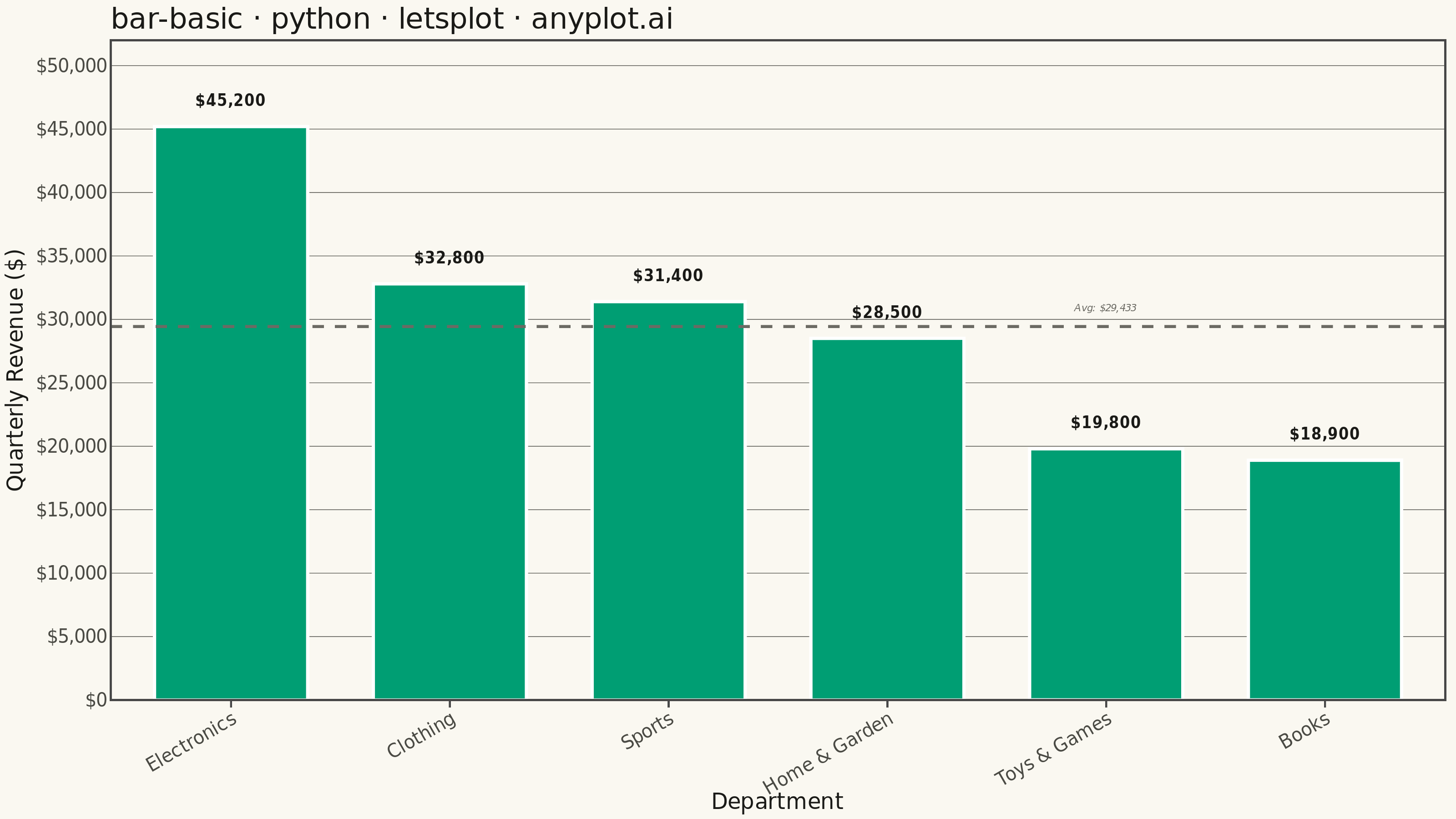
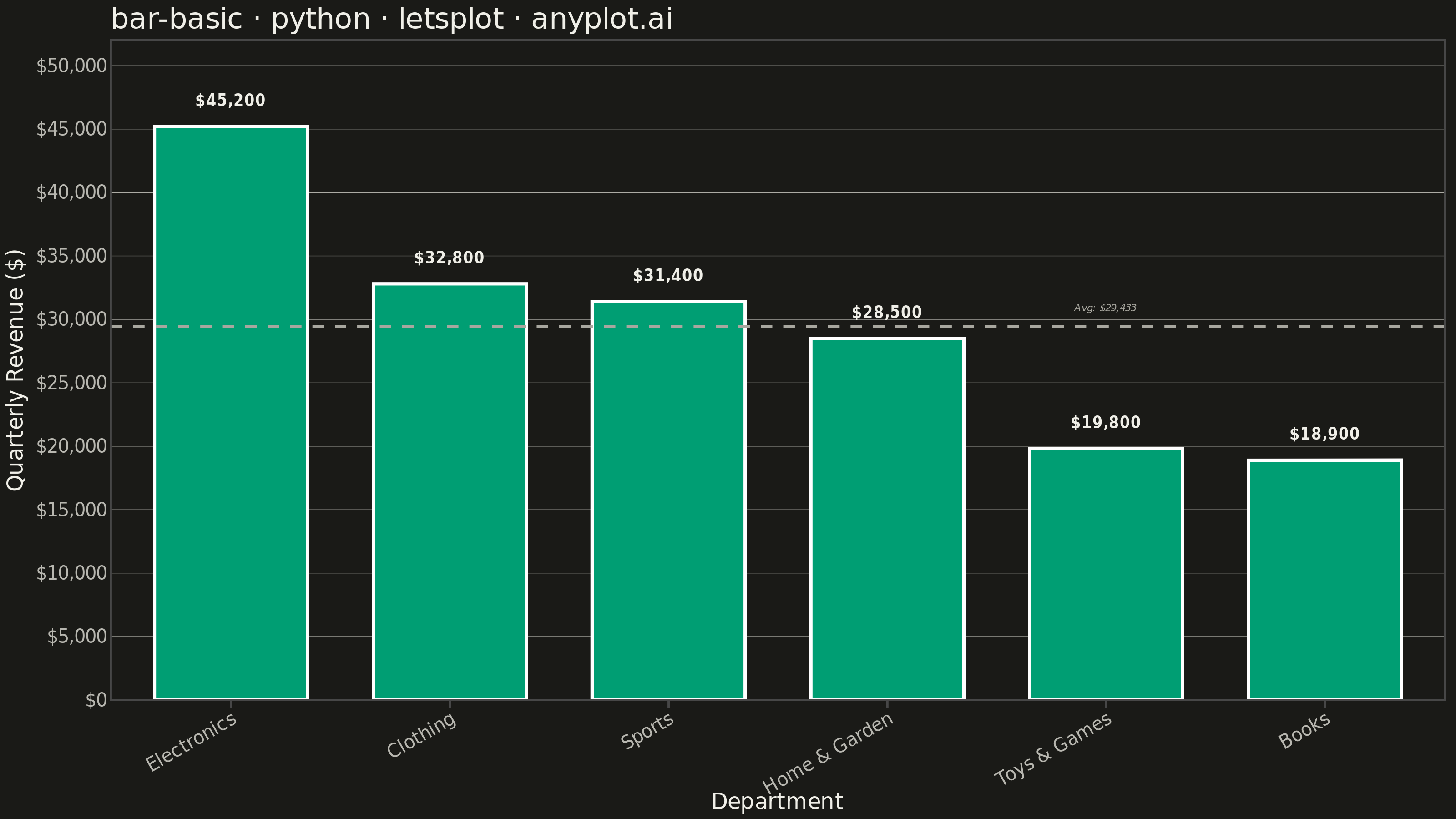
A vertical bar chart that displays categorical data with rectangular bars whose heights are proportional to the values they represent. This fundamental visualization is ideal for comparing discrete categories and identifying which categories have the highest or lowest values. Bar charts excel at showing rankings, distributions across categories, and making relative comparisons intuitive.
""" anyplot.ai
bar-basic: Basic Bar Chart
Library: letsplot 4.10.1 | Python 3.13.13
Quality: 90/100 | Updated: 2026-05-28
"""

import os

import pandas as pd
from lets_plot import *
from lets_plot.export import ggsave


LetsPlot.setup_html()

THEME = os.getenv("ANYPLOT_THEME", "light")
PAGE_BG = "#FAF8F1" if THEME == "light" else "#1A1A17"
ELEVATED_BG = "#FFFDF6" if THEME == "light" else "#242420"
INK = "#1A1A17" if THEME == "light" else "#F0EFE8"
INK_SOFT = "#4A4A44" if THEME == "light" else "#B8B7B0"
INK_MUTED = "#6B6A63" if THEME == "light" else "#A8A79F"
BRAND = "#009E73"

# Data - Quarterly revenue by department, sorted descending
categories = ["Electronics", "Clothing", "Sports", "Home & Garden", "Toys & Games", "Books"]
values = [45200, 32800, 31400, 28500, 19800, 18900]
df = pd.DataFrame({"category": categories, "value": values})

mean_val = sum(values) / len(values)
mean_label_df = pd.DataFrame({"x": ["Toys & Games"], "y": [mean_val + 1500], "label": [f"Avg: ${int(mean_val):,}"]})

anyplot_theme = theme(
    plot_background=element_rect(fill=PAGE_BG, color=PAGE_BG),
    panel_background=element_rect(fill=PAGE_BG),
    panel_grid_major_x=element_blank(),
    panel_grid_minor=element_blank(),
    panel_grid_major_y=element_line(color=INK_SOFT, size=0.3),
    axis_title=element_text(color=INK, size=12),
    axis_text=element_text(color=INK_SOFT, size=10),
    axis_text_x=element_text(angle=30, hjust=1, color=INK_SOFT, size=10),
    axis_line=element_line(color=INK_SOFT),
    plot_title=element_text(color=INK, size=16),
    legend_background=element_rect(fill=ELEVATED_BG, color=INK_SOFT),
    legend_text=element_text(color=INK_SOFT, size=10),
    legend_title=element_text(color=INK),
)

plot = (
    ggplot(df, aes(x="category", y="value"))
    + geom_bar(
        fill=BRAND,
        stat="identity",
        width=0.7,
        tooltips=layer_tooltips()
        .title("@category")
        .line("Revenue|$@{value}"),
    )
    + geom_text(
        aes(label="value"),
        position=position_nudge(y=2000),
        size=4,
        label_format="${,d}",
        color=INK,
        fontface="bold",
    )
    + geom_hline(yintercept=mean_val, color=INK_MUTED, size=0.7, linetype="dashed")
    + geom_text(
        data=mean_label_df,
        mapping=aes(x="x", y="y", label="label"),
        color=INK_MUTED,
        size=3,
        hjust=0.5,
        fontface="italic",
    )
    + labs(
        x="Department", y="Quarterly Revenue ($)", title="bar-basic · python · letsplot · anyplot.ai"
    )
    + scale_x_discrete(limits=categories)
    + scale_y_continuous(limits=[0, 52000], format="${,.0f}", expand=[0, 0, 0.08, 0])
    + anyplot_theme
    + ggsize(800, 450)
)

ggsave(plot, filename=f"plot-{THEME}.png", path=".", scale=4)
ggsave(plot, filename=f"plot-{THEME}.html", path=".")
Runnable source as JSON, for any HTTP client: https://api.anyplot.ai/specs/bar-basic/letsplot/code. Any spec id and library id listed in llms-full.txt fit the same URL shape; every URL below is complete and callable.
{
  "spec_id": "bar-basic",
  "language": "python",
  "library": "letsplot",
  "page": "https://anyplot.ai/bar-basic/python/letsplot",
  "hub": "https://anyplot.ai/bar-basic",
  "code_json": "https://api.anyplot.ai/specs/bar-basic/letsplot/code",
  "spec_json": "https://api.anyplot.ai/specs/bar-basic",
  "render_light_png": "https://storage.googleapis.com/anyplot-images/plots/bar-basic/python/letsplot/plot-light.png",
  "render_dark_png": "https://storage.googleapis.com/anyplot-images/plots/bar-basic/python/letsplot/plot-dark.png",
  "interactive_light_html": "https://storage.googleapis.com/anyplot-images/plots/bar-basic/python/letsplot/plot-light.html",
  "interactive_dark_html": "https://storage.googleapis.com/anyplot-images/plots/bar-basic/python/letsplot/plot-dark.html",
  "quality_score": 90.0,
  "license": "MIT",
  "guide": "https://anyplot.ai/llms.txt"
}
Part of Basic Bar Chart on anyplot.ai.