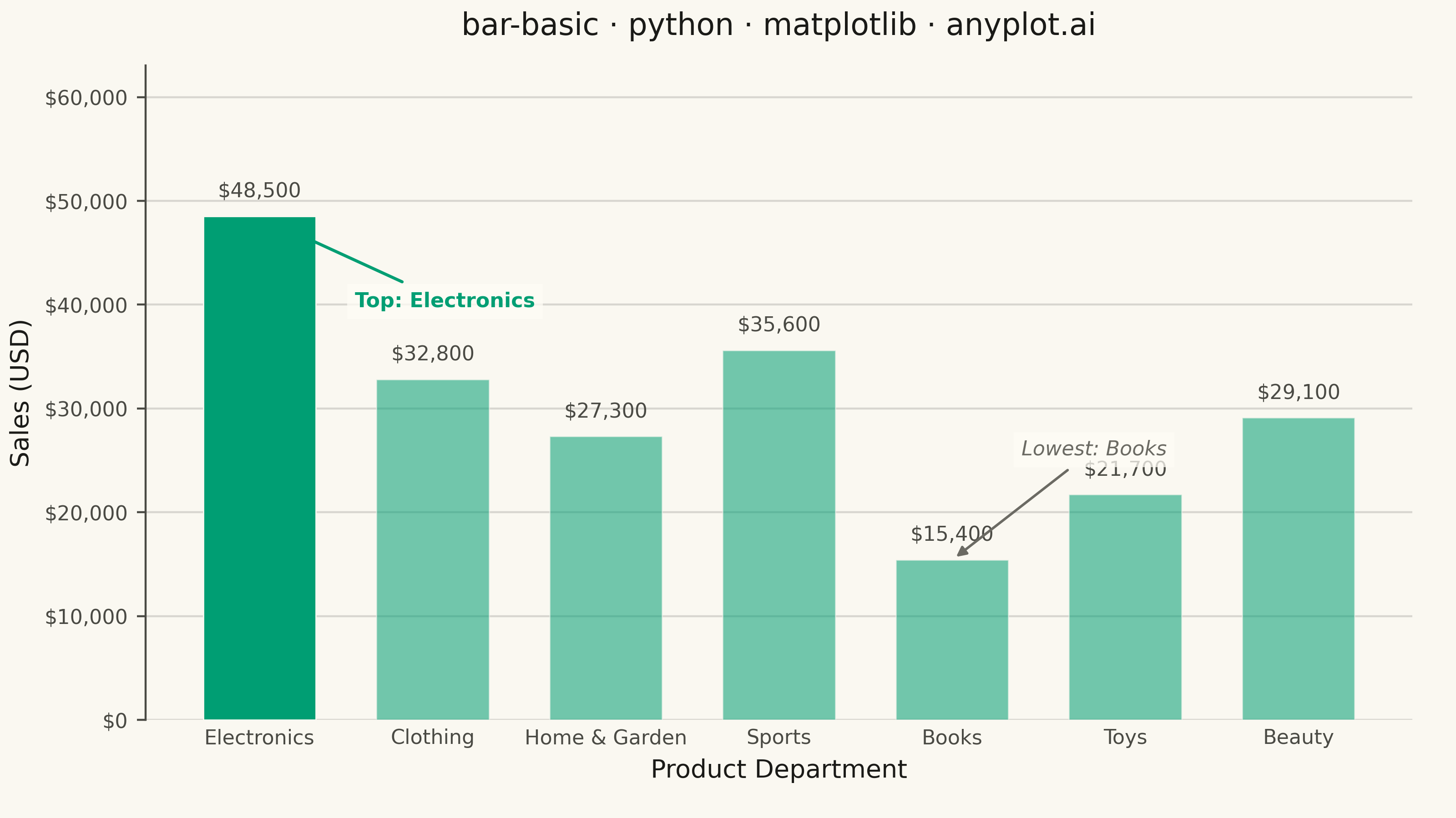
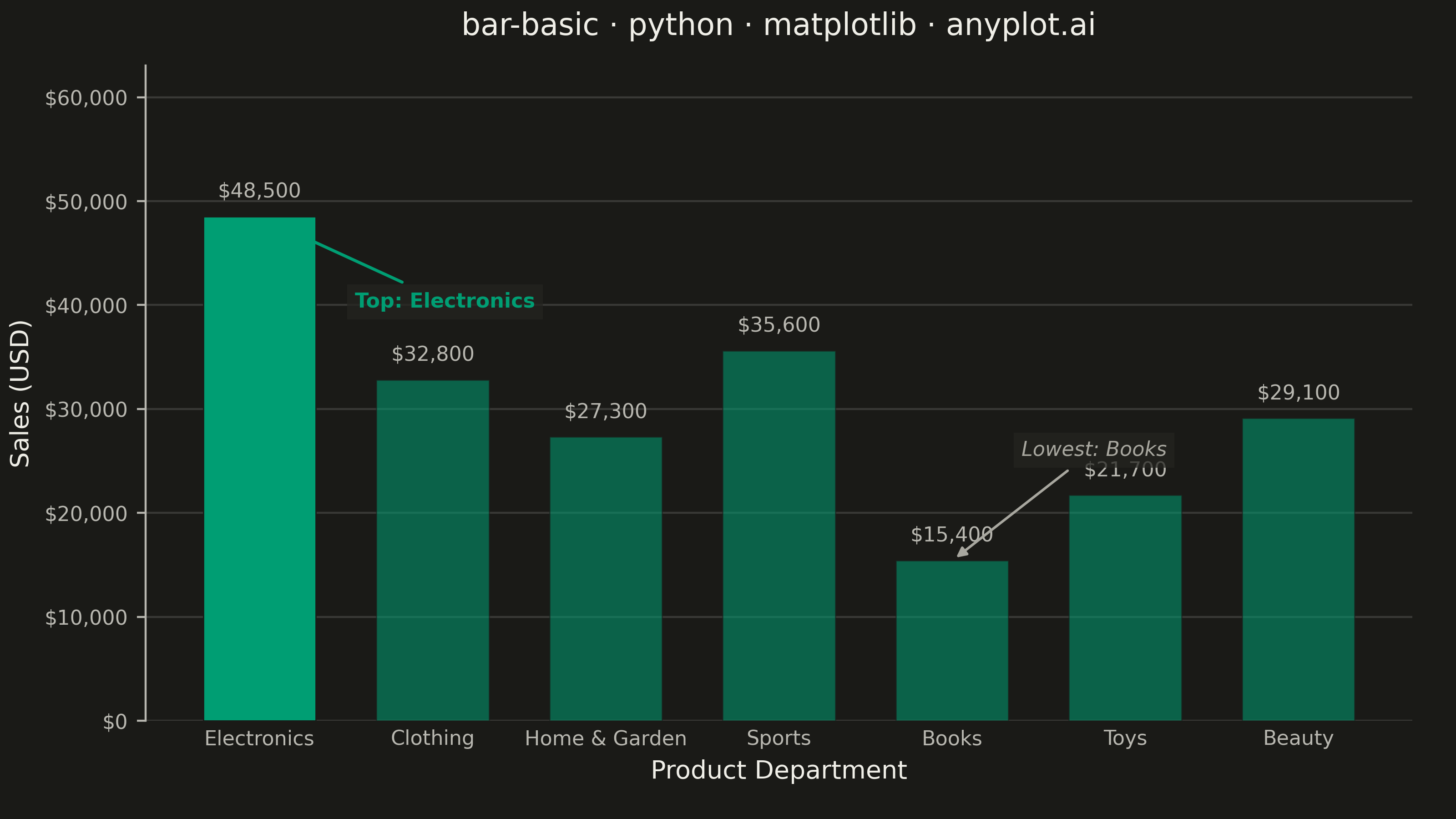
A vertical bar chart that displays categorical data with rectangular bars whose heights are proportional to the values they represent. This fundamental visualization is ideal for comparing discrete categories and identifying which categories have the highest or lowest values. Bar charts excel at showing rankings, distributions across categories, and making relative comparisons intuitive.
""" anyplot.ai
bar-basic: Basic Bar Chart
Library: matplotlib 3.10.9 | Python 3.13.13
Quality: 89/100 | Updated: 2026-05-28
"""

import os

import matplotlib.pyplot as plt
import matplotlib.ticker as ticker


# Theme tokens
THEME = os.getenv("ANYPLOT_THEME", "light")
PAGE_BG = "#FAF8F1" if THEME == "light" else "#1A1A17"
ELEVATED_BG = "#FFFDF6" if THEME == "light" else "#242420"
INK = "#1A1A17" if THEME == "light" else "#F0EFE8"
INK_SOFT = "#4A4A44" if THEME == "light" else "#B8B7B0"
INK_MUTED = "#6B6A63" if THEME == "light" else "#A8A79F"
BRAND = "#009E73"

# Data — Q1 retail sales by product department
categories = ["Electronics", "Clothing", "Home & Garden", "Sports", "Books", "Toys", "Beauty"]
values = [48500, 32800, 27300, 35600, 15400, 21700, 29100]

max_idx = values.index(max(values))
min_idx = values.index(min(values))

# Plot
fig, ax = plt.subplots(figsize=(8, 4.5), dpi=400, facecolor=PAGE_BG)
ax.set_facecolor(PAGE_BG)

bars = ax.bar(categories, values, color=BRAND, width=0.65, edgecolor=PAGE_BG, linewidth=0.5)

# Focal emphasis: top bar at full opacity, others desaturated
for i, bar in enumerate(bars):
    bar.set_alpha(1.0 if i == max_idx else 0.55)

# Value labels above bars
ax.bar_label(bars, labels=[f"${v:,.0f}" for v in values], padding=6, fontsize=8, color=INK_SOFT)

# Y-axis dollar formatting
ax.yaxis.set_major_formatter(ticker.StrMethodFormatter("${x:,.0f}"))

# Title and axis labels
title = "bar-basic · python · matplotlib · anyplot.ai"
ax.set_title(title, fontsize=12, fontweight="medium", color=INK, pad=12)
ax.set_xlabel("Product Department", fontsize=10, color=INK)
ax.set_ylabel("Sales (USD)", fontsize=10, color=INK)
ax.tick_params(axis="both", labelsize=8, colors=INK_SOFT)
ax.tick_params(axis="x", length=0)

# Subtle y-axis grid
ax.yaxis.grid(True, alpha=0.15, linewidth=0.8, color=INK)
ax.set_axisbelow(True)

# Y-axis range with headroom for value labels and annotations
ax.set_ylim(bottom=0, top=max(values) * 1.30)

# Spines — open x-axis (bottom removed; tick marks already length=0), left spine only
ax.spines["top"].set_visible(False)
ax.spines["right"].set_visible(False)
ax.spines["bottom"].set_visible(False)
ax.spines["left"].set_color(INK_SOFT)

# Annotation — top performer: text placed to the right of its bar, short arrow
ax.annotate(
    f"Top: {categories[max_idx]}",
    xy=(max_idx, values[max_idx]),
    xytext=(max_idx + 0.55, values[max_idx] * 0.82),
    fontsize=8,
    fontweight="bold",
    color=BRAND,
    ha="left",
    arrowprops={"arrowstyle": "-|>", "color": BRAND, "lw": 1.2},
    bbox={"facecolor": ELEVATED_BG, "edgecolor": "none", "alpha": 0.75, "pad": 3},
)

# Annotation — lowest performer: text placed directly above its own bar (no cross-bar arrow)
ax.annotate(
    f"Lowest: {categories[min_idx]}",
    xy=(min_idx, values[min_idx]),
    xytext=(min_idx + 0.4, values[min_idx] + max(values) * 0.20),
    fontsize=8,
    fontstyle="italic",
    color=INK_MUTED,
    ha="left",
    va="bottom",
    arrowprops={"arrowstyle": "-|>", "color": INK_MUTED, "lw": 1.0},
    bbox={"facecolor": ELEVATED_BG, "edgecolor": "none", "alpha": 0.75, "pad": 3},
)

# Layout
fig.subplots_adjust(left=0.10, right=0.97, top=0.92, bottom=0.12)

# Save
plt.savefig(f"plot-{THEME}.png", dpi=400, facecolor=PAGE_BG)
Runnable source as JSON, for any HTTP client: https://api.anyplot.ai/specs/bar-basic/matplotlib/code. Any spec id and library id listed in llms-full.txt fit the same URL shape; every URL below is complete and callable.
{
  "spec_id": "bar-basic",
  "language": "python",
  "library": "matplotlib",
  "page": "https://anyplot.ai/bar-basic/python/matplotlib",
  "hub": "https://anyplot.ai/bar-basic",
  "code_json": "https://api.anyplot.ai/specs/bar-basic/matplotlib/code",
  "spec_json": "https://api.anyplot.ai/specs/bar-basic",
  "render_light_png": "https://storage.googleapis.com/anyplot-images/plots/bar-basic/python/matplotlib/plot-light.png",
  "render_dark_png": "https://storage.googleapis.com/anyplot-images/plots/bar-basic/python/matplotlib/plot-dark.png",
  "quality_score": 89.0,
  "license": "MIT",
  "guide": "https://anyplot.ai/llms.txt"
}
Part of Basic Bar Chart on anyplot.ai.