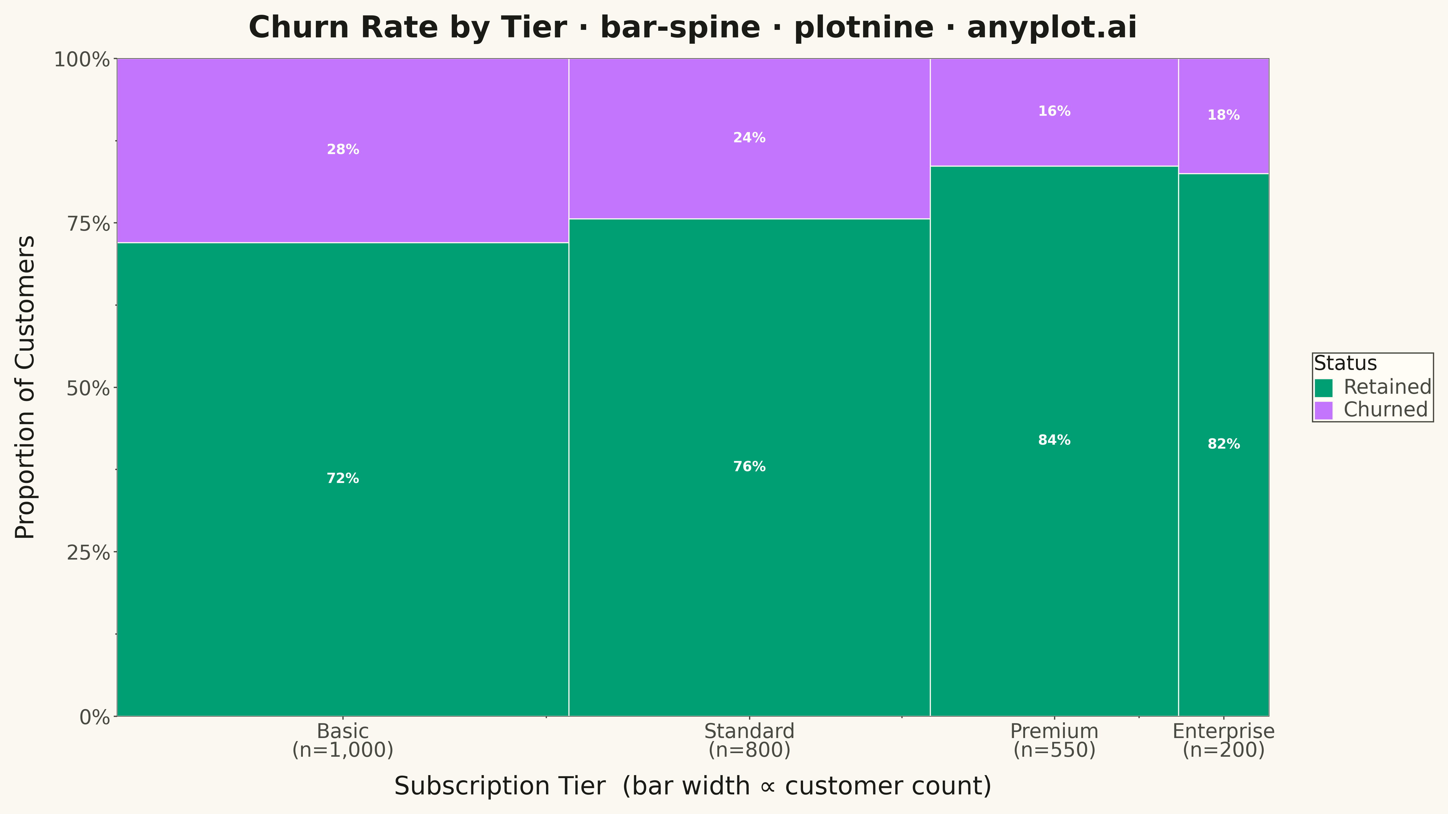
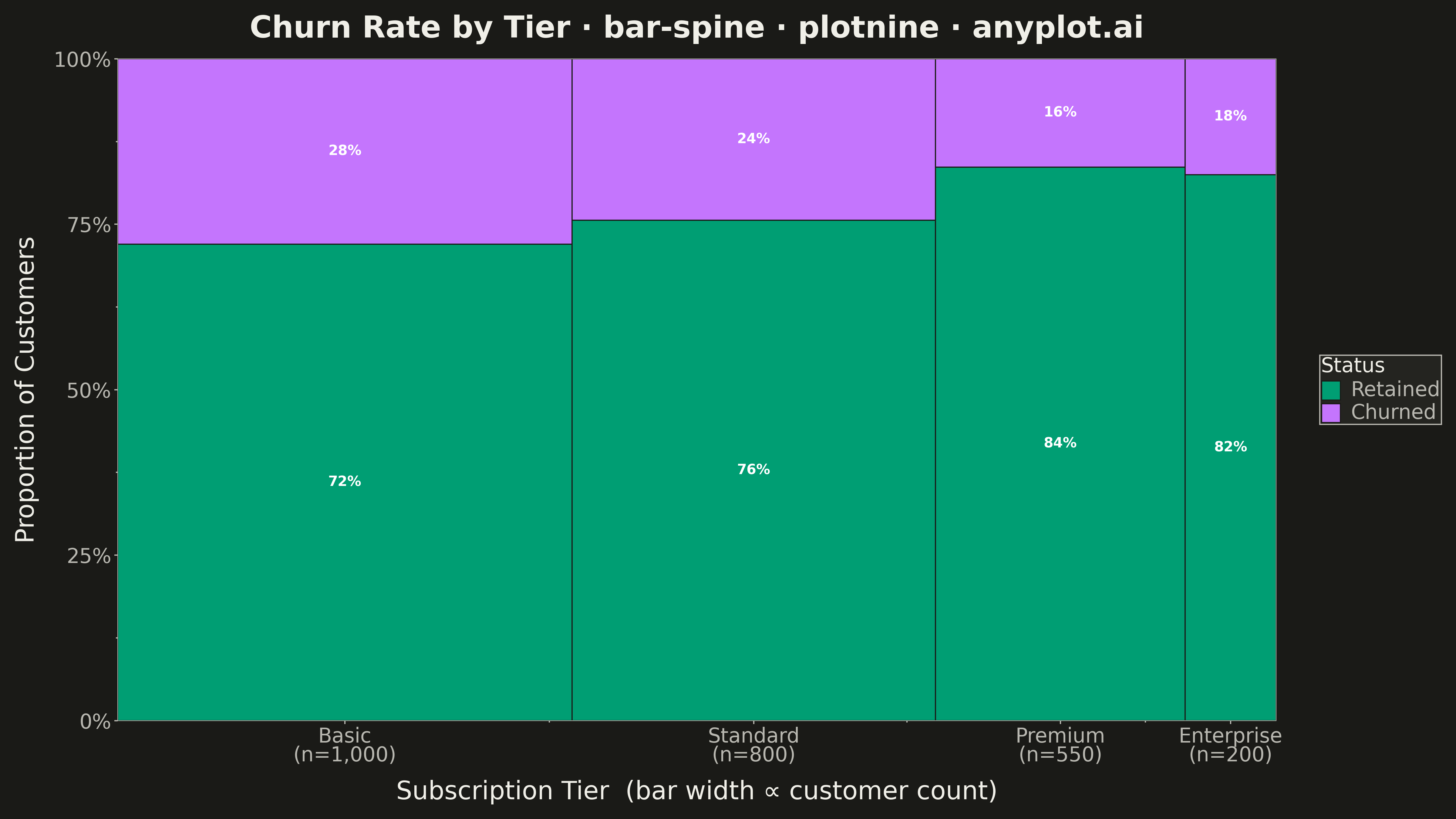
The same plot in 14 other libraries — Python: Altair, Bokeh, lets-plot, Matplotlib, Plotly, Pygal, Seaborn; R: ggplot2; Julia: Makie.jl; JavaScript: Chart.js, D3.js, Apache ECharts, Highcharts, MUI X Charts. Compare all 15 side by side: Spine Plot for Two-Variable Proportions in Python, R, Julia and JavaScript.
A spine plot (spineplot) is a stacked bar chart where bar widths are proportional to the marginal frequency of one categorical variable and the subdivisions within each bar show the conditional distribution of a second categorical variable. All bars are normalized to the same height (100%), so visual comparison focuses on how the conditional proportions shift across categories. It is a one-dimensional specialization of mosaic plots and excels at revealing associations between two categorical variables in contingency table data.
""" anyplot.ai
bar-spine: Spine Plot for Two-Variable Proportions
Library: plotnine 0.15.8 | Python 3.13.15
Quality: 89/100 | Updated: 2026-09-27
"""

import os

import pandas as pd
from plotnine import (
    aes,
    element_blank,
    element_line,
    element_rect,
    element_text,
    geom_rect,
    geom_text,
    ggplot,
    labs,
    scale_fill_manual,
    scale_x_continuous,
    scale_y_continuous,
    theme,
)


THEME = os.getenv("ANYPLOT_THEME", "light")
PAGE_BG = "#FAF8F1" if THEME == "light" else "#1A1A17"
ELEVATED_BG = "#FFFDF6" if THEME == "light" else "#242420"
INK = "#1A1A17" if THEME == "light" else "#F0EFE8"
INK_SOFT = "#4A4A44" if THEME == "light" else "#B8B7B0"

# Imprint palette — position 1 always the brand green
IMPRINT = ["#009E73", "#C475FD", "#4467A3", "#BD8233", "#AE3030", "#2ABCCD", "#954477", "#99B314"]

# Data — e-commerce order outcomes by product category.
# Categories are ordered by return rate, worst offender first — the story is
# "where do returns hurt most", so the eye lands on Apparel before Books.
orders_by_category = {
    "Apparel": {"Kept": 780, "Exchanged": 120, "Refunded": 300},
    "Electronics": {"Kept": 650, "Exchanged": 70, "Refunded": 180},
    "Home & Garden": {"Kept": 410, "Exchanged": 20, "Refunded": 70},
    "Toys": {"Kept": 320, "Exchanged": 5, "Refunded": 25},
    "Books": {"Kept": 240, "Exchanged": 2, "Refunded": 8},
}
category_order = list(orders_by_category)
outcome_order = ["Kept", "Exchanged", "Refunded"]

df = pd.DataFrame(
    [
        {"category": category, "outcome": outcome, "orders": count}
        for category, counts in orders_by_category.items()
        for outcome, count in counts.items()
    ]
)

# Marginal totals and bar widths (width ∝ order volume per category)
totals = df.groupby("category", sort=False)["orders"].sum().reindex(category_order).reset_index()
totals.columns = ["category", "total"]
grand_total = totals["total"].sum()
totals["width"] = totals["total"] / grand_total
totals["xmax"] = totals["width"].cumsum()
totals["xmin"] = totals["xmax"] - totals["width"]
totals["xcenter"] = (totals["xmin"] + totals["xmax"]) / 2

# Merge widths into main dataframe
df = df.merge(totals[["category", "total", "xmin", "xmax", "xcenter"]], on="category")
df["prop"] = df["orders"] / df["total"]

# Sort and compute cumulative y positions (conditional proportions)
df["category"] = pd.Categorical(df["category"], categories=category_order, ordered=True)
df["outcome"] = pd.Categorical(df["outcome"], categories=outcome_order, ordered=True)
df = df.sort_values(["category", "outcome"]).reset_index(drop=True)
df["ymax"] = df.groupby("category", observed=True)["prop"].cumsum()
df["ymin"] = df["ymax"] - df["prop"]
df["ylabel"] = (df["ymin"] + df["ymax"]) / 2
df["label"] = df["prop"].apply(lambda p: f"{p:.0%}" if p >= 0.06 else "")

# X-axis: one tick per category, centered under each variable-width bar
x_breaks = totals["xcenter"].tolist()
x_labels = [f"{c}\n(n={t:,})" for c, t in zip(totals["category"], totals["total"], strict=True)]

anyplot_theme = theme(
    figure_size=(8, 4.5),
    text=element_text(size=7),
    plot_background=element_rect(fill=PAGE_BG, color=PAGE_BG),
    panel_background=element_rect(fill=PAGE_BG),
    panel_grid_major=element_blank(),
    panel_grid_minor=element_blank(),
    panel_border=element_blank(),
    axis_line=element_line(color=INK_SOFT, size=0.5),
    axis_title=element_text(color=INK, size=10),
    axis_text=element_text(color=INK_SOFT, size=8),
    axis_ticks=element_line(color=INK_SOFT),
    plot_title=element_text(color=INK, size=10, weight="bold"),
    legend_background=element_rect(fill=ELEVATED_BG, color=INK_SOFT),
    legend_text=element_text(color=INK_SOFT, size=8),
    legend_title=element_text(color=INK, size=8),
    legend_key=element_rect(fill=ELEVATED_BG),
)

# Outcome -> Imprint slot: Kept keeps the mandatory brand green; Refunded is
# the genuine dollar loss so it borrows the semantic-red anchor (slot 5)
# instead of the next ordinal slot, making the costliest segment the one
# that visually jumps out in every category.
fill_values = {"Kept": IMPRINT[0], "Exchanged": IMPRINT[1], "Refunded": IMPRINT[4]}

# Plot
plot = (
    ggplot(df)
    + geom_rect(aes(xmin="xmin", xmax="xmax", ymin="ymin", ymax="ymax", fill="outcome"), color=PAGE_BG, size=0.5)
    + geom_text(aes(x="xcenter", y="ylabel", label="label"), color="white", size=2.8, fontweight="bold")
    + scale_fill_manual(values=fill_values, name="Outcome", limits=outcome_order)
    + scale_x_continuous(breaks=x_breaks, labels=x_labels, limits=(0, 1), expand=(0, 0))
    + scale_y_continuous(
        breaks=[0, 0.25, 0.5, 0.75, 1.0], labels=["0%", "25%", "50%", "75%", "100%"], limits=(0, 1), expand=(0, 0)
    )
    + labs(
        x="Product Category  (bar width ∝ order volume)",
        y="Share of Orders",
        title="Product Returns by Category · bar-spine · python · plotnine · anyplot.ai",
    )
    + anyplot_theme
)

# Save
plot.save(f"plot-{THEME}.png", dpi=400, width=8, height=4.5, units="in")
Runnable source as JSON, for any HTTP client: https://api.anyplot.ai/specs/bar-spine/plotnine/code. Any spec id and library id listed in llms-full.txt fit the same URL shape; every URL below is complete and callable.
{
  "spec_id": "bar-spine",
  "language": "python",
  "library": "plotnine",
  "page": "https://anyplot.ai/bar-spine/python/plotnine",
  "hub": "https://anyplot.ai/bar-spine",
  "code_json": "https://api.anyplot.ai/specs/bar-spine/plotnine/code",
  "spec_json": "https://api.anyplot.ai/specs/bar-spine",
  "render_light_png": "https://storage.googleapis.com/anyplot-images/plots/bar-spine/python/plotnine/plot-light.png",
  "render_dark_png": "https://storage.googleapis.com/anyplot-images/plots/bar-spine/python/plotnine/plot-dark.png",
  "quality_score": 89.0,
  "license": "MIT",
  "guide": "https://anyplot.ai/llms.txt"
}
Part of Spine Plot for Two-Variable Proportions on anyplot.ai.