The same plot in 14 other libraries — Python: Altair, Bokeh, lets-plot, Matplotlib, Plotly, plotnine, Seaborn; R: ggplot2; Julia: Makie.jl; JavaScript: Chart.js, D3.js, Apache ECharts, Highcharts, MUI X Charts. Compare all 15 side by side: Spine Plot for Two-Variable Proportions in Python, R, Julia and JavaScript.
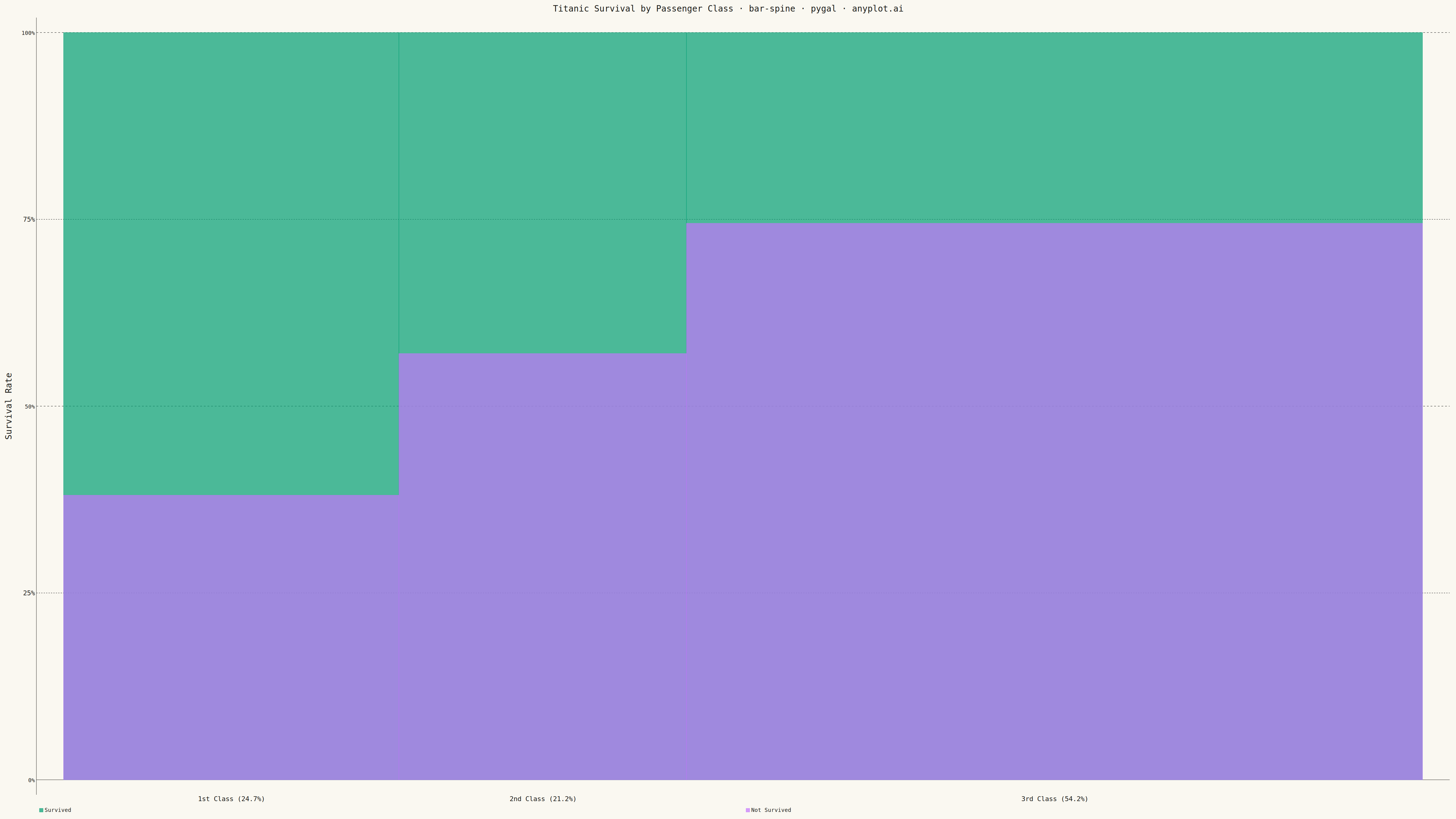
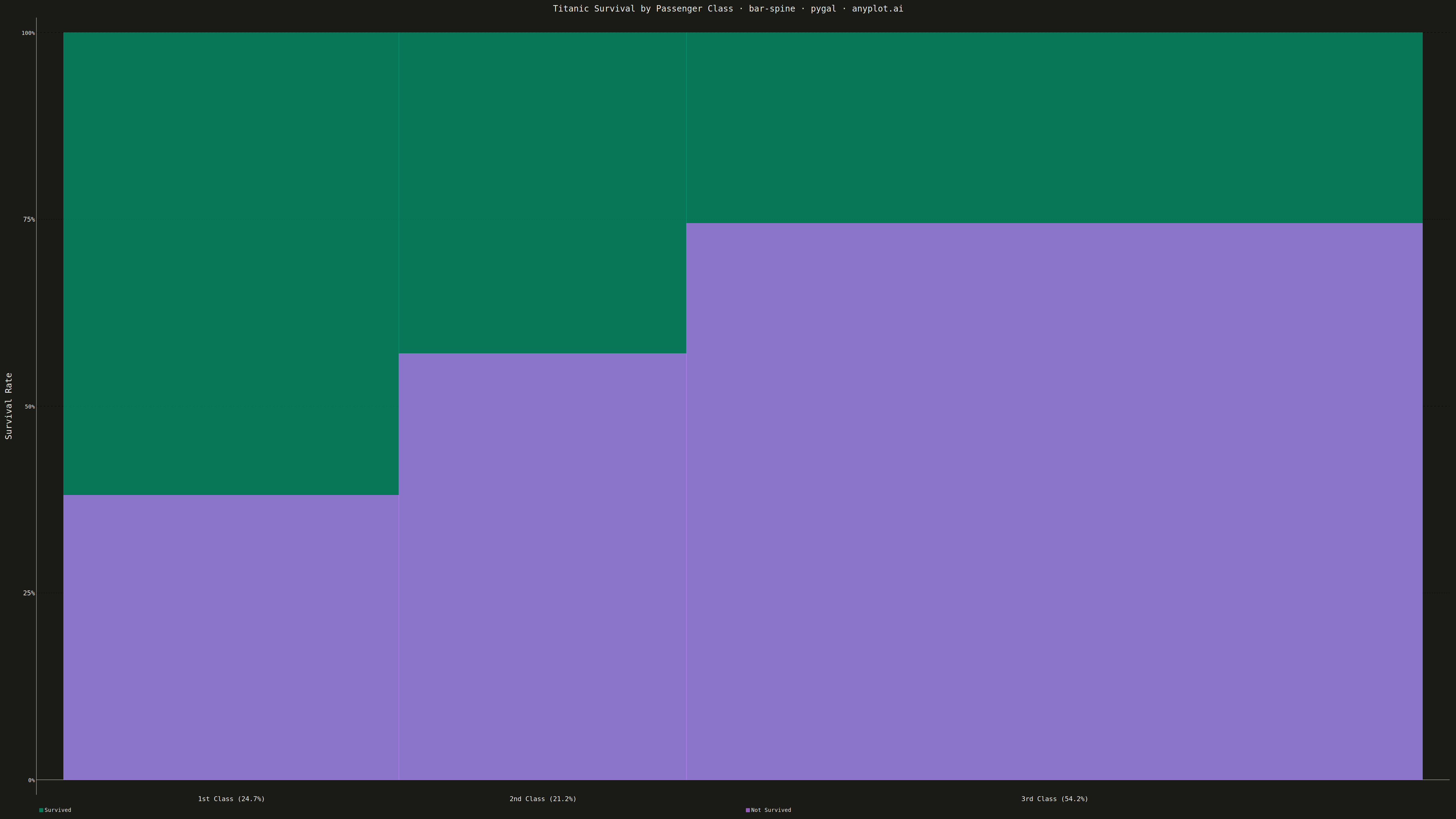
A spine plot (spineplot) is a stacked bar chart where bar widths are proportional to the marginal frequency of one categorical variable and the subdivisions within each bar show the conditional distribution of a second categorical variable. All bars are normalized to the same height (100%), so visual comparison focuses on how the conditional proportions shift across categories. It is a one-dimensional specialization of mosaic plots and excels at revealing associations between two categorical variables in contingency table data.
""" anyplot.ai
bar-spine: Spine Plot for Two-Variable Proportions
Library: pygal 3.1.3 | Python 3.13.15
Quality: 91/100 | Updated: 2026-09-27
"""

import os
import sys


# Remove current directory from path to avoid collision with this filename
_cwd = sys.path[0] if sys.path[0] else "."
if _cwd in sys.path:
    sys.path.remove(_cwd)

import pygal
from pygal.style import Style


sys.path.insert(0, _cwd)

THEME = os.getenv("ANYPLOT_THEME", "light")
PAGE_BG = "#FAF8F1" if THEME == "light" else "#1A1A17"
INK = "#1A1A17" if THEME == "light" else "#F0EFE8"
INK_SOFT = "#4A4A44" if THEME == "light" else "#B8B7B0"
INK_MUTED = "#6B6A63" if THEME == "light" else "#A8A79F"

IMPRINT = ("#009E73", "#C475FD", "#4467A3", "#BD8233", "#AE3030", "#2ABCCD", "#954477")

# Data: Titanic passenger survival by passenger class
class_names = ["1st Class", "2nd Class", "3rd Class"]
survived_counts = [200, 119, 181]
not_survived_counts = [123, 158, 528]
class_totals = [s + n for s, n in zip(survived_counts, not_survived_counts, strict=True)]
grand_total = sum(class_totals)

# Bar widths proportional to marginal (class) frequencies
widths = [t / grand_total for t in class_totals]
x_ranges = []
cumulative = 0.0
for w in widths:
    x_ranges.append((cumulative, cumulative + w))
    cumulative += w

# Conditional proportions within each bar (spine plot segments)
survive_props = [s / t for s, t in zip(survived_counts, class_totals, strict=True)]
not_survive_props = [1.0 - sp for sp in survive_props]

# Title fontsize scales with title length off the 67-char mandated baseline
TITLE = "Titanic Survival by Passenger Class · bar-spine · python · pygal · anyplot.ai"
title_font_size = round(66 * min(1.0, 67 / len(TITLE)))

custom_style = Style(
    background=PAGE_BG,
    plot_background=PAGE_BG,
    foreground=INK_SOFT,
    foreground_strong=INK,
    foreground_subtle=INK_MUTED,
    colors=IMPRINT,
    opacity=1,
    stroke_opacity=1,
    stroke_width=1.5,
    # Serif title distinguishes the headline from the monospace data labels
    # below, rather than leaving every text element in the library-default face.
    title_font_family='Georgia, "Times New Roman", serif',
    title_font_size=title_font_size,
    label_font_size=56,
    major_label_font_size=44,
    legend_font_size=44,
    value_font_size=36,
)

chart = pygal.Histogram(
    style=custom_style,
    width=3200,
    height=1800,
    title=TITLE,
    y_title="Survival Rate (%)",
    show_legend=True,
    show_x_guides=False,
    show_y_guides=True,
    legend_at_bottom=True,
    legend_at_bottom_columns=2,
    print_values=True,
    print_values_position="top",
    truncate_label=-1,
)

# Spine plot using overlapping Histogram bars:
# Series 1 "Survived" (Imprint green #009E73): full-height background bar (value=1.0)
# Series 2 "Not Survived" (Imprint lavender #C475FD): overlay bar from y=0 to not_survive_prop
# → lavender covers the bottom portion; green is visible at top (survive_prop)
# opacity=1 keeps the overlay fully solid so the covered green never bleeds through.
survived_data = [
    {"value": (1.0, x_min, x_max), "label": f"{cls} — {sp:.1%} survived"}
    for cls, sp, (x_min, x_max) in zip(class_names, survive_props, x_ranges, strict=True)
]
not_survived_data = [
    {"value": (nsp, x_min, x_max), "label": f"{cls} — {nsp:.1%} not survived"}
    for cls, nsp, (x_min, x_max) in zip(class_names, not_survive_props, x_ranges, strict=True)
]

# print_values_position="top" anchors each series' label just above its own
# rect's top edge. "Survived" spans the full [0, 1] range, so its label lands
# above the plot as a per-bar headline. "Not Survived" only rises to
# not_survive_prop, so its label sits right at the green/purple boundary —
# inside the visible green sliver, next to the segment it describes.
chart.add("Survived", survived_data, formatter=lambda _v, index=None, **_kw: f"{survive_props[index]:.0%} survived")
chart.add(
    "Not Survived",
    not_survived_data,
    formatter=lambda _v, index=None, **_kw: f"{not_survive_props[index]:.0%} not survived",
)

# Y-axis in percentage format
chart.y_labels = [
    {"label": "0%", "value": 0},
    {"label": "25%", "value": 0.25},
    {"label": "50%", "value": 0.50},
    {"label": "75%", "value": 0.75},
    {"label": "100%", "value": 1.0},
]

# X-axis labels centered under each variable-width bar (spec requirement)
chart.x_labels = [
    {"label": f"{cls} ({w:.1%})", "value": (x_min + x_max) / 2}
    for cls, w, (x_min, x_max) in zip(class_names, widths, x_ranges, strict=True)
]

chart.render_to_png(f"plot-{THEME}.png")
with open(f"plot-{THEME}.html", "wb") as f:
    f.write(chart.render())
Runnable source as JSON, for any HTTP client: https://api.anyplot.ai/specs/bar-spine/pygal/code. Any spec id and library id listed in llms-full.txt fit the same URL shape; every URL below is complete and callable.
{
  "spec_id": "bar-spine",
  "language": "python",
  "library": "pygal",
  "page": "https://anyplot.ai/bar-spine/python/pygal",
  "hub": "https://anyplot.ai/bar-spine",
  "code_json": "https://api.anyplot.ai/specs/bar-spine/pygal/code",
  "spec_json": "https://api.anyplot.ai/specs/bar-spine",
  "render_light_png": "https://storage.googleapis.com/anyplot-images/plots/bar-spine/python/pygal/plot-light.png",
  "render_dark_png": "https://storage.googleapis.com/anyplot-images/plots/bar-spine/python/pygal/plot-dark.png",
  "interactive_light_html": "https://storage.googleapis.com/anyplot-images/plots/bar-spine/python/pygal/plot-light.html",
  "interactive_dark_html": "https://storage.googleapis.com/anyplot-images/plots/bar-spine/python/pygal/plot-dark.html",
  "quality_score": 91.0,
  "license": "MIT",
  "guide": "https://anyplot.ai/llms.txt"
}
Part of Spine Plot for Two-Variable Proportions on anyplot.ai.