The same plot in 14 other libraries — Python: Altair, Bokeh, lets-plot, Matplotlib, plotnine, Pygal, Seaborn; R: ggplot2; Julia: Makie.jl; JavaScript: Chart.js, D3.js, Apache ECharts, Highcharts, MUI X Charts. Compare all 15 side by side: Spine Plot for Two-Variable Proportions in Python, R, Julia and JavaScript.
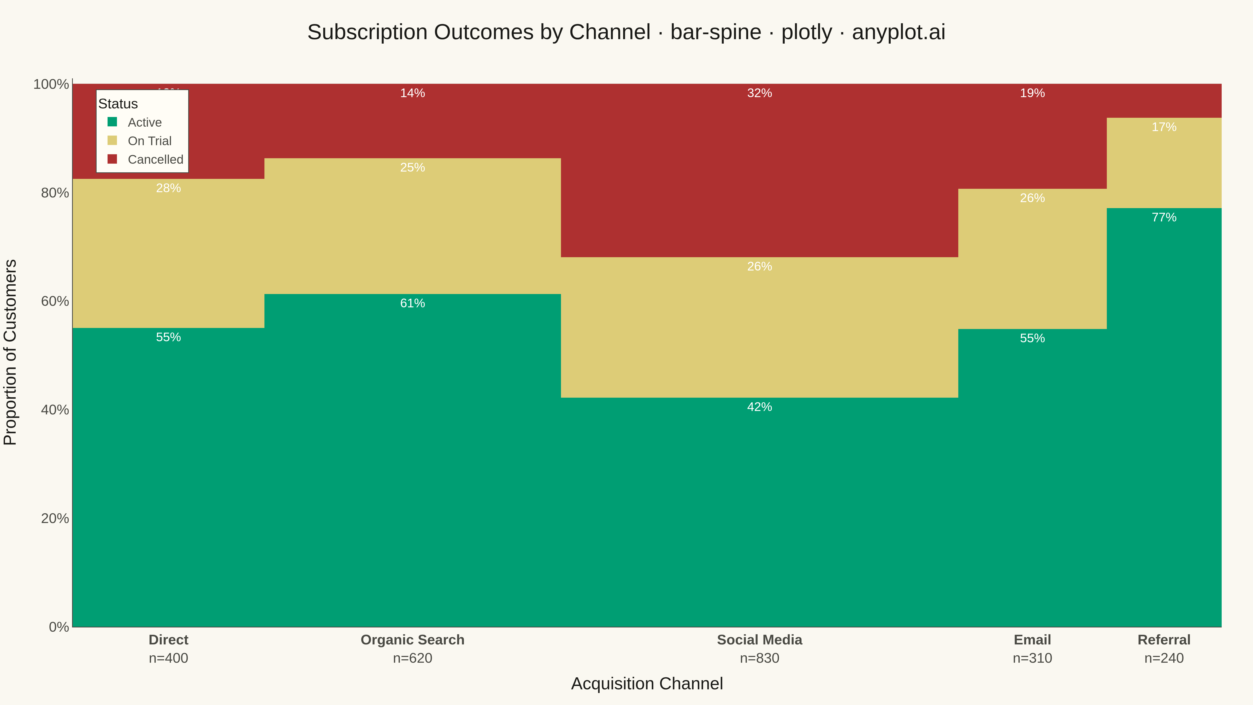
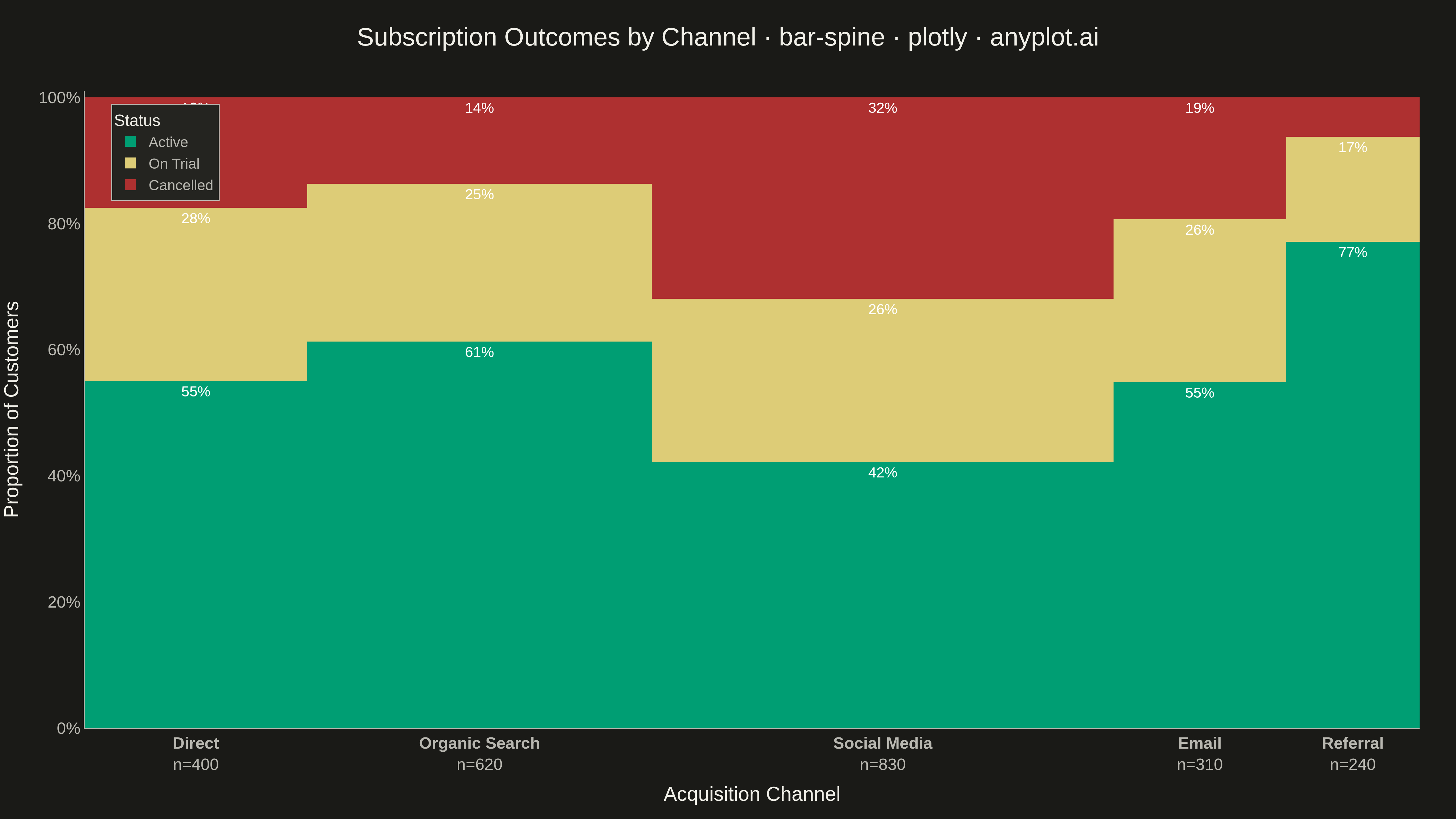
A spine plot (spineplot) is a stacked bar chart where bar widths are proportional to the marginal frequency of one categorical variable and the subdivisions within each bar show the conditional distribution of a second categorical variable. All bars are normalized to the same height (100%), so visual comparison focuses on how the conditional proportions shift across categories. It is a one-dimensional specialization of mosaic plots and excels at revealing associations between two categorical variables in contingency table data.
""" anyplot.ai
bar-spine: Spine Plot for Two-Variable Proportions
Library: plotly 7.1.0 | Python 3.13.15
Quality: 92/100 | Updated: 2026-09-27
"""

import os

import plotly.graph_objects as go


# Theme tokens
THEME = os.getenv("ANYPLOT_THEME", "light")
PAGE_BG = "#FAF8F1" if THEME == "light" else "#1A1A17"
ELEVATED_BG = "#FFFDF6" if THEME == "light" else "#242420"
INK = "#1A1A17" if THEME == "light" else "#F0EFE8"
INK_SOFT = "#4A4A44" if THEME == "light" else "#B8B7B0"
GRID = "rgba(26,26,23,0.15)" if THEME == "light" else "rgba(240,239,232,0.15)"

# Data: subscription outcomes by acquisition channel
channels = ["Direct", "Organic Search", "Social Media", "Email", "Referral"]
channel_sizes = [400, 620, 830, 310, 240]

outcome_counts = {
    "Active": [220, 380, 350, 170, 185],
    "On Trial": [110, 155, 215, 80, 40],
    "Cancelled": [70, 85, 265, 60, 15],
}

# Bar widths proportional to marginal counts
total = sum(channel_sizes)
widths = [c / total for c in channel_sizes]

# Bar centers along the x-axis (cumulative)
centers = []
pos = 0.0
for w in widths:
    centers.append(pos + w / 2)
    pos += w

# Conditional proportions within each bar (heights sum to 1)
outcome_props = {k: [cnt / m for cnt, m in zip(v, channel_sizes)] for k, v in outcome_counts.items()}

# Imprint semantic exception: the fill categories are literal subscription
# statuses (Active/On Trial/Cancelled), so we map to the status anchors a
# reader already expects (good=green, warning=amber, bad=red) instead of the
# canonical 1->2->3 ordinal sequence.
COLORS = {"Active": "#009E73", "On Trial": "#DDCC77", "Cancelled": "#AE3030"}
# Amber is light — dark ink reads better than white inside that segment.
TEXT_COLOR = {"Active": "white", "On Trial": INK, "Cancelled": "white"}

# Plot
fig = go.Figure()

for outcome in ["Active", "On Trial", "Cancelled"]:
    props = outcome_props[outcome]
    labels = [f"{p:.0%}" if p >= 0.09 else "" for p in props]
    fig.add_trace(
        go.Bar(
            name=outcome,
            x=centers,
            y=props,
            width=widths,
            marker_color=COLORS[outcome],
            marker_line_width=0,
            text=labels,
            textposition="inside",
            textfont=dict(size=11, color=TEXT_COLOR[outcome]),
            hovertemplate=[
                f"<b>{ch}</b><br>{outcome}: {p:.1%}<br>n={m:,}<extra></extra>"
                for ch, p, m in zip(channels, props, channel_sizes)
            ],
        )
    )

ticktext = [f"<b>{ch}</b><br>n={m:,}" for ch, m in zip(channels, channel_sizes)]

fig.update_layout(
    autosize=False,
    barmode="stack",
    bargap=0,
    title=dict(
        text="Subscription Outcomes by Channel · bar-spine · plotly · anyplot.ai",
        font=dict(size=16, color=INK),
        x=0.5,
        xanchor="center",
    ),
    xaxis=dict(
        title=dict(text="Acquisition Channel", font=dict(size=12, color=INK)),
        tickmode="array",
        tickvals=centers,
        ticktext=ticktext,
        tickfont=dict(size=10, color=INK_SOFT),
        range=[0, 1],
        showgrid=False,
        zeroline=False,
        linecolor=INK_SOFT,
        showline=True,
        ticks="",
    ),
    yaxis=dict(
        title=dict(text="Proportion of Customers", font=dict(size=12, color=INK)),
        tickformat=".0%",
        tickfont=dict(size=10, color=INK_SOFT),
        tickvals=[0, 0.2, 0.4, 0.6, 0.8, 1.0],
        # Headroom above the 100% bar tops for the two storytelling callouts.
        range=[0, 1.22],
        gridcolor=GRID,
        showgrid=True,
        linecolor=INK_SOFT,
        showline=True,
        zeroline=False,
    ),
    paper_bgcolor=PAGE_BG,
    plot_bgcolor=PAGE_BG,
    font=dict(color=INK),
    legend=dict(
        title=dict(text="Status", font=dict(color=INK, size=11)),
        bgcolor=ELEVATED_BG,
        bordercolor=INK_SOFT,
        borderwidth=1,
        font=dict(color=INK_SOFT, size=10),
        traceorder="normal",
        x=1.02,
        y=1,
        xanchor="left",
        yanchor="top",
    ),
    margin=dict(l=90, r=150, t=90, b=90),
)

# Storytelling callouts pointing at the two most interesting segments.
fig.add_annotation(
    x=centers[2],
    y=1.0,
    xref="x",
    yref="y",
    text="<b>32% churned</b><br>highest cancellation",
    showarrow=True,
    arrowhead=2,
    arrowwidth=1.5,
    arrowcolor=INK_SOFT,
    ax=0,
    ay=-40,
    align="center",
    font=dict(size=11, color=INK),
    bgcolor=ELEVATED_BG,
    bordercolor=INK_SOFT,
    borderwidth=1,
    borderpad=6,
)
fig.add_annotation(
    x=centers[4],
    y=1.0,
    xref="x",
    yref="y",
    text="<b>77% active</b><br>best retention",
    showarrow=True,
    arrowhead=2,
    arrowwidth=1.5,
    arrowcolor=INK_SOFT,
    ax=0,
    ay=-40,
    align="center",
    font=dict(size=11, color=INK),
    bgcolor=ELEVATED_BG,
    bordercolor=INK_SOFT,
    borderwidth=1,
    borderpad=6,
)

# Save — hard target: 3200 x 1800 (landscape).
fig.write_image(f"plot-{THEME}.png", width=800, height=450, scale=4)
fig.write_html(f"plot-{THEME}.html", include_plotlyjs="cdn")
Runnable source as JSON, for any HTTP client: https://api.anyplot.ai/specs/bar-spine/plotly/code. Any spec id and library id listed in llms-full.txt fit the same URL shape; every URL below is complete and callable.
{
  "spec_id": "bar-spine",
  "language": "python",
  "library": "plotly",
  "page": "https://anyplot.ai/bar-spine/python/plotly",
  "hub": "https://anyplot.ai/bar-spine",
  "code_json": "https://api.anyplot.ai/specs/bar-spine/plotly/code",
  "spec_json": "https://api.anyplot.ai/specs/bar-spine",
  "render_light_png": "https://storage.googleapis.com/anyplot-images/plots/bar-spine/python/plotly/plot-light.png",
  "render_dark_png": "https://storage.googleapis.com/anyplot-images/plots/bar-spine/python/plotly/plot-dark.png",
  "interactive_light_html": "https://storage.googleapis.com/anyplot-images/plots/bar-spine/python/plotly/plot-light.html",
  "interactive_dark_html": "https://storage.googleapis.com/anyplot-images/plots/bar-spine/python/plotly/plot-dark.html",
  "quality_score": 92.0,
  "license": "MIT",
  "guide": "https://anyplot.ai/llms.txt"
}
Part of Spine Plot for Two-Variable Proportions on anyplot.ai.