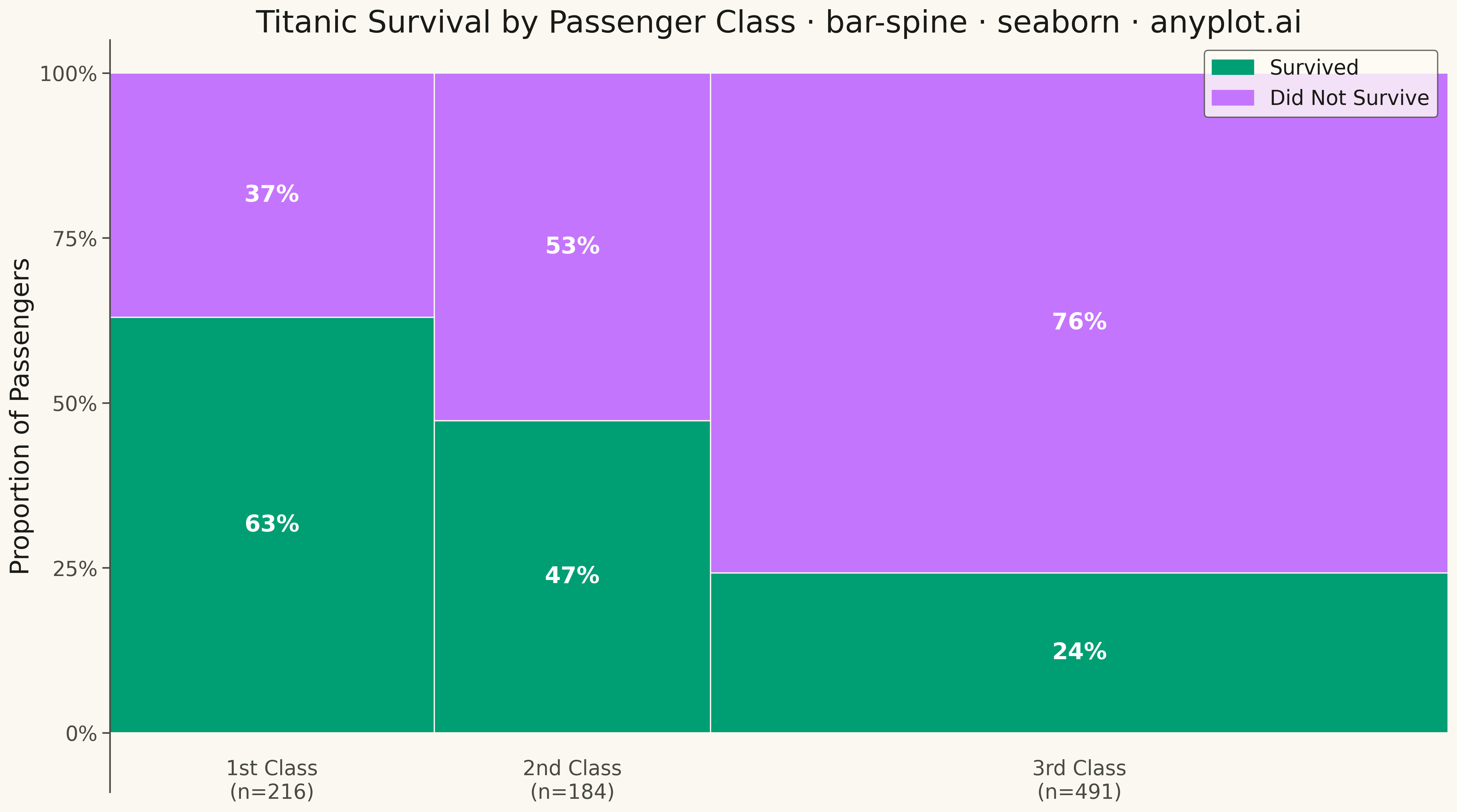
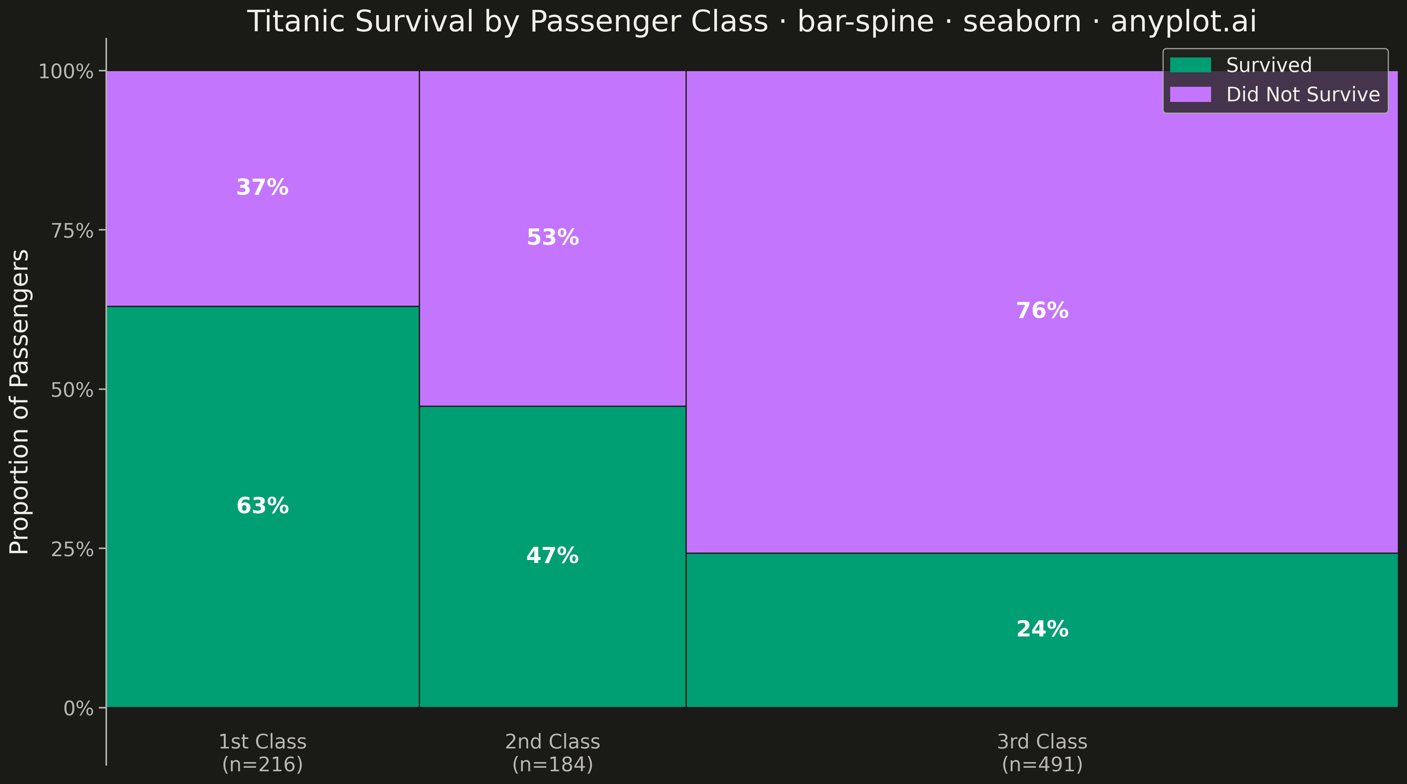
The same plot in 14 other libraries — Python: Altair, Bokeh, lets-plot, Matplotlib, Plotly, plotnine, Pygal; R: ggplot2; Julia: Makie.jl; JavaScript: Chart.js, D3.js, Apache ECharts, Highcharts, MUI X Charts. Compare all 15 side by side: Spine Plot for Two-Variable Proportions in Python, R, Julia and JavaScript.
A spine plot (spineplot) is a stacked bar chart where bar widths are proportional to the marginal frequency of one categorical variable and the subdivisions within each bar show the conditional distribution of a second categorical variable. All bars are normalized to the same height (100%), so visual comparison focuses on how the conditional proportions shift across categories. It is a one-dimensional specialization of mosaic plots and excels at revealing associations between two categorical variables in contingency table data.
""" anyplot.ai
bar-spine: Spine Plot for Two-Variable Proportions
Library: seaborn 0.13.2 | Python 3.13.15
Quality: 89/100 | Updated: 2026-09-27
"""

import os

import matplotlib.patches as mpatches
import matplotlib.pyplot as plt
import numpy as np
import seaborn as sns


# Theme tokens
THEME = os.getenv("ANYPLOT_THEME", "light")
PAGE_BG = "#FAF8F1" if THEME == "light" else "#1A1A17"
ELEVATED_BG = "#FFFDF6" if THEME == "light" else "#242420"
INK = "#1A1A17" if THEME == "light" else "#F0EFE8"
INK_SOFT = "#4A4A44" if THEME == "light" else "#B8B7B0"

# Imprint palette — Retained uses the brand green, Churned uses the semantic
# red anchor (bad/loss role), per the style guide's status semantic exception.
IMPRINT = ["#009E73", "#C475FD", "#4467A3", "#BD8233", "#AE3030", "#2ABCCD", "#954477"]

sns.set_theme(
    style="ticks",
    rc={
        "figure.facecolor": PAGE_BG,
        "axes.facecolor": PAGE_BG,
        "axes.edgecolor": INK_SOFT,
        "axes.labelcolor": INK,
        "text.color": INK,
        "xtick.color": INK_SOFT,
        "ytick.color": INK_SOFT,
        "grid.color": INK,
        "grid.alpha": 0.10,
        "legend.facecolor": ELEVATED_BG,
        "legend.edgecolor": INK_SOFT,
    },
)
sns.set_context("notebook", font_scale=1.0)

# Route the two fill colors through seaborn's palette machinery (matplotlib's
# ax.bar draws the bars themselves — sns.barplot can't vary bar width per
# category — but the color lookup for every segment is genuine seaborn usage).
sns.set_palette(IMPRINT)
palette = sns.color_palette()

# Data — customers acquired per channel, six months later split into retained/churned
channels = ["Referral", "Organic Search", "Email", "Direct", "Paid Social"]
retained_counts = np.array([663, 440, 280, 186, 122])
churned_counts = np.array([187, 180, 150, 124, 168])
channel_totals = retained_counts + churned_counts
total_customers = channel_totals.sum()

fill_order = ["Retained", "Churned"]
colors = [palette[0], palette[4]]

widths = channel_totals / total_customers
x_positions = np.cumsum(np.concatenate([[0], widths[:-1]]))

# Plot
fig, ax = plt.subplots(figsize=(8, 4.5), dpi=400, facecolor=PAGE_BG)
ax.set_facecolor(PAGE_BG)

for i in range(len(channels)):
    proportions = [retained_counts[i] / channel_totals[i], churned_counts[i] / channel_totals[i]]
    bottom = 0.0

    for j, proportion in enumerate(proportions):
        ax.bar(
            x=x_positions[i],
            height=proportion,
            width=widths[i],
            bottom=bottom,
            color=colors[j],
            align="edge",
            edgecolor=PAGE_BG,
            linewidth=0.8,
        )

        if proportion > 0.06:
            ax.text(
                x_positions[i] + widths[i] / 2,
                bottom + proportion / 2,
                f"{proportion:.0%}",
                ha="center",
                va="center",
                fontsize=11,
                color="white",
                fontweight="bold",
            )

        bottom += proportion

# X-axis labels centered under variable-width bars
ax.set_ylim(-0.14, 1.05)
for i, channel in enumerate(channels):
    center = x_positions[i] + widths[i] / 2
    ax.text(center, -0.05, f"{channel}\n(n={channel_totals[i]})", ha="center", va="top", fontsize=9, color=INK_SOFT)

# Style
title = "Customer Retention by Channel · bar-spine · python · seaborn · anyplot.ai"
title_fontsize = round(12 * min(1.0, 67 / len(title)))
title_fontsize = max(title_fontsize, 8)

ax.set_xlim(0, 1)
ax.set_xticks([])
ax.set_yticks([0, 0.25, 0.5, 0.75, 1.0])
ax.set_yticklabels(["0%", "25%", "50%", "75%", "100%"], fontsize=8, color=INK_SOFT)
ax.set_ylabel("Proportion of Customers", fontsize=10, color=INK)
ax.set_title(title, fontsize=title_fontsize, fontweight="medium", color=INK)

sns.despine(ax=ax, bottom=True)
ax.spines["left"].set_color(INK_SOFT)

ax.yaxis.grid(True, alpha=0.10, linewidth=0.8, color=INK)

legend_patches = [mpatches.Patch(color=colors[j], label=fill_order[j]) for j in range(len(fill_order))]
ax.legend(
    handles=legend_patches, loc="upper right", fontsize=8, frameon=True, facecolor=ELEVATED_BG, edgecolor=INK_SOFT
)

plt.tight_layout()
plt.savefig(f"plot-{THEME}.png", dpi=400, facecolor=PAGE_BG)
Runnable source as JSON, for any HTTP client: https://api.anyplot.ai/specs/bar-spine/seaborn/code. Any spec id and library id listed in llms-full.txt fit the same URL shape; every URL below is complete and callable.
{
  "spec_id": "bar-spine",
  "language": "python",
  "library": "seaborn",
  "page": "https://anyplot.ai/bar-spine/python/seaborn",
  "hub": "https://anyplot.ai/bar-spine",
  "code_json": "https://api.anyplot.ai/specs/bar-spine/seaborn/code",
  "spec_json": "https://api.anyplot.ai/specs/bar-spine",
  "render_light_png": "https://storage.googleapis.com/anyplot-images/plots/bar-spine/python/seaborn/plot-light.png",
  "render_dark_png": "https://storage.googleapis.com/anyplot-images/plots/bar-spine/python/seaborn/plot-dark.png",
  "quality_score": 89.0,
  "license": "MIT",
  "guide": "https://anyplot.ai/llms.txt"
}
Part of Spine Plot for Two-Variable Proportions on anyplot.ai.