The same plot in 14 other libraries — JavaScript: D3.js, Apache ECharts, Highcharts, MUI X Charts; Python: Altair, Bokeh, lets-plot, Matplotlib, Plotly, plotnine, Pygal, Seaborn; R: ggplot2; Julia: Makie.jl. Compare all 15 side by side: Spine Plot for Two-Variable Proportions in Python, R, Julia and JavaScript.
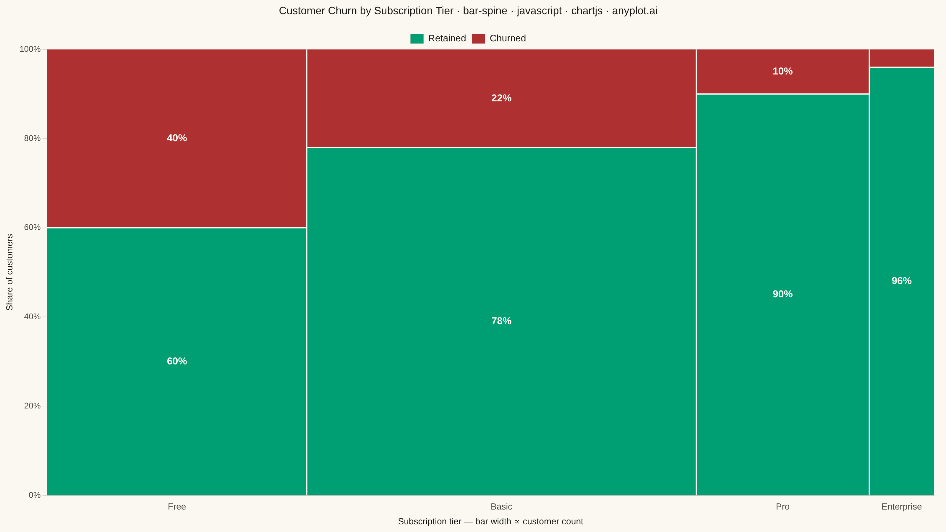
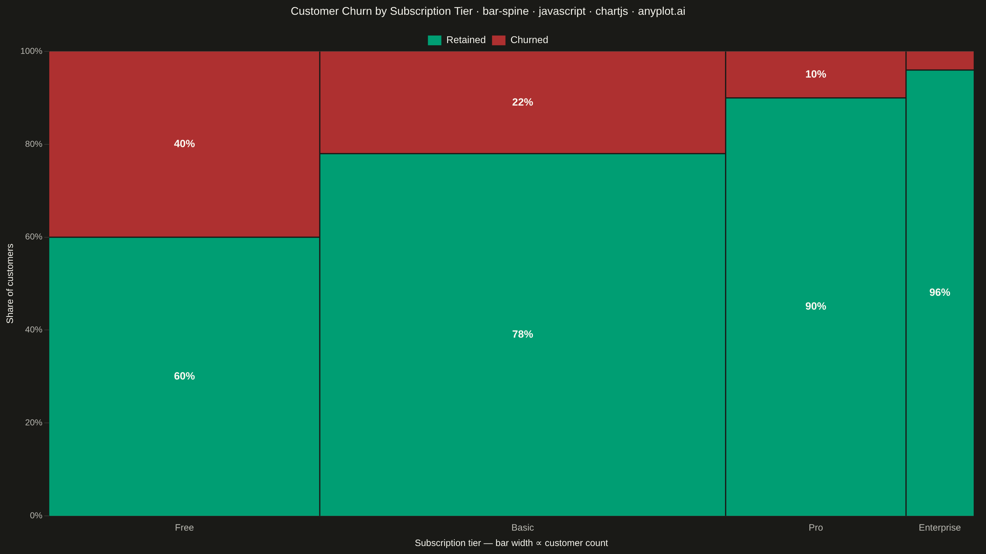
A spine plot (spineplot) is a stacked bar chart where bar widths are proportional to the marginal frequency of one categorical variable and the subdivisions within each bar show the conditional distribution of a second categorical variable. All bars are normalized to the same height (100%), so visual comparison focuses on how the conditional proportions shift across categories. It is a one-dimensional specialization of mosaic plots and excels at revealing associations between two categorical variables in contingency table data.
// anyplot.ai
// bar-spine: Spine Plot for Two-Variable Proportions
// Library: chartjs 4.4.7 | JavaScript 22.23.2
// Quality: 93/100 | Updated: 2026-09-27

const t = window.ANYPLOT_TOKENS;

// --- Data (in-memory, deterministic) ----------------------------------------
// Customer churn by subscription tier: bar WIDTH = marginal tier size (how many
// customers are on that plan), segment HEIGHT = conditional retained/churned
// split within the tier. Cheaper tiers churn far more than paid ones.
const tiers = ["Free", "Basic", "Pro", "Enterprise"];
const totals = [600, 900, 400, 150]; // customers per tier (marginal frequency)
const churned = [240, 198, 40, 6]; // churned customers per tier
const retained = totals.map((total, i) => total - churned[i]);
const retainedPct = retained.map((count, i) => (count / totals[i]) * 100);
const churnedPct = churned.map((count, i) => (count / totals[i]) * 100);

// Cumulative edges along x so bar width is exactly proportional to tier size
// and adjacent bars are flush (no gaps), per the spec.
const totalCustomers = totals.reduce((sum, count) => sum + count, 0);
const edges = totals.reduce((acc, count) => [...acc, acc[acc.length - 1] + count], [0]);
const centers = tiers.map((_, i) => (edges[i] + edges[i + 1]) / 2);

// Chart.js's bar controller lays out every bar in a dataset at one shared
// width (it has no per-bar thickness hook), so a spine plot's variable-width
// requirement can't be expressed through the stock bar element. Instead we
// mount an invisible scatter chart purely to get Chart.js's linear scales,
// legend and title, then draw the real proportional rectangles ourselves in a
// plugin using those scales' own pixel mapping — the documented extension
// point for custom geometry Chart.js's built-in controllers don't cover.
const SEGMENT_LABEL_COLOR = "#FAF8F1"; // fixed light label, reads on saturated fills in both themes

// --- Mount -------------------------------------------------------------------
const canvas = document.createElement("canvas");
document.getElementById("container").appendChild(canvas);

// --- Spine drawing plugin ---------------------------------------------------
const drawSpine = {
  id: "drawSpine",
  afterDatasetsDraw(chart) {
    const { ctx, chartArea, scales } = chart;
    const xScale = scales.x;
    const yScale = scales.y;
    const yZero = yScale.getPixelForValue(0);
    const yHundred = yScale.getPixelForValue(100);

    ctx.save();
    ctx.beginPath();
    ctx.rect(chartArea.left, chartArea.top, chartArea.width, chartArea.height);
    ctx.clip();

    tiers.forEach((tier, i) => {
      const xLeft = xScale.getPixelForValue(edges[i]);
      const xRight = xScale.getPixelForValue(edges[i + 1]);
      const xCenter = (xLeft + xRight) / 2;
      const ySplit = yScale.getPixelForValue(retainedPct[i]);

      ctx.fillStyle = t.palette[0]; // Retained — brand green, always first series
      ctx.fillRect(xLeft, ySplit, xRight - xLeft, yZero - ySplit);
      ctx.strokeStyle = t.ink;
      ctx.lineWidth = 1.25;
      ctx.strokeRect(xLeft, ySplit, xRight - xLeft, yZero - ySplit);

      ctx.fillStyle = t.palette[4]; // Churned — matte red, semantic loss anchor
      ctx.fillRect(xLeft, yHundred, xRight - xLeft, ySplit - yHundred);
      ctx.strokeStyle = t.ink;
      ctx.lineWidth = 1.25;
      ctx.strokeRect(xLeft, yHundred, xRight - xLeft, ySplit - yHundred);
      // Redundant ink-color outline on both segments (default-style-guide.md
      // "Optional outline pattern"): a shape boundary independent of hue, so
      // the Retained/Churned split doesn't rely on green/red alone for
      // deuteranopia/protanopia readers, and it firms up matte-red's marginal
      // dark-theme contrast.

      // Bar edges: thin page-bg stroke for definition (default-style-guide.md
      // "Data Element Styling"), between the two stacked segments...
      ctx.fillStyle = t.pageBg;
      ctx.fillRect(xLeft, ySplit - 1, xRight - xLeft, 2);

      ctx.font = "600 17px -apple-system, BlinkMacSystemFont, sans-serif";
      ctx.textAlign = "center";
      ctx.textBaseline = "middle";
      ctx.fillStyle = SEGMENT_LABEL_COLOR;
      const retainedHeight = yZero - ySplit;
      const churnedHeight = ySplit - yHundred;
      if (retainedHeight >= 45) {
        ctx.fillText(`${Math.round(retainedPct[i])}%`, xCenter, (yZero + ySplit) / 2);
      }
      if (churnedHeight >= 45) {
        ctx.fillText(`${Math.round(churnedPct[i])}%`, xCenter, (ySplit + yHundred) / 2);
      }
    });

    // ...and between adjacent bars, so equal-colored neighbors stay legible.
    ctx.fillStyle = t.pageBg;
    for (let i = 1; i < edges.length - 1; i++) {
      const x = xScale.getPixelForValue(edges[i]);
      ctx.fillRect(x - 1, yHundred, 2, yZero - yHundred);
    }

    ctx.restore();
  },
};

// --- Title -------------------------------------------------------------------
const title = "Customer Churn by Subscription Tier · bar-spine · javascript · chartjs · anyplot.ai";
const titleSize = Math.round(22 * Math.min(1, 67 / title.length));

// --- Chart -------------------------------------------------------------------
new Chart(canvas, {
  type: "scatter",
  data: {
    datasets: [
      { label: "Retained", data: [], backgroundColor: t.palette[0], showLine: false },
      { label: "Churned", data: [], backgroundColor: t.palette[4], showLine: false },
    ],
  },
  options: {
    responsive: true,
    maintainAspectRatio: false,
    animation: false,
    layout: { padding: { top: 8, right: 20, bottom: 4, left: 4 } },
    plugins: {
      title: {
        display: true,
        text: title,
        color: t.ink,
        font: { size: titleSize, weight: "500" },
        padding: { bottom: 18 },
      },
      legend: {
        position: "top",
        align: "center",
        labels: { color: t.ink, font: { size: 16 }, boxWidth: 22, boxHeight: 16 },
      },
      tooltip: { enabled: false },
    },
    scales: {
      x: {
        type: "linear",
        min: 0,
        max: totalCustomers,
        afterBuildTicks: (axis) => {
          axis.ticks = centers.map((value) => ({ value }));
        },
        ticks: {
          autoSkip: false,
          maxTicksLimit: tiers.length,
          color: t.inkSoft,
          font: { size: 15 },
          callback: (value, index) => tiers[index],
        },
        grid: { display: false },
        title: {
          display: true,
          text: "Subscription tier — bar width ∝ customer count",
          color: t.ink,
          font: { size: 15 },
        },
      },
      y: {
        type: "linear",
        min: 0,
        max: 100,
        ticks: {
          stepSize: 20,
          color: t.inkSoft,
          font: { size: 14 },
          callback: (value) => `${value}%`,
        },
        grid: { color: t.grid },
        title: { display: true, text: "Share of customers", color: t.ink, font: { size: 15 } },
      },
    },
  },
  plugins: [drawSpine],
});
Runnable source as JSON, for any HTTP client: https://api.anyplot.ai/specs/bar-spine/chartjs/code. Any spec id and library id listed in llms-full.txt fit the same URL shape; every URL below is complete and callable.
{
  "spec_id": "bar-spine",
  "language": "javascript",
  "library": "chartjs",
  "page": "https://anyplot.ai/bar-spine/javascript/chartjs",
  "hub": "https://anyplot.ai/bar-spine",
  "code_json": "https://api.anyplot.ai/specs/bar-spine/chartjs/code",
  "spec_json": "https://api.anyplot.ai/specs/bar-spine",
  "render_light_png": "https://storage.googleapis.com/anyplot-images/plots/bar-spine/javascript/chartjs/plot-light.png",
  "render_dark_png": "https://storage.googleapis.com/anyplot-images/plots/bar-spine/javascript/chartjs/plot-dark.png",
  "interactive_light_html": "https://storage.googleapis.com/anyplot-images/plots/bar-spine/javascript/chartjs/plot-light.html",
  "interactive_dark_html": "https://storage.googleapis.com/anyplot-images/plots/bar-spine/javascript/chartjs/plot-dark.html",
  "quality_score": 93.0,
  "license": "MIT",
  "guide": "https://anyplot.ai/llms.txt"
}
Part of Spine Plot for Two-Variable Proportions on anyplot.ai.