The same plot in 14 other libraries — JavaScript: Chart.js, D3.js, Apache ECharts, MUI X Charts; Python: Altair, Bokeh, lets-plot, Matplotlib, Plotly, plotnine, Pygal, Seaborn; R: ggplot2; Julia: Makie.jl. Compare all 15 side by side: Spine Plot for Two-Variable Proportions in Python, R, Julia and JavaScript.
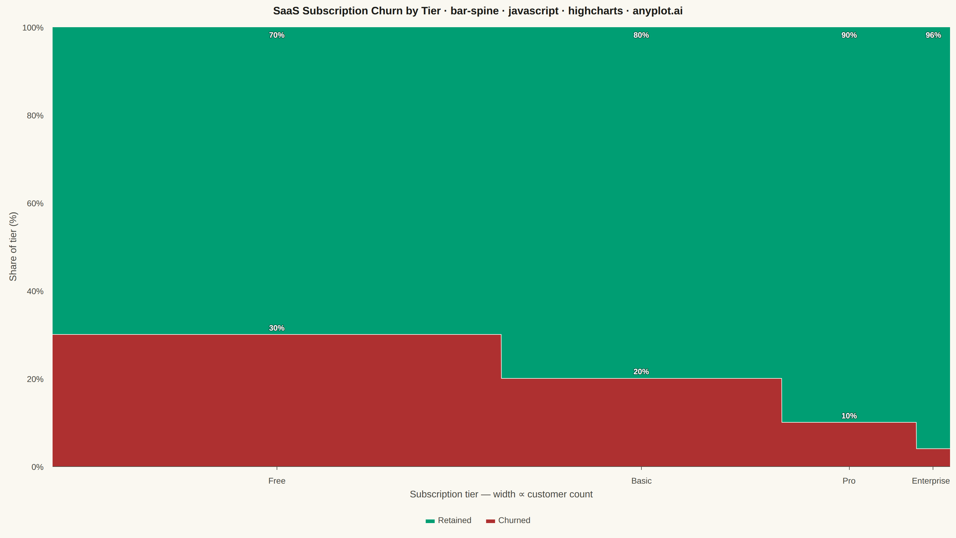
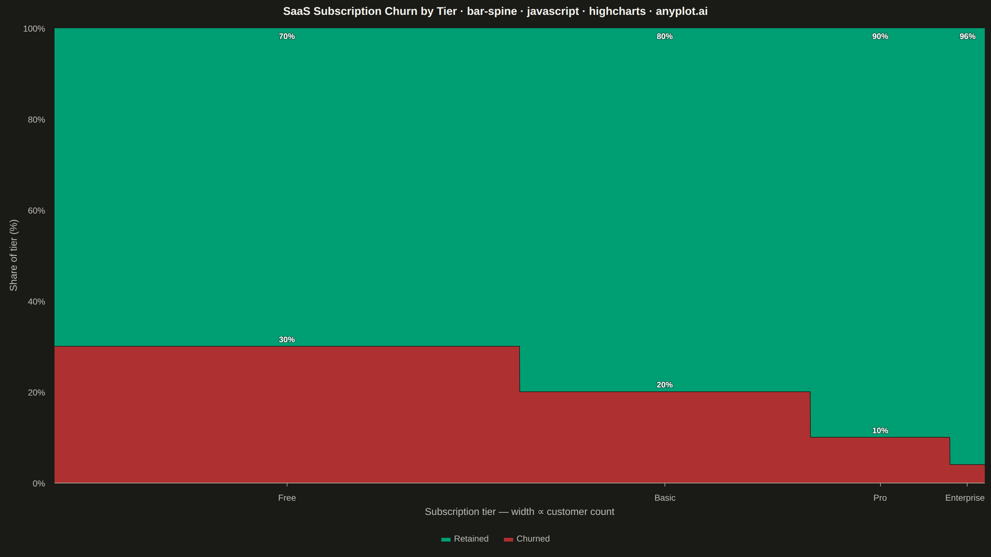
A spine plot (spineplot) is a stacked bar chart where bar widths are proportional to the marginal frequency of one categorical variable and the subdivisions within each bar show the conditional distribution of a second categorical variable. All bars are normalized to the same height (100%), so visual comparison focuses on how the conditional proportions shift across categories. It is a one-dimensional specialization of mosaic plots and excels at revealing associations between two categorical variables in contingency table data.
// anyplot.ai
// bar-spine: Spine Plot for Two-Variable Proportions
// Library: highcharts 12.6.0 | JavaScript 22.23.2
// Quality: 90/100 | Updated: 2026-09-27

const t = window.ANYPLOT_TOKENS;

// --- Data (in-memory, deterministic) ----------------------------------------
// SaaS subscription tiers: bar width = marginal customer count per tier,
// stacked segment heights = conditional retained/churned split within tier.
const TIERS = [
  { name: "Free", retained: 2800, churned: 1200 },
  { name: "Basic", retained: 2000, churned: 500 },
  { name: "Pro", retained: 1080, churned: 120 },
  { name: "Enterprise", retained: 288, churned: 12 },
];

// Highcharts' core bundle has no variable-width column series (that lives in
// the variwide module, which isn't loaded). A spine plot is built instead as
// a stacked, fully-opaque step-area chart on a linear x-axis: each tier gets
// two x-positions (its cumulative-width start/end) holding the same y value,
// so the area is flat across the tier's width and steps to the next tier's
// height at the boundary. A tiny epsilon keeps boundary x-values strictly
// increasing (exact duplicates would double-count in Highcharts' per-x
// stacking sum) while staying far below one screen pixel.
const EPS = 1;
let cursor = 0;
const segments = TIERS.map((tier, i) => {
  const total = tier.retained + tier.churned;
  const x0 = cursor;
  const x1 = cursor + total;
  cursor = x1;
  return {
    name: tier.name,
    x0,
    x1,
    center: (x0 + x1) / 2,
    startX: i === 0 ? x0 : x0 + EPS,
    endX: i === TIERS.length - 1 ? x1 : x1 - EPS,
    retainedPct: (tier.retained / total) * 100,
    churnedPct: (tier.churned / total) * 100,
  };
});
const totalWidth = cursor;

function findSegment(x) {
  return (
    segments.find((s) => x >= s.x0 - EPS && x <= s.x1 + EPS) ||
    segments[segments.length - 1]
  );
}

// Percentage data labels are a secondary, non-color cue for telling the
// Retained/Churned bands apart (mitigates red-green CVD ambiguity) and
// satisfy the spec's "consider adding percentage labels when space permits"
// note. Only the segment's center point (inserted below, between its flat
// startX/endX run) carries a label. A minimum-width exception keeps the
// label on even the thinnest band (Enterprise churned, 4%) by dropping to a
// smaller font instead of hiding it outright — the smallest legible size
// still fits the ~4%-tall band, so hue is never the sole Retained/Churned
// cue anywhere in the chart.
const MIN_LABEL_SHARE = 3;
const THIN_BAND_SHARE = 8;
const labelCenterXs = new Set(segments.map((s) => s.center));
function segmentLabelFormatter() {
  if (!labelCenterXs.has(this.x) || this.y < MIN_LABEL_SHARE) return null;
  return `${Math.round(this.y)}%`;
}
const labelStyle = {
  color: "#FFFFFF",
  fontSize: "13px",
  fontWeight: "600",
  textOutline: "1px rgba(26, 26, 23, 0.55)",
};
const thinLabelStyle = { ...labelStyle, fontSize: "12px" };
function labelStyleFor(share) {
  return share < THIN_BAND_SHARE ? thinLabelStyle : labelStyle;
}

// Retained (good) keeps the brand-green first slot; churned (bad) takes the
// semantic-red anchor rather than the next ordinal palette position. Each
// segment's fill is a subtle vertical gradient (a touch lighter at the top)
// rather than a flat tint, giving the stack a little depth without changing
// the perceived hue at a glance.
function depthFill(color) {
  return {
    linearGradient: { x1: 0, y1: 0, x2: 0, y2: 1 },
    stops: [
      [0, Highcharts.color(color).brighten(0.12).get()],
      [1, color],
    ],
  };
}
const series = [
  {
    name: "Retained",
    color: t.palette[0],
    fillColor: depthFill(t.palette[0]),
    data: segments.flatMap((s) => [
      { x: s.startX, y: s.retainedPct },
      {
        x: s.center,
        y: s.retainedPct,
        dataLabels: { style: labelStyleFor(s.retainedPct) },
      },
      { x: s.endX, y: s.retainedPct },
    ]),
  },
  {
    name: "Churned",
    color: t.palette[4],
    fillColor: depthFill(t.palette[4]),
    data: segments.flatMap((s) => [
      { x: s.startX, y: s.churnedPct },
      {
        x: s.center,
        y: s.churnedPct,
        dataLabels: { style: labelStyleFor(s.churnedPct) },
      },
      { x: s.endX, y: s.churnedPct },
    ]),
  },
];

// --- Chart -------------------------------------------------------------------
const titleText =
  "SaaS Subscription Churn by Tier · bar-spine · javascript · highcharts · anyplot.ai";
const titleRatio = titleText.length > 67 ? 67 / titleText.length : 1;
const titleFontSize = Math.max(18, Math.round(30 * titleRatio));

Highcharts.chart("container", {
  chart: {
    type: "area",
    backgroundColor: "transparent",
    animation: false,
    style: { fontFamily: "inherit" },
  },
  credits: { enabled: false },
  colors: t.palette,
  title: {
    text: titleText,
    style: { color: t.ink, fontSize: `${titleFontSize}px`, fontWeight: "600" },
  },
  xAxis: {
    min: 0,
    max: totalWidth,
    title: {
      text: "Subscription tier — width ∝ customer count",
      style: { color: t.inkSoft, fontSize: "16px" },
    },
    tickPositions: segments.map((s) => s.center),
    gridLineWidth: 0,
    lineColor: t.inkSoft,
    tickColor: t.inkSoft,
    tickLength: 6,
    labels: {
      formatter: function () {
        return findSegment(this.value).name;
      },
      style: { color: t.inkSoft, fontSize: "14px" },
    },
  },
  yAxis: {
    min: 0,
    max: 100,
    tickInterval: 20,
    title: {
      text: "Share of tier (%)",
      style: { color: t.inkSoft, fontSize: "16px" },
    },
    gridLineColor: t.grid,
    labels: {
      format: "{value}%",
      style: { color: t.inkSoft, fontSize: "14px" },
    },
  },
  legend: {
    itemStyle: { color: t.inkSoft, fontSize: "14px" },
    itemHoverStyle: { color: t.ink },
    symbolRadius: 2,
    itemDistance: 24,
    margin: 20,
    backgroundColor: t.elevatedBg,
    borderColor: t.grid,
    borderWidth: 1,
    borderRadius: 6,
    padding: 12,
  },
  tooltip: {
    shared: true,
    valueDecimals: 1,
    valueSuffix: "%",
    backgroundColor: t.elevatedBg,
    borderColor: t.grid,
    style: { color: t.ink, fontSize: "13px" },
    formatter: function () {
      const seg = findSegment(this.x);
      const lines = [`<b>${seg.name}</b>`];
      this.points.forEach((p) => {
        lines.push(`${p.series.name}: ${p.y.toFixed(1)}%`);
      });
      return lines.join("<br/>");
    },
  },
  plotOptions: {
    series: { animation: false },
    area: {
      stacking: "normal",
      fillOpacity: 1,
      lineWidth: 1,
      lineColor: t.pageBg,
      marker: { enabled: false },
      states: { hover: { enabled: false } },
      dataLabels: {
        enabled: true,
        formatter: segmentLabelFormatter,
        style: labelStyle,
      },
    },
  },
  series,
});
Runnable source as JSON, for any HTTP client: https://api.anyplot.ai/specs/bar-spine/highcharts/code. Any spec id and library id listed in llms-full.txt fit the same URL shape; every URL below is complete and callable.
{
  "spec_id": "bar-spine",
  "language": "javascript",
  "library": "highcharts",
  "page": "https://anyplot.ai/bar-spine/javascript/highcharts",
  "hub": "https://anyplot.ai/bar-spine",
  "code_json": "https://api.anyplot.ai/specs/bar-spine/highcharts/code",
  "spec_json": "https://api.anyplot.ai/specs/bar-spine",
  "render_light_png": "https://storage.googleapis.com/anyplot-images/plots/bar-spine/javascript/highcharts/plot-light.png",
  "render_dark_png": "https://storage.googleapis.com/anyplot-images/plots/bar-spine/javascript/highcharts/plot-dark.png",
  "interactive_light_html": "https://storage.googleapis.com/anyplot-images/plots/bar-spine/javascript/highcharts/plot-light.html",
  "interactive_dark_html": "https://storage.googleapis.com/anyplot-images/plots/bar-spine/javascript/highcharts/plot-dark.html",
  "quality_score": 90.0,
  "license": "MIT",
  "guide": "https://anyplot.ai/llms.txt"
}
Part of Spine Plot for Two-Variable Proportions on anyplot.ai.