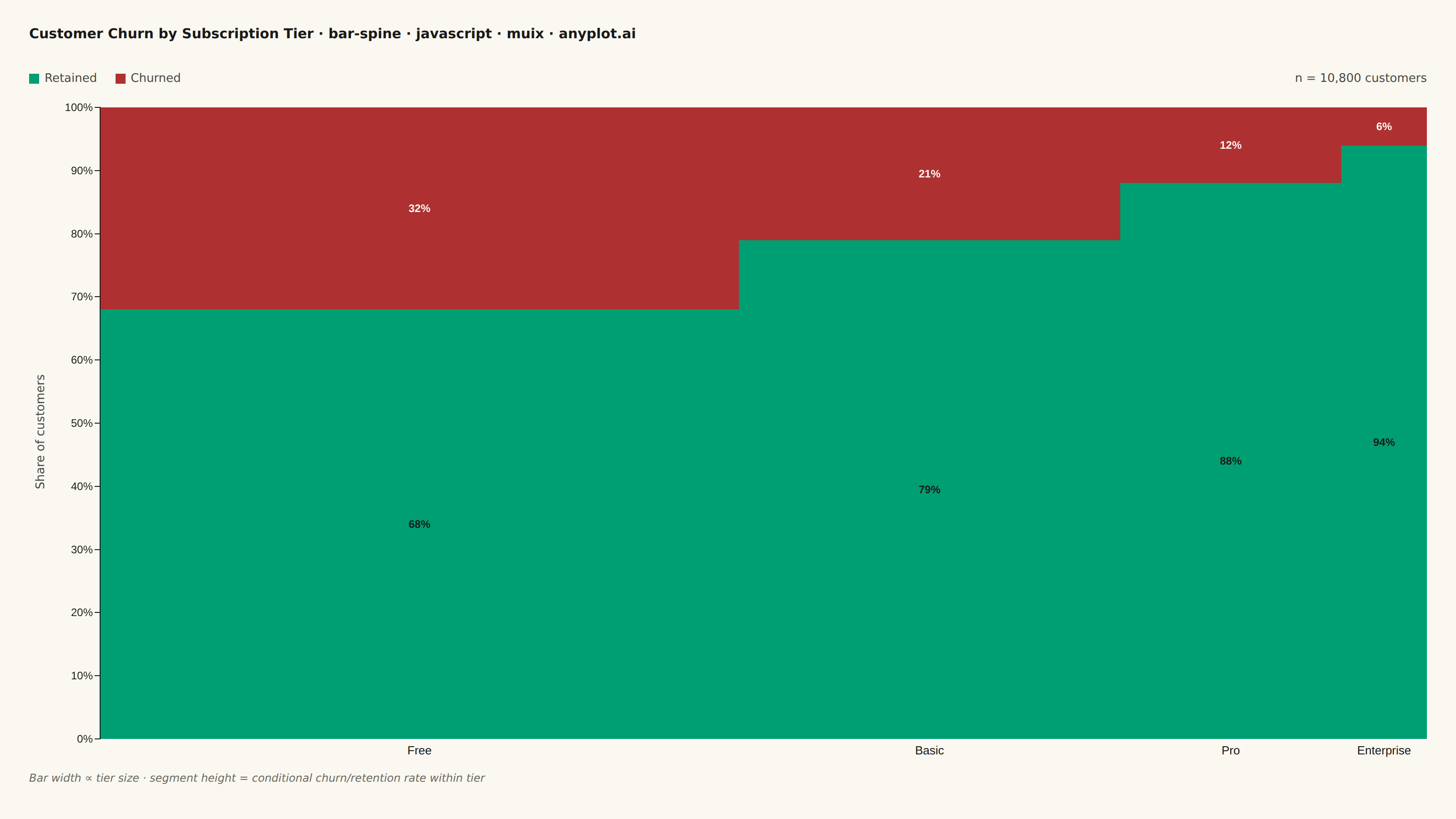
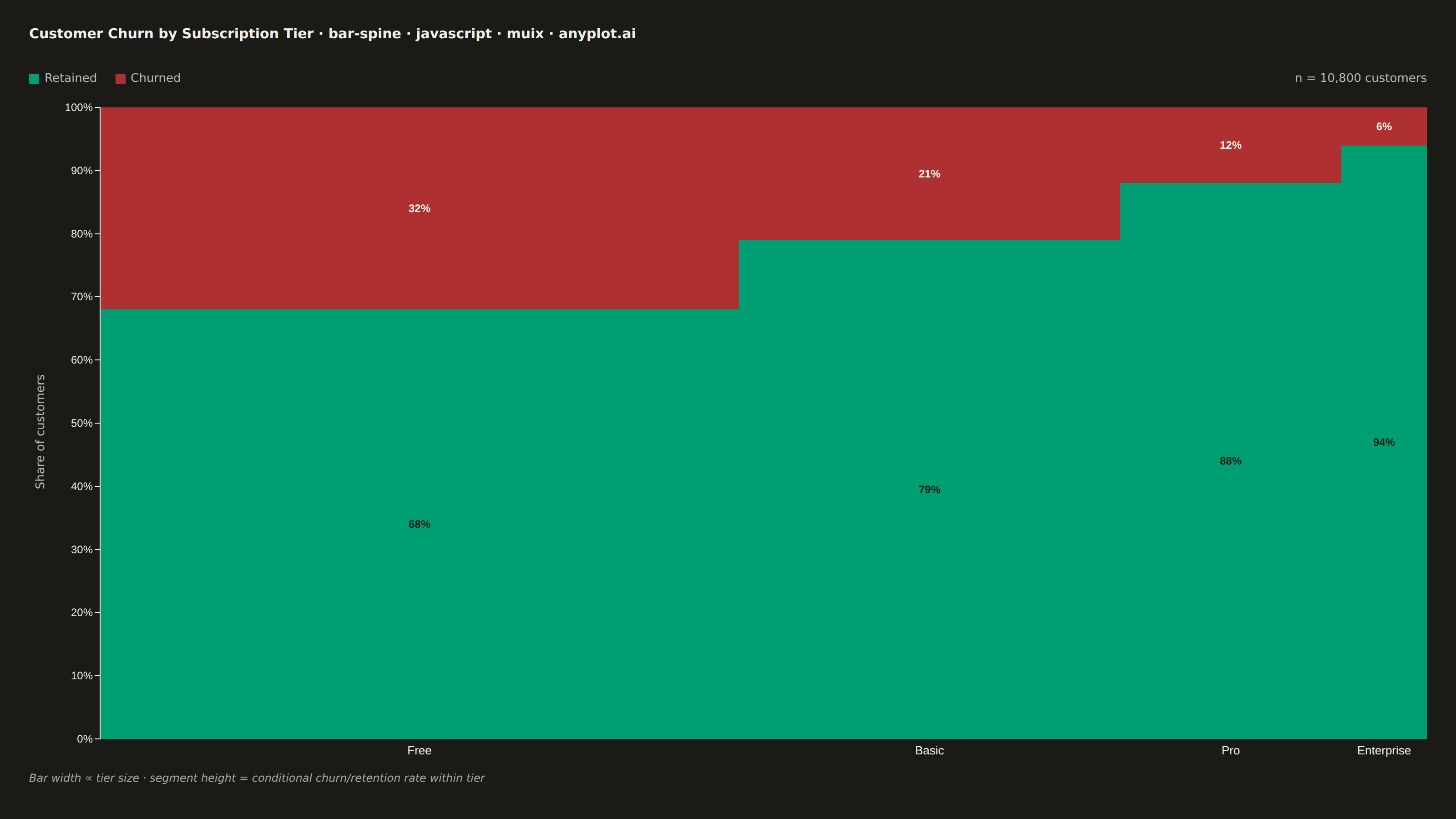
The same plot in 14 other libraries — JavaScript: Chart.js, D3.js, Apache ECharts, Highcharts; Python: Altair, Bokeh, lets-plot, Matplotlib, Plotly, plotnine, Pygal, Seaborn; R: ggplot2; Julia: Makie.jl. Compare all 15 side by side: Spine Plot for Two-Variable Proportions in Python, R, Julia and JavaScript.
A spine plot (spineplot) is a stacked bar chart where bar widths are proportional to the marginal frequency of one categorical variable and the subdivisions within each bar show the conditional distribution of a second categorical variable. All bars are normalized to the same height (100%), so visual comparison focuses on how the conditional proportions shift across categories. It is a one-dimensional specialization of mosaic plots and excels at revealing associations between two categorical variables in contingency table data.
// anyplot.ai
// bar-spine: Spine Plot for Two-Variable Proportions
// Library: muix 7.29.1 | JavaScript 22.23.2
// Quality: 95/100 | Updated: 2026-09-27
import { BarChart } from "@mui/x-charts/BarChart";

const t = window.ANYPLOT_TOKENS;
const size = window.ANYPLOT_SIZE;
const INK_MUTED = window.ANYPLOT_THEME === "light" ? "#6B6A63" : "#A8A79F";

// Segment labels: a redundant text cue on top of stacking position so the
// three-way split doesn't rely on hue alone. Fixed (theme-independent) fill
// colors are picked per series for contrast against that series' fixed data
// color, not the page theme.
const MIN_LABEL_HEIGHT = 22; // px; hide the label if a segment can't fit one line of text
const segmentLabel = (item, context) =>
  context.bar.height < MIN_LABEL_HEIGHT ? null : `${item.value}%`;
const LABEL_FILL = { retained: "#1A1A17", downgraded: "#1A1A17", churned: "#FAF8F1" };
const labelSlotProps = (ownerState) => ({
  style: { fill: LABEL_FILL[ownerState.seriesId], fontSize: 12, fontWeight: 600 },
});

// --- Data (in-memory, deterministic) ----------------------------------------
// Customer counts per subscription tier, split into three outcomes: churned
// (cancelled), downgraded (moved to a cheaper tier but stayed a customer),
// and retained (stayed at the same tier). Bar WIDTH encodes each tier's
// marginal share of the customer base; segment HEIGHT encodes the
// conditional outcome split within that tier — the three-category split
// showcases the spine plot's conditional-distribution feature better than a
// binary churned/retained split would.
const tiers = [
  { name: "Free", churned: 1664, downgraded: 900, retained: 2636 },
  { name: "Basic", churned: 651, downgraded: 500, retained: 1949 },
  { name: "Pro", churned: 216, downgraded: 180, retained: 1404 },
  { name: "Enterprise", churned: 42, downgraded: 20, retained: 638 },
];

const totals = tiers.map((d) => d.churned + d.downgraded + d.retained);
const grandTotal = totals.reduce((sum, v) => sum + v, 0);
const churnPct = tiers.map((d, i) => Math.round((d.churned / totals[i]) * 1000) / 10);
const downgradePct = tiers.map((d, i) => Math.round((d.downgraded / totals[i]) * 1000) / 10);
// Retained is the remainder, guaranteeing each stack sums to exactly 100%.
const retainPct = tiers.map((_, i) => Math.round((100 - churnPct[i] - downgradePct[i]) * 10) / 10);

// --- Layout: variable-width columns, each a single 100%-stacked bar --------
const PAD_H = 32;
const PAD_V = 28;
const GAP = 10;
const AXIS_LABEL_W = 26; // rotated "Share of customers" caption, drawn outside the chart SVGs
const TICK_W = 52; // reserved for the shared y-axis tick numbers, drawn only on the first column
const TITLE_H = 34;
const LEGEND_H = 28;
const CAPTION_H = 24;

const rowWidth = size.width - PAD_H * 2;
const barAreaWidth = rowWidth - AXIS_LABEL_W - TICK_W;
const barWidths = totals.map((total) => Math.round((barAreaWidth * total) / grandTotal));
barWidths[barWidths.length - 1] += barAreaWidth - barWidths.reduce((sum, w) => sum + w, 0);
const chartWidths = barWidths.map((w, i) => (i === 0 ? TICK_W + w : w));
const chartHeight = size.height - PAD_V * 2 - TITLE_H - LEGEND_H - CAPTION_H - GAP * 3;

const title = "Customer Churn by Subscription Tier · bar-spine · javascript · muix · anyplot.ai";
const titleFontSize = Math.round(18 * (title.length > 67 ? 67 / title.length : 1));

// Amber (downgraded) falls below WCAG 3:1 contrast on the cream background —
// a thin ink-color stroke on that series only keeps the segment boundary
// legible without adding noise to the higher-contrast green/red segments.
const barSx = { "& .MuiBarElement-series-downgraded": { stroke: t.ink, strokeWidth: 1 } };

// Reference ticks at 25/50/75%, drawn as an overlay ON TOP of the bars (MUI
// X's own `grid` prop paints behind the bar fills, invisible on a
// fully-opaque 100%-stack) so readers can gauge the wide Free bar's segment
// boundaries without tracing back to the shared y-axis. Kept short and
// confined to the axis edge of the (widest) Free bar — its percentage labels
// sit horizontally centered, well clear of this reach — so the ticks never
// cross a label.
const MARGIN_TOP = 8;
const MARGIN_BOTTOM = 26;
const REF_TICK_W = 130;
const plotAreaHeight = chartHeight - MARGIN_TOP - MARGIN_BOTTOM;
const refLines = [75, 50, 25].map((pct) => MARGIN_TOP + ((100 - pct) / 100) * plotAreaHeight);

// --- Chart (default-exported component — the harness mounts it) -------------
export default function Chart() {
  return (
    <div
      style={{
        width: size.width,
        height: size.height,
        padding: `${PAD_V}px ${PAD_H}px`,
        boxSizing: "border-box",
        display: "flex",
        flexDirection: "column",
        gap: GAP,
        fontFamily: "system-ui, sans-serif",
      }}
    >
      <div style={{ height: TITLE_H, fontSize: titleFontSize, fontWeight: 600, color: t.ink }}>
        {title}
      </div>

      <div
        style={{
          height: LEGEND_H,
          display: "flex",
          alignItems: "center",
          gap: 20,
          fontSize: 13,
          color: t.inkSoft,
        }}
      >
        <span style={{ display: "flex", alignItems: "center", gap: 6 }}>
          <span style={{ width: 11, height: 11, background: t.palette[0], display: "inline-block" }} />
          Retained
        </span>
        <span style={{ display: "flex", alignItems: "center", gap: 6 }}>
          <span
            style={{
              width: 11,
              height: 11,
              background: t.amber,
              border: `1px solid ${t.ink}`,
              boxSizing: "border-box",
              display: "inline-block",
            }}
          />
          Downgraded
        </span>
        <span style={{ display: "flex", alignItems: "center", gap: 6 }}>
          <span style={{ width: 11, height: 11, background: t.palette[4], display: "inline-block" }} />
          Churned
        </span>
        <span style={{ marginLeft: "auto" }}>n = {grandTotal.toLocaleString("en-US")} customers</span>
      </div>

      <div style={{ display: "flex", height: chartHeight, position: "relative" }}>
        <div
          style={{
            width: AXIS_LABEL_W,
            height: chartHeight,
            display: "flex",
            alignItems: "center",
            justifyContent: "center",
            flexShrink: 0,
          }}
        >
          <span
            style={{
              display: "inline-block",
              transform: "rotate(-90deg)",
              whiteSpace: "nowrap",
              fontSize: 13,
              color: t.inkSoft,
            }}
          >
            Share of customers
          </span>
        </div>
        {tiers.map((tier, i) => (
          <BarChart
            key={tier.name}
            width={chartWidths[i]}
            height={chartHeight}
            skipAnimation
            margin={{ top: MARGIN_TOP, right: 0, bottom: MARGIN_BOTTOM, left: i === 0 ? TICK_W : 0 }}
            sx={barSx}
            xAxis={[
              {
                scaleType: "band",
                data: [tier.name],
                categoryGapRatio: 0,
                tickLabelStyle: { fontSize: 13 },
                disableTicks: true,
                disableLine: true,
              },
            ]}
            yAxis={[
              {
                min: 0,
                max: 100,
                disableTicks: i !== 0,
                disableLine: i !== 0,
                valueFormatter: i === 0 ? (v) => `${v}%` : () => "",
                tickLabelStyle: { fontSize: 12 },
              },
            ]}
            series={[
              {
                id: "retained",
                data: [retainPct[i]],
                label: "Retained",
                stack: "total",
                color: t.palette[0],
              },
              {
                id: "downgraded",
                data: [downgradePct[i]],
                label: "Downgraded",
                stack: "total",
                color: t.amber,
              },
              {
                id: "churned",
                data: [churnPct[i]],
                label: "Churned",
                stack: "total",
                color: t.palette[4],
              },
            ]}
            barLabel={segmentLabel}
            slotProps={{ legend: { hidden: true }, barLabel: labelSlotProps }}
          />
        ))}
        <div
          style={{
            position: "absolute",
            left: AXIS_LABEL_W + TICK_W,
            width: REF_TICK_W,
            top: 0,
            height: chartHeight,
            pointerEvents: "none",
          }}
        >
          {refLines.map((top) => (
            <div
              key={top}
              style={{ position: "absolute", left: 0, right: 0, top, borderTop: `1px solid ${t.grid}` }}
            />
          ))}
        </div>
      </div>

      <div style={{ height: CAPTION_H, fontSize: 12, fontStyle: "italic", color: INK_MUTED }}>
        Bar width ∝ tier size · segment height = conditional retained/downgraded/churned rate within
        tier
      </div>
    </div>
  );
}
Runnable source as JSON, for any HTTP client: https://api.anyplot.ai/specs/bar-spine/muix/code. Any spec id and library id listed in llms-full.txt fit the same URL shape; every URL below is complete and callable.
{
  "spec_id": "bar-spine",
  "language": "javascript",
  "library": "muix",
  "page": "https://anyplot.ai/bar-spine/javascript/muix",
  "hub": "https://anyplot.ai/bar-spine",
  "code_json": "https://api.anyplot.ai/specs/bar-spine/muix/code",
  "spec_json": "https://api.anyplot.ai/specs/bar-spine",
  "render_light_png": "https://storage.googleapis.com/anyplot-images/plots/bar-spine/javascript/muix/plot-light.png",
  "render_dark_png": "https://storage.googleapis.com/anyplot-images/plots/bar-spine/javascript/muix/plot-dark.png",
  "interactive_light_html": "https://storage.googleapis.com/anyplot-images/plots/bar-spine/javascript/muix/plot-light.html",
  "interactive_dark_html": "https://storage.googleapis.com/anyplot-images/plots/bar-spine/javascript/muix/plot-dark.html",
  "quality_score": 95.0,
  "license": "MIT",
  "guide": "https://anyplot.ai/llms.txt"
}
Part of Spine Plot for Two-Variable Proportions on anyplot.ai.