The same plot in 14 other libraries — Python: Altair, lets-plot, Matplotlib, Plotly, plotnine, Pygal, Seaborn; R: ggplot2; Julia: Makie.jl; JavaScript: Chart.js, D3.js, Apache ECharts, Highcharts, MUI X Charts. Compare all 15 side by side: Spine Plot for Two-Variable Proportions in Python, R, Julia and JavaScript.
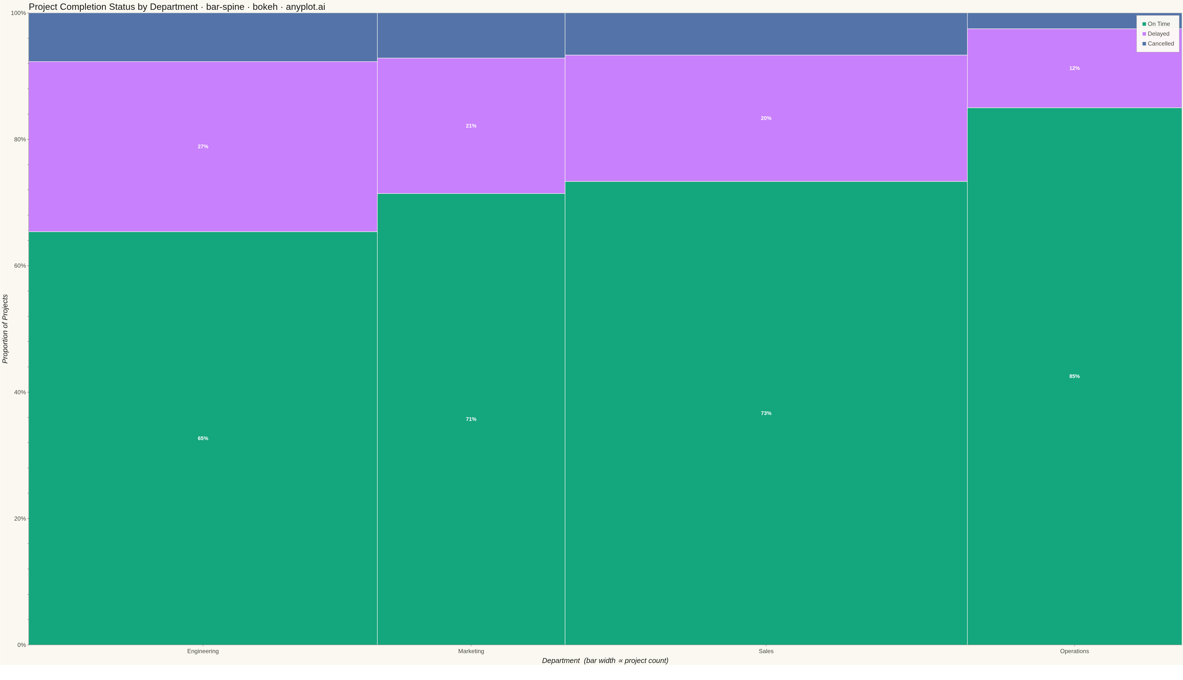
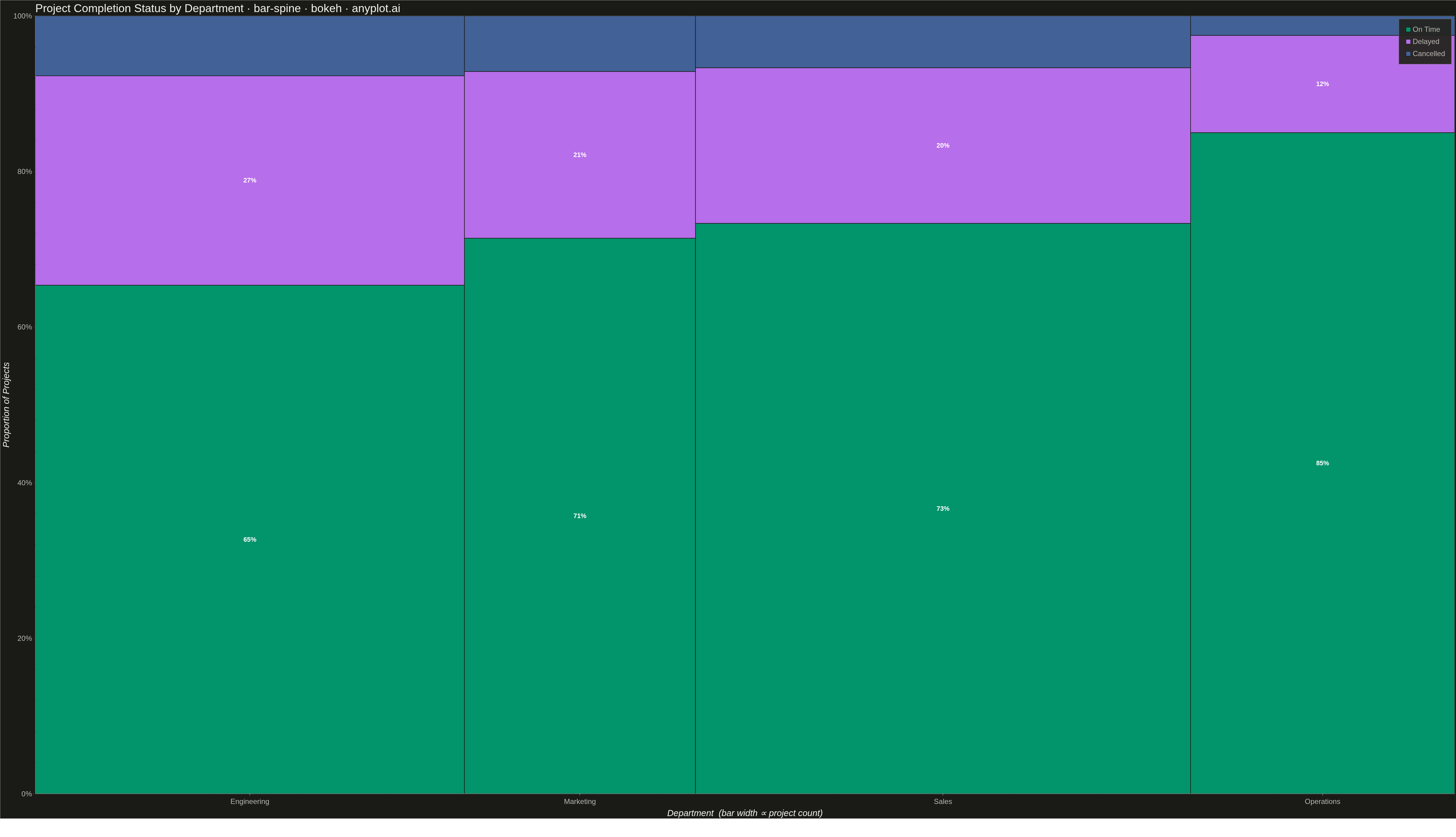
A spine plot (spineplot) is a stacked bar chart where bar widths are proportional to the marginal frequency of one categorical variable and the subdivisions within each bar show the conditional distribution of a second categorical variable. All bars are normalized to the same height (100%), so visual comparison focuses on how the conditional proportions shift across categories. It is a one-dimensional specialization of mosaic plots and excels at revealing associations between two categorical variables in contingency table data.
""" anyplot.ai
bar-spine: Spine Plot for Two-Variable Proportions
Library: bokeh 3.10.0 | Python 3.13.15
Quality: 88/100 | Updated: 2026-09-27
"""

import os
import sys
import time
from pathlib import Path


# Prevent this file (bokeh.py) from shadowing the installed bokeh package
_here = os.path.dirname(os.path.abspath(__file__))
sys.path = [p for p in sys.path if os.path.normpath(p or ".") != os.path.normpath(_here)]

import numpy as np
from bokeh.io import output_file, save
from bokeh.models import ColumnDataSource, FixedTicker, HoverTool, NumeralTickFormatter, Range1d
from bokeh.plotting import figure
from selenium import webdriver
from selenium.webdriver.chrome.options import Options


# Theme tokens (Imprint style guide)
THEME = os.getenv("ANYPLOT_THEME", "light")
PAGE_BG = "#FAF8F1" if THEME == "light" else "#1A1A17"
ELEVATED_BG = "#FFFDF6" if THEME == "light" else "#242420"
INK = "#1A1A17" if THEME == "light" else "#F0EFE8"
INK_SOFT = "#4A4A44" if THEME == "light" else "#B8B7B0"

# Semantic-status color mapping (Imprint palette "Semantic exception"): the
# fill categories are literally pass/warning/fail labels, so we reach past
# canonical ordinal order for the widely-expected traffic-light association.
# The brand-green requirement ("first series is always #009E73") is still
# satisfied since "On Time" is both semantically good AND first in the stack.
STATUS_COLOR = {
    "On Time": "#009E73",  # Imprint position 1 — brand green, also "good"
    "Delayed": "#DDCC77",  # Imprint amber anchor — "warning"
    "Cancelled": "#AE3030",  # Imprint position 5 — matte red, "bad/error"
}
# Text drawn on top of each status color needs its own contrast check: the
# amber anchor is light in both themes, so it takes dark ink text while the
# green/red fills stay dark enough for white text in both themes.
STATUS_LABEL_COLOR = {"On Time": "#FFFFFF", "Delayed": "#1A1A17", "Cancelled": "#FFFFFF"}

# Data: project completion status by department
departments = ["Engineering", "Marketing", "Sales", "Operations"]
statuses = ["On Time", "Delayed", "Cancelled"]

# Counts per (department, status) — columns map to statuses
counts = np.array(
    [
        [85, 35, 10],  # Engineering: 130 projects
        [50, 15, 5],  # Marketing:    70 projects
        [110, 30, 10],  # Sales:       150 projects
        [68, 10, 2],  # Operations:   80 projects
    ]
)

# Marginal totals and normalised bar widths
dept_totals = counts.sum(axis=1)
grand_total = int(dept_totals.sum())
bar_widths = dept_totals / grand_total
bar_lefts = np.concatenate([[0.0], np.cumsum(bar_widths[:-1])])
bar_rights = bar_lefts + bar_widths
x_centers = (bar_lefts + bar_rights) / 2

# Conditional proportions within each bar
cond_props = counts / dept_totals[:, np.newaxis]

# Best on-time performer — the callout annotation below
best_idx = int(np.argmax(cond_props[:, 0]))
best_pct = float(cond_props[best_idx, 0])
best_top = float(cond_props[best_idx, 0])

# Build figure — canonical 3200x1800 landscape canvas (see prompts/library/bokeh.md)
p = figure(
    width=3200,
    height=1800,
    x_range=Range1d(-0.01, 1.01),
    y_range=Range1d(-0.01, 1.18),  # headroom above 100% for the callout and legend clearance
    title="Project Completion Status by Department · bar-spine · python · bokeh · anyplot.ai",
    toolbar_location=None,  # bokeh's default toolbar shrinks the saved PNG below the target height
    min_border_bottom=160,  # room for 34pt x-tick labels + 42pt x-axis label
    min_border_left=180,  # room for 34pt y-tick labels + 42pt y-axis label
    min_border_top=110,  # room for 50pt title
    min_border_right=50,
)

# Draw one quad call per status so legend_label works correctly.
# line_color=None keeps adjacent bars/segments visually seamless — the spec
# requires "no gaps", and a background-colored stroke reads as a visible gap.
for j, status in enumerate(statuses):
    bottoms = [float(cond_props[i, :j].sum()) for i in range(len(departments))]
    tops = [float(cond_props[i, : j + 1].sum()) for i in range(len(departments))]

    source = ColumnDataSource(
        data={
            "left": list(bar_lefts),
            "right": list(bar_rights),
            "bottom": bottoms,
            "top": tops,
            "department": departments,
            "status": [status] * len(departments),
            "count": [int(counts[i, j]) for i in range(len(departments))],
            "pct": [f"{cond_props[i, j]:.1%}" for i in range(len(departments))],
        }
    )

    p.quad(
        left="left",
        right="right",
        bottom="bottom",
        top="top",
        color=STATUS_COLOR[status],
        line_color=None,
        alpha=0.95,
        legend_label=status,
        source=source,
    )

# Hover tool
hover = HoverTool(
    tooltips=[("Department", "@department"), ("Status", "@status"), ("Projects", "@count"), ("Share", "@pct")]
)
p.add_tools(hover)

# Percentage labels for segments >= 8% of bar height
label_x, label_y, label_text, label_color = [], [], [], []
for i in range(len(departments)):
    for j, status in enumerate(statuses):
        prop = float(cond_props[i, j])
        if prop >= 0.08:
            bottom = float(cond_props[i, :j].sum())
            label_x.append(float(x_centers[i]))
            label_y.append(bottom + prop / 2)
            label_text.append(f"{prop:.0%}")
            label_color.append(STATUS_LABEL_COLOR[status])

p.text(
    x=label_x,
    y=label_y,
    text=label_text,
    text_align="center",
    text_baseline="middle",
    text_font_size="28pt",
    text_font_style="bold",
    text_color=label_color,
)

# Focal-point callout on the best on-time performer: a short connector line
# from the segment top up to a "★ Best" label in the reserved headroom.
p.line(
    x=[x_centers[best_idx], x_centers[best_idx]],
    y=[best_top + 0.01, 1.055],
    line_color=INK_SOFT,
    line_width=2,
    line_dash="dashed",
)
p.text(
    x=[x_centers[best_idx]],
    y=[1.09],
    text=[f"★ Best: {best_pct:.0%} on-time"],
    text_align="center",
    text_baseline="middle",
    text_font_size="26pt",
    text_font_style="bold",
    text_color=STATUS_COLOR["On Time"],
)

# X-axis: fixed ticks centred on each bar, labelled with department name
p.xaxis.ticker = FixedTicker(ticks=[float(c) for c in x_centers])
p.xaxis.major_label_overrides = {float(x_centers[i]): departments[i] for i in range(len(departments))}

# Y-axis formatted as percentages, capped display range at 100%
p.yaxis.ticker = FixedTicker(ticks=[0.0, 0.2, 0.4, 0.6, 0.8, 1.0])
p.yaxis.formatter = NumeralTickFormatter(format="0%")

# Axis labels
p.xaxis.axis_label = "Department  (bar width ∝ project count)"
p.yaxis.axis_label = "Proportion of Projects"

# Text sizes — canonical bokeh 3200x1800 values (prompts/library/bokeh.md)
p.title.text_font_size = "50pt"
p.title.text_font_style = "normal"
p.xaxis.axis_label_text_font_size = "42pt"
p.yaxis.axis_label_text_font_size = "42pt"
p.xaxis.major_label_text_font_size = "34pt"
p.yaxis.major_label_text_font_size = "34pt"

# Theme-adaptive chrome
p.background_fill_color = PAGE_BG
p.border_fill_color = PAGE_BG
p.outline_line_color = INK_SOFT
p.title.text_color = INK
p.xaxis.axis_label_text_color = INK
p.yaxis.axis_label_text_color = INK
p.xaxis.major_label_text_color = INK_SOFT
p.yaxis.major_label_text_color = INK_SOFT
p.xaxis.axis_line_color = INK_SOFT
p.yaxis.axis_line_color = INK_SOFT
p.xaxis.major_tick_line_color = INK_SOFT
p.yaxis.major_tick_line_color = INK_SOFT
p.xgrid.grid_line_color = None
p.ygrid.grid_line_color = INK
p.ygrid.grid_line_alpha = 0.12

# Legend styling — top_left keeps it clear of the "Best" callout at top_right
p.legend.location = "top_left"
p.legend.background_fill_color = ELEVATED_BG
p.legend.border_line_color = INK_SOFT
p.legend.label_text_color = INK_SOFT
p.legend.label_text_font_size = "34pt"
p.legend.padding = 20
p.legend.spacing = 12

# Save HTML
output_file(f"plot-{THEME}.html")
save(p)

# Screenshot with headless Chrome via Selenium — window size matches the
# figure exactly, and the CDP viewport override pins innerHeight to avoid
# the phantom chrome-bar shortfall that clipped the x-axis in earlier renders.
W, H = 3200, 1800
opts = Options()
for arg in (
    "--headless=new",
    "--no-sandbox",
    "--disable-dev-shm-usage",
    "--disable-gpu",
    f"--window-size={W},{H}",
    "--hide-scrollbars",
):
    opts.add_argument(arg)
driver = webdriver.Chrome(options=opts)
driver.set_window_size(W, H)
driver.get(f"file://{Path(f'plot-{THEME}.html').resolve()}")
driver.execute_cdp_cmd(
    "Emulation.setDeviceMetricsOverride", {"width": W, "height": H, "deviceScaleFactor": 1, "mobile": False}
)
time.sleep(3)  # let bokeh's JS render the canvas
driver.save_screenshot(f"plot-{THEME}.png")
driver.quit()
Runnable source as JSON, for any HTTP client: https://api.anyplot.ai/specs/bar-spine/bokeh/code. Any spec id and library id listed in llms-full.txt fit the same URL shape; every URL below is complete and callable.
{
  "spec_id": "bar-spine",
  "language": "python",
  "library": "bokeh",
  "page": "https://anyplot.ai/bar-spine/python/bokeh",
  "hub": "https://anyplot.ai/bar-spine",
  "code_json": "https://api.anyplot.ai/specs/bar-spine/bokeh/code",
  "spec_json": "https://api.anyplot.ai/specs/bar-spine",
  "render_light_png": "https://storage.googleapis.com/anyplot-images/plots/bar-spine/python/bokeh/plot-light.png",
  "render_dark_png": "https://storage.googleapis.com/anyplot-images/plots/bar-spine/python/bokeh/plot-dark.png",
  "interactive_light_html": "https://storage.googleapis.com/anyplot-images/plots/bar-spine/python/bokeh/plot-light.html",
  "interactive_dark_html": "https://storage.googleapis.com/anyplot-images/plots/bar-spine/python/bokeh/plot-dark.html",
  "quality_score": 88.0,
  "license": "MIT",
  "guide": "https://anyplot.ai/llms.txt"
}
Part of Spine Plot for Two-Variable Proportions on anyplot.ai.