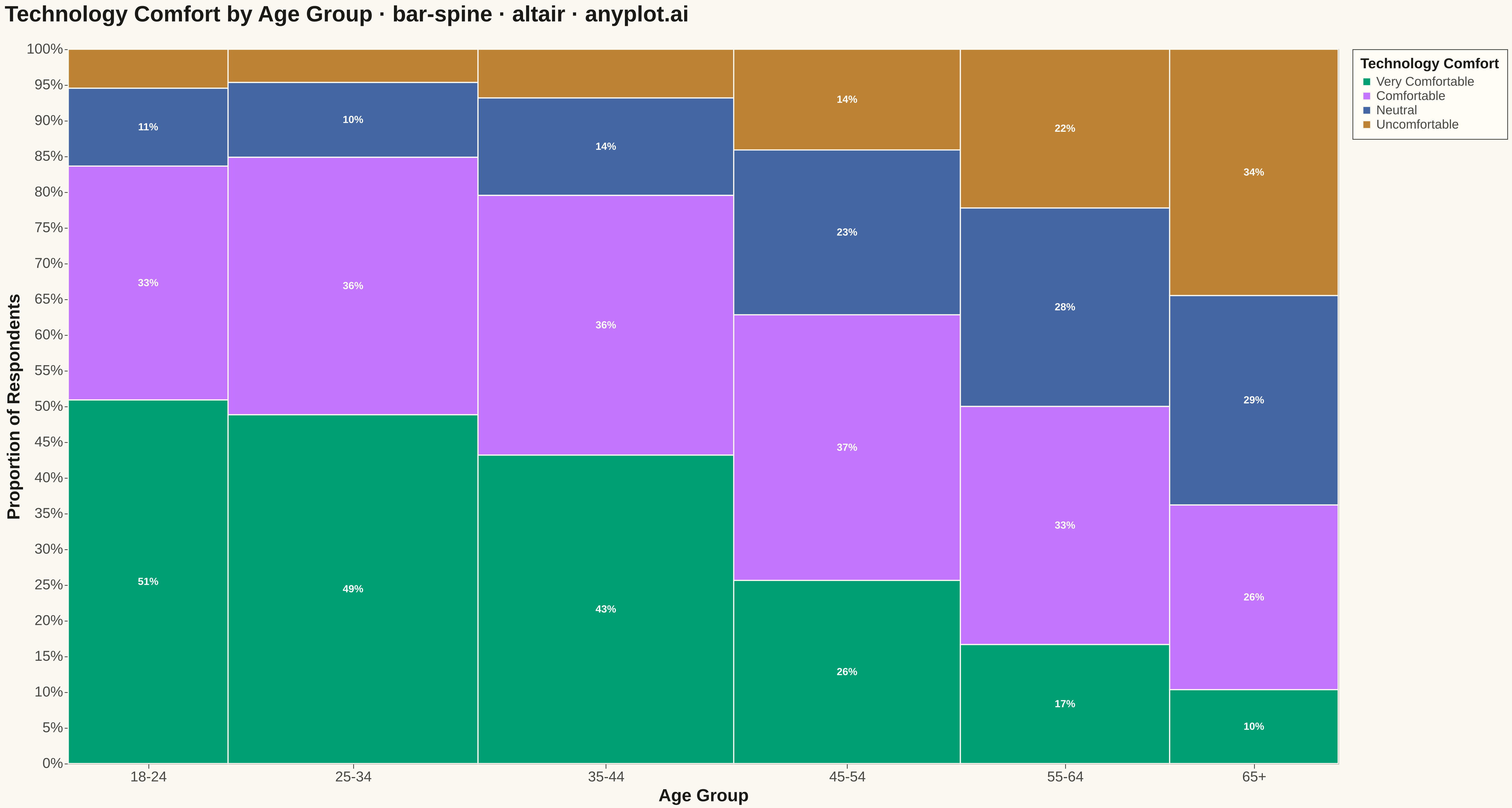
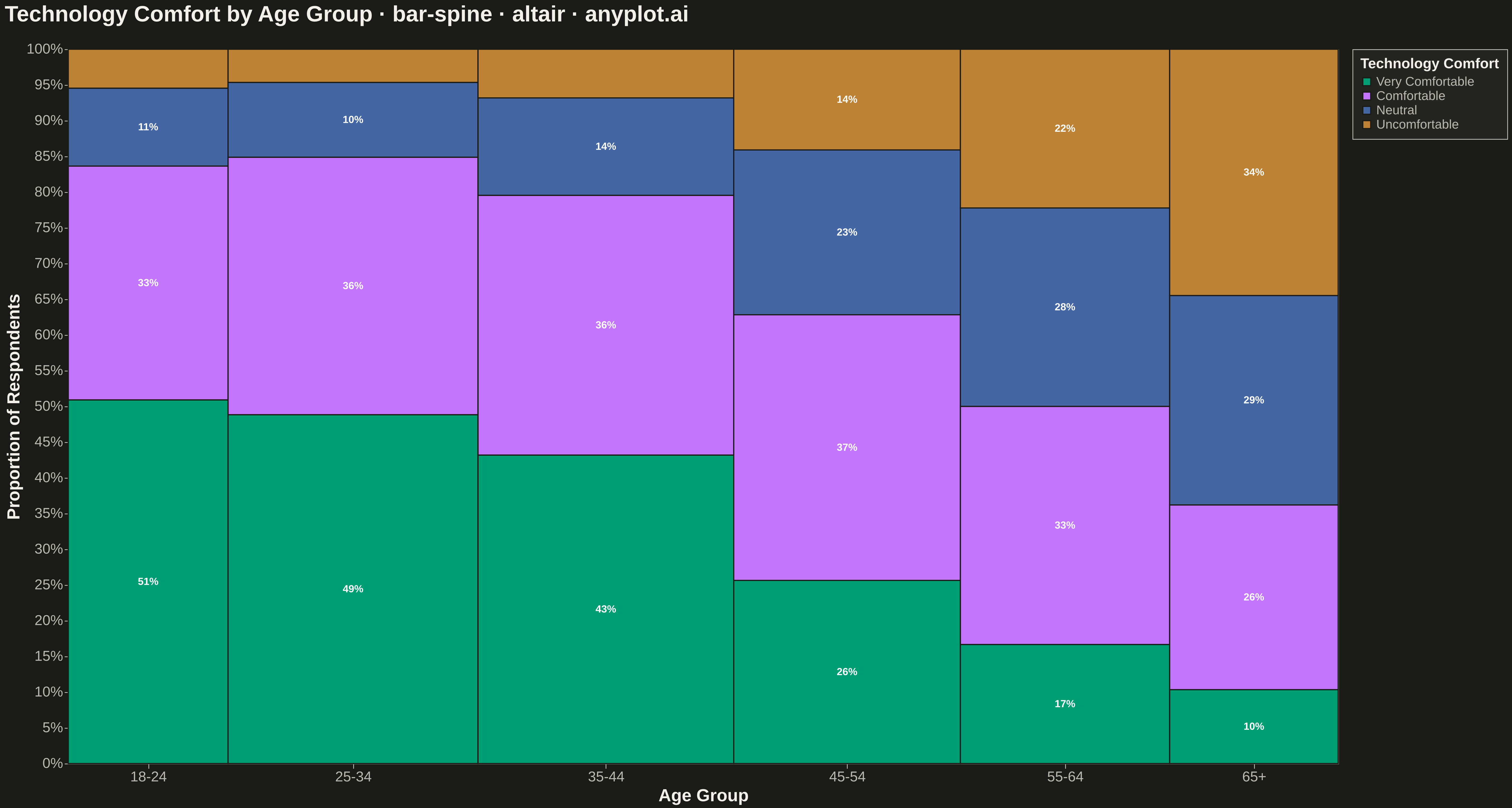
The same plot in 14 other libraries — Python: Bokeh, lets-plot, Matplotlib, Plotly, plotnine, Pygal, Seaborn; R: ggplot2; Julia: Makie.jl; JavaScript: Chart.js, D3.js, Apache ECharts, Highcharts, MUI X Charts. Compare all 15 side by side: Spine Plot for Two-Variable Proportions in Python, R, Julia and JavaScript.
A spine plot (spineplot) is a stacked bar chart where bar widths are proportional to the marginal frequency of one categorical variable and the subdivisions within each bar show the conditional distribution of a second categorical variable. All bars are normalized to the same height (100%), so visual comparison focuses on how the conditional proportions shift across categories. It is a one-dimensional specialization of mosaic plots and excels at revealing associations between two categorical variables in contingency table data.
""" anyplot.ai
bar-spine: Spine Plot for Two-Variable Proportions
Library: altair 6.3.0 | Python 3.13.15
Quality: 88/100 | Updated: 2026-09-27
"""

import os
import sys


# Prevent this file from shadowing the installed altair package
_script_dir = os.path.dirname(os.path.abspath(__file__))
sys.path = [p for p in sys.path if os.path.abspath(p or ".") != _script_dir]
del _script_dir

import altair as alt
import pandas as pd
from PIL import Image


# Theme tokens
THEME = os.getenv("ANYPLOT_THEME", "light")
PAGE_BG = "#FAF8F1" if THEME == "light" else "#1A1A17"
ELEVATED_BG = "#FFFDF6" if THEME == "light" else "#242420"
INK = "#1A1A17" if THEME == "light" else "#F0EFE8"
INK_SOFT = "#4A4A44" if THEME == "light" else "#B8B7B0"

IMPRINT = ["#009E73", "#C475FD", "#4467A3", "#BD8233"]
# Per-segment percentage-label text color, chosen for >=4.5:1 contrast against
# each fixed Imprint fill (data colors don't change with theme).
LABEL_TEXT_COLOR = {
    "Very Comfortable": "#FFFFFF",
    "Comfortable": "#1A1A17",
    "Neutral": "#FFFFFF",
    "Uncomfortable": "#1A1A17",
}

# Data — technology comfort survey by age group
age_groups = ["18-24", "25-34", "35-44", "45-54", "55-64", "65+"]
comfort_cats = ["Very Comfortable", "Comfortable", "Neutral", "Uncomfortable"]

raw_counts = {
    "18-24": [280, 180, 60, 30],
    "25-34": [420, 310, 90, 40],
    "35-44": [380, 320, 120, 60],
    "45-54": [200, 290, 180, 110],
    "55-64": [120, 240, 200, 160],
    "65+": [60, 150, 170, 200],
}

records = []
for age in age_groups:
    for cat, cnt in zip(comfort_cats, raw_counts[age], strict=False):
        records.append({"age_group": age, "comfort": cat, "count": cnt})
df = pd.DataFrame(records)

# Marginal totals → proportional bar widths
totals = df.groupby("age_group")["count"].sum().reindex(age_groups)
grand_total = int(totals.sum())
x_widths = totals / grand_total
x_ends = x_widths.cumsum()
x_starts = x_ends - x_widths
x_mids = (x_starts + x_ends) / 2

# Pre-compute rectangle boundaries for each (age_group, comfort) combination
spine_records = []
for age in age_groups:
    group = df[df["age_group"] == age].set_index("comfort").reindex(comfort_cats)
    total = int(totals[age])
    y_acc = 0.0
    for cat in comfort_cats:
        cnt = int(group.loc[cat, "count"])
        prop = cnt / total
        y0 = y_acc
        y1 = y_acc + prop
        spine_records.append(
            {
                "age_group": age,
                "comfort": cat,
                "x_start": float(x_starts[age]),
                "x_end": float(x_ends[age]),
                "x_mid": float(x_mids[age]),
                "y_start": y0,
                "y_end": y1,
                "y_mid": (y0 + y1) / 2,
                "proportion": prop,
                "count": cnt,
                "total": total,
                "pct_label": f"{prop:.0%}" if prop >= 0.10 else "",
                "label_color": LABEL_TEXT_COLOR[cat],
            }
        )
        y_acc = y1

spine_df = pd.DataFrame(spine_records)

# X-axis tick positions at bar midpoints with custom labels
x_mid_list = [round(float(x_mids[a]), 6) for a in age_groups]
label_expr = " : ".join(
    [f"abs(datum.value - {xm}) < 0.01 ? '{age}'" for age, xm in zip(age_groups, x_mid_list, strict=False)] + ["''"]
)

# Spine bars
bars = (
    alt.Chart(spine_df)
    .mark_rect(stroke=PAGE_BG, strokeWidth=0.5)
    .encode(
        x=alt.X(
            "x_start:Q",
            scale=alt.Scale(domain=[0, 1]),
            axis=alt.Axis(
                values=x_mid_list,
                labelExpr=label_expr,
                labelAngle=0,
                title="Age Group",
                titleFontSize=12,
                labelFontSize=10,
                domainColor=INK_SOFT,
                tickColor=INK_SOFT,
                labelColor=INK_SOFT,
                titleColor=INK,
                grid=False,
                tickSize=4,
            ),
        ),
        x2="x_end:Q",
        y=alt.Y(
            "y_start:Q",
            scale=alt.Scale(domain=[0, 1]),
            axis=alt.Axis(
                format="%",
                title="Proportion of Respondents",
                titleFontSize=12,
                labelFontSize=10,
                domainColor=INK_SOFT,
                tickColor=INK_SOFT,
                labelColor=INK_SOFT,
                titleColor=INK,
                gridColor=INK,
                gridOpacity=0.10,
                grid=True,
            ),
        ),
        y2="y_end:Q",
        color=alt.Color(
            "comfort:N",
            scale=alt.Scale(domain=comfort_cats, range=IMPRINT),
            legend=alt.Legend(
                title="Technology Comfort",
                titleFontSize=10,
                labelFontSize=10,
                fillColor=ELEVATED_BG,
                strokeColor=INK_SOFT,
                titleColor=INK,
                labelColor=INK_SOFT,
                orient="right",
                padding=6,
            ),
        ),
        tooltip=[
            alt.Tooltip("age_group:N", title="Age Group"),
            alt.Tooltip("comfort:N", title="Comfort Level"),
            alt.Tooltip("proportion:Q", title="Proportion", format=".1%"),
            alt.Tooltip("count:Q", title="Count"),
        ],
    )
)

# Percentage labels inside segments wide enough to fit text
pct_labels = (
    alt.Chart(spine_df[spine_df["pct_label"] != ""])
    .mark_text(align="center", baseline="middle", fontSize=10, fontWeight="bold")
    .encode(
        x=alt.X("x_mid:Q", scale=alt.Scale(domain=[0, 1])),
        y=alt.Y("y_mid:Q", scale=alt.Scale(domain=[0, 1])),
        text="pct_label:N",
        color=alt.Color("label_color:N", scale=None, legend=None),
    )
)

# Compose and configure
chart = (
    alt.layer(bars, pct_labels)
    .properties(
        width=595,
        height=320,
        background=PAGE_BG,
        title=alt.TitleParams(
            "Technology Comfort by Age Group · bar-spine · python · altair · anyplot.ai",
            subtitle="Comfort with technology collapses sharply past age 55",
            fontSize=16,
            subtitleFontSize=11,
            color=INK,
            subtitleColor=INK_SOFT,
            anchor="start",
            offset=10,
        ),
    )
    .configure_view(fill=PAGE_BG, stroke=None, continuousWidth=595, continuousHeight=320)
    .configure_title(color=INK, fontSize=16)
)

# Save — hard target: 3200 x 1800 (landscape). See prompts/library/altair.md "Canvas".
chart.save(f"plot-{THEME}.png", scale_factor=4.0)
chart.save(f"plot-{THEME}.html")

TW, TH = 3200, 1800
_img = Image.open(f"plot-{THEME}.png").convert("RGB")
_w, _h = _img.size
if _w > TW or _h > TH:
    raise SystemExit(
        f"altair vl-convert produced {_w}x{_h}, exceeds target {TW}x{TH}. "
        f"Shrink chart .properties(width=, height=) values and re-render."
    )
if _w < TW or _h < TH:
    _canvas = Image.new("RGB", (TW, TH), PAGE_BG)
    _canvas.paste(_img, ((TW - _w) // 2, (TH - _h) // 2))
    _canvas.save(f"plot-{THEME}.png")
Runnable source as JSON, for any HTTP client: https://api.anyplot.ai/specs/bar-spine/altair/code. Any spec id and library id listed in llms-full.txt fit the same URL shape; every URL below is complete and callable.
{
  "spec_id": "bar-spine",
  "language": "python",
  "library": "altair",
  "page": "https://anyplot.ai/bar-spine/python/altair",
  "hub": "https://anyplot.ai/bar-spine",
  "code_json": "https://api.anyplot.ai/specs/bar-spine/altair/code",
  "spec_json": "https://api.anyplot.ai/specs/bar-spine",
  "render_light_png": "https://storage.googleapis.com/anyplot-images/plots/bar-spine/python/altair/plot-light.png",
  "render_dark_png": "https://storage.googleapis.com/anyplot-images/plots/bar-spine/python/altair/plot-dark.png",
  "interactive_light_html": "https://storage.googleapis.com/anyplot-images/plots/bar-spine/python/altair/plot-light.html",
  "interactive_dark_html": "https://storage.googleapis.com/anyplot-images/plots/bar-spine/python/altair/plot-dark.html",
  "quality_score": 88.0,
  "license": "MIT",
  "guide": "https://anyplot.ai/llms.txt"
}
Part of Spine Plot for Two-Variable Proportions on anyplot.ai.