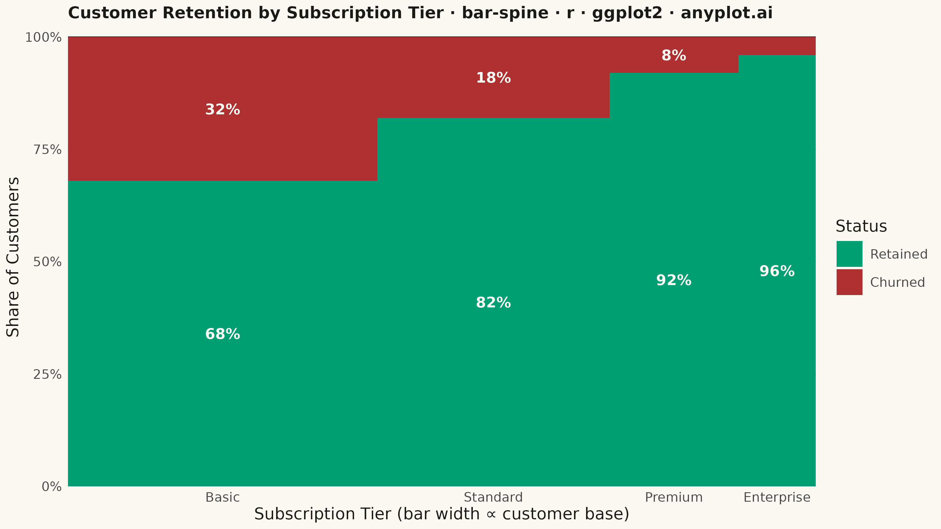
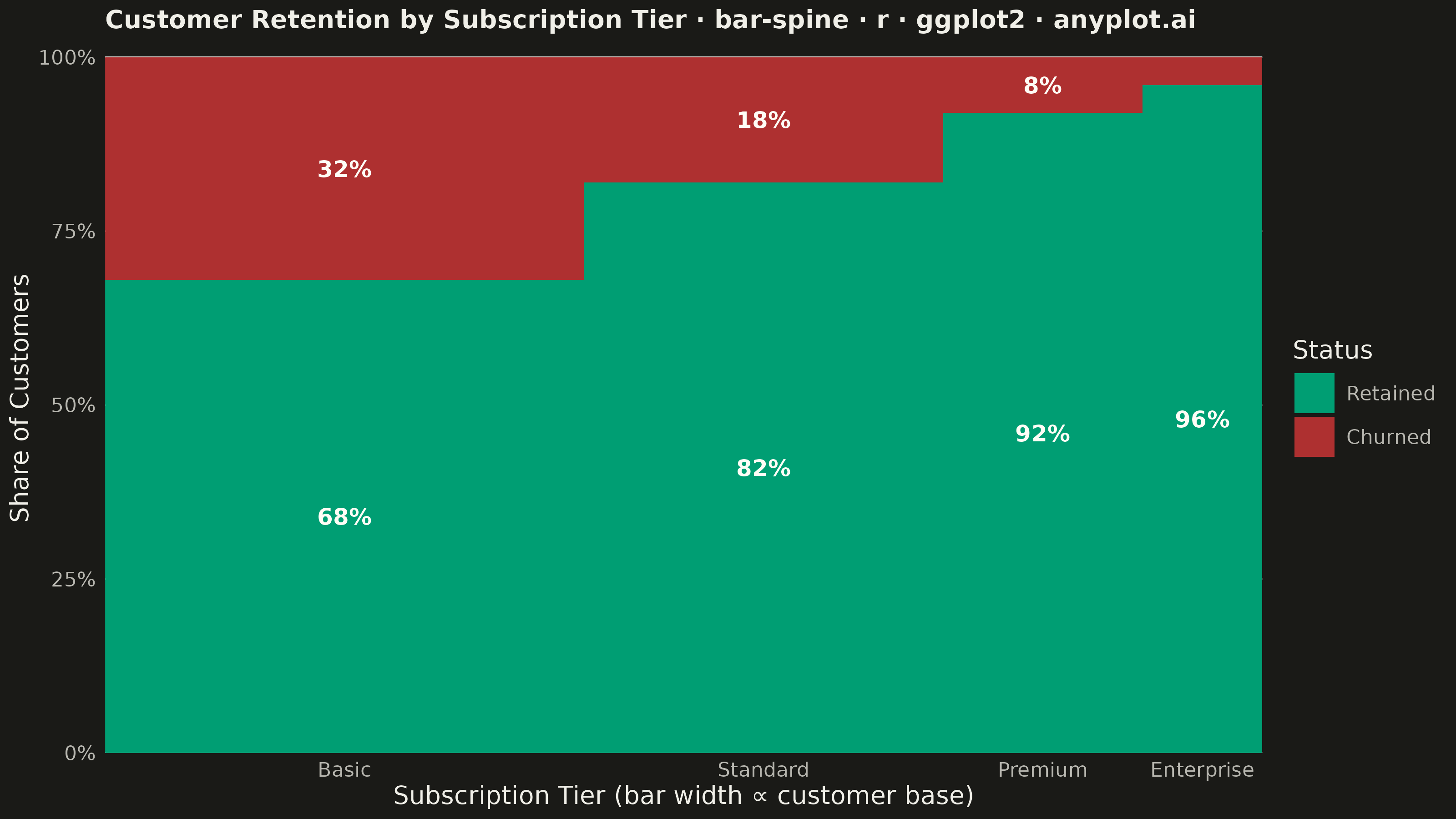
The same plot in 14 other libraries — Python: Altair, Bokeh, lets-plot, Matplotlib, Plotly, plotnine, Pygal, Seaborn; Julia: Makie.jl; JavaScript: Chart.js, D3.js, Apache ECharts, Highcharts, MUI X Charts. Compare all 15 side by side: Spine Plot for Two-Variable Proportions in Python, R, Julia and JavaScript.
A spine plot (spineplot) is a stacked bar chart where bar widths are proportional to the marginal frequency of one categorical variable and the subdivisions within each bar show the conditional distribution of a second categorical variable. All bars are normalized to the same height (100%), so visual comparison focuses on how the conditional proportions shift across categories. It is a one-dimensional specialization of mosaic plots and excels at revealing associations between two categorical variables in contingency table data.
#' anyplot.ai
#' bar-spine: Spine Plot for Two-Variable Proportions
#' Library: ggplot2 3.5.1 | R 4.4.1
#' Quality: 94/100 | Updated: 2026-09-27

library(ggplot2)
library(dplyr)
library(scales)
library(ragg)

set.seed(42)

# --- Theme tokens -------------------------------------------------------
THEME    <- Sys.getenv("ANYPLOT_THEME", "light")
PAGE_BG  <- if (THEME == "light") "#FAF8F1" else "#1A1A17"
INK      <- if (THEME == "light") "#1A1A17" else "#F0EFE8"
INK_SOFT <- if (THEME == "light") "#4A4A44" else "#B8B7B0"
IMPRINT_PALETTE <- c(
  "#009E73", # 1 - brand green (semantic: retained / good)
  "#AE3030"  # 5 - matte red   (semantic: churned / bad)
)
SEGMENT_TEXT <- "#FFFDF6" # warm near-white, legible on both fills
# Imprint "neutral" anchor happens to equal INK; used below for a reference
# trend line so it reads as structural (like gridlines), not a 3rd data series.
NEUTRAL <- INK

# --- Data -----------------------------------------------------------------
# SaaS customer base split by subscription tier (bar width = tier size) and
# retention outcome over the last billing cycle (segment height = share).
TIER_LEVELS   <- c("Basic", "Standard", "Premium", "Enterprise")
STATUS_LEVELS <- c("Retained", "Churned")

df_counts <- tibble::tibble(
  tier   = factor(rep(TIER_LEVELS, each = 2), levels = TIER_LEVELS),
  status = factor(rep(STATUS_LEVELS, times = 4), levels = STATUS_LEVELS),
  count  = c(816, 384, 738, 162, 460, 40, 288, 12)
)

tier_totals <- df_counts %>%
  group_by(tier) %>%
  summarise(total = sum(count), .groups = "drop") %>%
  arrange(tier) %>%
  mutate(
    width = total / sum(total),
    xmax  = cumsum(width),
    xmin  = xmax - width,
    xmid  = (xmin + xmax) / 2
  )

spine_df <- df_counts %>%
  left_join(tier_totals, by = "tier") %>%
  group_by(tier) %>%
  arrange(tier, status) %>%
  mutate(
    prop = count / total,
    ymax = cumsum(prop),
    ymin = ymax - prop,
    ymid = (ymin + ymax) / 2
  ) %>%
  ungroup()

# Retained/churned boundary per tier == the retention rate itself; connecting
# it across tiers turns the width+color pattern into an explicit trend line.
retention_trend <- spine_df %>%
  filter(status == "Retained") %>%
  arrange(xmid)

# --- Plot -------------------------------------------------------------------
plot_title <- "Customer Retention by Subscription Tier · bar-spine · r · ggplot2 · anyplot.ai"
plot_subtitle <- "Retention climbs steadily from Basic to Enterprise"
title_fontsize <- max(8, round(12 * 58 / nchar(plot_title)))

# Push each segment's percentage label away from the retained/churned
# boundary (where the retention trend-line marker sits) instead of dead
# center, so the label never crowds the marker even in thin segments.
label_df <- spine_df %>%
  filter(prop > 0.06) %>%
  mutate(y_label = ifelse(status == "Retained", ymin + prop * 0.35, ymin + prop * 0.65))

p <- ggplot(spine_df) +
  geom_rect(
    aes(xmin = xmin, xmax = xmax, ymin = ymin, ymax = ymax, fill = status),
    color = NA
  ) +
  geom_line(
    data = retention_trend,
    aes(x = xmid, y = ymax, group = 1),
    color = NEUTRAL, linewidth = 0.5, linetype = "22", alpha = 0.85
  ) +
  geom_point(
    data = retention_trend,
    aes(x = xmid, y = ymax),
    shape = 21, size = 2.2, stroke = 0.8, color = NEUTRAL, fill = PAGE_BG
  ) +
  geom_text(
    data = label_df,
    aes(x = xmid, y = y_label, label = percent(prop, accuracy = 1)),
    color = SEGMENT_TEXT, size = 3.2, fontface = "bold"
  ) +
  scale_fill_manual(
    values = c(Retained = IMPRINT_PALETTE[1], Churned = IMPRINT_PALETTE[2]),
    name = "Status"
  ) +
  scale_x_continuous(
    breaks = tier_totals$xmid, labels = tier_totals$tier,
    expand = c(0, 0)
  ) +
  scale_y_continuous(
    labels = percent_format(accuracy = 1),
    expand = expansion(mult = c(0, 0.02))
  ) +
  labs(
    title = plot_title,
    subtitle = plot_subtitle,
    x = "Subscription Tier (bar width ∝ customer base)",
    y = "Share of Customers"
  ) +
  theme_minimal(base_size = 8) +
  theme(
    plot.background    = element_rect(fill = PAGE_BG, color = PAGE_BG),
    panel.background   = element_rect(fill = PAGE_BG, color = NA),
    panel.grid.major.x = element_blank(),
    panel.grid.minor   = element_blank(),
    panel.grid.major.y = element_line(color = INK, linewidth = 0.3),
    axis.title         = element_text(color = INK, size = 10),
    axis.text          = element_text(color = INK_SOFT, size = 8),
    axis.ticks         = element_blank(),
    plot.title         = element_text(color = INK, size = title_fontsize, face = "bold"),
    plot.subtitle      = element_text(color = INK_SOFT, size = 9, face = "italic", margin = margin(t = 2, b = 6)),
    legend.text        = element_text(color = INK_SOFT, size = 8),
    legend.title       = element_text(color = INK, size = 10),
    plot.margin        = margin(t = 5, r = 12, b = 5, l = 5)
  )

# --- Save -------------------------------------------------------------------
ggsave(
  filename = sprintf("plot-%s.png", THEME),
  plot     = p,
  device   = ragg::agg_png,
  width    = 8,
  height   = 4.5,
  units    = "in",
  dpi      = 400
)
Runnable source as JSON, for any HTTP client: https://api.anyplot.ai/specs/bar-spine/ggplot2/code. Any spec id and library id listed in llms-full.txt fit the same URL shape; every URL below is complete and callable.
{
  "spec_id": "bar-spine",
  "language": "r",
  "library": "ggplot2",
  "page": "https://anyplot.ai/bar-spine/r/ggplot2",
  "hub": "https://anyplot.ai/bar-spine",
  "code_json": "https://api.anyplot.ai/specs/bar-spine/ggplot2/code",
  "spec_json": "https://api.anyplot.ai/specs/bar-spine",
  "render_light_png": "https://storage.googleapis.com/anyplot-images/plots/bar-spine/r/ggplot2/plot-light.png",
  "render_dark_png": "https://storage.googleapis.com/anyplot-images/plots/bar-spine/r/ggplot2/plot-dark.png",
  "quality_score": 94.0,
  "license": "MIT",
  "guide": "https://anyplot.ai/llms.txt"
}
Part of Spine Plot for Two-Variable Proportions on anyplot.ai.