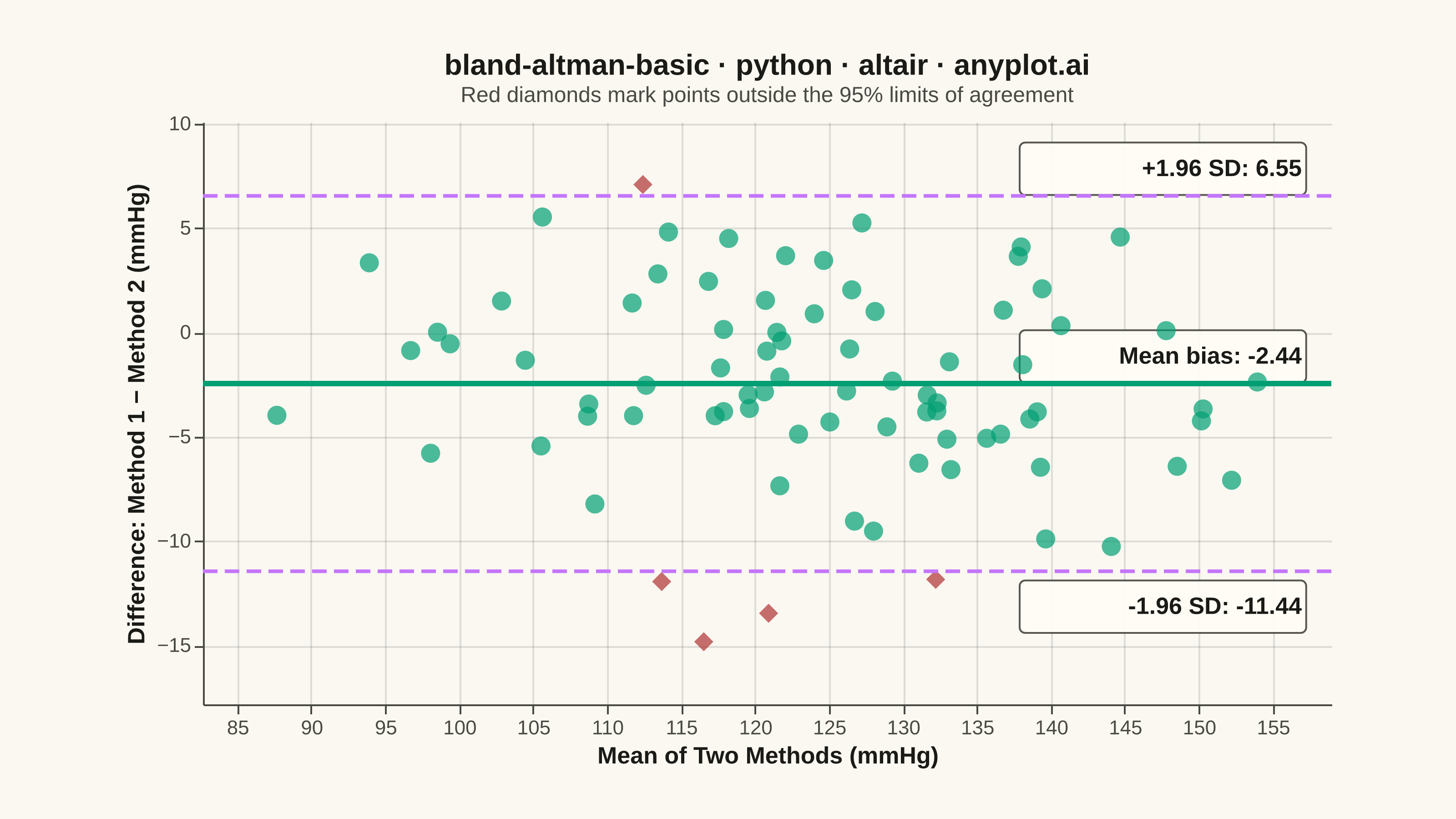
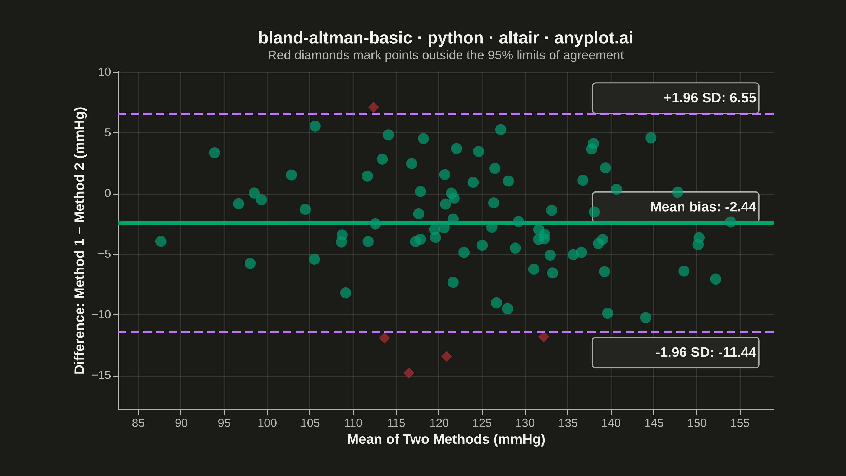
A Bland-Altman plot (also known as a difference plot or Tukey mean-difference plot) visualizes the agreement between two measurement methods by plotting the difference against the average of paired observations. It displays the mean difference (bias) as a horizontal line and limits of agreement (mean ± 1.96 SD) to assess whether the methods are interchangeable within acceptable tolerances.
""" anyplot.ai
bland-altman-basic: Bland-Altman Agreement Plot
Library: altair 6.2.2 | Python 3.13.14
Quality: 91/100 | Updated: 2026-08-11
"""

import os
import sys


# Remove script directory from path to avoid importing self instead of altair package
script_dir = os.path.dirname(os.path.abspath(__file__))
while script_dir in sys.path:
    sys.path.remove(script_dir)

import altair as alt
import numpy as np
import pandas as pd
from PIL import Image


# Theme tokens (see prompts/default-style-guide.md "Theme-adaptive Chrome")
THEME = os.getenv("ANYPLOT_THEME", "light")
PAGE_BG = "#FAF8F1" if THEME == "light" else "#1A1A17"
ELEVATED_BG = "#FFFDF6" if THEME == "light" else "#242420"
INK = "#1A1A17" if THEME == "light" else "#F0EFE8"
INK_SOFT = "#4A4A44" if THEME == "light" else "#B8B7B0"
BRAND = "#009E73"  # Imprint palette position 1 — ALWAYS first series
LOA_COLOR = "#C475FD"  # Imprint palette position 2 — limits-of-agreement lines
OUTLIER = "#AE3030"  # Imprint semantic anchor — points outside the limits of agreement

# Data: simulated systolic blood pressure from two sphygmomanometers
np.random.seed(42)
n = 80
method1 = np.random.normal(loc=125, scale=15, size=n)
method2 = method1 + np.random.normal(loc=2.5, scale=5, size=n)

# Bland-Altman statistics
mean_values = (method1 + method2) / 2
diff_values = method1 - method2
mean_diff = np.mean(diff_values)
std_diff = np.std(diff_values, ddof=1)
upper_loa = mean_diff + 1.96 * std_diff
lower_loa = mean_diff - 1.96 * std_diff

df = pd.DataFrame({"Mean": mean_values, "Difference": diff_values})

# Axis ranges with headroom for the limit lines and annotations
x_min = df["Mean"].min() - 5
x_max = df["Mean"].max() + 5
y_min = min(df["Difference"].min(), lower_loa) - 3
y_max = max(df["Difference"].max(), upper_loa) + 3

# Scatter points — flagged red + diamond shape when outside the 95% limits of
# agreement (redundant shape encoding keeps the flag CVD-safe, not color-only)
outlier_predicate = f"datum.Difference > {upper_loa} || datum.Difference < {lower_loa}"
scatter = (
    alt.Chart(df)
    .mark_point(size=110, filled=True, opacity=0.7)
    .encode(
        x=alt.X("Mean:Q", title="Mean of Two Methods (mmHg)", scale=alt.Scale(domain=[x_min, x_max], zero=False)),
        y=alt.Y(
            "Difference:Q",
            title="Difference: Method 1 − Method 2 (mmHg)",
            scale=alt.Scale(domain=[y_min, y_max], zero=False),
        ),
        color=alt.condition(outlier_predicate, alt.value(OUTLIER), alt.value(BRAND)),
        shape=alt.condition(outlier_predicate, alt.value("diamond"), alt.value("circle")),
        tooltip=[
            alt.Tooltip("Mean:Q", format=".1f", title="Mean"),
            alt.Tooltip("Difference:Q", format=".1f", title="Difference"),
        ],
    )
)

# Mean bias line (solid)
mean_line = (
    alt.Chart(pd.DataFrame({"y": [mean_diff]}))
    .mark_rule(strokeWidth=3, color=BRAND)
    .encode(y=alt.Y("y:Q", scale=alt.Scale(domain=[y_min, y_max], zero=False)))
)

# Limits of agreement lines (dashed)
loa_lines = (
    alt.Chart(pd.DataFrame({"y": [upper_loa, lower_loa]}))
    .mark_rule(strokeWidth=2, strokeDash=[8, 4], color=LOA_COLOR)
    .encode(y=alt.Y("y:Q", scale=alt.Scale(domain=[y_min, y_max], zero=False)))
)

# Annotation labels, framed with an elevated-surface box for legibility over the scatter
annotation_df = pd.DataFrame(
    {
        "x": [x_max - 2, x_max - 2, x_max - 2],
        "y": [mean_diff + 1.3, upper_loa + 1.3, lower_loa - 1.7],
        "text": [f"Mean bias: {mean_diff:.2f}", f"+1.96 SD: {upper_loa:.2f}", f"-1.96 SD: {lower_loa:.2f}"],
    }
)
box_pad_x = (x_max - x_min) * 0.125
box_pad_y = (y_max - y_min) * 0.045
box_df = annotation_df.assign(
    x0=annotation_df["x"] - 2 * box_pad_x,
    x1=annotation_df["x"] + 0.3,
    y0=annotation_df["y"] - box_pad_y,
    y1=annotation_df["y"] + box_pad_y,
)
annotation_boxes = (
    alt.Chart(box_df)
    .mark_rect(fill=ELEVATED_BG, stroke=INK_SOFT, strokeWidth=1, cornerRadius=3, opacity=0.92)
    .encode(
        x=alt.X("x0:Q", scale=alt.Scale(domain=[x_min, x_max], zero=False)),
        x2="x1:Q",
        y=alt.Y("y0:Q", scale=alt.Scale(domain=[y_min, y_max], zero=False)),
        y2="y1:Q",
    )
)
annotations = (
    alt.Chart(annotation_df)
    .mark_text(align="right", fontSize=13, fontWeight="bold", color=INK)
    .encode(
        x=alt.X("x:Q", scale=alt.Scale(domain=[x_min, x_max], zero=False)),
        y=alt.Y("y:Q", scale=alt.Scale(domain=[y_min, y_max], zero=False)),
        text="text:N",
    )
)

# Title — length-based fontsize formula (see prompts/plot-generator.md)
title_text = "bland-altman-basic · python · altair · anyplot.ai"
title_fontsize = round(16 * min(1.0, 67 / len(title_text)))

# Combine layers, enable pan/zoom, and apply theme-adaptive chrome.
# Subtitle spells out the red/diamond = outlier semantics so the encoding is
# self-explanatory without a separate legend.
chart = (
    (annotation_boxes + scatter + mean_line + loa_lines + annotations)
    .properties(
        width=620,
        height=320,
        background=PAGE_BG,
        title=alt.Title(
            title_text,
            subtitle="Red diamonds mark points outside the 95% limits of agreement",
            fontSize=title_fontsize,
            subtitleFontSize=12,
            subtitleColor=INK_SOFT,
            anchor="middle",
            color=INK,
        ),
    )
    .interactive()
    .configure_view(fill=PAGE_BG, stroke=None)
    .configure_axis(
        domainColor=INK_SOFT,
        tickColor=INK_SOFT,
        gridColor=INK,
        gridOpacity=0.12,
        labelColor=INK_SOFT,
        titleColor=INK,
        labelFontSize=11,
        titleFontSize=13,
    )
    .configure_title(color=INK, fontSize=title_fontsize)
)

# Save PNG then pad to the exact canonical target — never crop (see prompts/library/altair.md)
chart.save(f"plot-{THEME}.png", scale_factor=4.0)
TARGET_W, TARGET_H = 3200, 1800
img = Image.open(f"plot-{THEME}.png").convert("RGB")
w, h = img.size
if w > TARGET_W or h > TARGET_H:
    raise SystemExit(
        f"altair vl-convert produced {w}x{h}, exceeds target {TARGET_W}x{TARGET_H}. "
        f"Shrink chart .properties(width=, height=) values and re-render."
    )
if w < TARGET_W or h < TARGET_H:
    canvas = Image.new("RGB", (TARGET_W, TARGET_H), PAGE_BG)
    canvas.paste(img, ((TARGET_W - w) // 2, (TARGET_H - h) // 2))
    canvas.save(f"plot-{THEME}.png")

chart.save(f"plot-{THEME}.html")
Runnable source as JSON, for any HTTP client: https://api.anyplot.ai/specs/bland-altman-basic/altair/code. Any spec id and library id listed in llms-full.txt fit the same URL shape; every URL below is complete and callable.
{
  "spec_id": "bland-altman-basic",
  "language": "python",
  "library": "altair",
  "page": "https://anyplot.ai/bland-altman-basic/python/altair",
  "hub": "https://anyplot.ai/bland-altman-basic",
  "code_json": "https://api.anyplot.ai/specs/bland-altman-basic/altair/code",
  "spec_json": "https://api.anyplot.ai/specs/bland-altman-basic",
  "render_light_png": "https://storage.googleapis.com/anyplot-images/plots/bland-altman-basic/python/altair/plot-light.png",
  "render_dark_png": "https://storage.googleapis.com/anyplot-images/plots/bland-altman-basic/python/altair/plot-dark.png",
  "interactive_light_html": "https://storage.googleapis.com/anyplot-images/plots/bland-altman-basic/python/altair/plot-light.html",
  "interactive_dark_html": "https://storage.googleapis.com/anyplot-images/plots/bland-altman-basic/python/altair/plot-dark.html",
  "quality_score": 91.0,
  "license": "MIT",
  "guide": "https://anyplot.ai/llms.txt"
}
Part of Bland-Altman Agreement Plot on anyplot.ai.