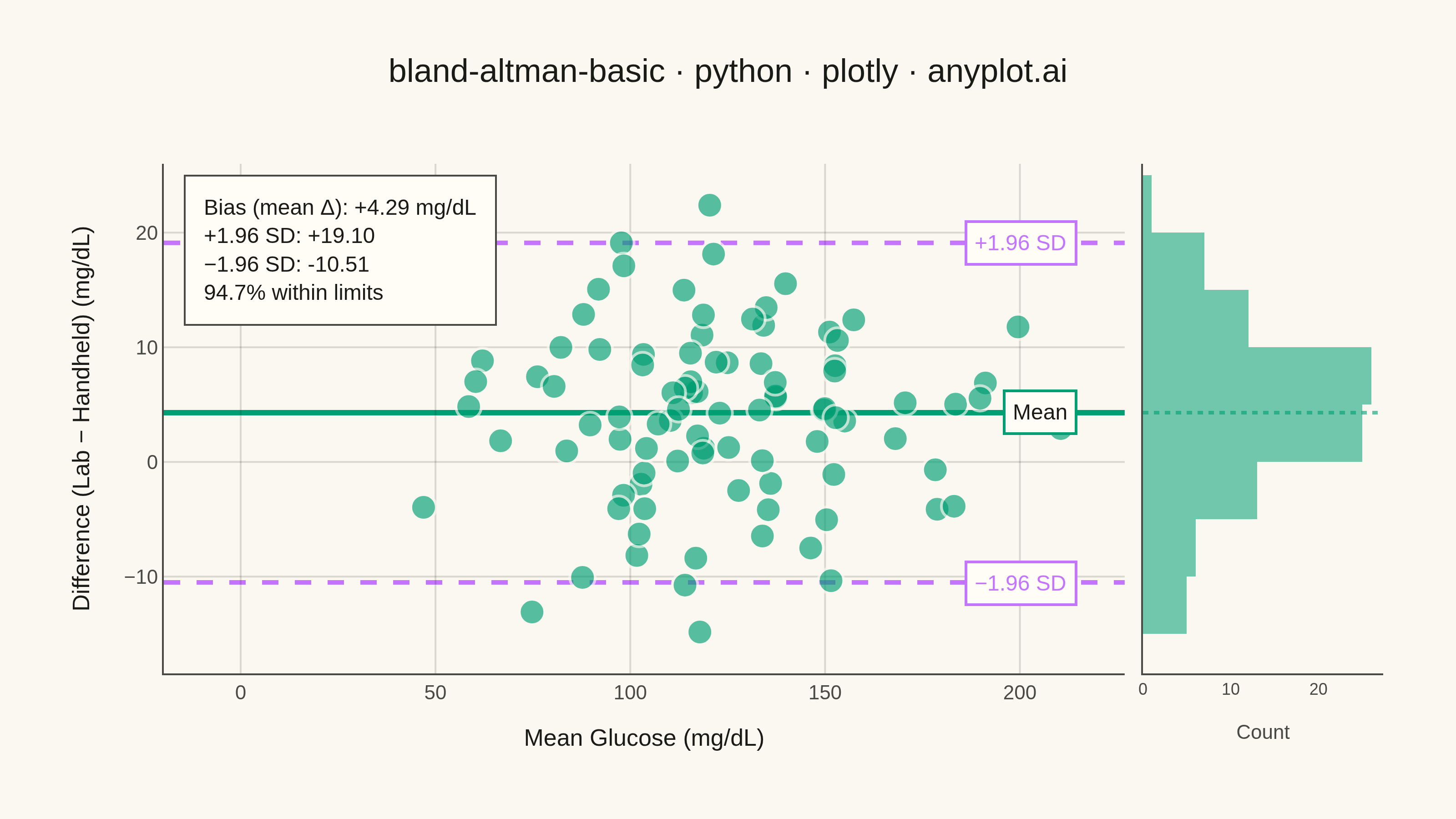
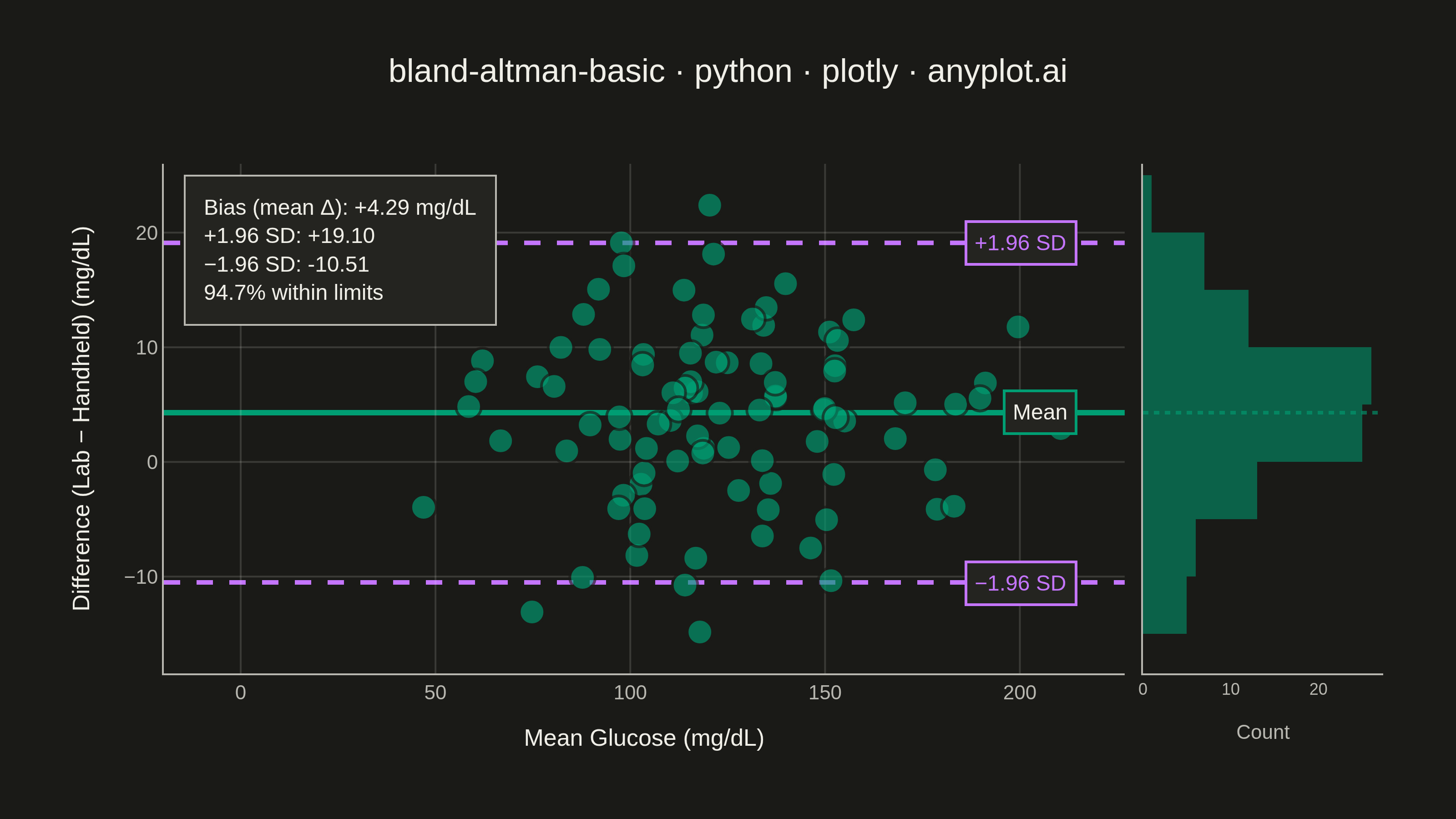
A Bland-Altman plot (also known as a difference plot or Tukey mean-difference plot) visualizes the agreement between two measurement methods by plotting the difference against the average of paired observations. It displays the mean difference (bias) as a horizontal line and limits of agreement (mean ± 1.96 SD) to assess whether the methods are interchangeable within acceptable tolerances.
""" anyplot.ai
bland-altman-basic: Bland-Altman Agreement Plot
Library: plotly 6.9.0 | Python 3.13.14
Quality: 94/100 | Updated: 2026-08-11
"""

import os

import numpy as np
import plotly.graph_objects as go
from plotly.subplots import make_subplots


# Theme tokens (Imprint palette — theme-adaptive chrome)
THEME = os.getenv("ANYPLOT_THEME", "light")
PAGE_BG = "#FAF8F1" if THEME == "light" else "#1A1A17"
ELEVATED_BG = "#FFFDF6" if THEME == "light" else "#242420"
INK = "#1A1A17" if THEME == "light" else "#F0EFE8"
INK_SOFT = "#4A4A44" if THEME == "light" else "#B8B7B0"
GRID = "rgba(26,26,23,0.15)" if THEME == "light" else "rgba(240,239,232,0.15)"

BRAND = "#009E73"  # Imprint palette position 1 — observations + bias line
ACCENT = "#C475FD"  # Imprint palette position 2 — limits of agreement

# Data - Glucose meter readings comparison (medical device validation)
np.random.seed(73)
n_samples = 95

# Lab reference method (plasma glucose in mg/dL)
method1 = np.random.normal(120, 35, n_samples)

# New handheld glucose meter with slight systematic bias
bias = -3.2
method2 = method1 + bias + np.random.normal(0, 8, n_samples)

# Calculate Bland-Altman statistics
means = (method1 + method2) / 2
differences = method1 - method2

mean_diff = np.mean(differences)
std_diff = np.std(differences, ddof=1)
upper_loa = mean_diff + 1.96 * std_diff
lower_loa = mean_diff - 1.96 * std_diff
within_limits = np.sum((differences >= lower_loa) & (differences <= upper_loa))
pct_within = 100 * within_limits / n_samples

# Figure: scatter panel + marginal histogram of the differences, so the
# distribution shape (and its symmetry around the bias line) is visible at a
# glance instead of only implied by the LoA math.
fig = make_subplots(rows=1, cols=2, column_widths=[0.8, 0.2], shared_yaxes=True, horizontal_spacing=0.015)

# Shaded band for the 95% limits of agreement, sitting behind the data
fig.add_hrect(y0=lower_loa, y1=upper_loa, fillcolor=ACCENT, opacity=0.08, line_width=0, layer="below", row=1, col=1)

# Scatter of differences vs means
fig.add_trace(
    go.Scatter(
        x=means,
        y=differences,
        mode="markers",
        marker={"size": 14, "color": BRAND, "opacity": 0.65, "line": {"width": 1.5, "color": PAGE_BG}},
        name="Observations",
        hovertemplate="Mean: %{x:.1f} mg/dL<br>Difference: %{y:.1f} mg/dL<extra></extra>",
    ),
    row=1,
    col=1,
)

# Mean difference line (bias)
fig.add_hline(y=mean_diff, line={"color": BRAND, "width": 3}, layer="below", row=1, col=1)

# Upper limit of agreement
fig.add_hline(y=upper_loa, line={"color": ACCENT, "width": 2.5, "dash": "dash"}, layer="below", row=1, col=1)

# Lower limit of agreement
fig.add_hline(y=lower_loa, line={"color": ACCENT, "width": 2.5, "dash": "dash"}, layer="below", row=1, col=1)

# Line-end labels, anchored well inside the row=1,col=1 domain (x domain=0.95)
# so they never cross into the marginal-histogram column and cover its bars.
for label_text, label_y, label_color in (
    ("Mean", mean_diff, BRAND),
    ("+1.96 SD", upper_loa, ACCENT),
    ("−1.96 SD", lower_loa, ACCENT),
):
    fig.add_annotation(
        xref="x domain",
        yref="y",
        x=0.95,
        y=label_y,
        xanchor="right",
        yanchor="middle",
        text=label_text,
        showarrow=False,
        font={"size": 12, "color": INK if label_color == BRAND else label_color},
        bgcolor=ELEVATED_BG,
        bordercolor=label_color,
        borderwidth=1.5,
        borderpad=4,
        row=1,
        col=1,
    )

# Boxed summary of the agreement statistics, in one place instead of
# scattered across three separate line labels
fig.add_annotation(
    xref="x domain",
    yref="y domain",
    x=0.02,
    y=0.98,
    xanchor="left",
    yanchor="top",
    align="left",
    showarrow=False,
    text=(
        f"Bias (mean Δ): {mean_diff:+.2f} mg/dL<br>"
        f"+1.96 SD: {upper_loa:+.2f}<br>"
        f"−1.96 SD: {lower_loa:+.2f}<br>"
        f"{pct_within:.1f}% within limits"
    ),
    font={"size": 12, "color": INK},
    bgcolor=ELEVATED_BG,
    bordercolor=INK_SOFT,
    borderwidth=1,
    borderpad=10,
    row=1,
    col=1,
)

# Marginal histogram — shows the shape of the difference distribution,
# which is what the ±1.96 SD limits of agreement assume is approximately normal
fig.add_trace(
    go.Histogram(
        y=differences,
        orientation="h",
        nbinsy=18,
        marker={"color": BRAND, "opacity": 0.55, "line": {"width": 0}},
        showlegend=False,
        hovertemplate="Count: %{x}<extra></extra>",
    ),
    row=1,
    col=2,
)
fig.add_hline(y=mean_diff, line={"color": BRAND, "width": 2, "dash": "dot"}, opacity=0.6, row=1, col=2)

# Axes
fig.update_xaxes(
    title={"text": "Mean Glucose (mg/dL)", "font": {"size": 13, "color": INK}},
    tickfont={"size": 11, "color": INK_SOFT},
    gridcolor=GRID,
    showgrid=True,
    zeroline=False,
    linecolor=INK_SOFT,
    row=1,
    col=1,
)
fig.update_yaxes(
    title={"text": "Difference (Lab − Handheld) (mg/dL)", "font": {"size": 13, "color": INK}},
    tickfont={"size": 11, "color": INK_SOFT},
    gridcolor=GRID,
    showgrid=True,
    zeroline=False,
    linecolor=INK_SOFT,
    row=1,
    col=1,
)
fig.update_xaxes(
    title={"text": "Count", "font": {"size": 11, "color": INK_SOFT}},
    tickfont={"size": 9, "color": INK_SOFT},
    showgrid=False,
    zeroline=False,
    linecolor=INK_SOFT,
    row=1,
    col=2,
)
fig.update_yaxes(showgrid=False, zeroline=False, linecolor=INK_SOFT, showticklabels=False, row=1, col=2)

# Layout
fig.update_layout(
    autosize=False,
    title={
        "text": "bland-altman-basic · python · plotly · anyplot.ai",
        "font": {"size": 18, "color": INK},
        "x": 0.5,
        "xanchor": "center",
    },
    paper_bgcolor=PAGE_BG,
    plot_bgcolor=PAGE_BG,
    font={"color": INK},
    showlegend=False,
    margin={"l": 90, "r": 40, "t": 90, "b": 80},
    hovermode="closest",
)

# Save outputs
fig.write_image(f"plot-{THEME}.png", width=800, height=450, scale=4)
fig.write_html(f"plot-{THEME}.html", include_plotlyjs="cdn")
Runnable source as JSON, for any HTTP client: https://api.anyplot.ai/specs/bland-altman-basic/plotly/code. Any spec id and library id listed in llms-full.txt fit the same URL shape; every URL below is complete and callable.
{
  "spec_id": "bland-altman-basic",
  "language": "python",
  "library": "plotly",
  "page": "https://anyplot.ai/bland-altman-basic/python/plotly",
  "hub": "https://anyplot.ai/bland-altman-basic",
  "code_json": "https://api.anyplot.ai/specs/bland-altman-basic/plotly/code",
  "spec_json": "https://api.anyplot.ai/specs/bland-altman-basic",
  "render_light_png": "https://storage.googleapis.com/anyplot-images/plots/bland-altman-basic/python/plotly/plot-light.png",
  "render_dark_png": "https://storage.googleapis.com/anyplot-images/plots/bland-altman-basic/python/plotly/plot-dark.png",
  "interactive_light_html": "https://storage.googleapis.com/anyplot-images/plots/bland-altman-basic/python/plotly/plot-light.html",
  "interactive_dark_html": "https://storage.googleapis.com/anyplot-images/plots/bland-altman-basic/python/plotly/plot-dark.html",
  "quality_score": 94.0,
  "license": "MIT",
  "guide": "https://anyplot.ai/llms.txt"
}
Part of Bland-Altman Agreement Plot on anyplot.ai.