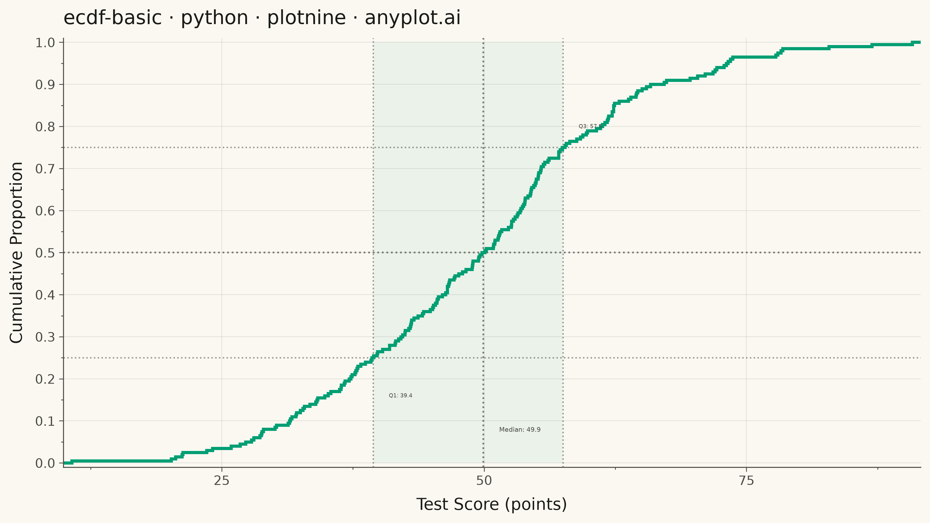
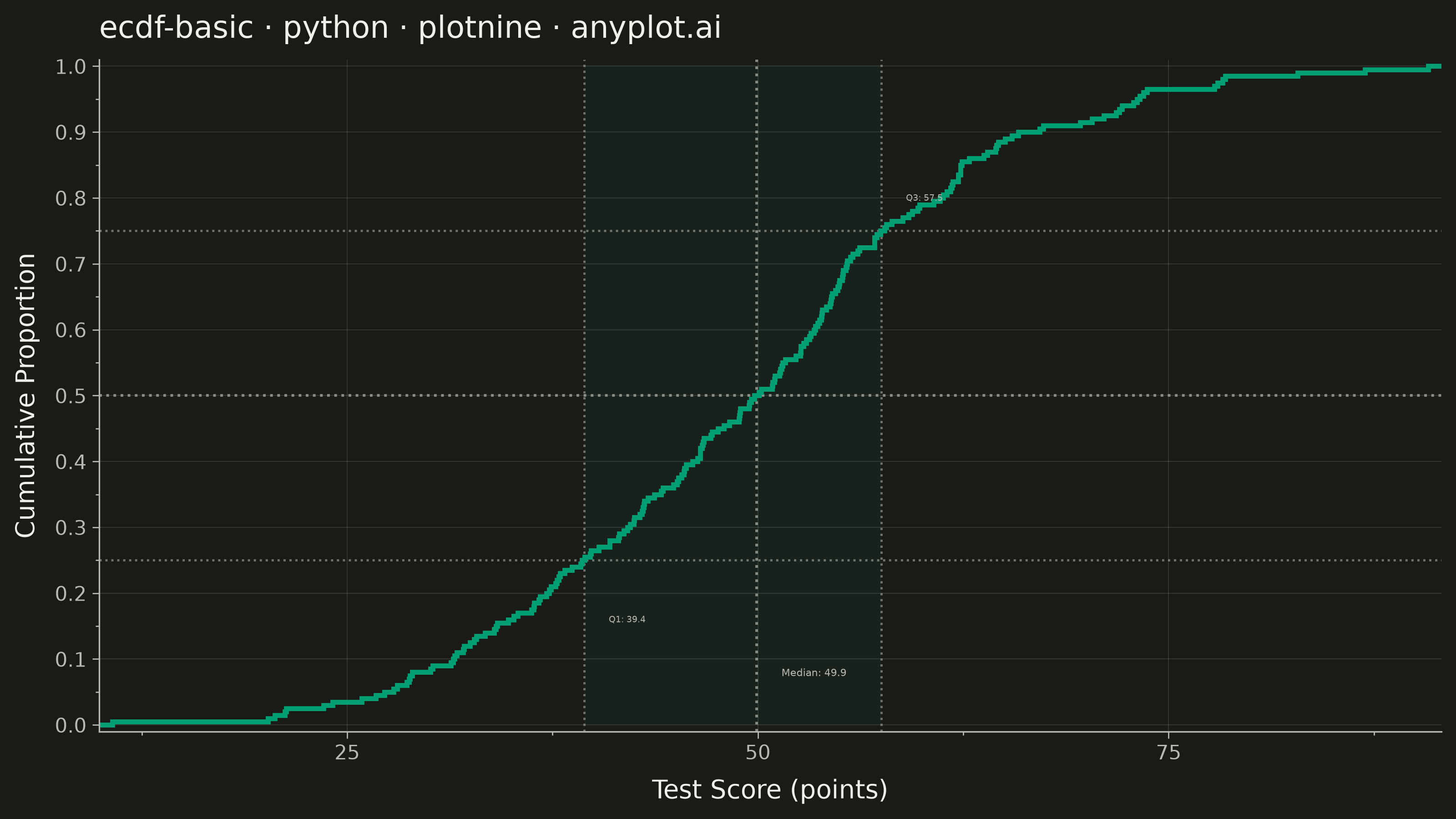
An ECDF (Empirical Cumulative Distribution Function) plot displays a step function that shows the proportion of observations less than or equal to each value. Unlike histograms, ECDF plots require no binning or smoothing, providing a non-parametric estimate of the cumulative distribution. The y-axis ranges from 0 to 1, allowing direct reading of percentiles and quantiles from the visualization.
""" anyplot.ai
ecdf-basic: Basic ECDF Plot
Library: plotnine 0.15.7 | Python 3.13.14
Quality: 89/100 | Updated: 2026-06-25
"""

import os
import sys

import numpy as np
import pandas as pd


# Avoid shadowing the plotnine library when this file is run directly
_cwd = os.getcwd()
sys.path = [p for p in sys.path if os.path.abspath(p) != _cwd]

from plotnine import (
    aes,
    annotate,
    element_blank,
    element_line,
    element_rect,
    element_text,
    geom_hline,
    geom_vline,
    ggplot,
    ggsave,
    labs,
    scale_x_continuous,
    scale_y_continuous,
    stat_ecdf,
    theme,
    theme_minimal,
)


# Theme tokens (Imprint palette)
THEME = os.getenv("ANYPLOT_THEME", "light")
PAGE_BG = "#FAF8F1" if THEME == "light" else "#1A1A17"
ELEVATED_BG = "#FFFDF6" if THEME == "light" else "#242420"
INK = "#1A1A17" if THEME == "light" else "#F0EFE8"
INK_SOFT = "#4A4A44" if THEME == "light" else "#B8B7B0"
INK_MUTED = "#6B6A63" if THEME == "light" else "#A8A79F"
BRAND = "#009E73"  # Imprint palette position 1

# Data: test scores — normal distribution
np.random.seed(42)
scores = np.random.randn(200) * 15 + 50
q1 = float(np.percentile(scores, 25))
median_score = float(np.median(scores))
q3 = float(np.percentile(scores, 75))

df = pd.DataFrame({"score": scores})

title = "ecdf-basic · python · plotnine · anyplot.ai"

# Plot — stat_ecdf computes ECDF internally via plotnine's stat layer
plot = (
    ggplot(df, aes(x="score"))
    # IQR shaded band — highlights the interquartile range (middle 50%)
    + annotate("rect", xmin=q1, xmax=q3, ymin=0.0, ymax=1.0, fill=BRAND, alpha=0.06)
    # Quartile reference crosshairs (Q1, median, Q3)
    + geom_hline(yintercept=0.25, color=INK_SOFT, size=0.5, linetype="dotted", alpha=0.55)
    + geom_hline(yintercept=0.50, color=INK_SOFT, size=0.6, linetype="dotted", alpha=0.70)
    + geom_hline(yintercept=0.75, color=INK_SOFT, size=0.5, linetype="dotted", alpha=0.55)
    + geom_vline(xintercept=q1, color=INK_SOFT, size=0.5, linetype="dotted", alpha=0.55)
    + geom_vline(xintercept=median_score, color=INK_SOFT, size=0.6, linetype="dotted", alpha=0.70)
    + geom_vline(xintercept=q3, color=INK_SOFT, size=0.5, linetype="dotted", alpha=0.55)
    # ECDF step line — rendered on top of reference elements
    + stat_ecdf(geom="step", color=BRAND, size=1.1)
    # Quartile annotations — teach readers how to extract percentile information
    + annotate("text", x=q1 + 1.5, y=0.16, label=f"Q1: {q1:.1f}", color=INK_SOFT, size=3.5, ha="left")
    + annotate(
        "text", x=median_score + 1.5, y=0.08, label=f"Median: {median_score:.1f}", color=INK_SOFT, size=4.0, ha="left"
    )
    + annotate("text", x=q3 + 1.5, y=0.80, label=f"Q3: {q3:.1f}", color=INK_SOFT, size=3.5, ha="left")
    + labs(x="Test Score (points)", y="Cumulative Proportion", title=title)
    + scale_x_continuous(expand=(0.01, 0))
    + scale_y_continuous(limits=(0, 1), breaks=np.arange(0, 1.1, 0.1), expand=(0.01, 0))
    + theme_minimal()
    + theme(
        figure_size=(8, 4.5),
        plot_background=element_rect(fill=PAGE_BG, color=PAGE_BG),
        panel_background=element_rect(fill=PAGE_BG, color=PAGE_BG),
        panel_border=element_blank(),
        panel_grid_major=element_line(color=INK, size=0.3, alpha=0.15),
        panel_grid_minor=element_blank(),
        axis_line=element_line(color=INK_SOFT, size=0.6),
        axis_ticks=element_line(color=INK_SOFT, size=0.5),
        text=element_text(color=INK, size=7),
        plot_title=element_text(color=INK, size=12, weight="medium", ha="left"),
        axis_title=element_text(color=INK, size=10),
        axis_text=element_text(color=INK_SOFT, size=8),
        legend_background=element_rect(fill=ELEVATED_BG, color=INK_SOFT),
        legend_text=element_text(color=INK_SOFT, size=8),
        legend_title=element_text(color=INK, size=8),
    )
)

ggsave(plot, filename=f"plot-{THEME}.png", dpi=400, width=8, height=4.5)
Runnable source as JSON, for any HTTP client: https://api.anyplot.ai/specs/ecdf-basic/plotnine/code. Any spec id and library id listed in llms-full.txt fit the same URL shape; every URL below is complete and callable.
{
  "spec_id": "ecdf-basic",
  "language": "python",
  "library": "plotnine",
  "page": "https://anyplot.ai/ecdf-basic/python/plotnine",
  "hub": "https://anyplot.ai/ecdf-basic",
  "code_json": "https://api.anyplot.ai/specs/ecdf-basic/plotnine/code",
  "spec_json": "https://api.anyplot.ai/specs/ecdf-basic",
  "render_light_png": "https://storage.googleapis.com/anyplot-images/plots/ecdf-basic/python/plotnine/plot-light.png",
  "render_dark_png": "https://storage.googleapis.com/anyplot-images/plots/ecdf-basic/python/plotnine/plot-dark.png",
  "quality_score": 89.0,
  "license": "MIT",
  "guide": "https://anyplot.ai/llms.txt"
}
Part of Basic ECDF Plot on anyplot.ai.