The same plot in 14 other libraries — Python: Altair, Bokeh, lets-plot, Matplotlib, Plotly, plotnine, Seaborn; R: ggplot2; Julia: Makie.jl; JavaScript: Chart.js, D3.js, Apache ECharts, Highcharts, MUI X Charts. Compare all 15 side by side: Polar Heatmap for Cyclic Two-Dimensional Data in Python, R, Julia and JavaScript.
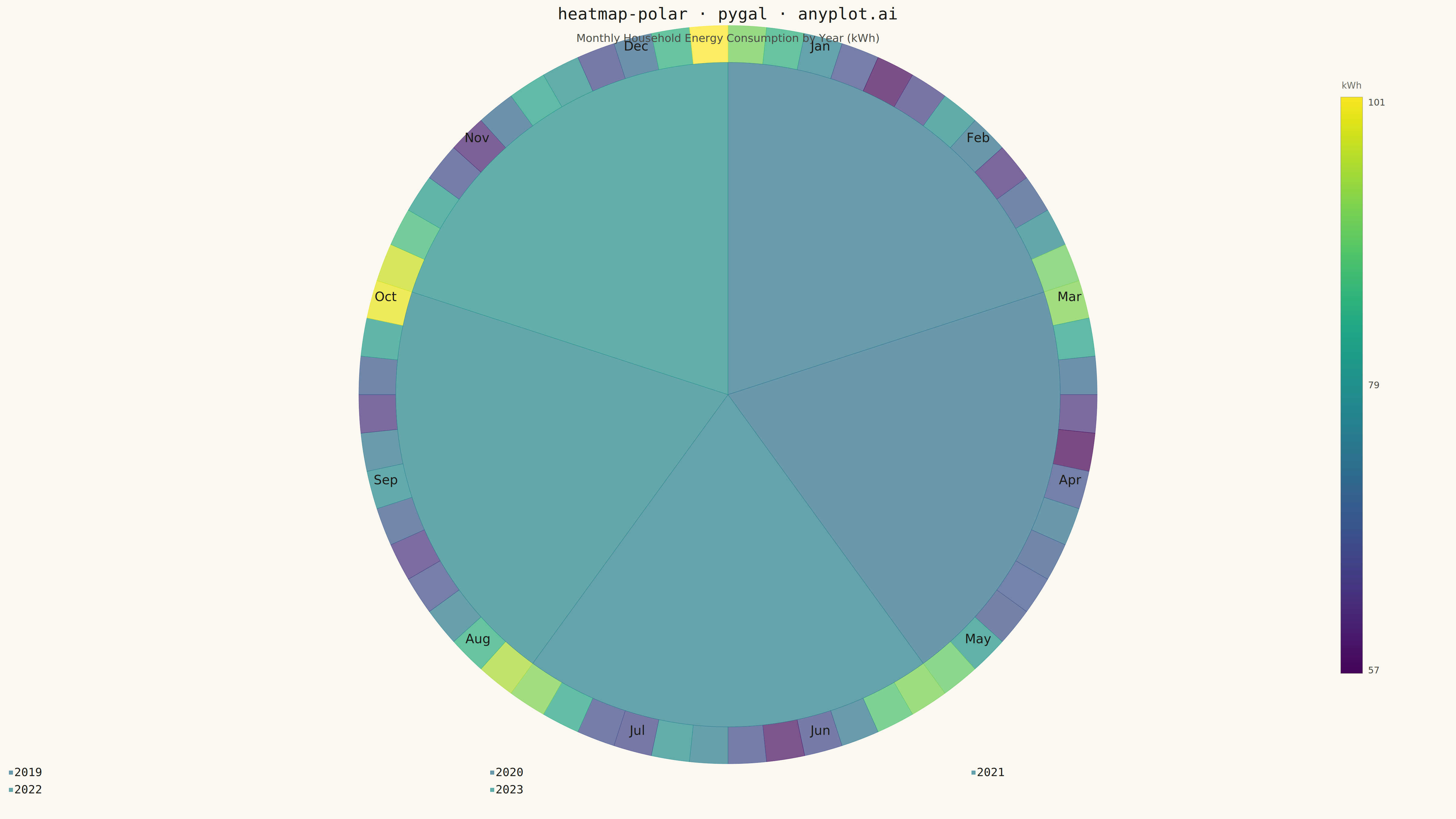
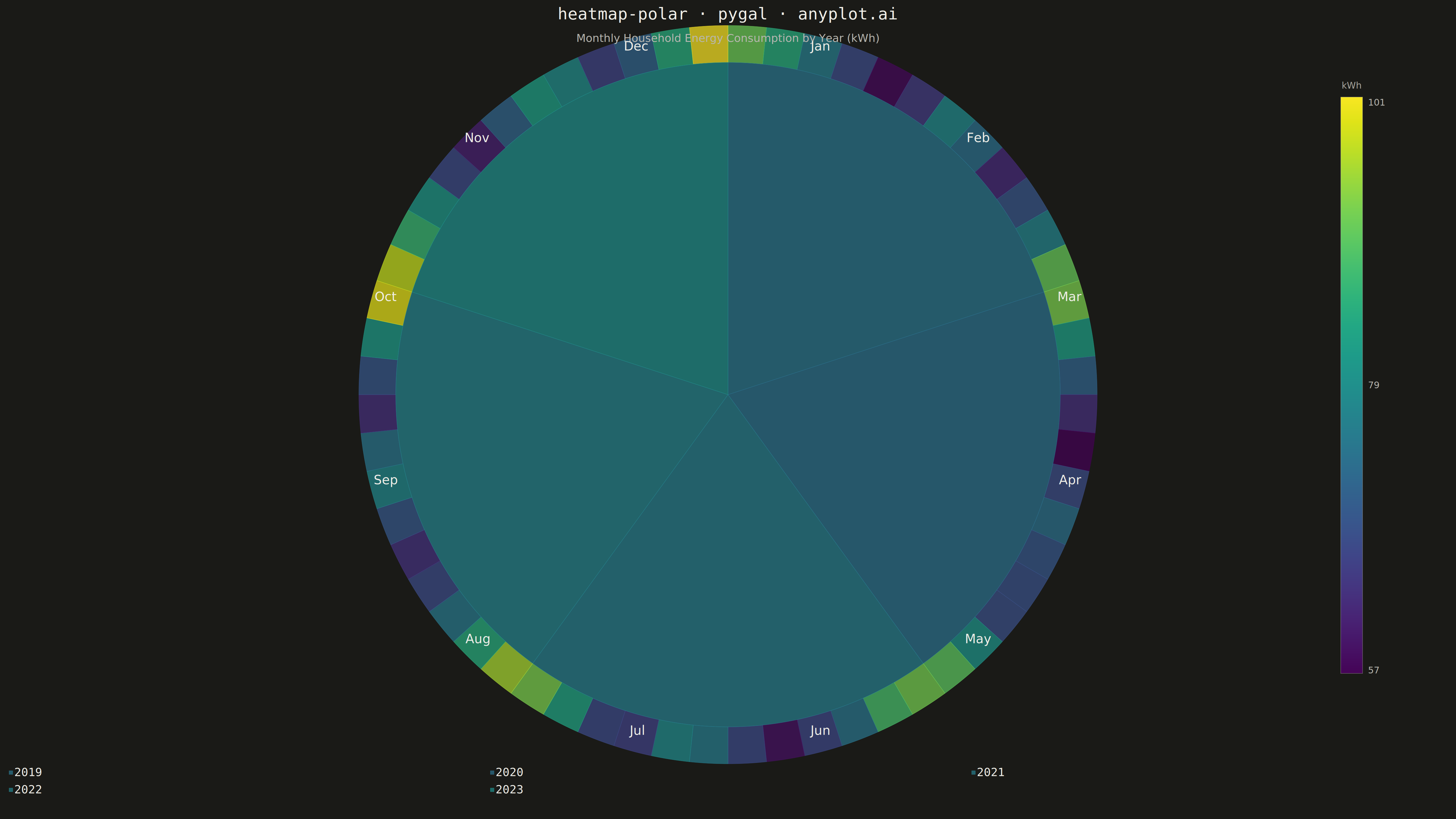
A heatmap wrapped around a circle where the angular axis represents a cyclic variable (e.g., hour of day, month) and the radial axis represents a second categorical or ordinal variable (e.g., day of week, year). Cell color encodes the measured value. This visualization reveals patterns in data with inherent cyclical structure that rectangular heatmaps distort, since the first and last angular bins are visually adjacent rather than separated at opposite ends of a row.
""" anyplot.ai
heatmap-polar: Polar Heatmap for Cyclic Two-Dimensional Data
Library: pygal 3.1.0 | Python 3.13.13
Quality: 82/100 | Created: 2026-05-13
"""

import math
import os
import sys


def _plot():
    # Remove current directory from sys.path to prevent self-import of this file (pygal.py)
    this_dir = os.path.dirname(os.path.abspath(__file__))
    sys.path[:] = [p for p in sys.path if os.path.realpath(p) != os.path.realpath(this_dir)]

    import cairosvg
    import matplotlib.cm as cm
    import numpy as np
    import pygal
    from pygal.style import Style

    THEME = os.getenv("ANYPLOT_THEME", "light")
    PAGE_BG = "#FAF8F1" if THEME == "light" else "#1A1A17"
    INK = "#1A1A17" if THEME == "light" else "#F0EFE8"
    INK_SOFT = "#4A4A44" if THEME == "light" else "#B8B7B0"
    INK_MUTED = "#6B6A63" if THEME == "light" else "#A8A79F"

    # Data: monthly household energy consumption (kWh) across 5 years
    np.random.seed(42)
    years = [2019, 2020, 2021, 2022, 2023]
    months = ["Jan", "Feb", "Mar", "Apr", "May", "Jun", "Jul", "Aug", "Sep", "Oct", "Nov", "Dec"]
    n_years, n_months = len(years), len(months)

    base = np.array([90, 85, 74, 63, 58, 65, 74, 71, 63, 67, 78, 92], dtype=float)
    data = np.zeros((n_years, n_months))
    for i in range(n_years):
        data[i] = base * (1.0 + i * 0.018) + np.random.normal(0, 2.5, n_months)

    vmin, vmax = data.min(), data.max()

    def val_to_hex(val):
        t = float(np.clip((val - vmin) / (vmax - vmin), 0, 1))
        r, g, b, _ = cm.viridis(t)
        return f"#{int(r * 255):02x}{int(g * 255):02x}{int(b * 255):02x}"

    # Representative viridis color per year for pygal legend swatches
    year_colors = tuple(val_to_hex(float(data[i].mean())) for i in range(n_years))

    # pygal Style: all chrome derived from ANYPLOT_THEME tokens
    custom_style = Style(
        background=PAGE_BG,
        plot_background=PAGE_BG,
        foreground=INK,
        foreground_strong=INK,
        foreground_subtle=INK_MUTED,
        colors=year_colors,
        title_font_size=54,
        legend_font_size=38,
        label_font_size=36,
        value_font_size=32,
    )

    # pygal.Pie with multiple series renders as concentric rings (inner → outer per year)
    # value=1 for every sector ensures equal angular width (heatmap: color encodes kWh, not size)
    chart = pygal.Pie(
        width=4800,
        height=2700,
        style=custom_style,
        inner_radius=0.22,
        title="heatmap-polar · pygal · anyplot.ai",
        legend_at_bottom=True,
        print_values=False,
        show_legend=True,
        half_pie=False,
    )

    for i, year in enumerate(years):
        chart.add(
            str(year),
            [
                {"value": 1, "color": val_to_hex(data[i, j]), "label": f"{months[j]}: {data[i, j]:.0f} kWh"}
                for j in range(n_months)
            ],
        )

    # Render pygal chart to SVG (includes interactive JS for HTML output)
    svg_bytes = chart.render()
    svg_str = svg_bytes.decode("utf-8")

    # SVG post-processing: add subtitle, month labels, and colorbar
    # Estimated pie layout on 4800×2700 with title (~100px) and bottom legend (~130px):
    # chart area height ≈ 2470px → radius ≈ 1080, center ≈ (2400, 1280)
    CX, CY, R_OUTER = 2400, 1280, 1080

    subtitle_svg = (
        f'<text x="{CX}" y="138" text-anchor="middle" '
        f'fill="{INK_SOFT}" font-size="36" font-family="sans-serif">'
        f"Monthly Household Energy Consumption by Year (kWh)</text>"
    )

    # Month labels outside the outermost ring, clockwise from 12 o'clock
    month_labels_svg = []
    for j, month in enumerate(months):
        angle = (j + 0.5) * 2 * math.pi / n_months  # radians clockwise from north
        lx = CX + (R_OUTER + 88) * math.sin(angle)
        ly = CY - (R_OUTER + 88) * math.cos(angle)
        month_labels_svg.append(
            f'<text x="{lx:.0f}" y="{ly:.0f}" text-anchor="middle" dominant-baseline="middle" '
            f'fill="{INK}" font-size="42" font-weight="500" font-family="sans-serif">{month}</text>'
        )

    # Colorbar: SVG linearGradient (far right — viridis, top=vmax, bottom=vmin)
    cb_x, cb_y_top, cb_h, cb_w = 4420, 320, 1900, 72
    grad_stops = "".join(
        f'<stop offset="{k * 5}%" style="stop-color:{val_to_hex(vmax - (k / 20) * (vmax - vmin))};stop-opacity:1"/>'
        for k in range(21)
    )
    colorbar_svg = f"""
<defs>
  <linearGradient id="cbGrad" x1="0" y1="0" x2="0" y2="1">
    {grad_stops}
  </linearGradient>
</defs>
<rect x="{cb_x}" y="{cb_y_top}" width="{cb_w}" height="{cb_h}" fill="url(#cbGrad)"/>
<rect x="{cb_x}" y="{cb_y_top}" width="{cb_w}" height="{cb_h}" fill="none" stroke="{INK_MUTED}" stroke-width="2" opacity="0.4"/>
<text x="{cb_x + cb_w // 2}" y="{cb_y_top - 28}" text-anchor="middle" fill="{INK_MUTED}" font-size="30" font-family="sans-serif">kWh</text>
<text x="{cb_x + cb_w + 18}" y="{cb_y_top}" dominant-baseline="hanging" fill="{INK_SOFT}" font-size="30" font-family="sans-serif">{vmax:.0f}</text>
<text x="{cb_x + cb_w + 18}" y="{cb_y_top + cb_h // 2}" dominant-baseline="middle" fill="{INK_SOFT}" font-size="30" font-family="sans-serif">{(vmin + vmax) / 2:.0f}</text>
<text x="{cb_x + cb_w + 18}" y="{cb_y_top + cb_h}" dominant-baseline="auto" fill="{INK_SOFT}" font-size="30" font-family="sans-serif">{vmin:.0f}</text>
"""

    extra = subtitle_svg + "\n" + "\n".join(month_labels_svg) + colorbar_svg

    # Inject before the last </svg> tag
    parts = svg_str.rsplit("</svg>", 1)
    svg_str = parts[0] + extra + "\n</svg>" + parts[1]

    # Save HTML (pygal's interactive SVG-in-browser output format)
    html_str = (
        f"<!DOCTYPE html><html><head><meta charset='utf-8'>"
        f"<style>body{{margin:0;background:{PAGE_BG};}}</style></head>"
        f"<body>{svg_str}</body></html>"
    )
    with open(f"plot-{THEME}.html", "w", encoding="utf-8") as f:
        f.write(html_str)

    # Save PNG via cairosvg (same pipeline as pygal.render_to_png internally)
    cairosvg.svg2png(
        bytestring=svg_str.encode("utf-8"), write_to=f"plot-{THEME}.png", output_width=4800, output_height=2700
    )


_plot()
Runnable source as JSON, for any HTTP client: https://api.anyplot.ai/specs/heatmap-polar/pygal/code. Any spec id and library id listed in llms-full.txt fit the same URL shape; every URL below is complete and callable.
{
  "spec_id": "heatmap-polar",
  "language": "python",
  "library": "pygal",
  "page": "https://anyplot.ai/heatmap-polar/python/pygal",
  "hub": "https://anyplot.ai/heatmap-polar",
  "code_json": "https://api.anyplot.ai/specs/heatmap-polar/pygal/code",
  "spec_json": "https://api.anyplot.ai/specs/heatmap-polar",
  "render_light_png": "https://storage.googleapis.com/anyplot-images/plots/heatmap-polar/python/pygal/plot-light.png",
  "render_dark_png": "https://storage.googleapis.com/anyplot-images/plots/heatmap-polar/python/pygal/plot-dark.png",
  "interactive_light_html": "https://storage.googleapis.com/anyplot-images/plots/heatmap-polar/python/pygal/plot-light.html",
  "interactive_dark_html": "https://storage.googleapis.com/anyplot-images/plots/heatmap-polar/python/pygal/plot-dark.html",
  "quality_score": 82.0,
  "license": "MIT",
  "guide": "https://anyplot.ai/llms.txt"
}
Part of Polar Heatmap for Cyclic Two-Dimensional Data on anyplot.ai.