The same plot in 14 other libraries — Python: Altair, Bokeh, lets-plot, Matplotlib, Plotly, plotnine, Pygal; R: ggplot2; Julia: Makie.jl; JavaScript: Chart.js, D3.js, Apache ECharts, Highcharts, MUI X Charts. Compare all 15 side by side: Polar Heatmap for Cyclic Two-Dimensional Data in Python, R, Julia and JavaScript.
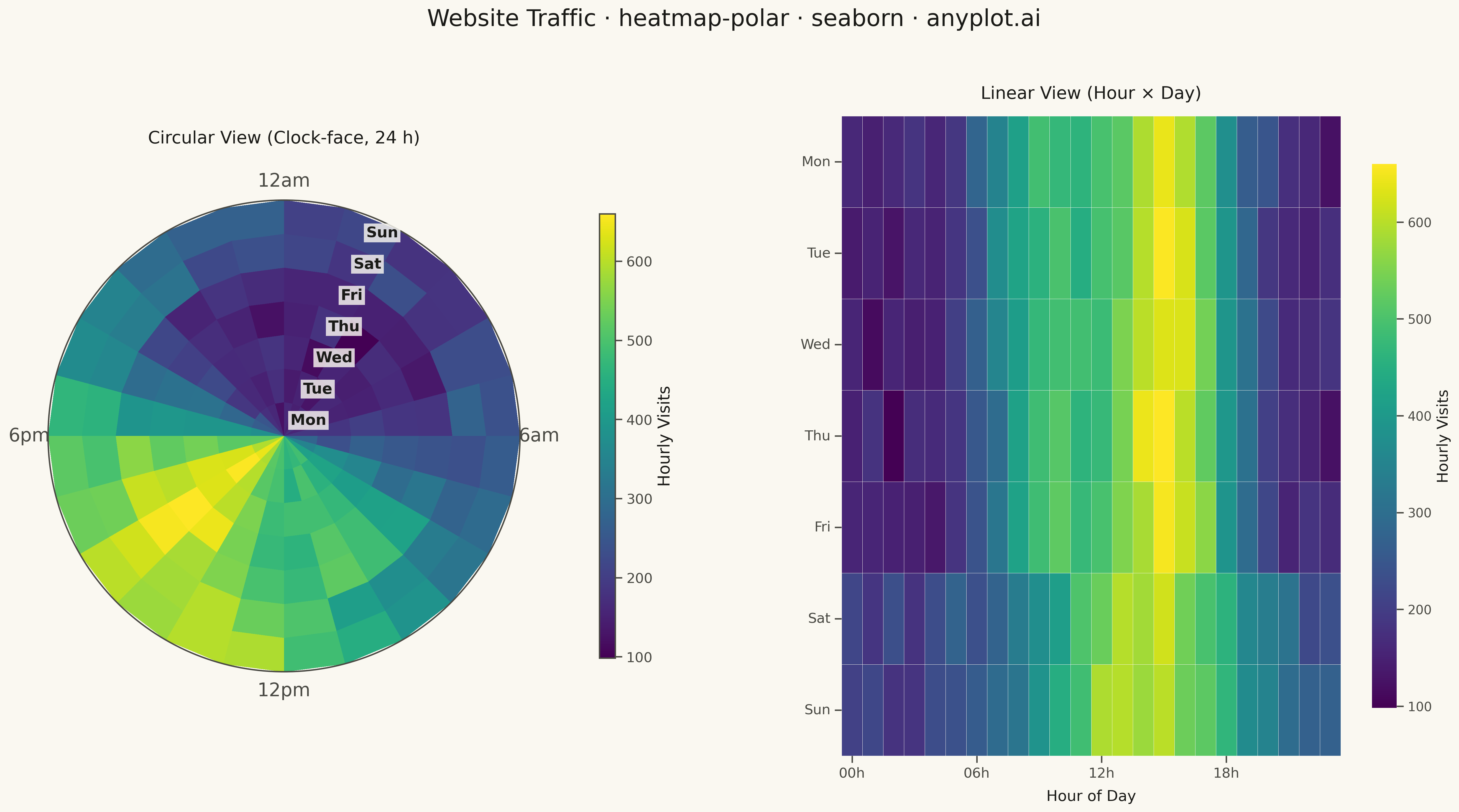
A heatmap wrapped around a circle where the angular axis represents a cyclic variable (e.g., hour of day, month) and the radial axis represents a second categorical or ordinal variable (e.g., day of week, year). Cell color encodes the measured value. This visualization reveals patterns in data with inherent cyclical structure that rectangular heatmaps distort, since the first and last angular bins are visually adjacent rather than separated at opposite ends of a row.
""" anyplot.ai
heatmap-polar: Polar Heatmap for Cyclic Two-Dimensional Data
Library: seaborn 0.13.2 | Python 3.13.13
Quality: 85/100 | Created: 2026-05-13
"""

import os

import matplotlib.pyplot as plt
import numpy as np
import seaborn as sns


# Theme tokens
THEME = os.getenv("ANYPLOT_THEME", "light")
PAGE_BG = "#FAF8F1" if THEME == "light" else "#1A1A17"
ELEVATED_BG = "#FFFDF6" if THEME == "light" else "#242420"
INK = "#1A1A17" if THEME == "light" else "#F0EFE8"
INK_SOFT = "#4A4A44" if THEME == "light" else "#B8B7B0"

sns.set_theme(
    style="ticks",
    rc={
        "figure.facecolor": PAGE_BG,
        "axes.facecolor": PAGE_BG,
        "text.color": INK,
        "xtick.color": INK_SOFT,
        "ytick.color": INK_SOFT,
        "grid.color": INK,
        "grid.alpha": 0.10,
    },
)

# Data: hourly website traffic by day of week
np.random.seed(42)
days = ["Mon", "Tue", "Wed", "Thu", "Fri", "Sat", "Sun"]
n_days = len(days)
n_hours = 24

# Synthetic traffic with realistic weekday/weekend patterns
traffic = np.zeros((n_days, n_hours))
for d in range(n_days):
    for h in range(n_hours):
        if d >= 5:  # Weekend: afternoon peak
            traffic[d, h] = 200 + 400 * np.exp(-0.5 * ((h - 14) / 4) ** 2)
        else:  # Weekday: morning and afternoon peaks
            morning = 300 * np.exp(-0.5 * ((h - 9) / 2) ** 2)
            afternoon = 500 * np.exp(-0.5 * ((h - 15) / 2.5) ** 2)
            traffic[d, h] = 150 + morning + afternoon
traffic += np.random.normal(0, 20, traffic.shape)
traffic = np.clip(traffic, 0, None)

# Plot — polar projection for the circular heatmap
fig = plt.figure(figsize=(12, 12), facecolor=PAGE_BG)
ax = fig.add_subplot(111, projection="polar")
ax.set_facecolor(PAGE_BG)

theta_edges = np.linspace(0, 2 * np.pi, n_hours + 1)
r_edges = np.arange(n_days + 1, dtype=float)

mesh = ax.pcolormesh(theta_edges, r_edges, traffic, cmap="viridis", shading="flat")

# Clock orientation: midnight at top, clockwise like a 24-hour clock face
ax.set_theta_zero_location("N")
ax.set_theta_direction(-1)

# Hour labels at the four cardinal positions only
hour_positions = np.linspace(0, 2 * np.pi, n_hours, endpoint=False)
ax.set_xticks(hour_positions)
hour_labels = [
    "12am" if h == 0 else "6am" if h == 6 else "12pm" if h == 12 else "6pm" if h == 18 else "" for h in range(n_hours)
]
ax.set_xticklabels(hour_labels, fontsize=18, color=INK_SOFT, fontweight="medium")

# Day-of-week labels at the center of each radial ring
ax.set_yticks(np.arange(n_days) + 0.5)
ax.set_yticklabels(days, fontsize=16, color=INK_SOFT)
ax.set_ylim(0, n_days)
ax.tick_params(axis="y", length=0)

# Subtle cell gridlines to separate rings and sectors
ax.grid(True, alpha=0.12, color=INK, linewidth=0.6)

# Colorbar legend
cbar = plt.colorbar(mesh, ax=ax, pad=0.13, fraction=0.03, aspect=30)
cbar.set_label("Hourly Visits", fontsize=20, color=INK)
cbar.ax.tick_params(labelsize=16, colors=INK_SOFT)
plt.setp(cbar.ax.yaxis.get_ticklabels(), color=INK_SOFT)
cbar.outline.set_edgecolor(INK_SOFT)

ax.set_title(
    "Website Traffic · heatmap-polar · seaborn · anyplot.ai", fontsize=24, fontweight="medium", color=INK, pad=25
)

plt.tight_layout()
plt.savefig(f"plot-{THEME}.png", dpi=300, bbox_inches="tight", facecolor=PAGE_BG)
Runnable source as JSON, for any HTTP client: https://api.anyplot.ai/specs/heatmap-polar/seaborn/code. Any spec id and library id listed in llms-full.txt fit the same URL shape; every URL below is complete and callable.
{
  "spec_id": "heatmap-polar",
  "language": "python",
  "library": "seaborn",
  "page": "https://anyplot.ai/heatmap-polar/python/seaborn",
  "hub": "https://anyplot.ai/heatmap-polar",
  "code_json": "https://api.anyplot.ai/specs/heatmap-polar/seaborn/code",
  "spec_json": "https://api.anyplot.ai/specs/heatmap-polar",
  "render_light_png": "https://storage.googleapis.com/anyplot-images/plots/heatmap-polar/python/seaborn/plot-light.png",
  "render_dark_png": "https://storage.googleapis.com/anyplot-images/plots/heatmap-polar/python/seaborn/plot-dark.png",
  "quality_score": 85.0,
  "license": "MIT",
  "guide": "https://anyplot.ai/llms.txt"
}
Part of Polar Heatmap for Cyclic Two-Dimensional Data on anyplot.ai.