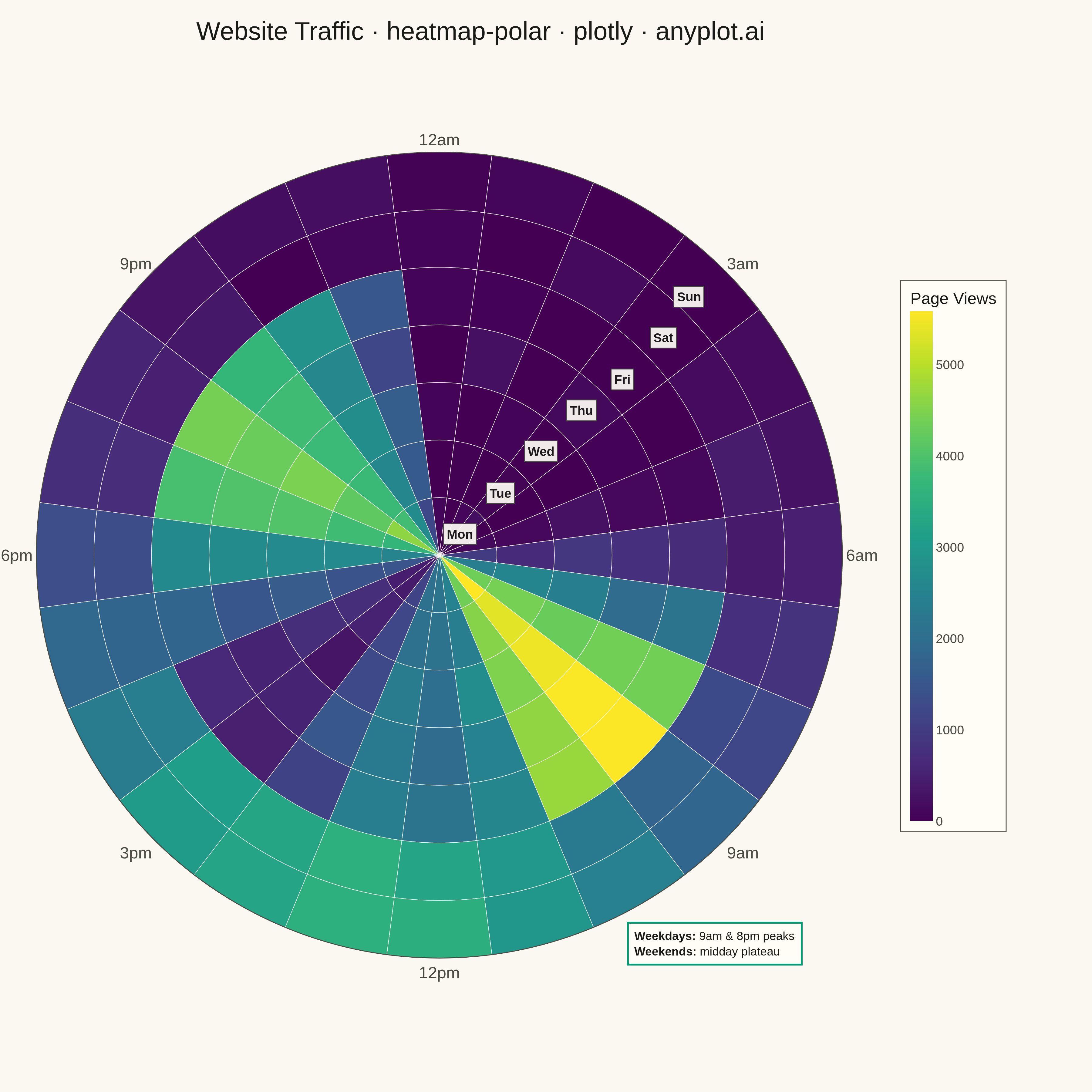
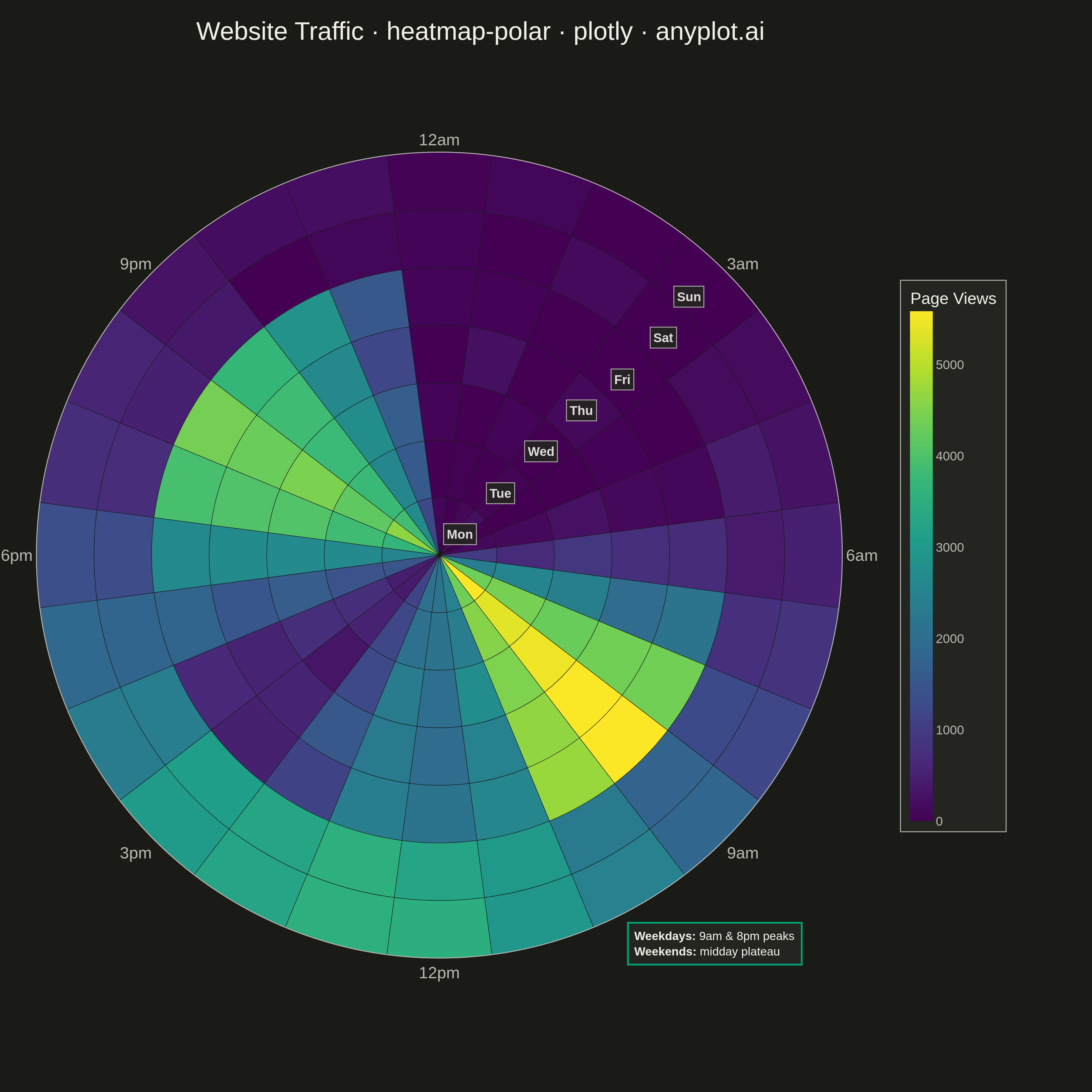
The same plot in 14 other libraries — Python: Altair, Bokeh, lets-plot, Matplotlib, plotnine, Pygal, Seaborn; R: ggplot2; Julia: Makie.jl; JavaScript: Chart.js, D3.js, Apache ECharts, Highcharts, MUI X Charts. Compare all 15 side by side: Polar Heatmap for Cyclic Two-Dimensional Data in Python, R, Julia and JavaScript.
A heatmap wrapped around a circle where the angular axis represents a cyclic variable (e.g., hour of day, month) and the radial axis represents a second categorical or ordinal variable (e.g., day of week, year). Cell color encodes the measured value. This visualization reveals patterns in data with inherent cyclical structure that rectangular heatmaps distort, since the first and last angular bins are visually adjacent rather than separated at opposite ends of a row.
""" anyplot.ai
heatmap-polar: Polar Heatmap for Cyclic Two-Dimensional Data
Library: plotly 6.7.0 | Python 3.13.13
Quality: 89/100 | Created: 2026-05-13
"""

import os

import numpy as np
import plotly.graph_objects as go


# Theme tokens
THEME = os.getenv("ANYPLOT_THEME", "light")
PAGE_BG = "#FAF8F1" if THEME == "light" else "#1A1A17"
ELEVATED_BG = "#FFFDF6" if THEME == "light" else "#242420"
INK = "#1A1A17" if THEME == "light" else "#F0EFE8"
INK_SOFT = "#4A4A44" if THEME == "light" else "#B8B7B0"
GRID = "rgba(26,26,23,0.10)" if THEME == "light" else "rgba(240,239,232,0.10)"

# Data: website page views by hour of day (angular) and day of week (radial)
np.random.seed(42)
days = ["Mon", "Tue", "Wed", "Thu", "Fri", "Sat", "Sun"]
n_days = 7
n_hours = 24

traffic = np.zeros((n_days, n_hours))
for d in range(n_days):
    for h in range(n_hours):
        morning_peak = np.exp(-0.5 * ((h - 9) / 1.5) ** 2)
        evening_peak = np.exp(-0.5 * ((h - 20) / 2.0) ** 2)
        lunch_peak = 0.4 * np.exp(-0.5 * ((h - 13) / 1.0) ** 2)
        if d >= 5:  # weekend: single midday peak
            traffic[d, h] = 3500 * np.exp(-0.5 * ((h - 13) / 3.5) ** 2) + np.random.normal(0, 80)
        else:  # weekday: morning + lunch + evening peaks
            traffic[d, h] = 5500 * (morning_peak + 0.8 * evening_peak + lunch_peak) + np.random.normal(0, 150)

traffic = np.clip(traffic, 0, None)
vmin, vmax = traffic.min(), traffic.max()

# Angular layout: 24 hours each occupying 15°, starting at top (midnight), clockwise
hour_angles = [h * (360.0 / n_hours) for h in range(n_hours)]
bar_width = 360.0 / n_hours

# Plot
fig = go.Figure()

for d, day in enumerate(days):
    hourly = traffic[d].tolist()
    fig.add_trace(
        go.Barpolar(
            r=[1.0] * n_hours,
            base=[d] * n_hours,
            theta=hour_angles,
            width=[bar_width] * n_hours,
            marker={"color": hourly, "coloraxis": "coloraxis", "line": {"color": PAGE_BG, "width": 0.5}},
            name=day,
            showlegend=False,
            customdata=np.column_stack([list(range(n_hours)), hourly]),
            hovertemplate=(
                f"<b>{day}</b><br>Hour: %{{customdata[0]:.0f}}:00<br>Page Views: %{{customdata[1]:,.0f}}<extra></extra>"
            ),
        )
    )

# Style
angular_tickvals = [h * 15 for h in [0, 3, 6, 9, 12, 15, 18, 21]]
angular_ticktext = ["12am", "3am", "6am", "9am", "12pm", "3pm", "6pm", "9pm"]

fig.update_layout(
    title={
        "text": "Website Traffic · heatmap-polar · plotly · anyplot.ai",
        "font": {"size": 28, "color": INK},
        "x": 0.44,
        "y": 0.98,
        "xanchor": "center",
        "yanchor": "top",
    },
    polar={
        "bgcolor": PAGE_BG,
        "domain": {"x": [0, 0.82], "y": [0.02, 0.98]},
        "angularaxis": {
            "direction": "clockwise",
            "rotation": 90,
            "tickvals": angular_tickvals,
            "ticktext": angular_ticktext,
            "tickfont": {"size": 18, "color": INK_SOFT},
            "linecolor": INK_SOFT,
            "gridcolor": GRID,
            "gridwidth": 1,
        },
        "radialaxis": {
            "range": [0, n_days],
            "tickvals": [d + 0.5 for d in range(n_days)],
            "ticktext": days,
            "tickfont": {"size": 16, "color": INK_SOFT},
            "gridcolor": GRID,
            "showgrid": True,
            "showline": False,
            "angle": 45,
            "tickangle": 0,
        },
    },
    coloraxis={
        "colorscale": "viridis",
        "cmin": vmin,
        "cmax": vmax,
        "colorbar": {
            "title": {"text": "Page Views", "font": {"size": 18, "color": INK}},
            "tickfont": {"size": 14, "color": INK_SOFT},
            "bgcolor": ELEVATED_BG,
            "bordercolor": INK_SOFT,
            "borderwidth": 1,
            "thickness": 25,
            "len": 0.55,
            "x": 0.88,
            "y": 0.5,
            "yanchor": "middle",
        },
    },
    paper_bgcolor=PAGE_BG,
    font={"color": INK},
    margin={"l": 40, "r": 80, "t": 60, "b": 40},
)

# Save
fig.write_image(f"plot-{THEME}.png", width=1200, height=1200, scale=3)
fig.write_html(f"plot-{THEME}.html", include_plotlyjs="cdn")
Runnable source as JSON, for any HTTP client: https://api.anyplot.ai/specs/heatmap-polar/plotly/code. Any spec id and library id listed in llms-full.txt fit the same URL shape; every URL below is complete and callable.
{
  "spec_id": "heatmap-polar",
  "language": "python",
  "library": "plotly",
  "page": "https://anyplot.ai/heatmap-polar/python/plotly",
  "hub": "https://anyplot.ai/heatmap-polar",
  "code_json": "https://api.anyplot.ai/specs/heatmap-polar/plotly/code",
  "spec_json": "https://api.anyplot.ai/specs/heatmap-polar",
  "render_light_png": "https://storage.googleapis.com/anyplot-images/plots/heatmap-polar/python/plotly/plot-light.png",
  "render_dark_png": "https://storage.googleapis.com/anyplot-images/plots/heatmap-polar/python/plotly/plot-dark.png",
  "interactive_light_html": "https://storage.googleapis.com/anyplot-images/plots/heatmap-polar/python/plotly/plot-light.html",
  "interactive_dark_html": "https://storage.googleapis.com/anyplot-images/plots/heatmap-polar/python/plotly/plot-dark.html",
  "quality_score": 89.0,
  "license": "MIT",
  "guide": "https://anyplot.ai/llms.txt"
}
Part of Polar Heatmap for Cyclic Two-Dimensional Data on anyplot.ai.