The same plot in 14 other libraries — Python: Altair, Bokeh, lets-plot, Matplotlib, Plotly, Pygal, Seaborn; R: ggplot2; Julia: Makie.jl; JavaScript: Chart.js, D3.js, Apache ECharts, Highcharts, MUI X Charts. Compare all 15 side by side: Polar Heatmap for Cyclic Two-Dimensional Data in Python, R, Julia and JavaScript.
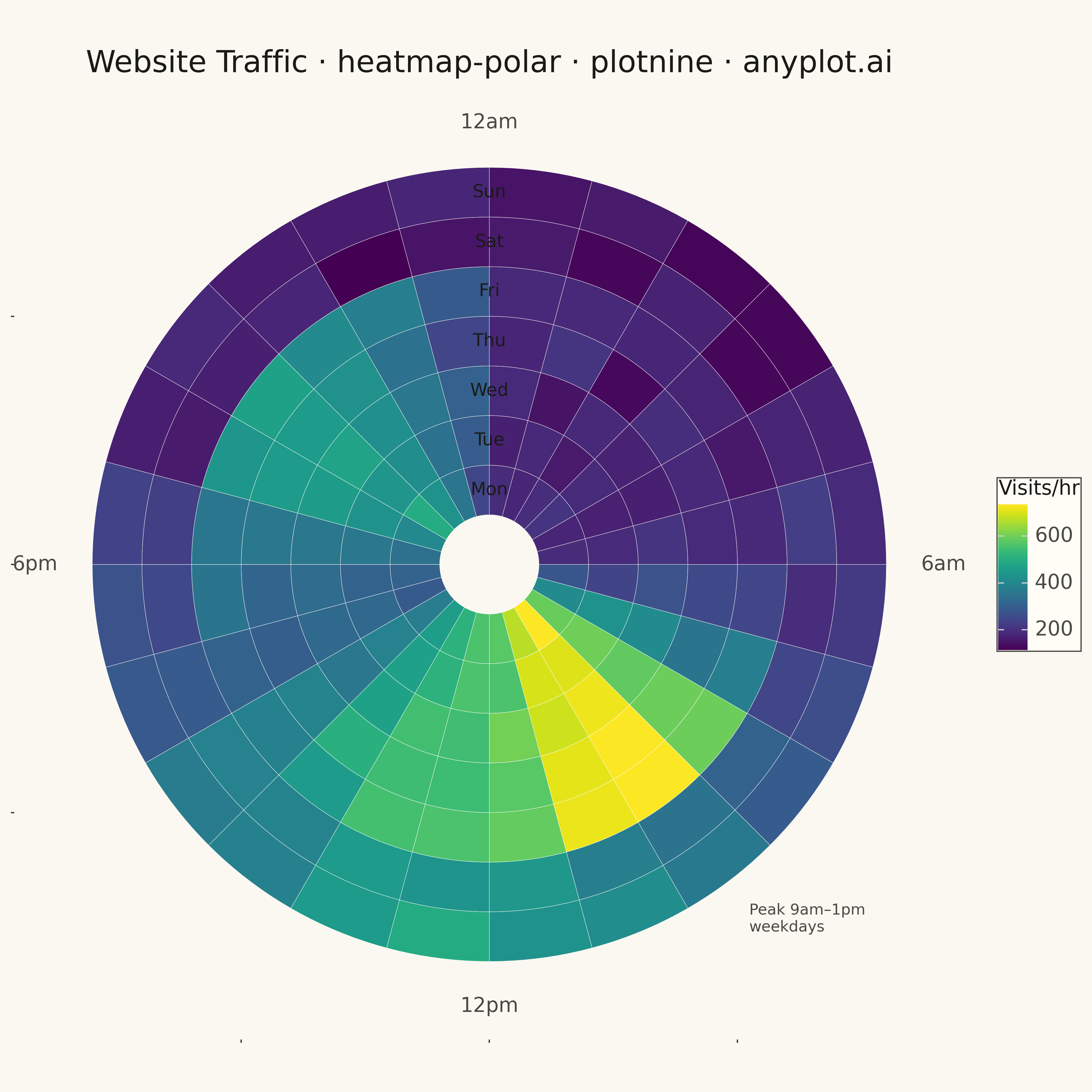
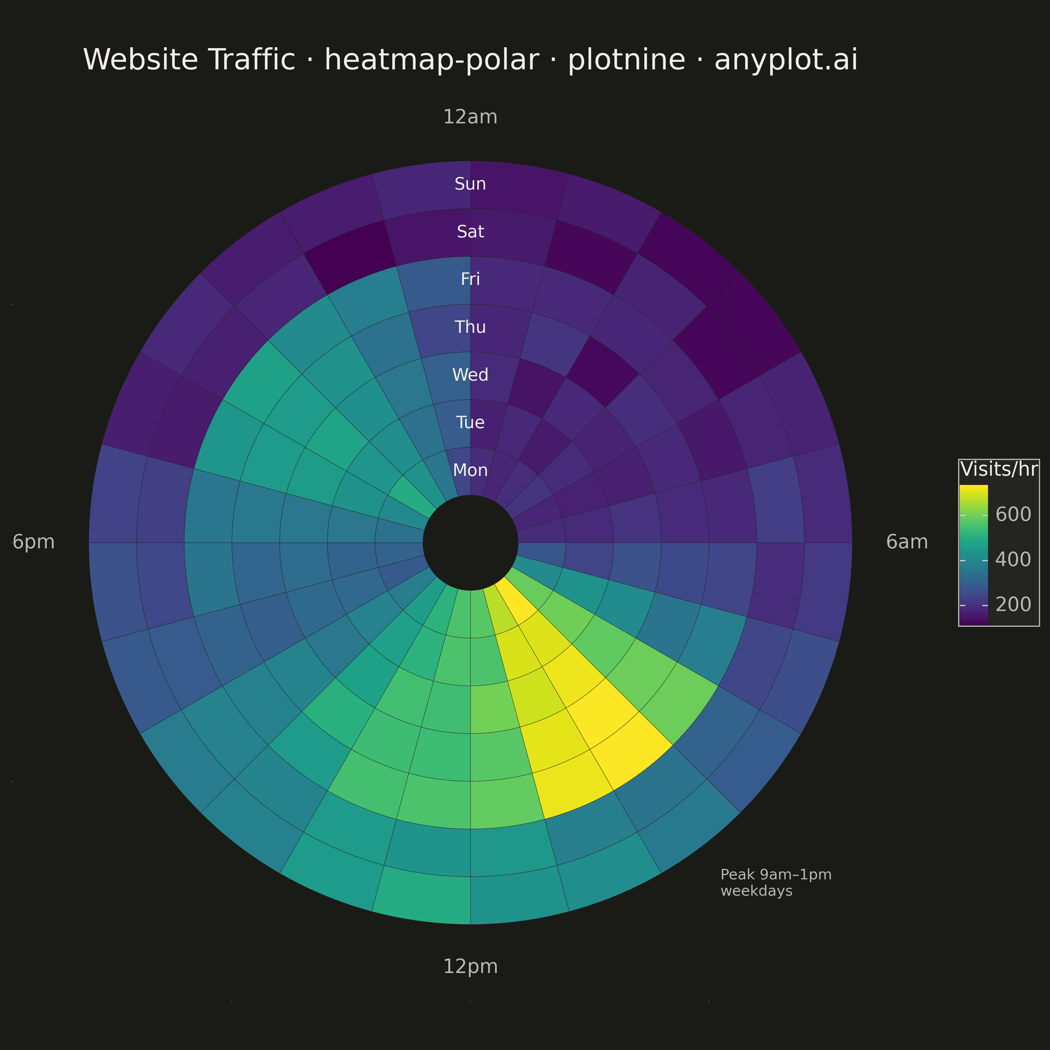
A heatmap wrapped around a circle where the angular axis represents a cyclic variable (e.g., hour of day, month) and the radial axis represents a second categorical or ordinal variable (e.g., day of week, year). Cell color encodes the measured value. This visualization reveals patterns in data with inherent cyclical structure that rectangular heatmaps distort, since the first and last angular bins are visually adjacent rather than separated at opposite ends of a row.
""" anyplot.ai
heatmap-polar: Polar Heatmap for Cyclic Two-Dimensional Data
Library: plotnine 0.15.4 | Python 3.13.13
Quality: 86/100 | Created: 2026-05-13
"""

import os
import sys


# Prevent current directory from shadowing the plotnine package
sys.path = [p for p in sys.path if not p.endswith("implementations") and not p.endswith("python")]

import numpy as np
import pandas as pd
from plotnine import (
    aes,
    annotate,
    coord_equal,
    element_blank,
    element_rect,
    element_text,
    geom_polygon,
    geom_text,
    ggplot,
    labs,
    scale_fill_cmap,
    theme,
)


THEME = os.getenv("ANYPLOT_THEME", "light")
PAGE_BG = "#FAF8F1" if THEME == "light" else "#1A1A17"
ELEVATED_BG = "#FFFDF6" if THEME == "light" else "#242420"
INK = "#1A1A17" if THEME == "light" else "#F0EFE8"
INK_SOFT = "#4A4A44" if THEME == "light" else "#B8B7B0"

# Data: hourly website traffic by day of week
np.random.seed(42)
days = ["Mon", "Tue", "Wed", "Thu", "Fri", "Sat", "Sun"]

traffic_matrix = np.zeros((7, 24))
for d_idx in range(7):
    is_weekend = d_idx >= 5
    for h in range(24):
        if is_weekend:
            traffic = 140 + np.exp(-0.5 * ((h - 12) / 3.5) ** 2) * 320
        else:
            traffic = (
                180
                + np.exp(-0.5 * ((h - 9) / 1.5) ** 2) * 520
                + np.exp(-0.5 * ((h - 13) / 1.8) ** 2) * 360
                + np.exp(-0.5 * ((h - 20) / 2.0) ** 2) * 290
            )
        traffic_matrix[d_idx, h] = max(0.0, traffic + np.random.normal(0, 20))

# Build polygon vertices for each cell as a wedge in Cartesian space.
# Clockwise layout: 12am at top (θ = π/2), hours increase clockwise.
N_ARC = 10
poly_rows = []
cell_id = 0

for d_idx in range(7):
    r_in = float(d_idx + 1)
    r_out = float(d_idx + 2)
    for h in range(24):
        val = traffic_matrix[d_idx, h]
        t0 = np.pi / 2 - h * (2 * np.pi / 24)
        t1 = np.pi / 2 - (h + 1) * (2 * np.pi / 24)
        # inner arc (clockwise = decreasing θ)
        for t in np.linspace(t0, t1, N_ARC):
            poly_rows.append({"px": r_in * np.cos(t), "py": r_in * np.sin(t), "g": cell_id, "v": val})
        # outer arc (counter-clockwise back = increasing θ)
        for t in np.linspace(t1, t0, N_ARC):
            poly_rows.append({"px": r_out * np.cos(t), "py": r_out * np.sin(t), "g": cell_id, "v": val})
        cell_id += 1

df_poly = pd.DataFrame(poly_rows)

# Day labels centered on 12am axis at each ring's radial midpoint
df_day = pd.DataFrame({"px": [0] * 7, "py": [d + 1.5 for d in range(7)], "label": days})

# Outer boundary radius for annotation placement
R_OUT = 8.0

# Peak annotation position: 9:30am direction, just outside the outermost ring
h_ann = 9.5
theta_ann = np.pi / 2 - h_ann * (2 * np.pi / 24)
r_ann = R_OUT + 0.6
x_ann = r_ann * np.cos(theta_ann)
y_ann = r_ann * np.sin(theta_ann)

plot = (
    ggplot(df_poly, aes(x="px", y="py", group="g", fill="v"))
    + geom_polygon(color=ELEVATED_BG, size=0.15)
    + geom_text(
        data=df_day,
        mapping=aes(x="px", y="py", label="label"),
        inherit_aes=False,
        color=INK,
        size=14,
        ha="center",
        va="center",
    )
    + annotate("text", x=0, y=R_OUT + 0.7, label="12am", color=INK_SOFT, size=16, ha="center", va="bottom")
    + annotate("text", x=R_OUT + 0.7, y=0, label="6am", color=INK_SOFT, size=16, ha="left", va="center")
    + annotate("text", x=0, y=-(R_OUT + 0.7), label="12pm", color=INK_SOFT, size=16, ha="center", va="top")
    + annotate("text", x=-(R_OUT + 0.7), y=0, label="6pm", color=INK_SOFT, size=16, ha="right", va="center")
    + annotate("text", x=x_ann, y=y_ann, label="Peak 9am–1pm\nweekdays", color=INK_SOFT, size=12, ha="left", va="top")
    + coord_equal()
    + scale_fill_cmap(cmap_name="viridis", name="Visits/hr")
    + labs(title="Website Traffic · heatmap-polar · plotnine · anyplot.ai", x="", y="")
    + theme(
        figure_size=(12, 12),
        plot_background=element_rect(fill=PAGE_BG, color=PAGE_BG),
        panel_background=element_rect(fill=PAGE_BG),
        panel_grid_major=element_blank(),
        panel_grid_minor=element_blank(),
        panel_border=element_blank(),
        axis_title=element_blank(),
        axis_text=element_blank(),
        axis_line=element_blank(),
        plot_title=element_text(color=INK, size=24, ha="center"),
        legend_background=element_rect(fill=ELEVATED_BG, color=INK_SOFT),
        legend_text=element_text(color=INK_SOFT, size=16),
        legend_title=element_text(color=INK, size=16),
    )
)

plot.save(f"plot-{THEME}.png", dpi=300)
Runnable source as JSON, for any HTTP client: https://api.anyplot.ai/specs/heatmap-polar/plotnine/code. Any spec id and library id listed in llms-full.txt fit the same URL shape; every URL below is complete and callable.
{
  "spec_id": "heatmap-polar",
  "language": "python",
  "library": "plotnine",
  "page": "https://anyplot.ai/heatmap-polar/python/plotnine",
  "hub": "https://anyplot.ai/heatmap-polar",
  "code_json": "https://api.anyplot.ai/specs/heatmap-polar/plotnine/code",
  "spec_json": "https://api.anyplot.ai/specs/heatmap-polar",
  "render_light_png": "https://storage.googleapis.com/anyplot-images/plots/heatmap-polar/python/plotnine/plot-light.png",
  "render_dark_png": "https://storage.googleapis.com/anyplot-images/plots/heatmap-polar/python/plotnine/plot-dark.png",
  "quality_score": 86.0,
  "license": "MIT",
  "guide": "https://anyplot.ai/llms.txt"
}
Part of Polar Heatmap for Cyclic Two-Dimensional Data on anyplot.ai.