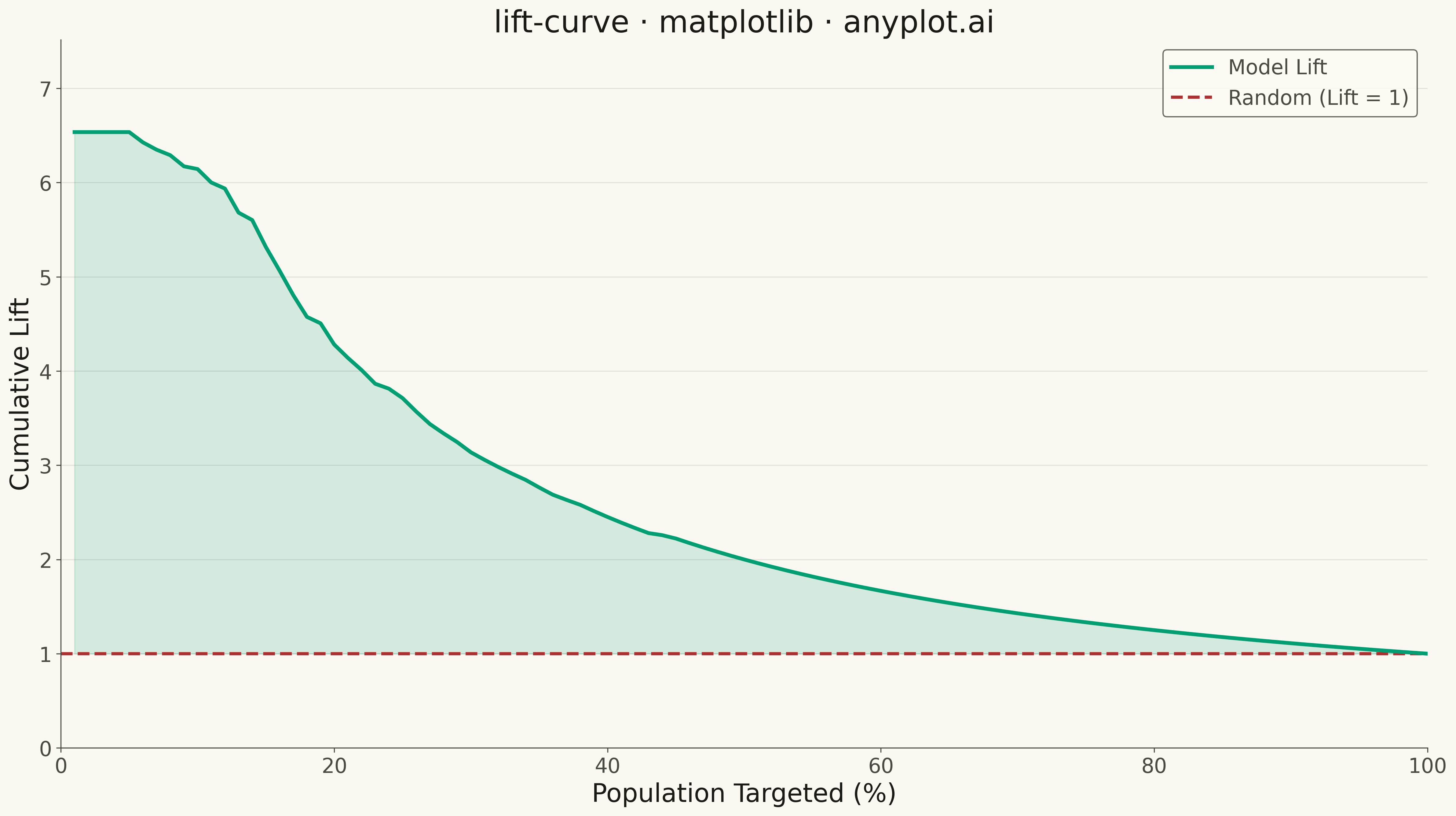
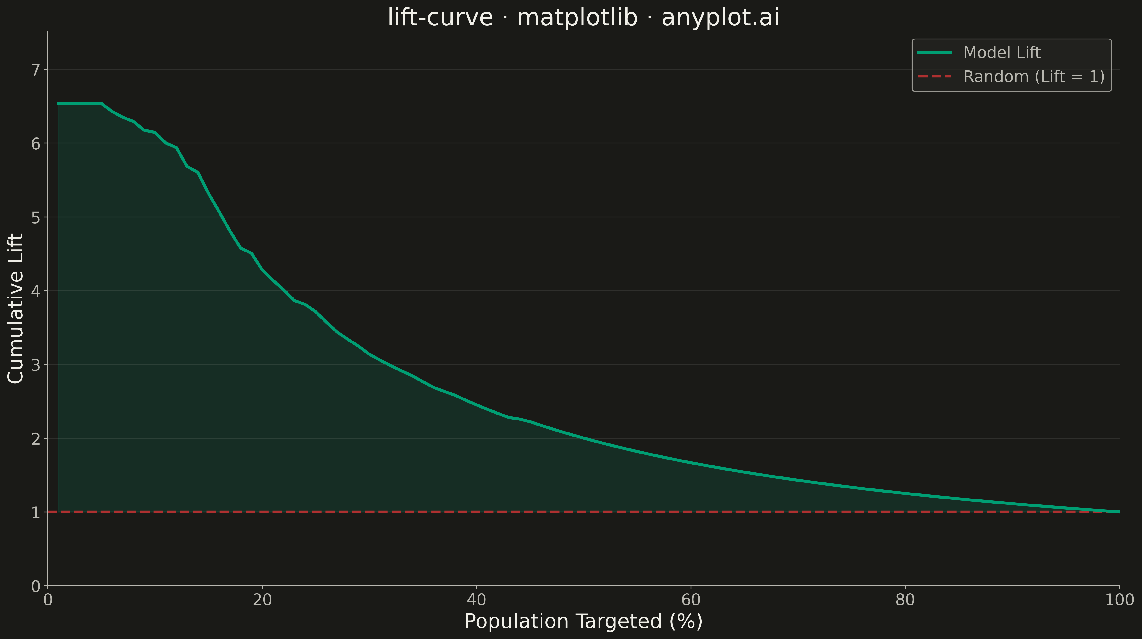
A lift curve visualizes how much better a predictive model performs compared to random selection, showing the cumulative lift ratio as you target increasing percentages of the population. It answers the question: "If I target the top X% of predictions, how many times more responders will I capture than random targeting?" This plot is essential for evaluating and comparing classification models in scenarios where targeting efficiency matters.
""" anyplot.ai
lift-curve: Model Lift Chart
Library: matplotlib 3.10.9 | Python 3.13.13
Quality: 94/100 | Updated: 2026-05-10
"""

import os

import matplotlib.pyplot as plt
import numpy as np


# Theme tokens
THEME = os.getenv("ANYPLOT_THEME", "light")
PAGE_BG = "#FAF8F1" if THEME == "light" else "#1A1A17"
ELEVATED_BG = "#FFFDF6" if THEME == "light" else "#242420"
INK = "#1A1A17" if THEME == "light" else "#F0EFE8"
INK_SOFT = "#4A4A44" if THEME == "light" else "#B8B7B0"
BRAND = "#009E73"  # Okabe-Ito position 1
ACCENT = "#AE3030"  # Okabe-Ito position 5 for reference line

# Data - Simulate realistic customer response model predictions
np.random.seed(42)
n_samples = 1000
base_rate = 0.15  # 15% baseline response rate

# Generate true labels with base rate
y_true = np.random.binomial(1, base_rate, n_samples)

# Generate model scores - correlated with true outcomes for realistic model
# Good responders get higher scores, non-responders get lower scores
y_score = np.where(
    y_true == 1,
    np.clip(np.random.beta(5, 2, n_samples), 0, 1),  # Responders: higher scores
    np.clip(np.random.beta(2, 5, n_samples), 0, 1),  # Non-responders: lower scores
)

# Calculate lift curve
# Sort by predicted score (descending)
sorted_indices = np.argsort(y_score)[::-1]
y_true_sorted = y_true[sorted_indices]

# Calculate cumulative response rate and lift
n_total = len(y_true)
n_positive = y_true.sum()
baseline_rate = n_positive / n_total

# Calculate cumulative lift at each percentage
percentages = np.arange(1, 101)
lift_values = []

for pct in percentages:
    n_selected = int(np.ceil(n_total * pct / 100))
    n_responders = y_true_sorted[:n_selected].sum()
    response_rate = n_responders / n_selected
    lift = response_rate / baseline_rate
    lift_values.append(lift)

lift_values = np.array(lift_values)

# Plot
fig, ax = plt.subplots(figsize=(16, 9), facecolor=PAGE_BG)
ax.set_facecolor(PAGE_BG)

# Plot lift curve
ax.plot(percentages, lift_values, color=BRAND, linewidth=3, label="Model Lift", zorder=3)

# Reference line at y=1 (random selection)
ax.axhline(y=1, color=ACCENT, linestyle="--", linewidth=2.5, label="Random (Lift = 1)", zorder=2)

# Fill area under curve for visual emphasis
ax.fill_between(percentages, 1, lift_values, where=(lift_values > 1), alpha=0.15, color=BRAND, zorder=1)

# Style
ax.set_xlabel("Population Targeted (%)", fontsize=20, color=INK)
ax.set_ylabel("Cumulative Lift", fontsize=20, color=INK)
ax.set_title("lift-curve · matplotlib · anyplot.ai", fontsize=24, fontweight="medium", color=INK)
ax.tick_params(axis="both", labelsize=16, colors=INK_SOFT)

# Set axis limits
ax.set_xlim(0, 100)
ax.set_ylim(0, max(lift_values) * 1.15)

# Grid
ax.yaxis.grid(True, alpha=0.10, linewidth=0.8, color=INK)

# Spines
ax.spines["top"].set_visible(False)
ax.spines["right"].set_visible(False)
for s in ("left", "bottom"):
    ax.spines[s].set_color(INK_SOFT)

# Legend
leg = ax.legend(fontsize=16, loc="upper right")
if leg:
    leg.get_frame().set_facecolor(ELEVATED_BG)
    leg.get_frame().set_edgecolor(INK_SOFT)
    plt.setp(leg.get_texts(), color=INK_SOFT)

plt.tight_layout()
plt.savefig(f"plot-{THEME}.png", dpi=300, bbox_inches="tight", facecolor=PAGE_BG)
Runnable source as JSON, for any HTTP client: https://api.anyplot.ai/specs/lift-curve/matplotlib/code. Any spec id and library id listed in llms-full.txt fit the same URL shape; every URL below is complete and callable.
{
  "spec_id": "lift-curve",
  "language": "python",
  "library": "matplotlib",
  "page": "https://anyplot.ai/lift-curve/python/matplotlib",
  "hub": "https://anyplot.ai/lift-curve",
  "code_json": "https://api.anyplot.ai/specs/lift-curve/matplotlib/code",
  "spec_json": "https://api.anyplot.ai/specs/lift-curve",
  "render_light_png": "https://storage.googleapis.com/anyplot-images/plots/lift-curve/python/matplotlib/plot-light.png",
  "render_dark_png": "https://storage.googleapis.com/anyplot-images/plots/lift-curve/python/matplotlib/plot-dark.png",
  "quality_score": 94.0,
  "license": "MIT",
  "guide": "https://anyplot.ai/llms.txt"
}
Part of Model Lift Chart on anyplot.ai.